Spatial Visualizations

Brianna Heggeseth

Announcements

This week in MSCS

  • Thursday 11:15am Coffee Break
  • Thursday 12-1pm MSCS Seminar (Really cool geometry)!
  • Next Wednesday (4:45-7pm): MSCS Block Party!

Class Masking Policy (Starting Friday)

  • Section 1: Masks required
  • Section 2: Masks optional
  • FYC: Masks optional

Taking Care of Each Other

  • If you are not feeling well, stay home/in the dorm & rest.
  • If you are exposed or a bit unwell, wear a mask.
  • Masks are always welcome!

Data Visuals that You’ve Created

Be Inspired by your Classmates!

Learning Goals

  • Plot data points on top of a map using the ggmap() function along with ggplot2 functions
  • Create choropleth maps using geom_map()
  • Add points and other ggplot2 features to a map created from geom_map()
  • Understand the basics of creating a map using leaflet, including adding points and choropleths to a base map

Template File

Download a template .Rmd of this activity. Put the file in a Day_06 folder within your COMP_STAT_112 folder.

  • This .Rmd only contains exercises that we’ll work on in class and you’ll finish for Assignment 5.

Spatial Viz

  • Points (Longitude, Latitude) on a Map
  • Contour/Heat Maps (2D Density) on a Map
  • Choropleths (color-filled polygons/regions)
  • Dynamic Maps

Points on a Map: Starbucks Example

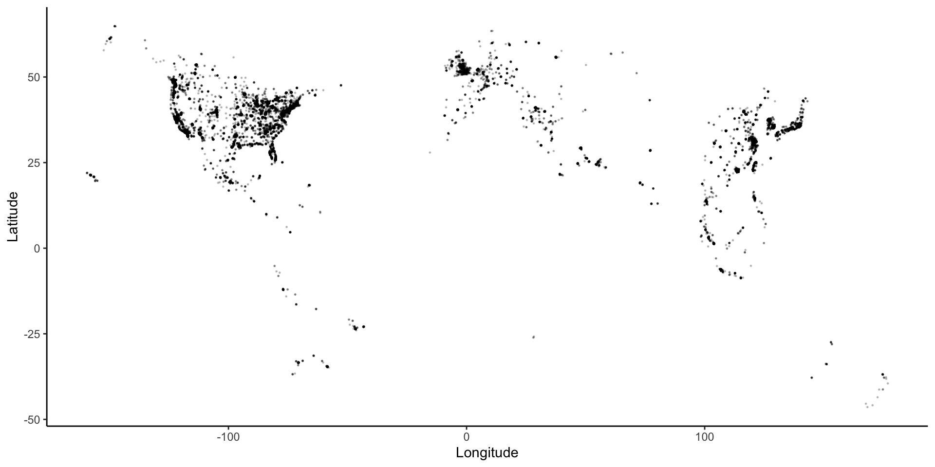
The Starbucks data, compiled by Danny Kaplan, contains information about every Starbucks in the world at the time the data were collected. It includes the Latitude and Longitude of each location. Let’s start by using familiar ggplot plotting tools.

# Starbucks locations
Starbucks <- read_csv("https://www.macalester.edu/~ajohns24/data/starbucks.csv")


ggplot(data = Starbucks) +
  geom_point(aes(x = Longitude, y = Latitude),
    alpha = 0.2,
    size = 0.2
  ) +
  theme_classic()

Map Background + Points

# Get the map information
world <- get_stamenmap(
  bbox = c(left = -180, bottom = -57, right = 179, top = 82.1),
  maptype = "terrain",
  zoom = 2
)

# Plot the points on the map
ggmap(world) + # creates the map "background"
  geom_point(
    data = Starbucks,
    aes(x = Longitude, y = Latitude),
    alpha = .3,
    size = 0.2
  ) +
  theme_map()

Map Projections (3D to 2D)

Important Context:

https://www.youtube.com/watch?v=vVX-PrBRtTY

Contour/Heat Maps

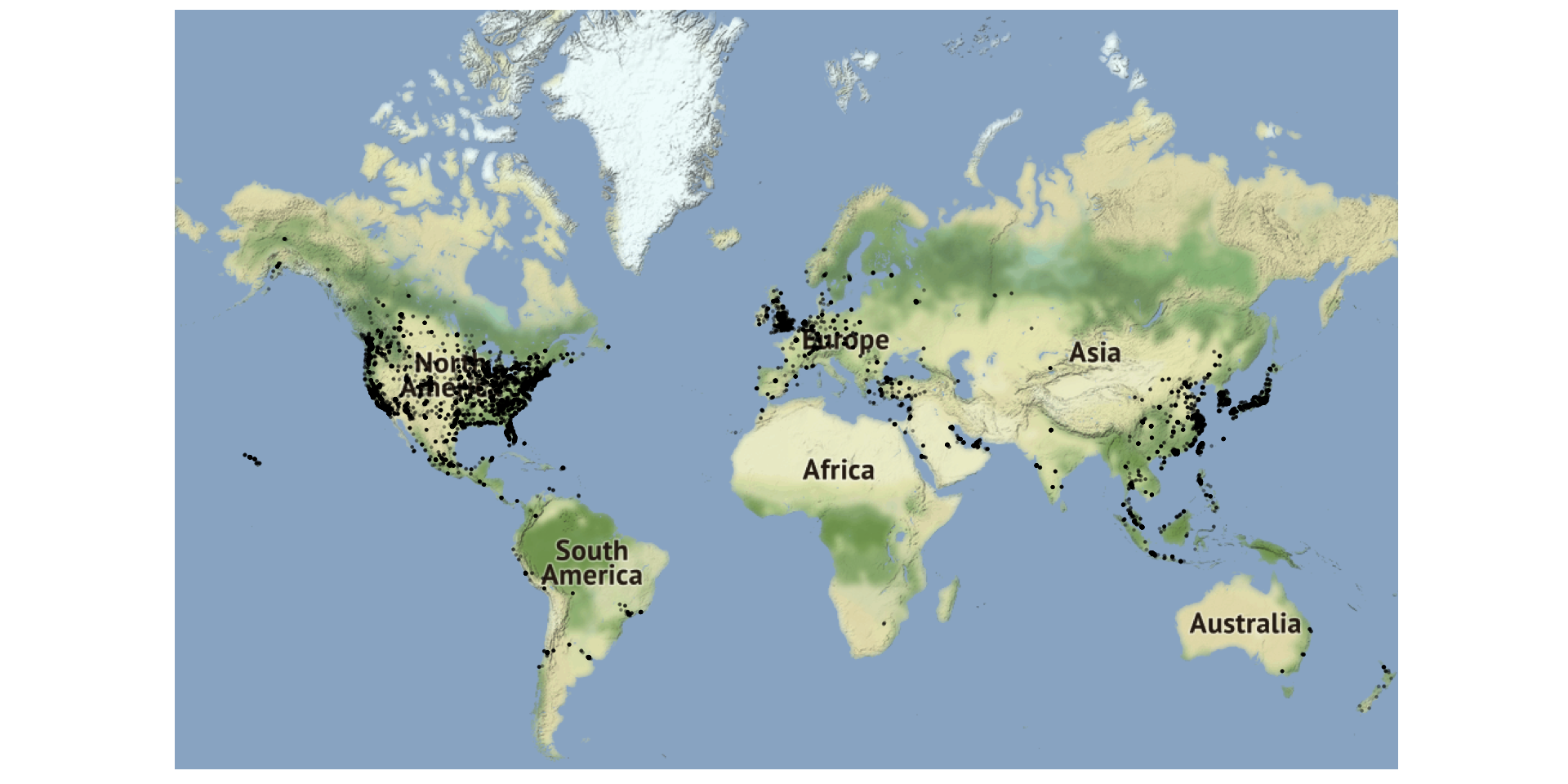
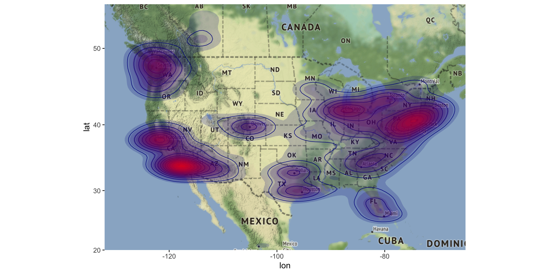
US_map2 <- get_stamenmap(
  bbox = c(left = -132, bottom = 20, right = -65, top = 55),
  maptype = "terrain",
  zoom = 4
)

ggmap(US_map2) +
  geom_density_2d(data = Starbucks, aes(x = Longitude, y = Latitude), size = 0.3, color='darkblue') +
  stat_density_2d(
    data = Starbucks,
    aes(x = Longitude, y = Latitude, fill = stat(level)),
    size = 0.1, bins = 20, geom = "polygon", alpha = 0.2
  ) +
  scale_fill_gradient(
    low = "darkblue", high = "red",
    guide = 'none'
  )

Choropleths

starbucks_us_by_state <- Starbucks %>%
  filter(Country == "US") %>%
  count(`State/Province`) %>%
  mutate(state_name = str_to_lower(abbr2state(`State/Province`)))

# US states map information - coordinates used to draw borders
states_map <- map_data("state")

# map that colors state by number of Starbucks
starbucks_us_by_state %>%
  ggplot() +
  geom_map(
    map = states_map,
    aes(
      map_id = state_name,
      fill = n
    )
  ) +
  # This assures the map looks decently nice:
  expand_limits(x = states_map$long, y = states_map$lat) +
  theme_map()

Dynamic Maps with Leaflet

favorite_stp <- tibble(
  place = c(
    "Macalester College", "Groveland Recreation Center",
    "Due Focacceria", "Shadow Falls Park", "Mattocks Park",
    "Carondelet Fields", "Pizza Luce", "Cold Front Ice Cream"
  ),
  long = c(
    -93.1712321, -93.1851310,
    -93.1775469, -93.1944518, -93.171057,
    -93.1582673, -93.1524256, -93.156652
  ),
  lat = c(
    44.9378965, 44.9351034, 44.9274973,
    44.9433359, 44.9284142, 44.9251236,
    44.9468848, 44.9266768
  )
)

leaflet(data = favorite_stp) %>%
  addTiles() %>%
  addMarkers(
    lng = ~long,
    lat = ~lat,
    label = ~place
  )

Advanced Spatial Mapping

If you want to get into spatial mapping, you’ll need to learn some GIS skills and consider coordinate reference systems (CRS).

The best tool in R to do this work is the sf package, which does work well with ggplot tools.

If you’d like to learn more, see my notes for my capstone course, Correlated Data.

After Class

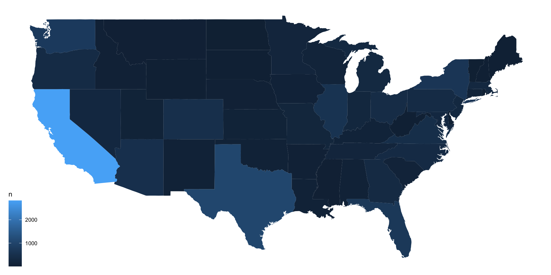
  • Complete the exercises by next Tuesday and submit for Assignment 5.

  • If you haven’t already, finish up the brief insights from Monday’s class for Assignment 4 (due Sunday).

  • Consider working on TT3 this week, you could apply your mapping skills!