Effective Visualizations
Announcements
- You should have an individual Google spreadsheet shared with you called Comp/Stat 112 Feedback [YOUR NAME]
- Let me know if you don’t.
- Join MSCS Community Google group if you are interested in learning more about:
- Department events
- Internship/summer research opportunities
Learning Goals
- Understand and apply the guiding principles of effective visualizations
Benefits of Visualizations
Visualizations help us understand what we’re working with:
- What are the scales of our variables?
- Are there any outliers, i.e. unusual cases?
- What are the patterns among our variables?
This understanding will inform our next steps:
- What method of analysis / model is appropriate?
Once our analysis is complete, visualizations are a powerful way to communicate our findings and tell a story.
Template File
Download a template .Rmd of this activity. Put the file in a Other_Activities folder within your COMP_STAT_112 folder.
- This .Rmd contains examples that we’ll work on in class.
- Make sure you add your name to the top & your collaborators are the people at your table
Analysis of Graphics
There is not one right way to visualize a data set.
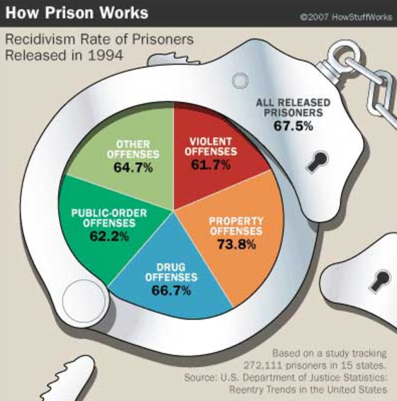
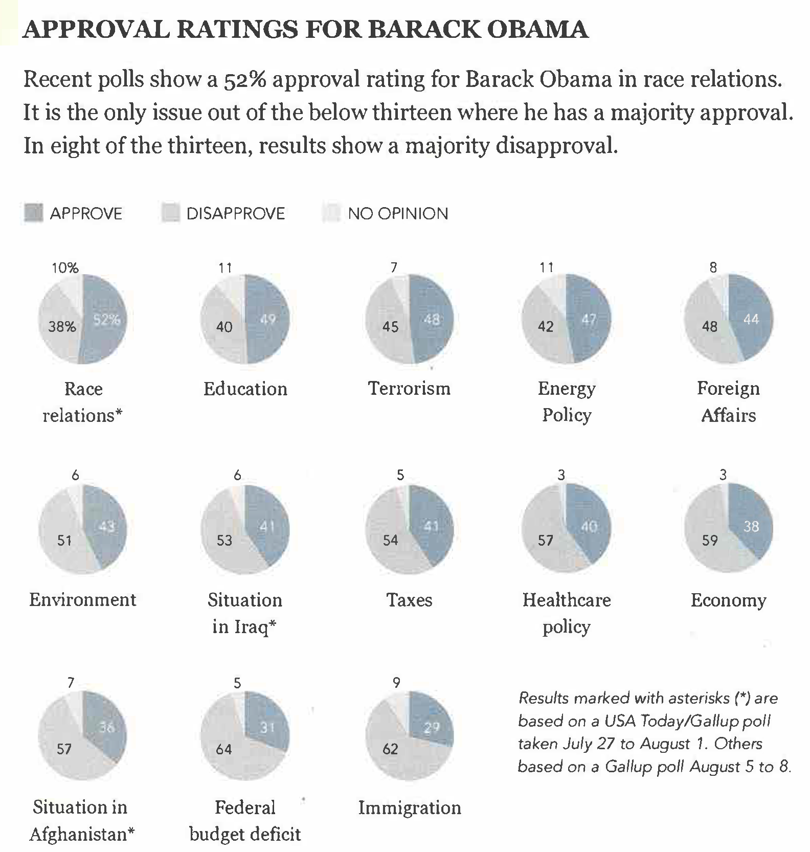
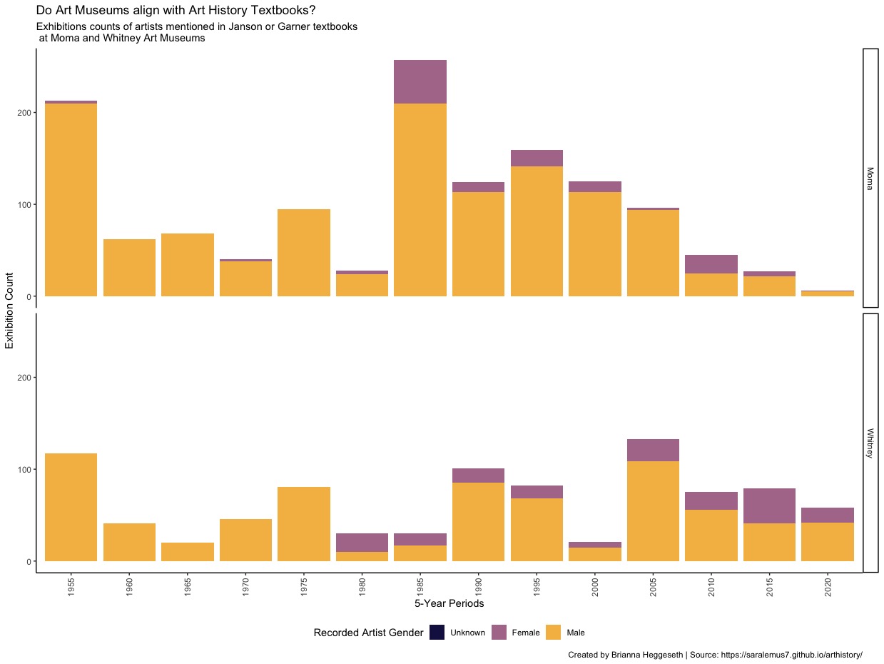
Let’s try some critical analysis on specific examples.
Identify the following:
- the story the graphic is aiming to communicate to the audience
- effective features of the graphic
- areas for improvement
Think and then discuss with group. Be prepared to share.
Example 1
Example 2

Example 3

Properties of Effective Visualizations
- Tells a Story
Graphics are designed by the human expert (you!) in order to reveal information that’s in the data.
You should clearly identify what story you want the graphic to tell to the audience, and double check that this story is being told.
Properties of Effective Visualizations
- Accessible
What audiences can access your story? Use alternative (alt) text and color-blind friendly color palettes.
Alt Text
Alt text should concisely articulate:
- what your visualization is (e.g. a bar chart showing which the harvest rate of cucumbers),
- a one sentence description of the what you think is the most important takeaway your visualization is showing, and
- a link to your data source if it’s not already in the caption
Great resource on writing alt text for data visualizations
Color Blind Friendly Colors
Color blindness impacts whether you can perceive color aesthetic differences.
One color blind friend palette is viridis:
+ scale_fill_viridis_d()or+ scale_color_viridis_d()when you are filling or coloring by a discrete/categorical variable+ scale_fill_viridis_c()or+ scale_color_viridis_c()when you are filling or coloring by a continuous/quantitative variable
Properties of Effective Visualizations
- Ethical
Data visualizations have a potentially enormous influence on how data are used to make decisions across all areas of human endeavor. - Michael Correll
Visibility - Make the invisible (labor, uncertainty, impact) visible
Privacy - Collect data with empathy
Power - Challenge structures of power
At a minimum, you should always:
Present data in a way that avoids misleading the audience (story should honestly represent data).
Always include your data source. Doing so attributes credit for labor, provides credibility to your work, and provides context for your graphic.
Properties of Effective Visualizations
- Good design to facilitate comparison
Good graphics make it easy for people to perceive things that are similar and things that are different.
Humans can perceive and compare nearby objects based on the aesthetics (roughly in descending order of ability):
- Position
- Length
- Angle
- Direction
- Shape (but only a very few different shapes)
- Area
- Volume
- Shade
- Color
Visual Perception - 1
Visual perception is selective, and our attention is often drawn to contrasts from the norm.

Implication: We should design visualizations so that the features we want to highlight stand out in contrast from those that are not worth the audience’s attention.
Visual Perception - 2
Our eyes are drawn to familiar patterns. We see what we know and expect.

Implication: Visualizations work best when they display information as patterns that familiar and easy to spot.
Visual Perception - 3
Memory plays an important role in human cognition, but working memory is extremely limited.
Implication: Visualizations must serve as external aids to augment working memory. If a visualization is unfamiliar, then it won’t be as effective.
Other Design Tips
- Put yourself in a reader’s shoes when you design data graphics. What parts of the data need explanation? We can minimize ambiguity by providing guides, label axes, etc.
- Data graphics are meant to shine a light on your data. Try to remove any elements that don’t help you do that. That is, eliminate “chart junk” (distracting and unnecessary adornments).
- Vary color and stroke styles to emphasize the parts in your graphic that are most important to the story you’re telling
- It is easier to judge length than it is to judge area or angles
- Be thoughtful about how your categories (levels) are ordered for categorical data. There may be a natural ordering
- Pie charts, donut charts, and 3D are evil
Basic Rules for Constructing Graphics
- Each quantitative variable requires a new axis.
- Each categorical variable requires a new way to “group” the graphic (eg: using colors, shapes, separate facets, etc to capture the grouping).
- For visualizations in which overlap in glyphs or plots obscures the patterns, try faceting or transparency.
Example
Consider one of the more complicated data graphics from Exercise 2.5:
What story does the data graphic tell? What is the main message that you take away from it?
Can the data graphic be described in terms of the Grammar of Graphics (frame, glyphs, aesthetics, facet, scale, guide)? If so, please describe.
Critique and/or praise the visualization choices made by the designer.
- Do they work?
- Are they misleading?
- Thought-provoking?
- Brilliant?
- Are there things that you would have done differently? Justify your response.
After Class
- Work on finishing Assignment 2 (due next Wednesday)
- If interested, try Tidy Tuesday 1 (due tomorrow).
