Bivariate Visualizations
Announcements
Feedback/Assessments
- Assignment 1 feedback available in individual spreadsheets
- Tidy Tuesday (TT1) feedback is in individual spreadsheets
- Tidy Tuesday (TT2) was posted on Tuesday (Moodle)
- Data set: Pet cats in the UK
Check it out and let me know if you encounter any issues!
Learning Goals
- Identify appropriate types of bivariate visualizations, depending on the type of variables (categorical, quantitative)
- Create basic bivariate visualizations based on real data
Alt Text for Visualizations
I want you to practice writing alt text for all of the visualizations you create. You can add alt text to your document by adding fig.alt="alt text here" after the r in {r} at the top of an R chunk.
Bivariate Visualizations
In this activity we will analyze data from the 2016 presidential election.
We’ll explore county-level election outcomes and demographics.
Template File
Go to the Course Website and today’s activity.
Download the template .Rmd of this activity. Put the file in the Assignment_03 folder within your COMP_STAT_112 folder.
- Add your name and your tablemates names as collaborators.
- This .Rmd only contains examples that we’ll work on in class and exercises you’ll finish for Assignment 3.
Getting to know the dataset
Loading in the Data
Getting to know the dataset
Check out the first rows of elect. What are the units of observation?
# A tibble: 6 × 34
  county total…¹ dem_2…² gop_2…³ oth_2…⁴ total…⁵ dem_2…⁶ gop_2…⁷ oth_2…⁸ total…⁹
  <chr>    <dbl>   <dbl>   <dbl>   <dbl>   <dbl>   <dbl>   <dbl>   <dbl>   <dbl>
1 Walke…   28652    7420   20722     510   28497    6551   21633     313   29243
2 Bullo…    5415    4011    1391      13    5318    4058    1250      10    4701
3 Calho…   49242   16334   32348     560   46240   15500   30272     468   47376
4 Barbo…   11630    5697    5866      67   11459    5873    5539      47   10390
5 Fayet…    7957    1994    5883      80    7912    1803    6034      75    8196
6 Baldw…   81413   19386   61271     756   84988   18329   65772     887   94090
# … with 24 more variables: dem_2016 <dbl>, gop_2016 <dbl>, oth_2016 <dbl>,
#   perdem_2016 <dbl>, perrep_2016 <dbl>, winrep_2016 <lgl>, perdem_2012 <dbl>,
#   perrep_2012 <dbl>, winrep_2012 <lgl>, perdem_2008 <dbl>, perrep_2008 <dbl>,
#   winrep_2008 <lgl>, region <dbl>, total_population <dbl>,
#   percent_white <dbl>, percent_black <dbl>, percent_asian <dbl>,
#   percent_hispanic <dbl>, per_capita_income <dbl>, median_rent <dbl>,
#   median_age <dbl>, polyname <chr>, abb <chr>, StateColor <chr>, and …
Getting to know the dataset
How much data do we have?
Getting to know the dataset
What are the names of the variables?
 [1] "county"            "total_2008"        "dem_2008"
 [4] "gop_2008"          "oth_2008"          "total_2012"
 [7] "dem_2012"          "gop_2012"          "oth_2012"
[10] "total_2016"        "dem_2016"          "gop_2016"
[13] "oth_2016"          "perdem_2016"       "perrep_2016"
[16] "winrep_2016"       "perdem_2012"       "perrep_2012"
[19] "winrep_2012"       "perdem_2008"       "perrep_2008"
[22] "winrep_2008"       "region"            "total_population"
[25] "percent_white"     "percent_black"     "percent_asian"
[28] "percent_hispanic"  "per_capita_income" "median_rent"
[31] "median_age"        "polyname"          "abb"
[34] "StateColor"
Review: Univariate Viz
Categorical Variable: Counts/Frequencies & Bar Plot
library(ggplot2)
# Construct a bar chart (a visual summary) of this variable.
ggplot(elect, aes(x = winrep_2016)) +
  geom_bar()
Try writing some alt text!
- Let’s use a screen reader to see my alt text in action!
- We can also right-click and press Inspect (on Chrome).
Review: Univariate Viz
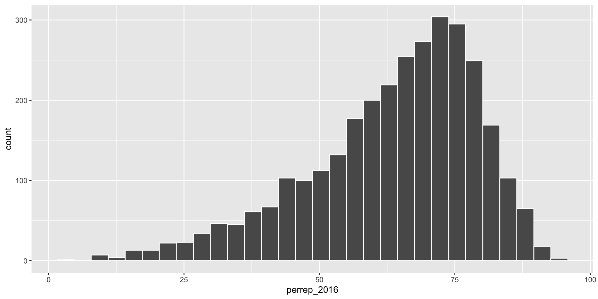
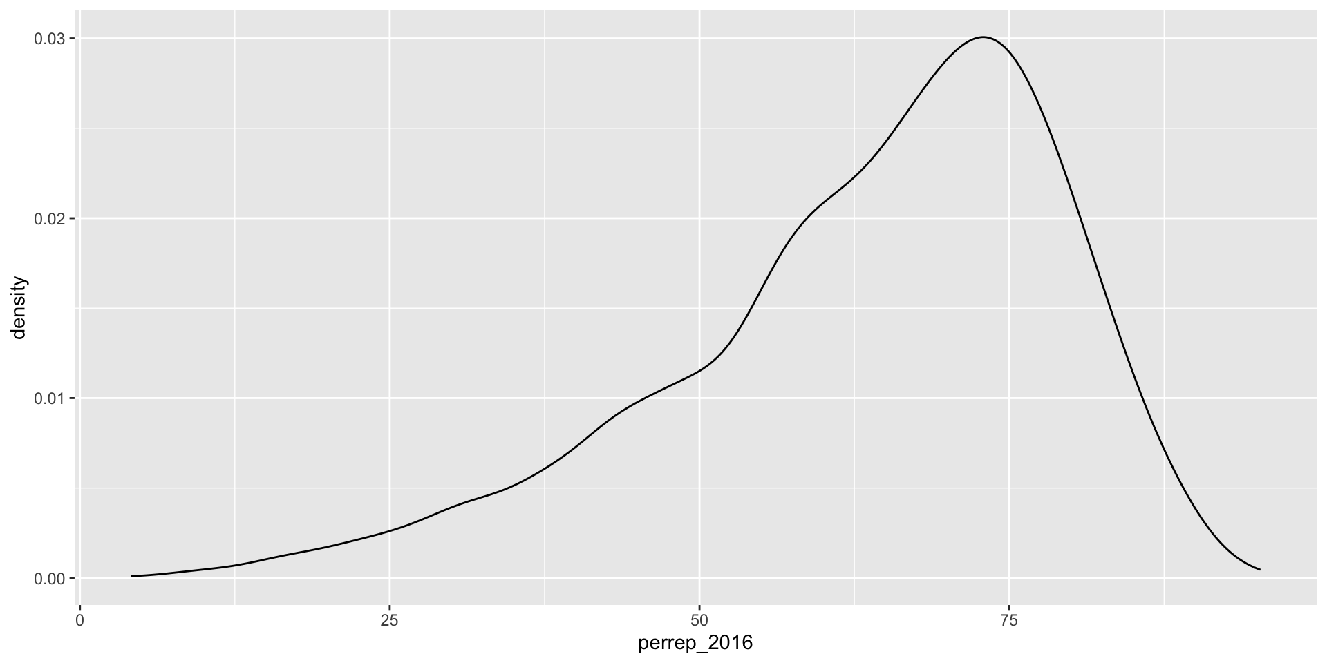
Quantitative Variable: Histogram or Density plot


Preview: Bivariate Viz
Quantitative + Quantitative Variable: Scatterplot

Preview: Bivariate Viz
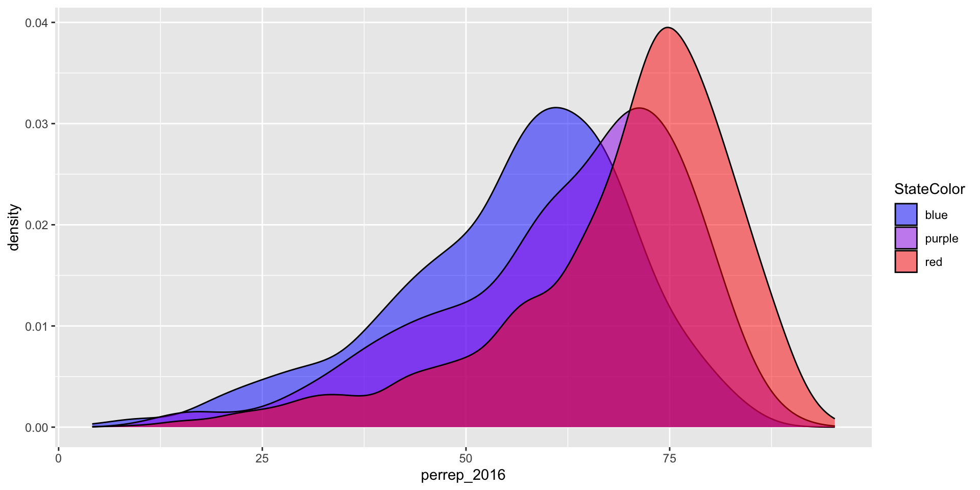
Quantitative + Categorical Variable: Density Plots, Boxplots, etc.

Preview: Bivariate Viz
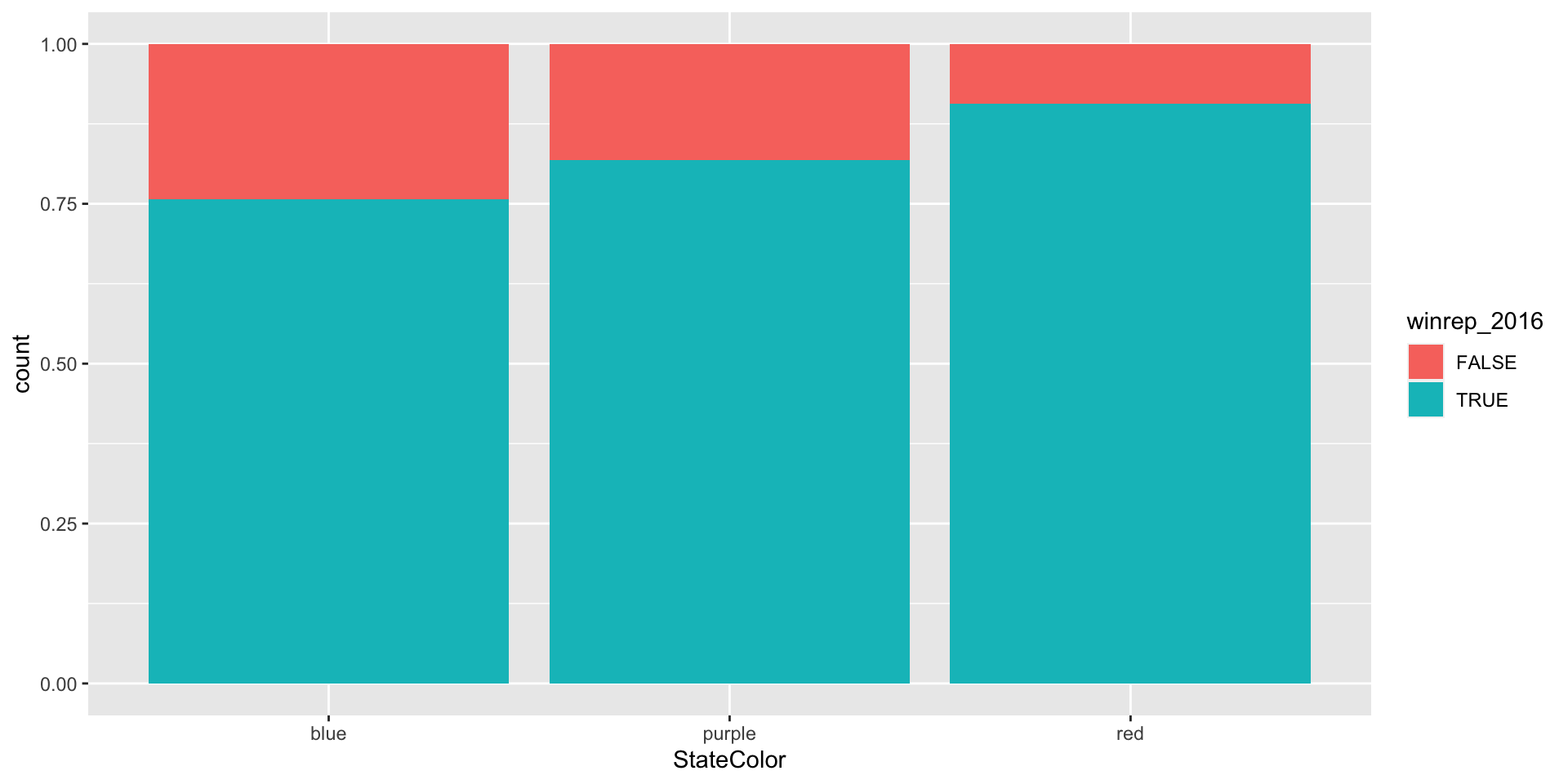
Categorical + Categorical Variable: side-by-side, proportion bar plots, etc.

In Class
Work on the activity, checking in with your mates at your table.
Notice patterns in the code! Feel free to make visualizations more effective as you go along.
After Class
You’ll make sure to complete Exercise 1-8 for the Assignment 3 (due next Wednesday).
For next Tuesday’s class, meet in the Idea Lab in the Library!
