Multivariate Visualizations + Idea Lab
Switch it Up
Sit with someone new today!
- Introduce yourself
- Share best or worst part of the weekend
Announcements
This week in MSCS
- Thursday 11:15am Coffee Break
This week in class
- TT3 posted today (check it out if you haven’t already completed TT1 or TT2)
Today we’ll practice discussing “insights” we gain from our visualizations. Then, we create some visuals by hand!
Learning Goals
- Understand how we can use additional aesthetics such as color and size to incorporate a third (or more variables) to a bivariate plot
- Develop comfort with interpreting heat maps and star plots, which allow you to look for patterns in variation in many variables.
Template File
Download a template .Rmd of this activity. Put the file in a Assignment_04 folder within your COMP_STAT_112 folder.
- This .Rmd contains examples that we’ll walk through in class and exercises you’ll finish for Assignment 4.
- Choice
If you’d prefer to write code, open the Rmd up now.
If you’d prefer to see code (write later), open Slides for Today!
More Aesthetic Attributes
To go beyond 2 variables, we need to add aesthetics for each new variable!
Data: Exploring SAT Scores
Though far from a perfect assessment of academic preparedness, SAT scores have historically been used as one measurement of a state’s education system.
| State | expend | ratio | salary | frac | verbal | math | sat | fracCat |
|---|---|---|---|---|---|---|---|---|
| Alabama | 4.405 | 17.2 | 31.144 | 8 | 491 | 538 | 1029 | (0,15] |
| Alaska | 8.963 | 17.6 | 47.951 | 47 | 445 | 489 | 934 | (45,100] |
| Arizona | 4.778 | 19.3 | 32.175 | 27 | 448 | 496 | 944 | (15,45] |
| Arkansas | 4.459 | 17.1 | 28.934 | 6 | 482 | 523 | 1005 | (0,15] |
| California | 4.992 | 24.0 | 41.078 | 45 | 417 | 485 | 902 | (15,45] |
| Colorado | 5.443 | 18.4 | 34.571 | 29 | 462 | 518 | 980 | (15,45] |
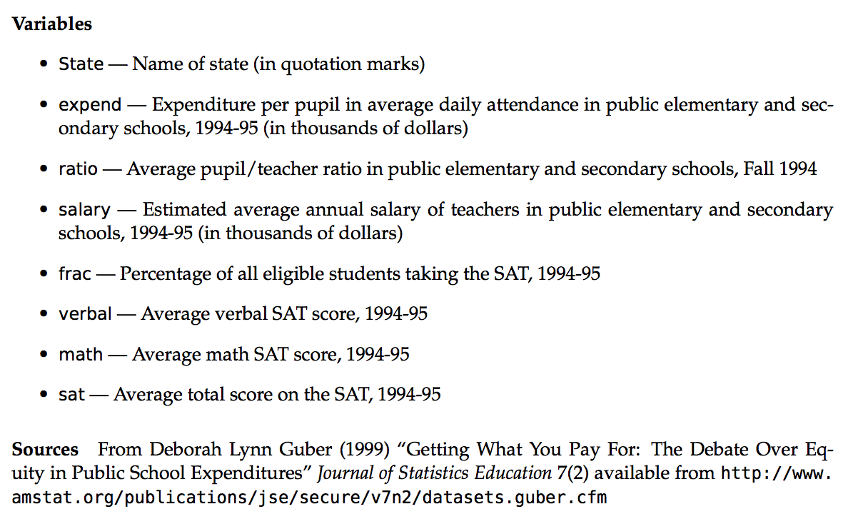
Data: Codebook
Univariate Density
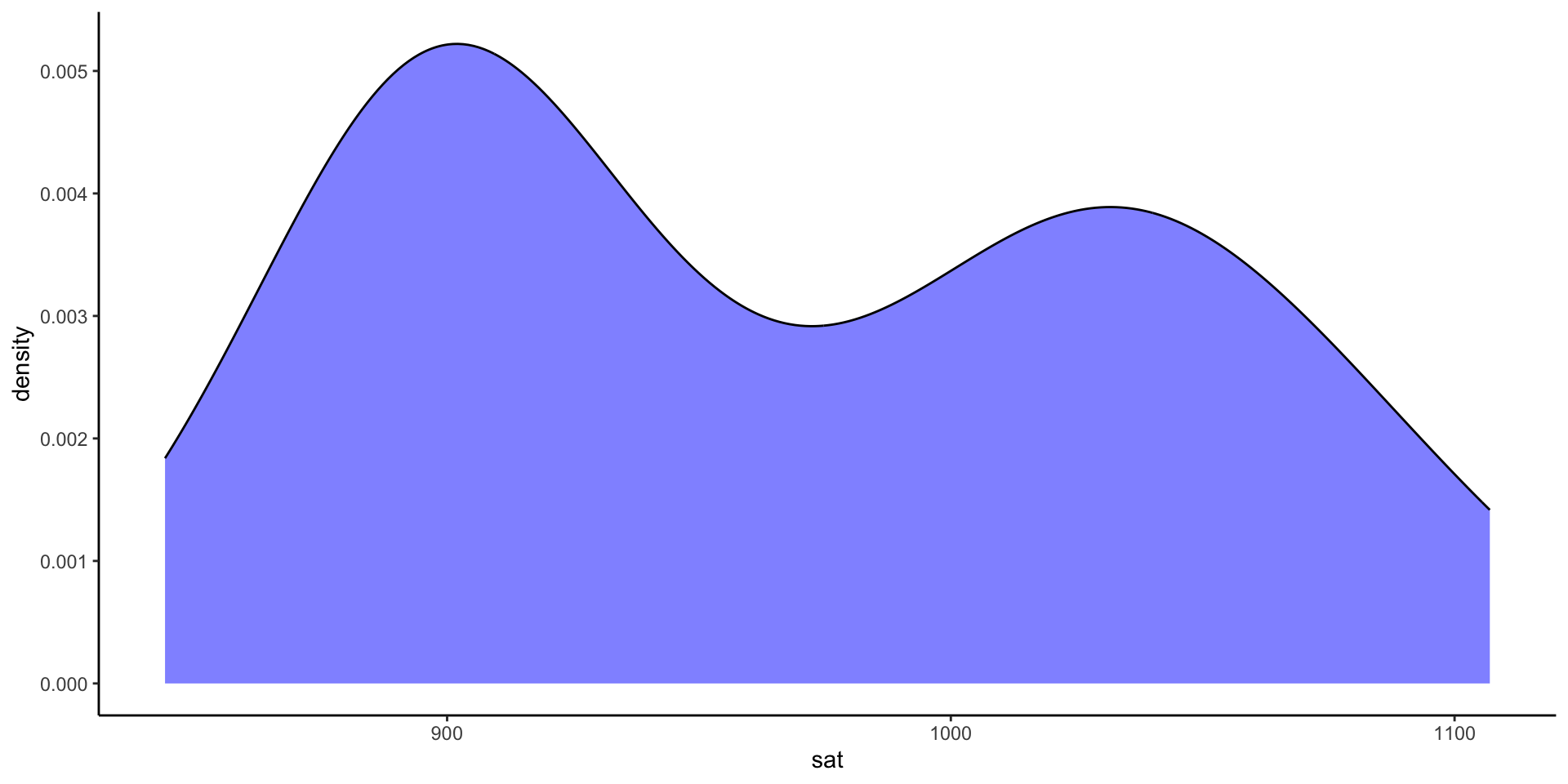
Variability in average SAT scores from state to state:
Bivariate Scatterplot
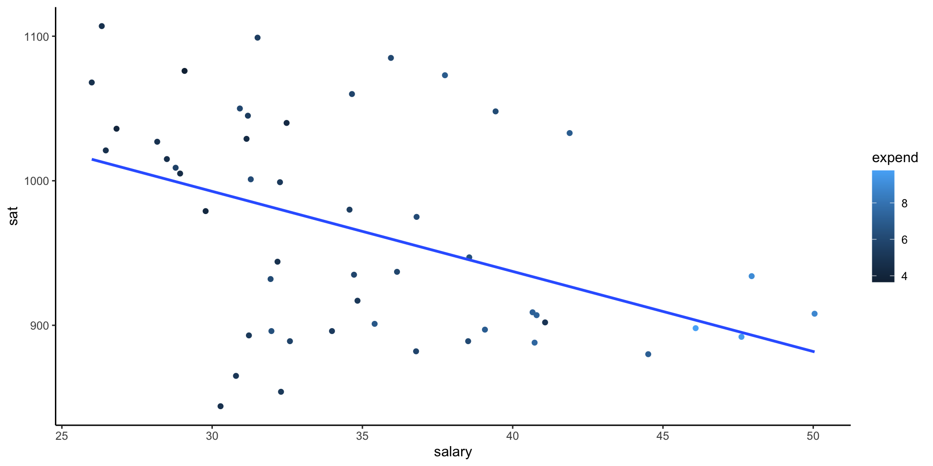
What degree do per pupil spending (expend) and teacher salary explain this variability?
ggplot(education, aes(y = sat, x = salary)) +
  geom_point() +
  geom_smooth(se = FALSE, method = "lm") + theme_classic()
ggplot(education, aes(y = sat, x = expend)) +
  geom_point() +
  geom_smooth(se = FALSE, method = "lm") + theme_classic()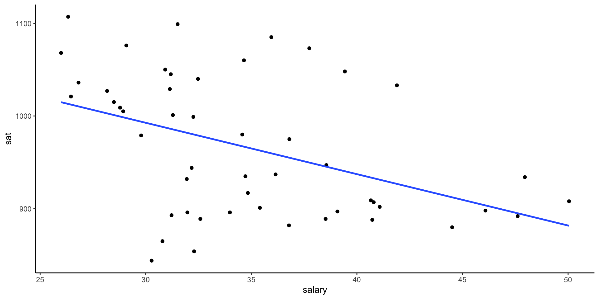
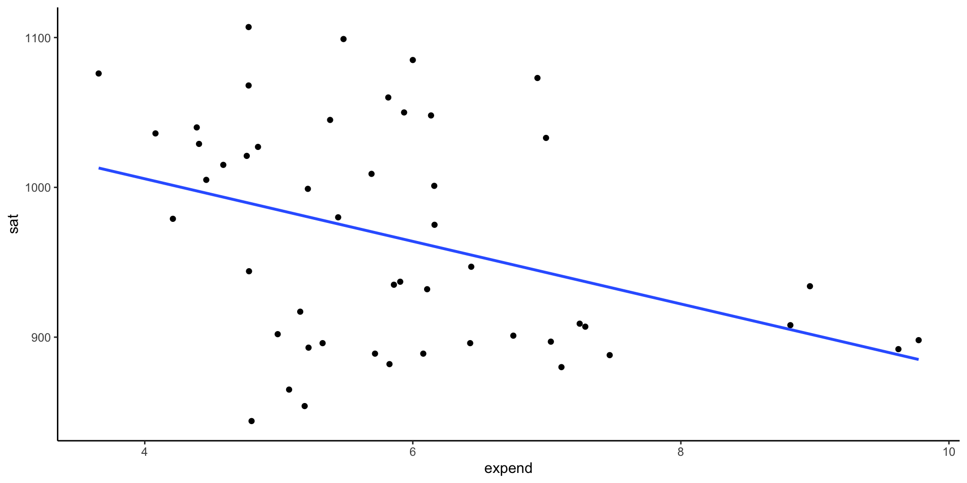
Is there anything that surprises you in the above plots? What are the relationship trends? Discuss as a group and write down 1 sentence summary of your thoughts in Rmd.
Example: Three Variables
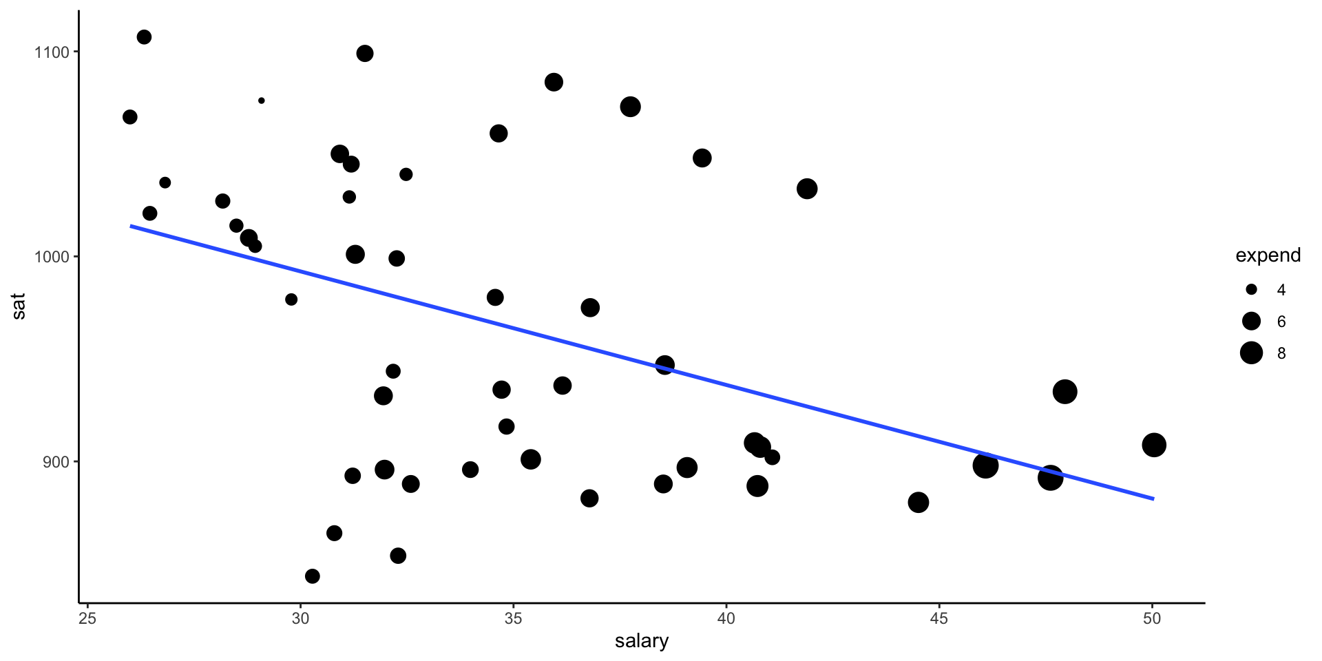
Make a single scatterplot visualization that demonstrates the relationship between sat, salary, and expend.
Hints:
1. Try using the color or size aesthetics to incorporate the expenditure data.
2. Include some model smooths with geom_smooth() to help highlight the trends.
Example: Three Variables
Another option!
Categorize your 3rd Quantitative Variable!
Example: Fraction who take SAT
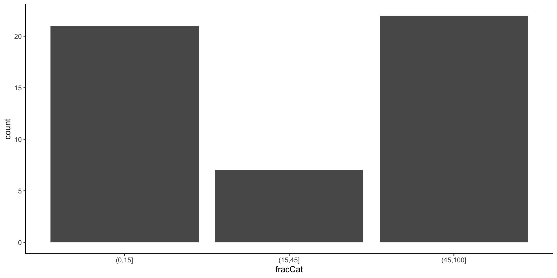
The fracCat variable in the education data categorizes the fraction of the state’s students that take the SAT into low (below 15%), medium (15-45%), and high (at least 45%).
- Make a univariate visualization of the
fracCatvariable to better understand how many states fall into each category.
Example: Fraction who take SAT
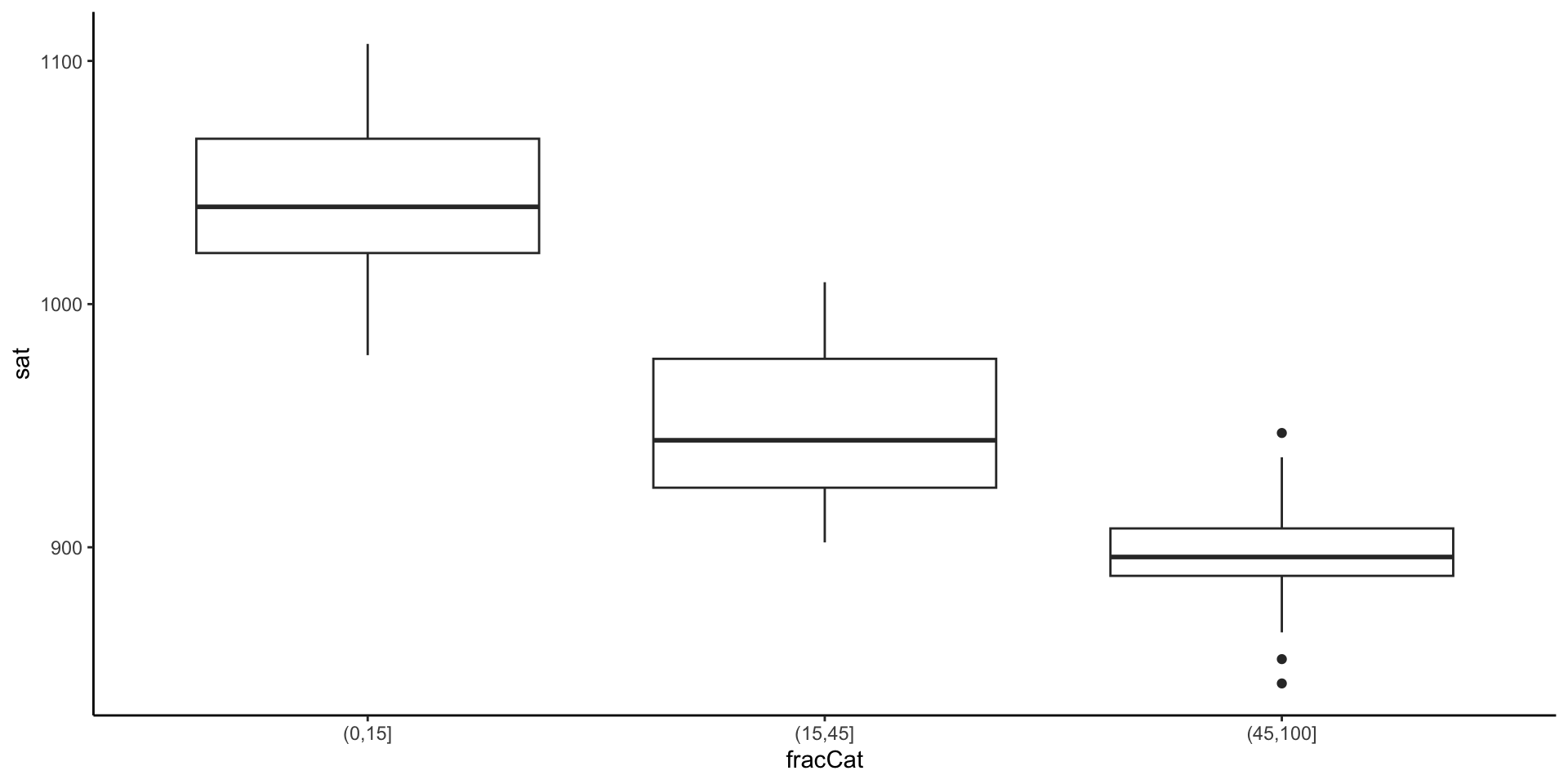
- Make a bivariate visualization that demonstrates the relationship between
fracCatandsat. What story does your graphic tell?
Example: Fraction who take SAT
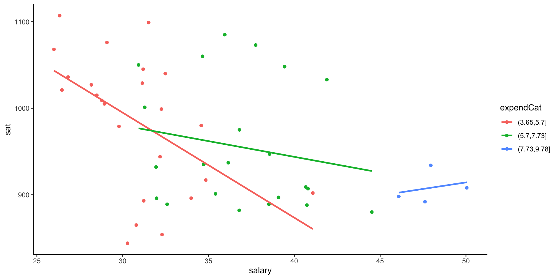
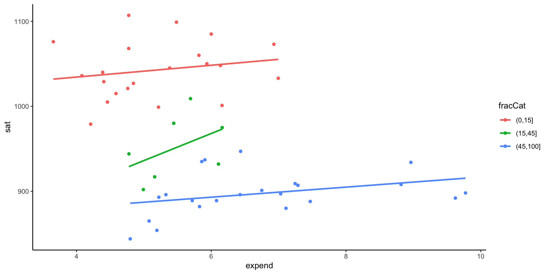
- Make a trivariate visualization that demonstrates the relationship between
fracCat,sat, andexpend. IncorporatefracCatas the color of each point, and use a single call togeom_smoothto add three trendlines (one for eachfracCat). What story does your graphic tell?
Example: Fraction who take SAT
- Putting all of this together, explain this example of Simpson’s Paradox. That is, why does it appear that SAT scores decrease as spending increases even though the opposite is true?
Discuss!
Other Multivariate Visualization Techniques
After class, I want you to look through the heat maps and star plots. I have a few exercises in which I want you to reflect on the insight you gain.
Handmade Visualizations
Let’s go to Google Doc for the instructions.
Your task: Create a visualizations based on the data provided with any materials available.
Handmade Visualizations - Data
| Name | Area (acres) | Max_depth (feet) | Watershed_area (acres) | Chain_of_lakes | Town |
| Bde Maka Ska | 401 | 87 | 2992 | Yes | Minneapolis |
| Lake Harriet | 335 | 85 | 1139 | Yes | Minneapolis |
| Lake Nokomis | 204 | 33 | 869 | No | Minneapolis |
| Cedar Lake | 170 | 51 | 1956 | Yes | Minneapolis |
| Lake of the Isles | 109 | 31 | 735 | Yes | Minneapolis |
| Lake Como | 71 | 15 | 1783 | No | St Paul |
| Lake Phalen | 198 | 91 | 14720 | No | St Paul |

