# Starbucks locations
Starbucks <- read_csv("https://bcheggeseth.github.io/112_spring_2023/data/starbucks.csv")


ggplot(data = Starbucks) +
  geom_point(aes(x = Longitude, y = Latitude),
    alpha = 0.2,
    size = 0.2
  ) +
  theme_classic()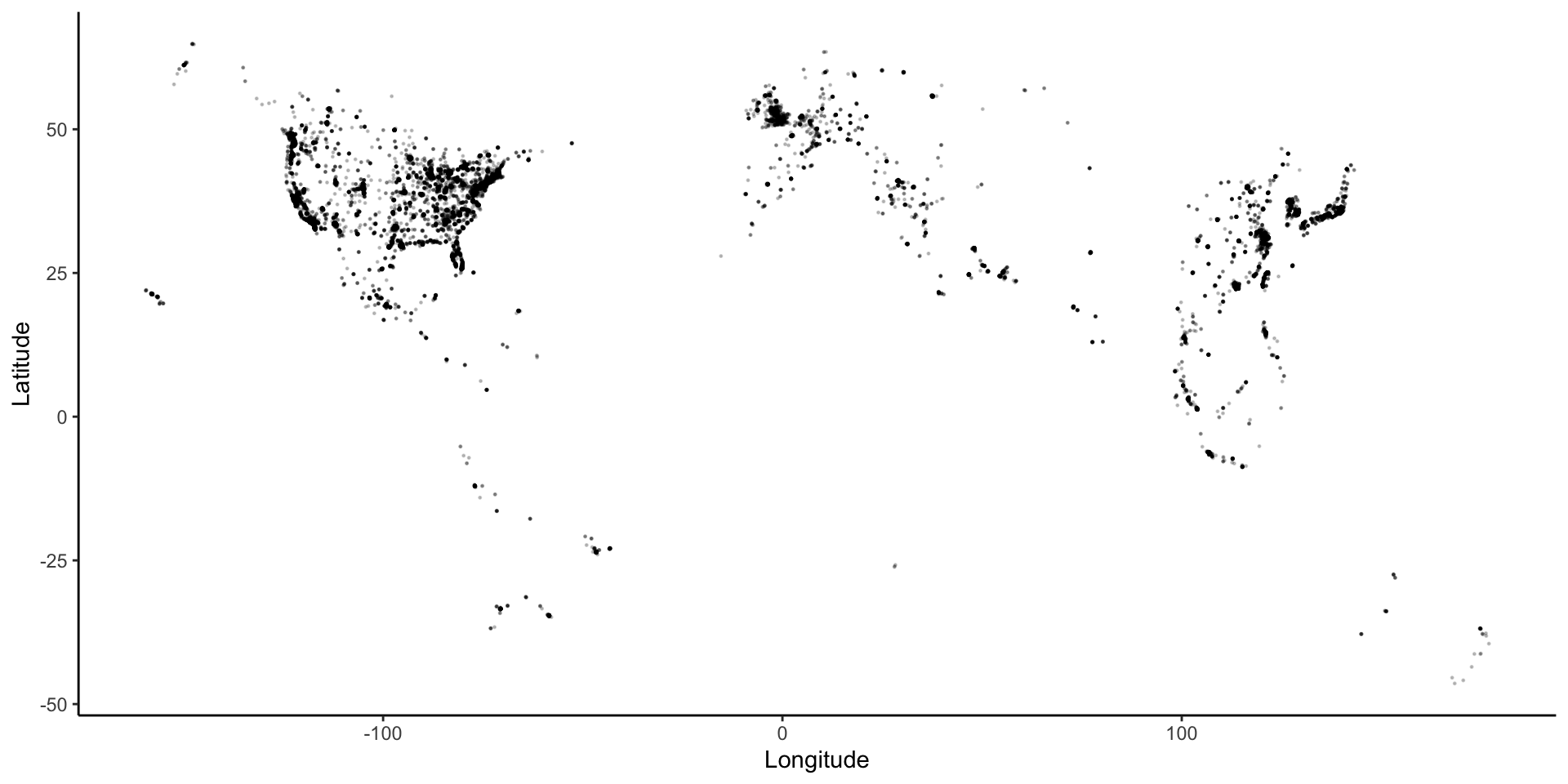
The Starbucks data, compiled by Danny Kaplan, contains information about every Starbucks in the world at the time the data were collected. It includes the Latitude and Longitude of each location. Let’s start by using familiar ggplot plotting tools.
# Get the map information
world <- get_stamenmap(
  bbox = c(left = -180, bottom = -57, right = 179, top = 82.1),
  maptype = "terrain",
  zoom = 2
)

# Plot the points on the map
ggmap(world) + # creates the map "background"
  geom_point(
    data = Starbucks,
    aes(x = Longitude, y = Latitude),
    alpha = .3,
    size = 0.2
  ) +
  theme_map()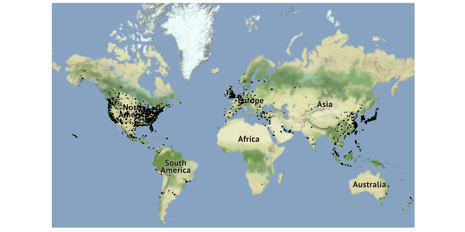
US_map2 <- get_stamenmap(
  bbox = c(left = -132, bottom = 20, right = -65, top = 55),
  maptype = "toner-lite",
  zoom = 5
)

# Contour plot
ggmap(US_map2) +
  geom_density_2d(data = Starbucks, aes(x = Longitude, y = Latitude), size = 0.3) +
  theme_map()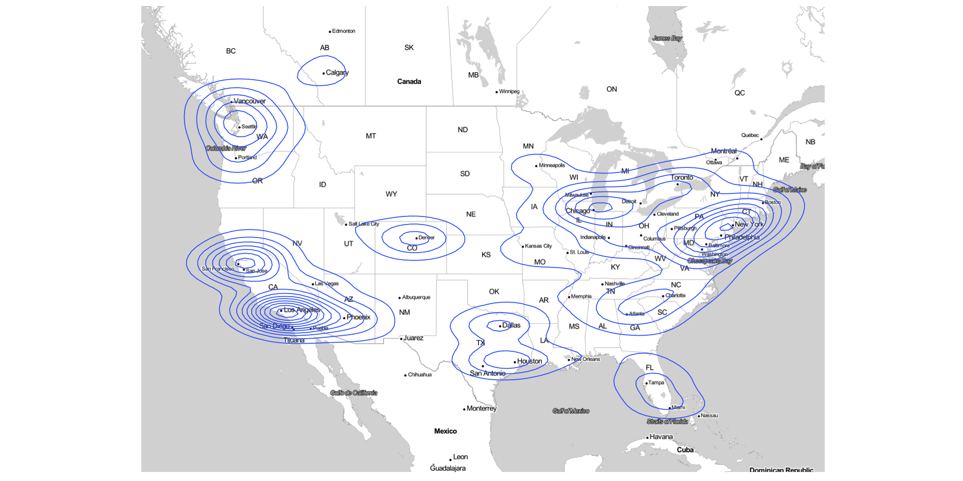
# Density plot
ggmap(US_map2) +
  stat_density_2d(
    data = Starbucks,
    aes(x = Longitude, y = Latitude, fill = stat(level)),
    size = 0.1, alpha = .2, bins = 20, geom = "polygon", color = 'darkblue'
  ) +
  scale_alpha(guide = 'none') +
  scale_fill_gradient(
    low = "darkblue", high = "red",
    guide = 'none'
  ) +
  theme_map()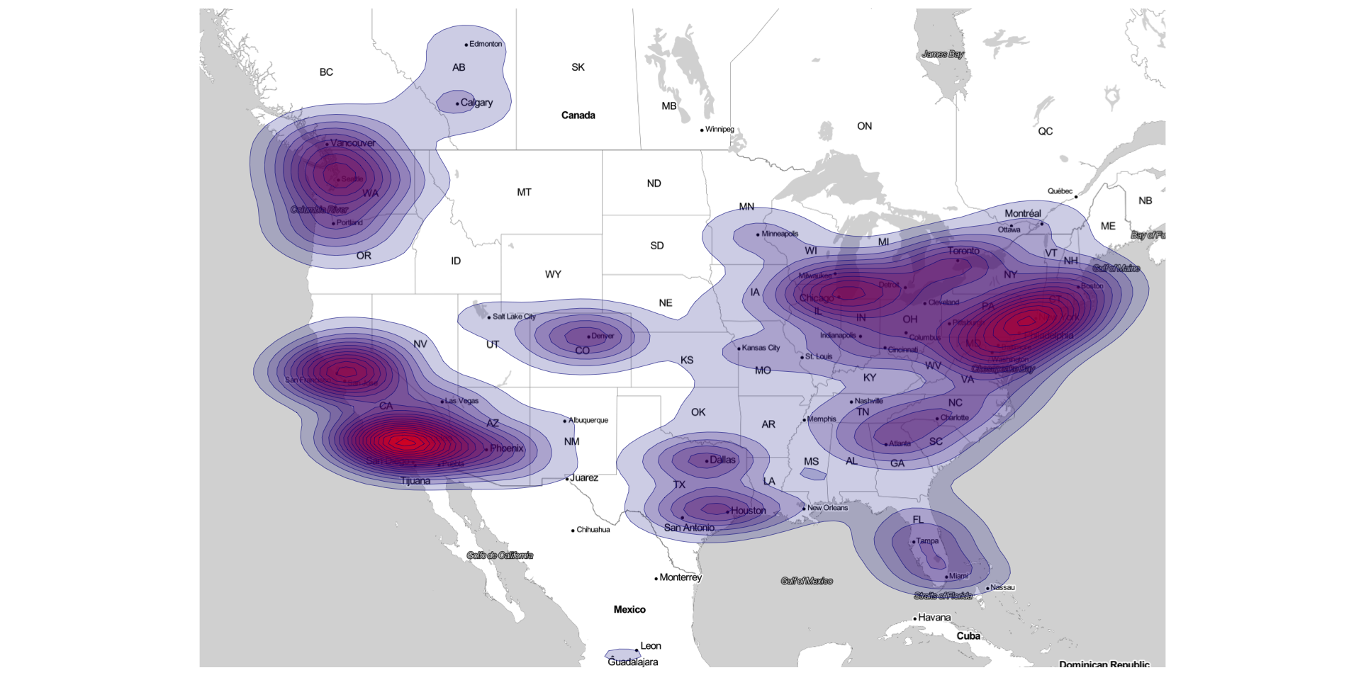
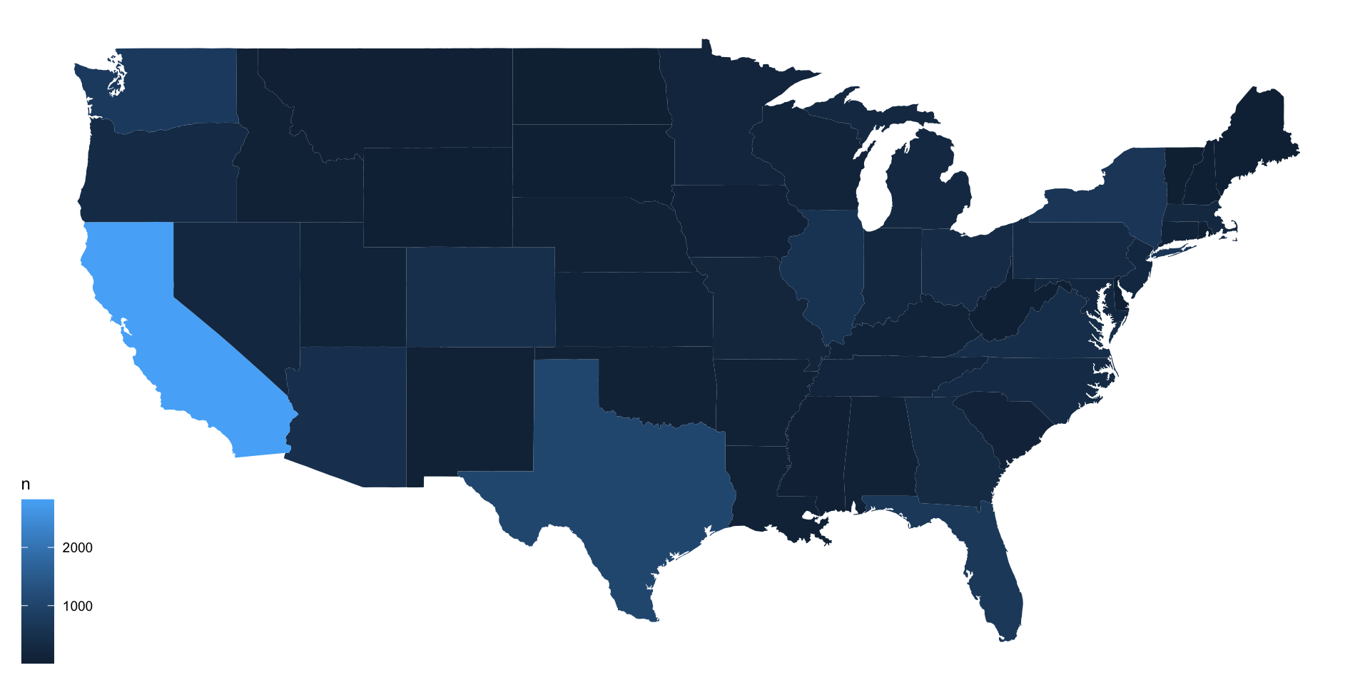
starbucks_us_by_state <- Starbucks %>%
  filter(Country == "US") %>%
  count(`State/Province`) %>%
  mutate(state_name = str_to_lower(abbr2state(`State/Province`)))

# US states map information - coordinates used to draw borders
states_map <- map_data("state")

# map that colors state by number of Starbucks
starbucks_us_by_state %>%
  ggplot() +
  geom_map(
    map = states_map,
    aes(
      map_id = state_name,
      fill = n
    )
  ) +
  # This assures the map looks decently nice:
  expand_limits(x = states_map$long, y = states_map$lat) +
  theme_map()