3.2 Lines
Let’s return to the thought experiment in which you were a manufacturer of button-down dress shirts.
body <- read.delim("Data/bodyfat.txt")

body %>%
    ggplot(aes(x = Neck, y = Chest)) +
    geom_point(color = 'steelblue') +
    labs(x = 'Neck size (cm)', y = 'Chest size (cm)') +
    theme_classic()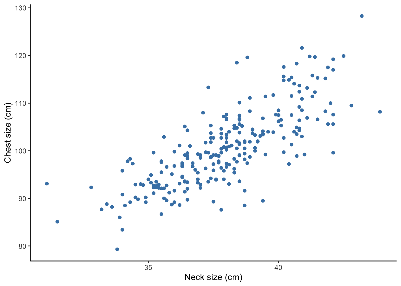
If you were to add one or multiple lines to the plot above to help you make business decisions, where would you want it (or them)?
Let’s say you were only going to make one size of shirt. You might want to add a horizontal line at the mean Chest size and a vertical line at the mean Neck size.
body %>%
    ggplot(aes(x = Neck, y = Chest)) +
    geom_point(color = 'steelblue') +
    geom_hline(yintercept = mean(body$Chest)) +
    geom_vline(xintercept = mean(body$Neck)) +
    labs(x = 'Neck size (cm)', y = 'Chest size (cm)') +
    theme_classic()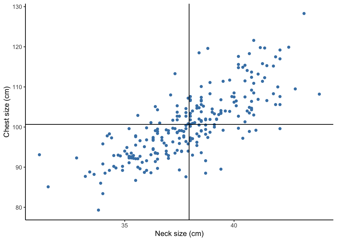
We can see that a shirt made to these specifications would fit the “average person.” However, this might not serve your market very well. For many people, the shirt would be too tight because their chest and/or neck sizes would be larger than average. For many people, the shirt would be too large because they chest and/or neck sizes would be smaller than average.
Let’s try something else. Let’s allow ourselves 5 different sizes (XS, S, M, L, XL). Then, we can cut the neck size variable into 5 groups of equal length and estimate the mean chest sizes within each of these groups.
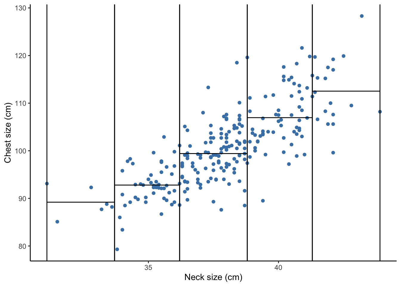
What do these lines tell us for our business venture?
What if we wanted to be able to make more sizes? Could we get a pretty good sense of what the chest sizes should be for a given neck size? Let’s try allowing for 8 different sizes.
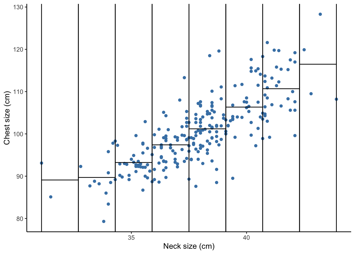
What are the pros and cons of having a larger number of sizes?
Stop and think about the data collection process. If you were measuring your own neck size, how precise do you think you could get? What factors might impact that precision?
We can see from this scatterplot that there is generally a linear relationship between neck and chest size. Perhaps we can find one line to describe the relationship between neck size and chest size and use that line to decide on sizes later.

What does line tell us for our business venture?
If the scatterplot between two quantitative variables resembles a straight line,
- a straight line could roughly describe the mean or average value of \(y\) for each value of \(x\).
- a straight line could describe how much we’d expect \(y\) to change based on a 1 unit change in \(x\).
- a straight line could help us predict the \(y\) based on a new value of \(x\).