2.4 One Categorical Variable
First, we consider survey data of the electoral registrar in Whickham in the UK (Source: Appleton et al 1996). A survey was conducted in 1972-1974 to study heart disease and thyroid disease and a few baseline characteristics were collected: age and smoking status. 20 years later, a follow-up was done to check on mortality status (alive/dead).
Let’s first consider the age distribution of this sample. Age, depending on how it is measured, could act as a quantitative variable or categorical variable. In this case, age is recorded as a quantitative variable because it is recorded to the nearest year. But, for illustrative purposes, let’s create a categorical variable by separating age into intervals.
Distribution: the way something is spread out (the way in which values vary).
# Note: anything to the right of a hashtag is a comment and is not evaluated as R code

library(dplyr) # Load the dplyr package
library(ggplot2) # Load the ggplot2 package
data(Whickham) # Load the data set from Whickham R package

# Create a new categorical variable with 4 categories based on age
Whickham <- Whickham %>%
    mutate(ageCat = cut(age, 4))

head(Whickham)
## outcome smoker age ageCat
## 1 Alive Yes 23 (17.9,34.5]
## 2 Alive Yes 18 (17.9,34.5]
## 3 Dead Yes 71 (67.5,84.1]
## 4 Alive No 67 (51,67.5]
## 5 Alive No 64 (51,67.5]
## 6 Alive Yes 38 (34.5,51]What do you lose when you convert a quantitative variable to a categorical variable? What do you gain?
2.4.1 Bar Plot
One of the best ways to show the distribution of one categorical variable is with a bar plot. For a bar plot,
- The height of the bars is the only part that encodes the data (width is meaningless).
- The height can either represent the frequency (count of units) or the relative frequency (proportion of units).
## Numerical summary (frequency and relative frequency)
Whickham %>%
    count(ageCat) %>%
    mutate(relfreq = n / sum(n))
## ageCat n relfreq
## 1 (17.9,34.5] 408 0.3105023
## 2 (34.5,51] 367 0.2792998
## 3 (51,67.5] 347 0.2640791
## 4 (67.5,84.1] 192 0.1461187## Graphical summary (bar plot)
Whickham %>%
ggplot(aes(x = ageCat)) +
geom_bar(fill="steelblue") +
labs(x = 'Age Categories in Years', y = 'Counts') +
theme_classic()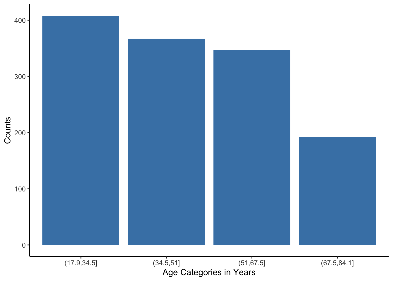
What do you notice? What do you wonder?
2.4.2 Pie Chart
Pie charts are only useful if you have 2 to 3 possible categories and you want to show relative group sizes.
This is the best use for a pie chart:
We are intentionally not showing you how to make a pie chart because a bar chart is a better choice.
Here is a good summary of why many people strongly dislike pie charts: http://www.businessinsider.com/pie-charts-are-the-worst-2013-6. Keep in mind Visualization Principle #4: Facilitate Comparisons. We are much better at comparing heights of bars than areas of slices of a pie chart.