2.7 One Quant. and One Cat. Variable
Let’s return to the NHANES data. We noticed variation in the amount people sleep. Why do some people sleep more than others? Are there any other characteristics that may be able to explain that variation?
Let’s look at the distribution of hours of sleep at night within subsets or groups of the NHANES data.
2.7.1 Multiple Histograms
Does the recorded binary gender explain the variability in the hours of sleep?
What are the ethical implications of collecting gender identity as a binary variable (male/female) if some individuals do not identify with these categories?
What might be the causal mechanism between gender identity and sleep? Might you be more interested in hormone levels, which might not necessarily correspond to gender identity? How might you change the data collection procedure so that the data can address the underlying research question?
Let’s make a histogram for each gender category by adding facet_grid(. ~ Gender) which separates the data into groups defined by the variable, Gender, and creates two plots along the x-axis.
NHANES %>%
    ggplot(aes(x = SleepHrsNight)) +
    geom_histogram(binwidth = 1, fill = "steelblue") +
    labs(x = 'Hours of Sleep (hours)') +
    facet_grid(. ~ Gender) +
    theme_classic()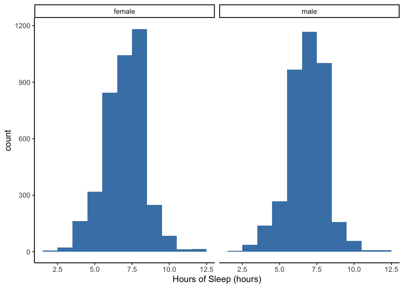
Do you notice any differences in sleep hour distributions between males and females?
What is easy to compare and what is hard to compare between the two histograms?
Does the number of children a woman has explain the variability in the hours of sleep?
Who have we excluded from our analysis by asking this question?
NHANES %>%
    filter(!is.na(nBabies)) %>%
    ggplot(aes(x = SleepHrsNight)) +
    geom_histogram(binwidth = 1, fill = "steelblue") +
    labs(x = 'Hours of Sleep (hours)') +
    facet_wrap(. ~ factor(nBabies), ncol = 4) +
    theme(axis.text.x = element_text(angle = 90, hjust = 1)) +
    theme_classic()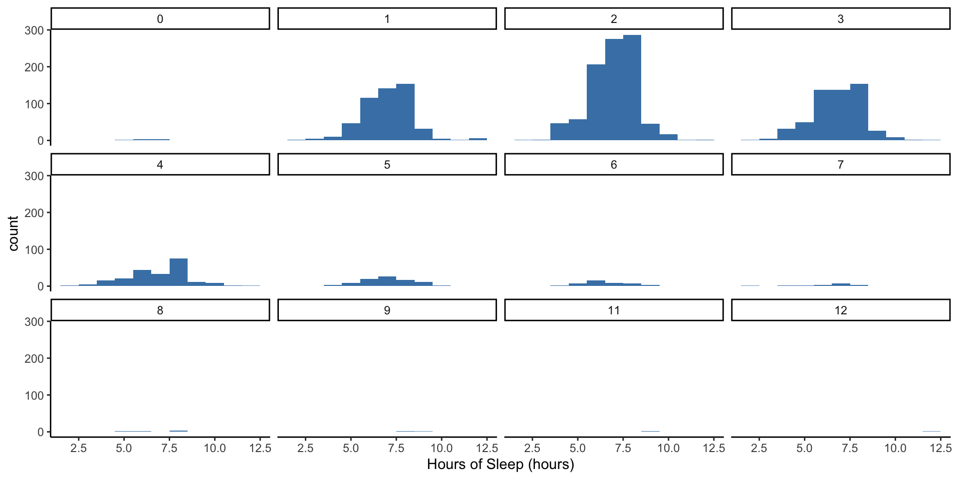
The 0 to 12 labels at the top of each of these panels correspond to the number of babies a woman had.
Do you notice any differences in sleep hour distributions between these groups?
Note the x and y axes are the same for all of the groups to facilitate comparison. What is easy to compare and what is hard to compare between the histograms?
Does the number of days someone has felt depressed explain the variability in the hours of sleep?
NHANES %>%
    ggplot(aes(x = SleepHrsNight)) +
    geom_histogram(binwidth = 1, fill = "steelblue") +
    labs(x = 'Hours of Sleep (hours)') +
    facet_grid(. ~ Depressed) +
theme_classic() 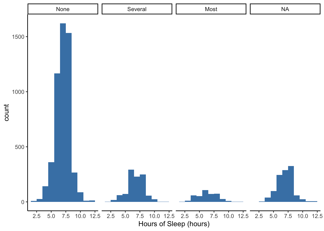
What’s the rightmost “NA” category? Some individuals in this study did not answer questions about days that they might have felt depressed, but they did report their hours of sleep per night.
What type of biases might be at play here?
2.7.2 Multiple Boxplots
Let’s visualize the same information but with boxplots instead of histograms and see if we can glean any other information.
NHANES %>%
    ggplot(aes(x = Gender, y = SleepHrsNight)) +
    geom_boxplot() +
    labs(x = 'Binary Gender', y = 'Hours of Sleep (hours)') +
theme_classic() 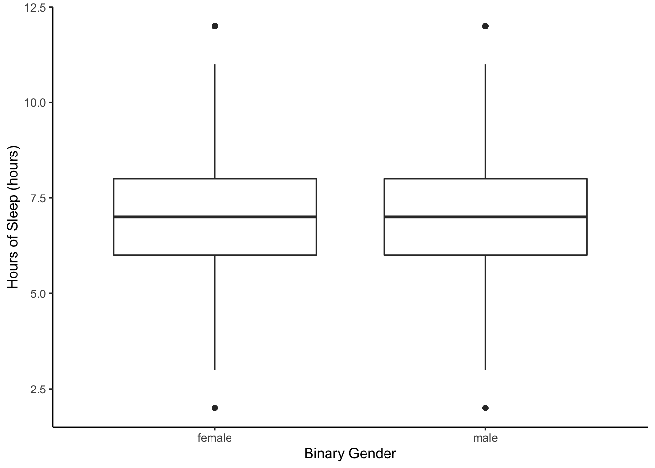
NHANES %>%
    ggplot(aes(x = factor(nBabies), y = SleepHrsNight)) +
    geom_boxplot() +
    labs(x = 'Number of Babies', y = 'Hours of Sleep (hours)') +
theme_classic() 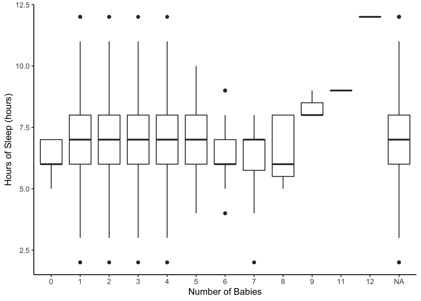
NHANES %>%
    ggplot(aes(x = factor(Depressed), y = SleepHrsNight)) +
    geom_boxplot() +
    labs(x = 'Days Depressed', y = 'Hours of Sleep (hours)') +
theme_classic() 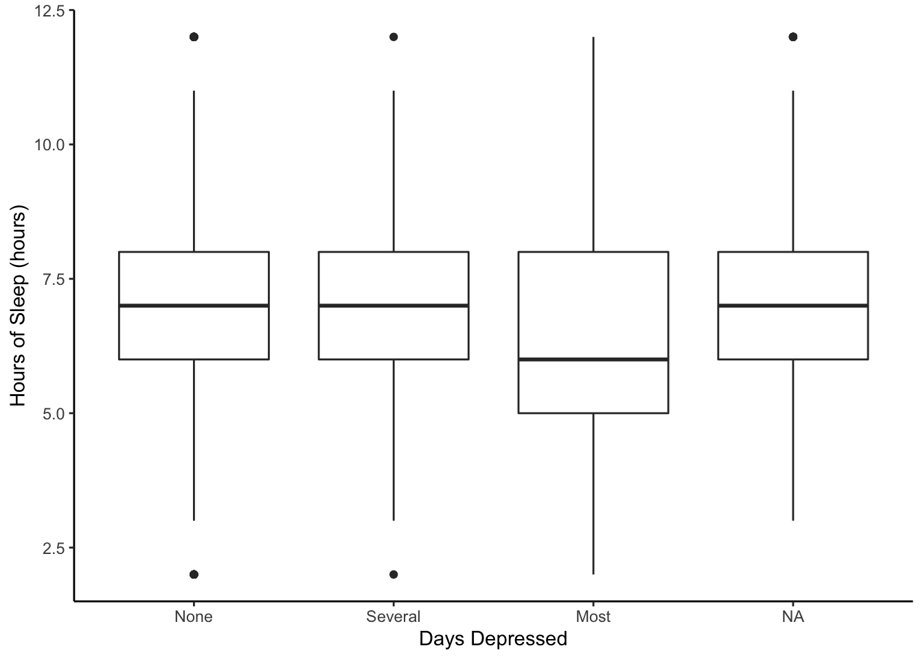
What is easy to compare and what is hard to compare between the boxplots?
Why might you use multiple boxplots instead of multiple histograms?
2.7.3 Is this a Real Difference?
If we notice differences in the the sleep distributions for groups based on self-reported Depression, is it a “REAL” difference? That is, is there a difference in the general U.S. population? Remember, we only have a random sample of the population. NHANES is supposed to be a representative sample of the U.S. population collected using a probability sampling procedure.
What if there were no “REAL” difference? Then the Depressed group labels wouldn’t be related to the hours of sleep.
Investigation Plan:
- Take all of the observed data on the hours of sleep and randomly shuffle them into new groups (of the same sizes as before). This breaks any associations between the Depressed group labels and the reported hours of sleep.
- Calculate the difference in mean hours of sleep between the groups. Record it.
- Repeat steps 1 and 2 many times (say 1000 times).
- Look at the differences based on random shuffles & compare to the observed difference.
library(mosaic)
#TRUE or FALSE (converted Depressed to a 2 category variable)
NHANES <- NHANES %>%
  mutate(DepressedMost = (Depressed == 'Most'))

obsdiff <- NHANES %>%
  with(lm(SleepHrsNight ~ DepressedMost)) %>%
  tidy() %>%
  filter(term == 'DepressedMostTRUE')

sim <- do(1000)*(
  NHANES %>%
    with(lm(SleepHrsNight ~ shuffle(DepressedMost)))
)

#Randomly shuffle the DepressedMost labels
#assuming no real difference in sleep
Below, we have a histogram of 1000 values calculated by randomly shuffling individuals in the sample into two groups (assuming no relationship between depression and sleep) and then finding the difference in the mean amount of sleep. The red vertical line showed the observed difference in mean amount of sleep in the data.
sim %>%
  ggplot(aes(x = DepressedMostTRUE)) +
  geom_histogram(fill = 'steelblue') +
  geom_vline(aes(xintercept = estimate), obsdiff, color = 'red') +
  labs(x = 'Difference in Mean Hours of Sleep', y = 'Counts') +
theme_classic() 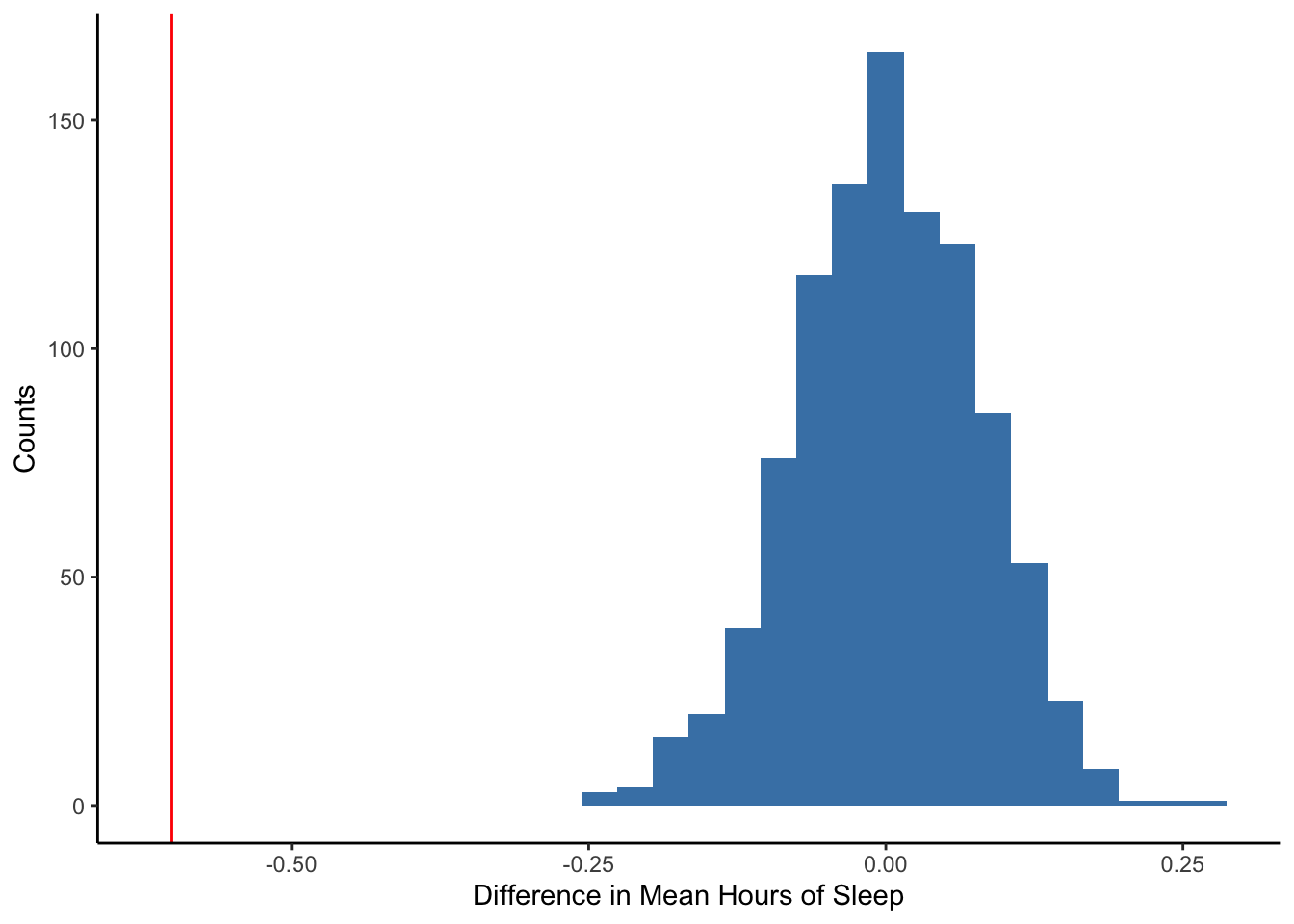
The observed difference in mean hours of sleep (red line) is quite far from the distribution of differences that results when we break the association between depression status and sleep hours (through randomized shuffling of group labels). Thus, it is unlikely to get a difference that large if there were no relationhip.
What do you think this indicates? How might you use this as evidence for or against a “real” population difference?