Advanced Visualization
Network Visualization
Read in the Capital Bikeshare data from the last quarter of 2014:
data_site <-
  "https://bcheggeseth.github.io/112_fall_2022/data/2014-Q4-Trips-History-Data-Small.rds"
Trips <- readRDS(gzcon(url(data_site)))
Stations <- read_csv("https://bcheggeseth.github.io/112_fall_2022/data/DC-Stations.csv")
One way to plot networks is to just use the geom_segment function in ggplot. Here is an example where we compute the bike ride flows between each pair of stations, keeping the data faceted by client and is_weekend, and filtering out low traffic links:
TrafficFlow <- Trips %>%
  mutate(is_weekend = ifelse(lubridate::wday(sdate) %in% c(1, 7), "weekend", "weekday")) %>%
  group_by(sstation, estation, client, is_weekend) %>%
  summarise(flow = n()) %>%
  left_join(Stations %>% select(name, lat, long), by = c("sstation" = "name")) %>%
  rename(slat = lat) %>%
  rename(slong = long) %>%
  left_join(Stations %>% select(name, lat, long), by = c("estation" = "name")) %>%
  rename(elat = lat) %>%
  rename(elong = long) %>%
filter(!is.na(slat) & !is.na(slong) & !is.na(elat) & !is.na(elong))| sstation | estation | client | is_weekend | flow | slat | slong | elat | elong |
|---|---|---|---|---|---|---|---|---|
| 10th & E St NW | 10th & E St NW | Casual | weekday | 12 | 38.89591 | -77.02606 | 38.89591 | -77.02606 |
| 10th & E St NW | 10th & E St NW | Casual | weekend | 36 | 38.89591 | -77.02606 | 38.89591 | -77.02606 |
| 10th & E St NW | 10th & E St NW | Registered | weekday | 24 | 38.89591 | -77.02606 | 38.89591 | -77.02606 |
| 10th & E St NW | 10th & E St NW | Registered | weekend | 15 | 38.89591 | -77.02606 | 38.89591 | -77.02606 |
| 10th & E St NW | 10th & U St NW | Registered | weekday | 4 | 38.89591 | -77.02606 | 38.91720 | -77.02590 |
| 10th & E St NW | 10th & U St NW | Registered | weekend | 1 | 38.89591 | -77.02606 | 38.91720 | -77.02590 |
| 10th & E St NW | 10th St & Constitution Ave NW | Casual | weekday | 4 | 38.89591 | -77.02606 | 38.89303 | -77.02601 |
| 10th & E St NW | 10th St & Constitution Ave NW | Casual | weekend | 19 | 38.89591 | -77.02606 | 38.89303 | -77.02601 |
| 10th & E St NW | 10th St & Constitution Ave NW | Registered | weekday | 4 | 38.89591 | -77.02606 | 38.89303 | -77.02601 |
| 10th & E St NW | 10th St & Constitution Ave NW | Registered | weekend | 4 | 38.89591 | -77.02606 | 38.89303 | -77.02601 |
myMap <- get_stamenmap(c(-77.1, 38.87, -76.975, 38.95), zoom = 14, maptype = "terrain") # centered at Logan Circle
# myMap<-get_map(location="Logan Circle",source="google",maptype="roadmap",zoom=13)
Plot data on the whole network:
thresh <- .04
max_flow <- max(TrafficFlow$flow)
TrafficFlow <- TrafficFlow %>%
  mutate(weight = flow / max_flow) %>%
  filter(weight > thresh)

ggmap(myMap) +
  geom_point(data = Stations, size = 2, color = "red", aes(x = long, y = lat)) +
  geom_segment(data = TrafficFlow, aes(x = slong, xend = elong, y = slat, yend = elat, alpha = weight / 2), arrow = arrow(length = unit(0.03, "npc")), color = "red") +
  facet_grid(client ~ is_weekend)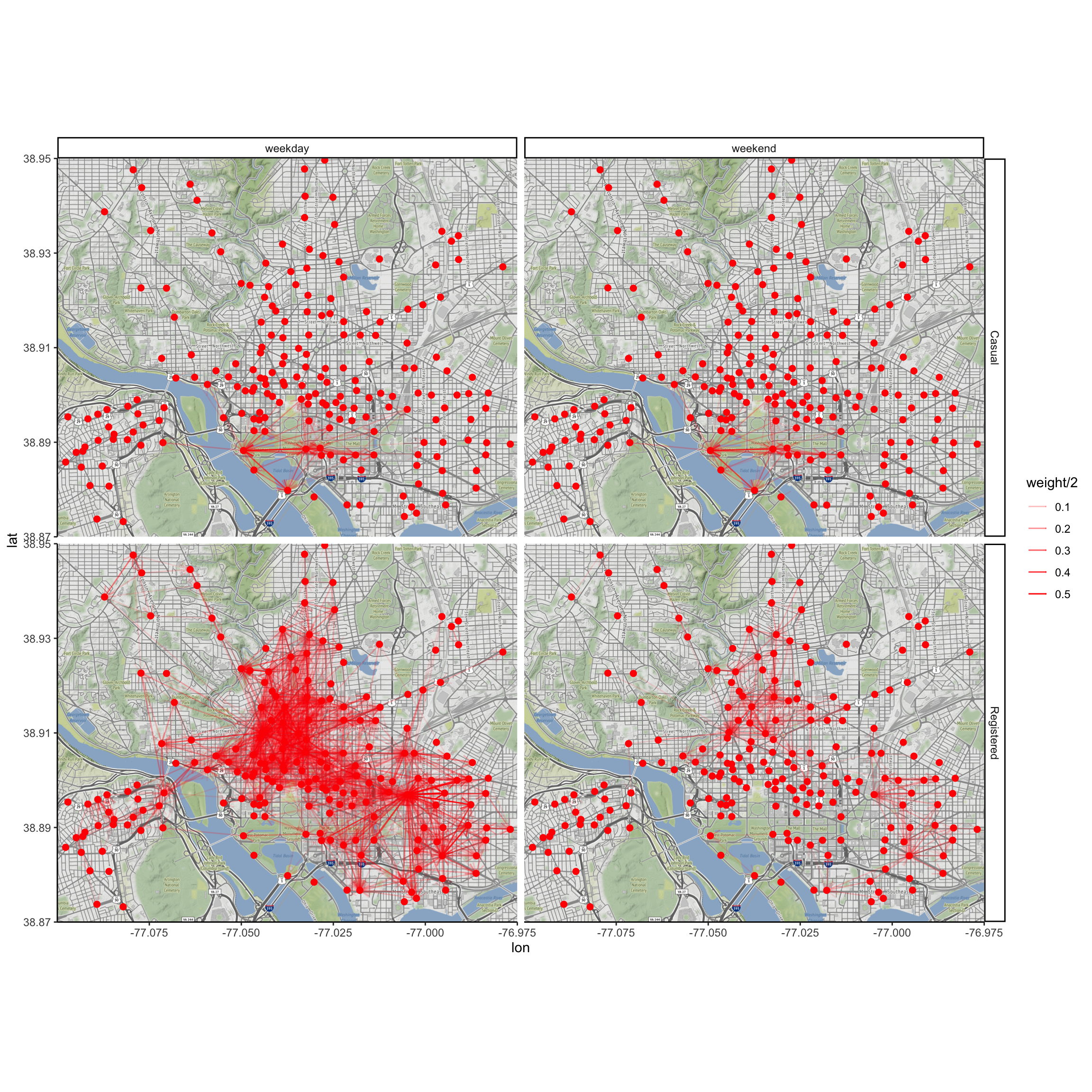
Animations with gganimate
The gganimate package animates a series of plots. Here are some resources:
Let’s do one example here. First we create a static plot of a single bike moving around town.
Identify a busy bike:
busyBikes <- Trips %>%
  group_by(bikeno) %>%
  summarise(count = n()) %>%
  arrange(desc(count)) %>%
  head(3)
Gather and tidy all data for that bike:
singleBike <- Trips %>%
  filter(bikeno == busyBikes$bikeno[1]) %>%
  arrange(sdate) %>%
  select(sdate, sstation, edate, estation)

singleTidy <- bind_rows(
  singleBike %>%
    select(date = sdate, station = sstation) %>%
    mutate(key = "start"),
  singleBike %>%
    select(date = edate, station = estation) %>%
    mutate(key = "end")
) %>%
  arrange(date) %>%
  left_join(Stations, by = c("station" = "name"))
Plot the movements of the bike over the first week:
stops <- singleTidy %>%
  select(station, lat, long, date) %>%
  head(102) %>%
  mutate(elapsed_hours = as.numeric(difftime(date, date[1], units = "hours"))) %>%
  mutate(order = 1:102)

ggmap(myMap) +
  geom_path(data = stops, aes(x = long, y = lat, color = elapsed_hours), size = 1.3) +
  scale_color_distiller(palette = "Reds") +
  labs(color = "Elapsed Hours")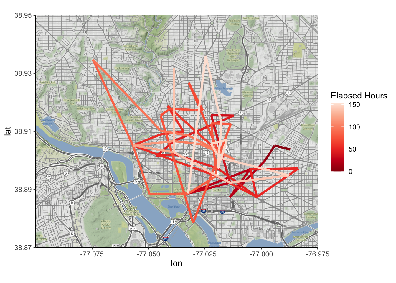
Now let’s animate the plot with gganimate:
library(gganimate)
library(av)
## Error in library(av): there is no package called 'av'pp_anim <- ggmap(myMap) +
geom_path(data = stops, aes(x = long, y = lat, color = elapsed_hours), size = 1.3) +
scale_color_distiller(palette = "Reds") +
labs(color = "Elapsed Hours", title = "Date and Time: {frame_along}") +
transition_reveal(date)
animate(pp_anim, fps = 1, start_pause = 2, end_pause = 15, renderer = av_renderer())## Error: The av package is required to use av_rendererThe animations above do not allow for interactivity. We’ll explore different methods to include interactivity in the following sections.
Interactive Visualizations
Additional reading:
- Interactivity in R for Data Science by Grolemund and Wickham.
- http://www.htmlwidgets.org/
htmlwidgets
Different htmlwidgets allow you to take advantage of the interactivity of html when generating graphics. Different types of widgets have been designed for different types of visualizations. In general, I found all of these easy to learn and use (i.e., I could get them up and running on an example I had in mind in under an hour).
leaflet for interactive maps
The leaflet htmlwidget allows you to easily create interactive maps. Just like ggplot, you add different layers to the visualiation (a “Tiles”” layer for a background map, different types of “Markers”, points lines, etc.). I found it super easy to learn and use. Here is an example:
library(leaflet)
pal <- colorNumeric(
  palette = "Greys",
  domain = stops$order, reverse = TRUE
)
leaflet(stops) %>%
  setView(-77.0296, 38.9096, zoom = 13) %>% # Logan Circle coords
  addProviderTiles("OpenStreetMap.Mapnik") %>% # this fixes a bug in addTiles() %>%
  addCircleMarkers(
    lat = ~lat, lng = ~long, color = ~ pal(order),
    popup = ~ paste(as.character(order), ": ", station, sep = "")
  ) %>%
  addPolylines(lat = ~lat, lng = ~long)
dygraphs
The dygraph pacakge allows us to generate interactive time series charts.
I am interested in how often the van needs to come by and pick up or drop off bicycles at different stations. So I want to look at the net daily departures at each station; that is, the number of departures minus the number of arrivals.
num_daily_departures <- Trips %>%
  mutate(month = lubridate::month(sdate)) %>%
  mutate(day = lubridate::day(sdate)) %>%
  group_by(month, day, sstation) %>%
  summarise(num_departures = n())
num_daily_arrivals <- Trips %>%
  mutate(month = lubridate::month(edate)) %>%
  mutate(day = lubridate::day(edate)) %>%
  group_by(month, day, estation) %>%
  filter(month > 9) %>%
  summarise(num_arrivals = n())
NetTraffic <- num_daily_departures %>%
  full_join(num_daily_arrivals, by = c("sstation" = "estation", "month" = "month", "day" = "day"))
NetTraffic[is.na(NetTraffic)] <- 0
NetTraffic <- NetTraffic %>%
  mutate(total_events = num_departures + num_arrivals) %>%
  mutate(net_departures = num_departures - num_arrivals) %>%
  rename(station = sstation) %>%
  group_by(station) %>%
  mutate(tot = sum(total_events)) %>%
  filter(tot > 6000) %>%
  ungroup() %>%
  mutate(date = ymd(paste("2014", as.character(month), as.character(day), sep = ""))) %>%
mutate(wday = wday(date, label = TRUE))| date | wday | station | num_departures | num_arrivals | total_events | net_departures |
|---|---|---|---|---|---|---|
| 2014-10-01 | Wed | 10th & E St NW | 42 | 37 | 79 | 5 |
| 2014-10-01 | Wed | 10th & U St NW | 46 | 27 | 73 | 19 |
| 2014-10-01 | Wed | 10th St & Constitution Ave NW | 43 | 40 | 83 | 3 |
| 2014-10-01 | Wed | 11th & F St NW | 49 | 42 | 91 | 7 |
| 2014-10-01 | Wed | 11th & K St NW | 72 | 61 | 133 | 11 |
| 2014-10-01 | Wed | 11th & Kenyon St NW | 57 | 53 | 110 | 4 |
| 2014-10-01 | Wed | 11th & M St NW | 117 | 105 | 222 | 12 |
| 2014-10-01 | Wed | 12th & L St NW | 52 | 54 | 106 | -2 |
| 2014-10-01 | Wed | 12th & U St NW | 84 | 89 | 173 | -5 |
| 2014-10-01 | Wed | 13th & D St NE | 45 | 53 | 98 | -8 |
Let’s plot the net daily departures for four different stations.
NetTrafficSelect <- NetTraffic %>%
  filter(station %in% c("Massachusetts Ave & Dupont Circle NW", "16th & Harvard St NW", "Lincoln Memorial", "Columbus Circle / Union Station")) %>%
  select(date, station, net_departures)
Note that dygraphs wants each time series in a separate column, as opposed to the tidy format in which you would want it for ggplot. It also wants it in the xts format. We can fix this with a spread command:
library(xts)
NetTrafficSelectWide <- NetTrafficSelect %>%
  spread(key = station, value = net_departures)
NetTrafficSelectXTS <- xts(NetTrafficSelectWide[, 2:5], order.by = NetTrafficSelectWide$date)
And now we are ready to create the visualization. Note how you can hover over points to see the values or use the range selector to adjust the domain on the x-axis.
library(dygraphs)
dygraph(NetTrafficSelectXTS, main = "Daily Net Departures at Four Select Stations") %>%
  dyRangeSelector() %>%
  dyOptions(
    drawPoints = TRUE,
    pointSize = 5,
    strokeWidth = 3,
    colors = RColorBrewer::brewer.pal(4, "Set2")
  ) %>%
  dyLegend(width = 1200)
plotly (d3)
The plotly package is a super convenient way to incorporate many of the cool features of d3 into your graphics without having to learn anything about d3 programming. This might be my favorite widget so far, because all you have to do is make your regular graphic with ggplot and then pass it to the function ggplotly.
library(plotly)
p <- ggplot(
  NetTrafficSelect,
  aes(x = date, y = net_departures, fill = station)
) +
  geom_col(position = "dodge")
ggplotly(p)
Note all of the extra functionality we get:
- You can turn individual time series on and off.
- You can pan and zoom in and out on select areas.
- You can hover on specific points to see either individual values, or (really cool) compare all values at that date.
Others
Here is a list of other cool htmlwidgets, along with demos: http://www.htmlwidgets.org/.
Dashboards
With the flexdashboard package, you can create dashboards with different configurations to display information visually. Each of these panels can include standard ggplot figures, htmlwidgets, text, tables, etc. The resulting dashboard is output as an html file that can be opened in a browswer.
You can check out the source code for each of these demo examples:
This page gives detailed instructions on using this package.
Shiny
As opposed to htmlwidgets, which leverage JavaScript code to create the interactivity, Shiny Web Apps use R code to directly build the interactivity. This interactivity is built on the server side, so a Shiny App needs to be hosted on a server, as opposed to an htmlwidget, which can be embedded into the html page.32
While this can be more complicated, it also opens the door to more possibilities. For example, if data is continuously being collected by the server, users can access up to date information. Shiny can also be used in conjunction with dashboards. Here are a couple examples:
The programming paradigm is slightly different than we are used to, because it is reactive. Here is another article on understanding reactivity. It points out that when the user changes the input in a Shiny app (e.g., checking a box, moving a slider, filtering out certain variables), “Shiny is re-running your R expressions in a carefully scheduled way.”
Shiny still utilizes JavaScript libraries like d3 and Leaflet.↩︎