7.6 Areal Data
Areal data can often be thought of as a “coarser-resolution” version of other data types, such as
average/aggregation of point reference data (a geostatistical field)
a count of points within a boundary from a point process.
For areal data, we will explore relationships between aggregate summaries of observations within boundaries while specifying spatial dependence regarding notions of neighborhoods and spatial proximity. The boundary of areas can be considered polygons determined by a closed sequence of ordered coordinates connected by straight line segments.
7.6.1 Polygons
Let’s look at an example to understand what we mean by polygons. Say we are interested in the county-level data in North Carolina. We can read in a series of shapefiles and specify a CRS (ellipsoid, datum, and projection) to project longitude and latitude onto a 2d surface.
library(spdep)
library(sf)
nc <- st_read(system.file("shapes/sids.shp", package="spData")[1], quiet=TRUE)
st_crs(nc) <- "+proj=longlat +datum=NAD27"
row.names(nc) <- as.character(nc$FIPSNO)
This data set includes some county-level information about births. Let’s look at the first 6 rows. This data set is not just a typical data frame but has geometric information. In particular, the geometry field is a list of multi polygons, a series of coordinates that can be connected to create polygons. They might be multi polygons in case one county may consist of two or more closed polygons (separated by a body of water, such as an island).
If we plot these polygons and fill them with their own color, we can see each boundary, including some counties that include islands (multiple polygons).
If we’d like to visualize an outcome spatially, we can change the fill to correspond to the value of another variable and shade the color on a spectrum. Below are cases of Sudden Infant Death (SID) in 1974 at a county level in North Carolina.
ggplot(nc) +
  geom_sf(aes(fill = SID74)) +
  scale_fill_gradient(high= 'red', low ='lightgrey') +
  theme_classic()
Here are the cases of SID relative to the birth rate in 1974 at a county level in North Carolina. This considers that more metropolitan areas will have higher birth rates and, thus, higher SID rates.
ggplot(nc) +
  geom_sf(aes(fill = SID74/BIR74)) +
  scale_fill_gradient(high= 'red', low ='lightgrey') +
  theme_classic()
Now, we might wonder why some counties have a higher incidence of SID. Do we have other county-level information that can help us explain those differences? Are there geographical similarities and differences that might explain why two counties closer together might have similar rates?
To answer these questions, we must first consider what it means for two polygons or areas to be “close.” We’ll use the language of two areas being close if they are neighbors. But, we need to define a neighborhood structure on our geometry of polygons.
7.6.2 Neighborhood Structure
For data on a regular lattice, it’s fairly straightforward to think about what a neighborhood means. You’ll often see terminology referring to Chess moves.
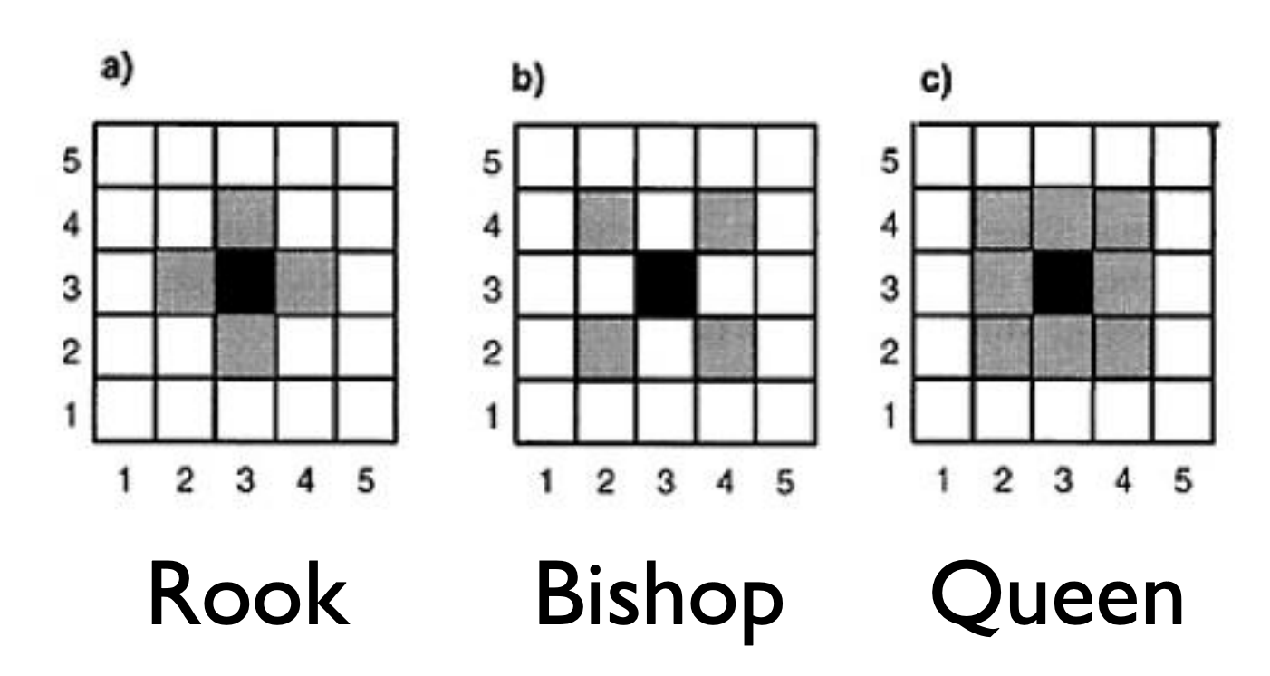
There are many ways to define the neighborhood structure if we have irregular lattices.
- Queen: If two polygons touch at all, even at one point, such as a corner, they are neighbors.
- Rook: If two polygons share an edge (more than one point), they are neighbors.
- K Nearest Neighbors: If we calculate the distance between the centers of the polygons, also known as centroids, we can define a neighborhood based on K nearest polygons, distance based on the centers.
- Distance Nearest Neighbors: If we calculate the distance between the centers of the polygons, also known as centroids, we can define a neighborhood based on a minimum and maximum distance for the nearest polygons, distance based on the centers.
As you see in the visualizations, these different ways of defining a neighborhood lead to nice and not-so-nice properties.
- Nice Properties
- Each polygon has at least one neighbor
- Neighbors make sense in the data context in that those neighbors share attributes that might make them more correlated
- Not So Nice Properties
- Polygons have no neighbors; which means that we are assuming they aren’t spatially correlated with any other polygon
- Polygons have too many neighbors, including some that wouldn’t be spatially correlated based on the data context
Of course, you can also define the neighborhoods manually to incorporate your knowledge of the data context. The approaches defined above are great ways to start thinking about neighboring polygons or areas and the correlation structure in the data.
# Centroid of Polygons
centroids <- st_centroid(st_geometry(nc), of_largest_polygon=TRUE)


#Neighbor information for nc data
Queen <- poly2nb(nc, queen = TRUE)
Rook <-  poly2nb(nc, queen = FALSE)

KNN <- knn2nb(knearneigh(centroids, k = 3)) #k: number of neighbors
KNNDist <- dnearneigh(centroids ,d1 = 0,d2 = 40) #d1: min distance, d2: max distanc

# Network lines from Neighbors
nb_Q_net <- nb2lines(nb = Queen, coords = centroids, as_sf = TRUE)
nb_R_net <- nb2lines(nb = Rook, coords = centroids, as_sf = TRUE)
nb_KNN_net <- nb2lines(nb = KNN, coords = centroids, as_sf = TRUE)
nb_KNNDist_net <- nb2lines(nb = KNNDist, coords = centroids, as_sf = TRUE)


# Plots of Neighbor Networks
nc %>%
ggplot() +
  geom_sf() +
  geom_sf(data = centroids) +
  geom_sf(data = nb_Q_net) +
  theme_classic()

nc %>%
ggplot() +
  geom_sf() +
  geom_sf(data = centroids) +
  geom_sf(data = nb_R_net) +
  theme_classic()

nc %>%
ggplot() +
  geom_sf() +
  geom_sf(data = centroids) +
  geom_sf(data = nb_KNN_net) +
  theme_classic()

nc %>%
ggplot() +
  geom_sf() +
  geom_sf(data = centroids) +
  geom_sf(data = nb_KNNDist_net) +
  theme_classic()
Typically, we codify this neighborhood structure with a spatial proximity or weighting matrix, \(W\). This \(n\times n\) matrix has values, \(w_{ij}\), between 0 and 1 that reflect whether or not the \(i\) area is a neighbor of the \(j\) area (0: not neighbor) and the strength of the influence of \(i\) on \(j\) (>0 if there is an influence or 1 if neighbor). These are called spatial weights in ArcGIS. We could restrict ourselves to binary values of \(w_{ij}\) such that 1 indicates a neighbor and 0 indicates not a neighbor.
Note: These relationships are often symmetric but not always. For example, an urban county may influence a nearby rural one more than vice versa. To incorporate this data context, we’d have to update this W matrix manually.
Considering the approaches above, Queen and Rook should give a symmetric \(W\), but Nearest Neighbors may not give a symmetric \(W\) based on the algorithm of defining neighbors.
# Neighbor Information to Spatial Proximity or Weighting Matrix
## style = 'B' forces W to be a binary matrix
## style = 'W' standardizes the rows (taking into account how many neighbors an area has)
## zero.policy = TRUE allows for polygons with no neighbors

W <- nb2mat(Queen, style='B', zero.policy = TRUE)

W[1:10,1:10]
7.6.3 Neighborhood-based Correlation
Now that we’ve defined a neighborhood structure using \(W\), we can estimate a neighborhood-based correlation called Moran’s I. This is a measure of spatial autocorrelation using the information in \(W\). We define Moran’s I as
\[I = \frac{n\sum_i\sum_j w_{ij} (Y_i - \bar{Y})(Y_j - \bar{Y})}{\sum_{i,j} w_{ij} \sum_i(Y_i - \bar{Y})^2}\]
Under \(H_0\): \(Y_i\) are independent and identically distributed, then \(\frac{I+1/(n-1)}{\sqrt{Var(I)}} \rightarrow N(0,1)\)
- Test heavily depends on the form of \(W\)
- Observations may not be independent or identically distributed due to a spatial trend or non-constant variance, so we’ll need to deal with that first.
- There is a lack of consensus about how areas with no neighbors should be treated in this context.
7.6.4 Spatial Autoregressive Models
To account for spatial trends and spatial autocorrelation, we follow a series of steps:
- Deal with the Trend: Fit a regression model to model the trend with OLS, then create a visual map of the residuals
\[Y_i = x_i^T\beta + \epsilon_i\] where \(i\) indexes spatial region
Test the residuals after detrending with Moran’s I
If there is spatial autocorrelation as measured by Moran’s I, fit an autoregressive model.
For example, if we want to predict the SID county rate in North Carolina as a function of the birth rate, we could fit a linear model first, then map the residuals and estimate the spatial autocorrelation of the residuals.
nc %>%
  ggplot(aes(y = SID74, x = BIR74)) +
  geom_point() + geom_smooth(se=FALSE) + theme_classic()

nc_lm <- lm(formula = log(SID74+1) ~ BIR74, data = nc)
nc$lm_resid <- resid(nc_lm)

nc %>%
  ggplot()+
  geom_sf(aes(fill = lm_resid)) +
  scale_fill_gradient2(mid = 'white', high= 'red', low ='blue') +
  theme_classic()

#Examine Extreme Residuals (higher or lower than what we'd expect)
nc %>%
  filter(abs(scale(lm_resid)) > 2)

spdep::moran.test(nc$lm_resid, nb2listw(Queen, style='B'), alternative = 'two.sided') # Using randomization test
7.6.4.1 Simultaneous Autoregressive Model (SAR)
We build autoregressive models for the data based on the proximity matrix \(W\),
\[\mathbf{Y} = \lambda \mathbf{W Y} + \mathbf{X}\boldsymbol \beta + \boldsymbol \epsilon,\quad\quad \boldsymbol\epsilon \sim N(0,\sigma^2I)\]
and typically, we assume \(Y\) are Gaussian if the outcome is continuous and use maximum likelihood estimation to estimate the parameters of this model.
This can be rewritten as
\[\mathbf{Y} \sim N(\mathbf{X}\boldsymbol\beta, \sigma^2[(I-\lambda \mathbf{W})^{T}(I-\lambda \mathbf{W})]^{-1})\]
where the proximity matrix \(\mathbf{W}\) should be weighted so that the rows sum to 1 (`style = ’W”).
library(spatialreg)
# Convert Neighborhood Information to List (with weighting so that rows sum to 1)
listW <- nb2listw(Queen, style = 'W')

# Fit SAR Model
nc_sar <- spautolm(formula = log(SID74+1) ~ BIR74, data = nc, listw = listW, family = "SAR")

summary(nc_sar)

nc$sar_resid <- resid(nc_sar)
nc$sar_pred <- exp(fitted(nc_sar))

nc %>%
  ggplot()+
  geom_sf(aes(fill = sar_pred)) +
  labs(title='Predictions from SAR Model',fill = 'SID Rate') +
  scale_fill_gradient(low = 'lightgrey', high='red')+
  theme_classic()

nc %>%
  ggplot()+
  geom_sf(aes(fill = sar_resid)) +
  labs(title='Residuals from SAR Model',fill = 'Residuals') +
  scale_fill_gradient2(mid = 'white', high= 'red', low ='blue')+
  theme_classic()

#RMSE
sqrt(mean(nc$sar_resid^2))

#Extreme Residuals (higher or lower than what we'd expect)
nc %>%
  filter(abs(scale(sar_resid)) > 3)

# Double check the residuals after the SAR model are independent
spdep::moran.test(nc$sar_resid, nb2listw(Queen, style='W'), alternative = 'two.sided') # Using randomization
7.6.4.2 Conditional Autoregressive Model (CAR)
An alternative but similar model says that
\[E(Y_i | Y_j, j\not= i) = x_i^T\beta + \sum^n_{j=1}c_{ij}(Y_j - x^T_j\beta)\]
\[Var(Y_i | Y_j, j\not= i) = \tau^2_i = \tau^2/w_{i.}\]
where \(w_{i.} = \sum^n_{j=1}w_{ij}\), \(c_{ij}\) is nonzero only if \(Y_j\in N_i\), where \(N_i\) is the neighborhood of \(Y_i\). \(c_{ij}\) is typically \(\lambda w_{ij}/w_{i.}\).
This can be rewritten as
\[\mathbf{Y} \sim N(\mathbf{X}\boldsymbol\beta, \sigma^2(I-\lambda \mathbf{W})^{-1})\]
listW = nb2listw(Queen, style = 'W')
nc_car = spautolm(formula = log(SID74+1) ~ BIR74, data = nc, listw = listW, family = "CAR")

summary(nc_car)

nc$car_resid <- resid(nc_car)
nc$car_pred <- exp(fitted(nc_car))

nc %>%
  ggplot()+
  geom_sf(aes(fill = car_pred)) +
  labs(title='Predictions from CAR Model',fill = 'SID Rate') +
  scale_fill_gradient(low = 'lightgrey', high='red')+
  theme_classic()

nc %>%
  ggplot()+
  geom_sf(aes(fill = car_resid)) +
  labs(title='Residuals from CAR Model',fill = 'Residuals') +
  scale_fill_gradient2(mid = 'white', high= 'red', low ='blue')+
  theme_classic()

#RMSE
sqrt(mean(nc$car_resid^2))

#Extreme Residuals (higher or lower than what we'd expect)
nc %>%
  filter(abs(scale(car_resid)) > 3)

# Double check the residuals after the SAR model are independent
spdep::moran.test(nc$car_resid, nb2listw(Queen, style='W'), alternative = 'two.sided') # Using randomization
Typically, the CAR model is fit in a Bayesian context. The details of the Bayesian estimation are beyond the scope of this course. See CARBayes package for more details.
Note: If you have count data within an area, transform it with a log() and model with a Gaussian model.
Reference about SAR and CAR Models and Covariance: https://citeseerx.ist.psu.edu/viewdoc/download?doi=10.1.1.498.3567&rep=rep1&type=pdf
7.6.5 Spatial Mixed Effects Models
While the SAR and CAR models are similar to autoregressive models for time series, we could also allow coefficients to differ across space, similar to a mixed effects model that we used for longitudinal data.
\[\mathbf{Y} = \mathbf{X}\boldsymbol \beta +\mathbf{b} + \boldsymbol \epsilon,\quad\quad \boldsymbol\epsilon \sim N(0,\sigma^2I)\]
where the random effects \(\mathbf{b}\sim N(0,G)\) and \(G\) can be assumed to be a covariance matrix based on spatial correlation such as the Matern correlation structure.
library(spaMM)
nc2 <- as(nc,"Spatial")

spamm <- fitme(log(SID74+1) ~ BIR74 + Matern(1 | x+y), data = as.data.frame(nc2), fixed = list(nu = 0.5))

summary(spamm)

spamm.map <- cbind(nc, spamm_pred = predict(spamm)) %>%
  mutate(spamm_resid = log(SID74+1) - spamm_pred)


spamm.map %>%
  ggplot(aes(fill = exp(spamm_pred))) +
  geom_sf() +
  scale_fill_gradient(low = 'lightgrey', high='red')+
  theme_classic()


spamm.map %>%
  ggplot(aes(fill = spamm_resid)) +
  geom_sf() +
  scale_fill_gradient2(mid = 'white', high= 'red', low ='blue') +
  theme_classic()

## RMSE
sqrt(mean(spamm.map$spamm_resid^2))

#Extreme Residuals (higher or lower than what we'd expect)
spamm.map %>%
  filter(abs(scale(spamm_resid)) > 3)

# Double check the residuals after the  model are independent
spdep::moran.test(spamm.map$spamm_resid, nb2listw(Queen, style='W'), alternative = 'two.sided') # Using randomization
7.6.6 Geographically (Spatially) Weighted Regression
Lastly, we present a non-parametric approach to spatial correlation called Geographically Weighted Regression (GWR). The general model is
\[Y_i = \beta_{i0} + \sum^p_{k=1}\beta_{ik}x_{ik} + \epsilon_i\]
where \(Y_i\) is the outcome at location \(i\), \(x_{ik}\) is the value of the \(k\)th explanatory variable at location \(i\), and \(\beta_{ik}\) is a local regression coefficient for the \(k\)th explanatory variable.
GWR allows the coefficients to vary continuously over a study region, and a set of coefficients can be estimated at any location. This is a non-parametric approach in that we do not specify the structure of how the coefficients vary, but rather use a “local regression” approach in 2 dimensions.
Each set of regression coefficients is estimated by weighted least squares (weighting points closer in space than those further away),
\[\hat{\boldsymbol\beta}_i = (\mathbf{X}^T\mathbf{W}_i\mathbf{X})^{-1}\mathbf{X}^T\mathbf{W}_i\mathbf{Y}\]
where \(\mathbf{W}_i\) is a diagonal matrix denoting the geographical weighting of each observed data for regression point \(i\). The weighting is calculated with a chosen kernel function based on proximities between the location \(i\) and the location of the other data points. One kernel function that could be used is the Gaussian kernel, such that
\[w_{ij} = \exp\left[\frac{-1}{2}\left(\frac{d_{ij}}{b}\right)^2 \right]\]
where \(d_{ij}\) is the distance between observation point \(j\) and regression point \(i\) and \(b\) is the kernel bandwidth. The optimal bandwidth can be chosen using cross-validation or a goodness-of-fit measure such as AIC or BIC.
library(spgwr)

GWRbandwidth <- gwr.sel(log(SID74+1) ~ BIR74, data = nc2, adapt = TRUE)

gwr.model <- gwr(log(SID74+1) ~ BIR74, data = nc2,
                adapt=GWRbandwidth,
                hatmatrix=TRUE,
                se.fit=TRUE)

gwr.model

gwr.map <- cbind(nc, as.matrix(as.data.frame(gwr.model$SDF))) %>%
  mutate(gwr_resid = log(SID74+1) - pred)

#map the coef, map the r2, map the residuals
gwr.map %>%
  ggplot(aes(fill = X.Intercept.)) +
  geom_sf() +
  scale_fill_gradient(low = 'lightgrey', high='blue')+
  theme_classic()

gwr.map %>%
  ggplot(aes(fill = BIR74.1)) +
  geom_sf() +
  scale_fill_gradient(low = 'lightgrey', high='green')+
  theme_classic()

gwr.map %>%
  ggplot(aes(fill = exp(pred))) +
  scale_fill_gradient(low = 'lightgrey', high='red')+
  geom_sf() + theme_classic()

gwr.map %>%
  ggplot(aes(fill = gwr_resid)) +
  geom_sf() +
  scale_fill_gradient2(mid = 'white', high= 'red', low ='blue') +
  theme_classic()

## RMSE
sqrt(mean(gwr.map$gwr_resid^2))

gwr.map %>%
  ggplot(aes(fill = localR2)) +
  geom_sf() + theme_classic()

# Double check the residuals after the  model are independent
spdep::moran.test(gwr.map$gwr_resid, nb2listw(Queen, style='W'), alternative = 'two.sided') # Using randomization
7.6.6.1 Meaningful Distances
While it may be the easiest to define spatial distance using the Euclidean distance between centroids of the areal boundaries, that may not be the most meaningful.
Two locations that are “close” geographically might be quite different due to other environmental factors such as physical factors (e.g., rivers, road infrastructure, and associated conditions of accessibility), socio-economic factors (e.g., preferences for hospitals, schools, and stores), and administrative geographies.
If you study outcomes related to transportation, river/stream networks or some complex terrain conditions, typical distance metrics may fail to reflect true spatial proximity. Instead, others should be considered, such as road network distance, travel time, water-based distance (along a river or stream or coastline), or landscape-based (i.e. complex terrain) distance.