4.2 Modeling Seasonality
Depending on the cyclic pattern, there are a few different techniques we could use to model the seasonal pattern.
First, let’s visualize the variability in the seasonality between different years for the birth data set. To do so, we’ll work with the residuals after removing the trend (using the moving average filter). Since we are interested in the cycles, we want to know how the number of births vary across the months within a year.
Using the ggplot2 package, we can visualize this with geom_line() by plotting the residuals by the month and have it color each line according to the year. To do this, it creates one line per year. Interestingly, we see that August and September has the highest residuals (approximately 9 months after winter break). In this case, we see that every year generally follows the same pattern.
birthTS %>%
  ggplot(aes(x = Month, y = Residual, color = factor(Year))) +
  geom_line() +
  theme_classic()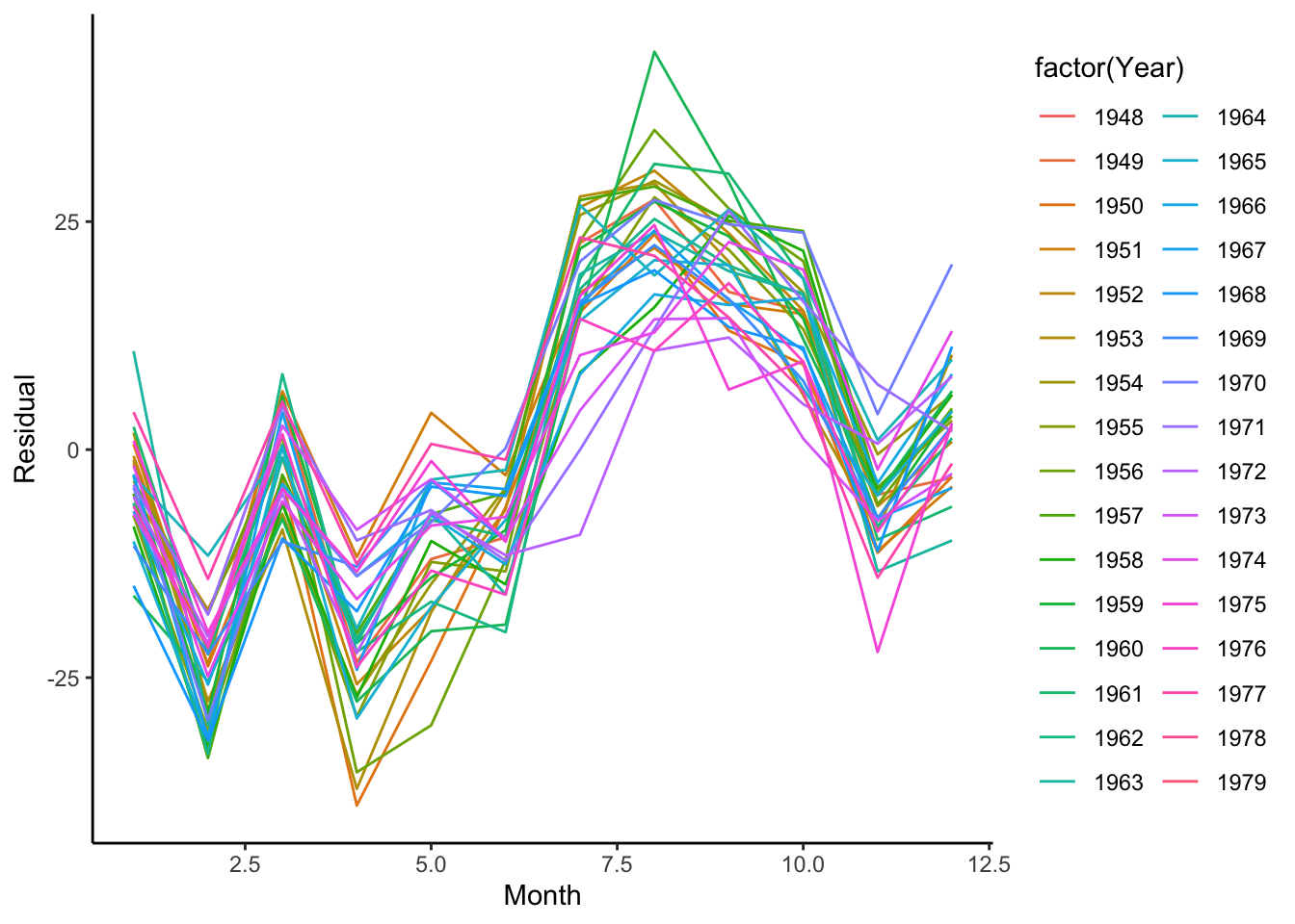
4.2.1 Parametric Approaches
Similar to modeling the trend, we can use some of our parametric tools to model the cyclic patterns in the data using our linear regression structures.
4.2.1.1 Indicator Variables
To estimate the seasonality that does not have a recognizable cyclic functional pattern (sine or cosine curve), we can model each month (or appropriate unit within a cycle) to have its own average by including indicator variables for each month (or appropriate unit within a cycle) in a linear regression model. Like when we estimate the trend, we want to make sure that we have fully estimated the seasonality but checking the residuals, to make sure that there is no seasonality in what is leftover.
birthTS <- birthTS %>%
  mutate(Month = factor(Month))

SeasonModel <- lm(Residual ~  Month, data = birthTS)
SeasonModel
##
## Call:
## lm(formula = Residual ~ Month, data = birthTS)
##
## Coefficients:
## (Intercept) Month2 Month3 Month4 Month5 Month6
## -4.231 -20.734 2.884 -17.412 -5.832 -4.814
## Month7 Month8 Month9 Month10 Month11 Month12
## 20.738 27.650 24.434 18.024 -2.110 7.567birthTS <- birthTS %>%
mutate(Season = predict(SeasonModel, newdata = data.frame(Month = birthTS$Month))) %>%
mutate(ResidualTS = Residual - Season)
# Estimated Trend + Seasonality
birthTS %>%
ggplot(aes(x = DecimalTime, y = Value)) +
geom_point() +
geom_line() +
geom_line(aes(x = DecimalTime, y = Trend + Season), color = 'blue', size = 1.5) +
theme_classic()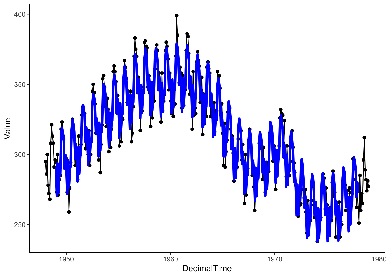
# Residuals
birthTS %>%
  ggplot(aes(x = Month, y = ResidualTS)) +
  geom_line(aes(group = factor(Year))) +
  geom_smooth(se = FALSE) +
  theme_classic()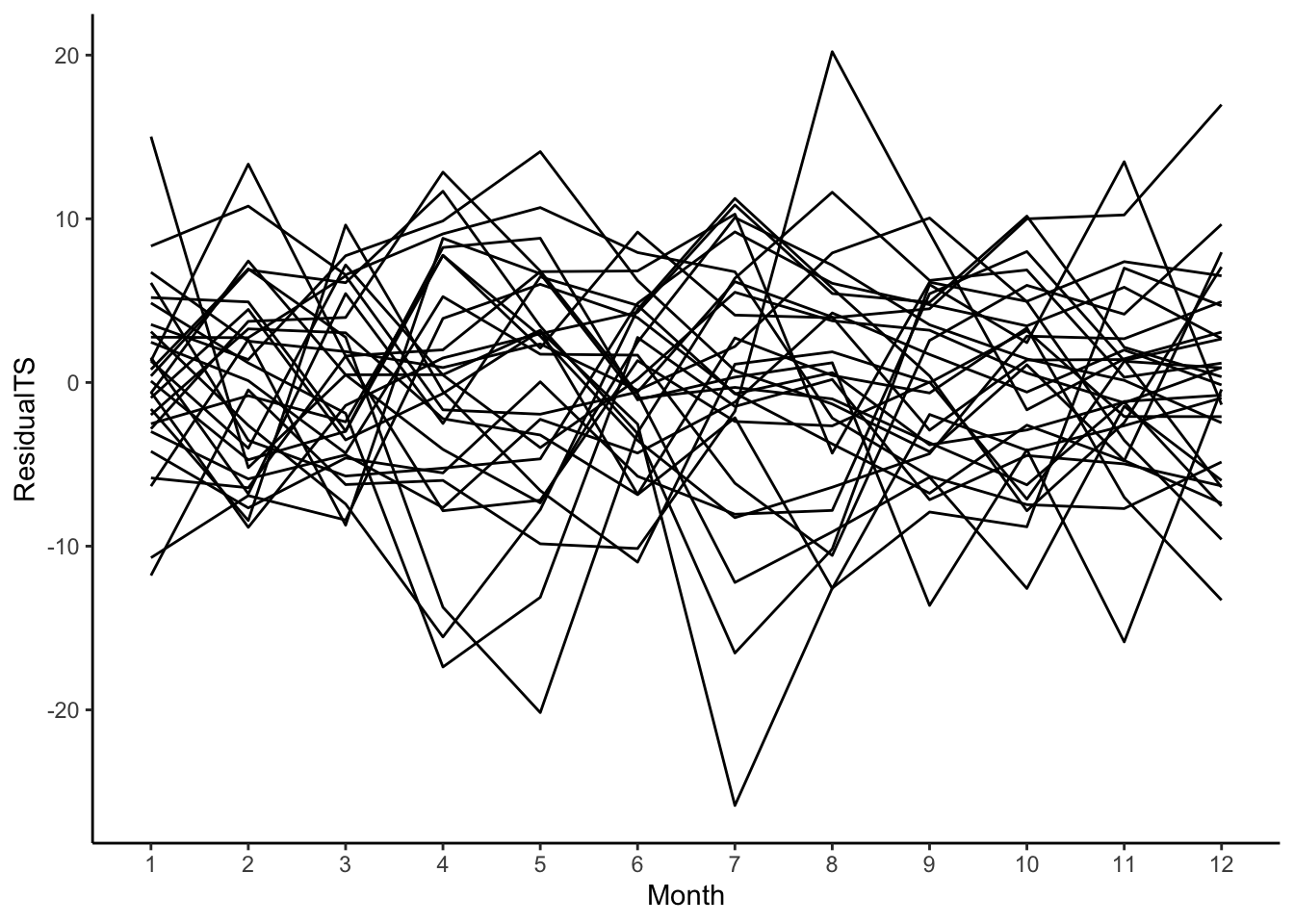
4.2.1.2 Sine and Cosine Curves
While it isn’t the case for this birth data set, if the cyclic pattern is like a sine curve, we could use a sine or cosine curve to model the relationship.
time <- seq(0,2*pi,length = 100)
tibble(
  t = time,
  sin = sin(time),
  cos = cos(time)
) %>%
  ggplot(aes(x = t, y = sin)) +
  geom_line() +
  geom_line(aes(x = t, y = cos),color = 'blue') +
  labs(x = 'x',y = 'f(x)') +
  theme_classic()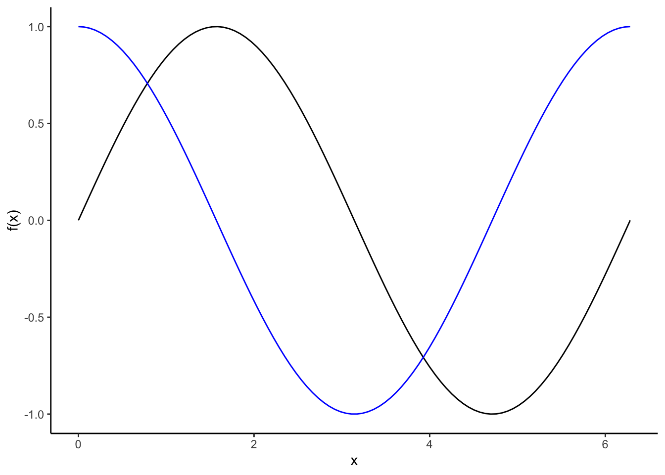
Remember a few properties of sine and cosine curves:
- \(\cos(0) = 1\), \(\cos(\pi/2) = 0\), \(\cos(\pi) = -1\), \(\cos(3\pi/2) = 0\) \(\cos(2\pi) = 1\)
- \(\sin(0) = 0\), \(\sin(\pi/2) = 1\), \(\sin(\pi) = 0\), \(\sin(3\pi/2) = -1\) \(\sin(2\pi) = 0\)
- The period (length of 1 full cycle) of sine or cosine function is \(2\pi\)
- We can write a sine curve model as \(A\sin(2\pi ft + s)\) where \(A\) is the amplitude (peak deviation from 0 instead of 1), \(f\) is the frequency (number of cycles that occur each unit of time), \(t\) is the time, and \(s\) is the shift in the x-axis.
Now, let’s try to apply it to the birth data.
SineSeason <- lm(Residual ~ sin(2*pi*(DecimalTime) ), data = birthTS) # frequency is 1 because a unit in DecimalTime is 1 year
SineSeason
##
## Call:
## lm(formula = Residual ~ sin(2 * pi * (DecimalTime)), data = birthTS)
##
## Coefficients:
## (Intercept) sin(2 * pi * (DecimalTime))
## -0.04286 -14.61751# Estimate Trend + Seasonality
birthTS %>%
mutate(SeasonSine = predict(SineSeason, newdata = data.frame(DecimalTime = birthTS$DecimalTime))) %>%
ggplot(aes(x = DecimalTime, y = Value)) +
geom_point() +
geom_line() +
geom_line(aes(x = DecimalTime, y = Trend + SeasonSine), color = 'blue') +
theme_classic()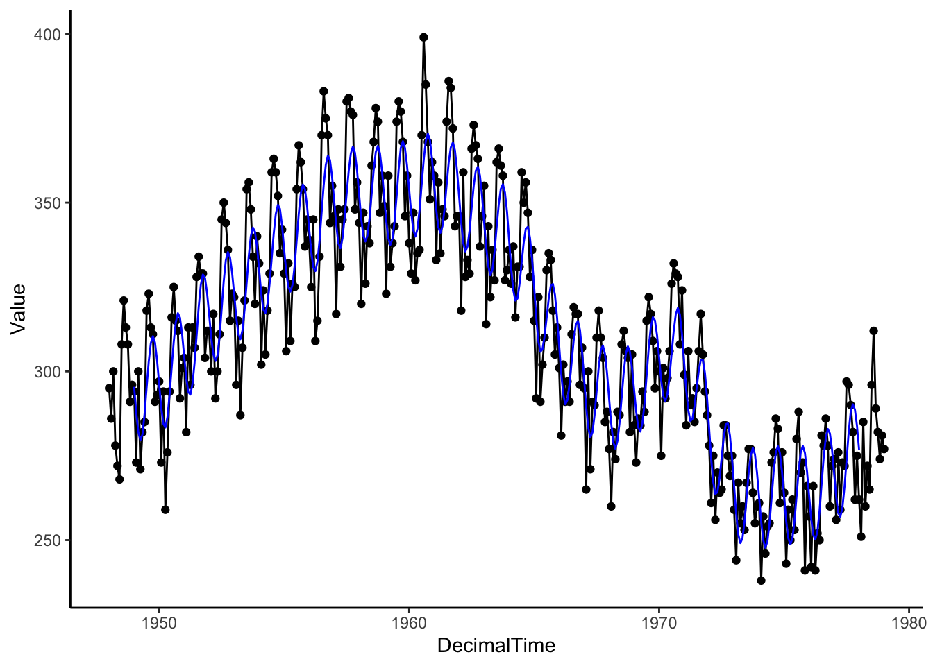
# Residuals
 birthTS %>%
   mutate(ResidualTS2  = Residual - predict(SineSeason, newdata = data.frame(DecimalTime = birthTS$DecimalTime))) %>%
   ggplot(aes(x = Month, y = ResidualTS2)) +
   geom_line(aes(group = factor(Year))) +
   geom_smooth(se = FALSE) +
   theme_classic()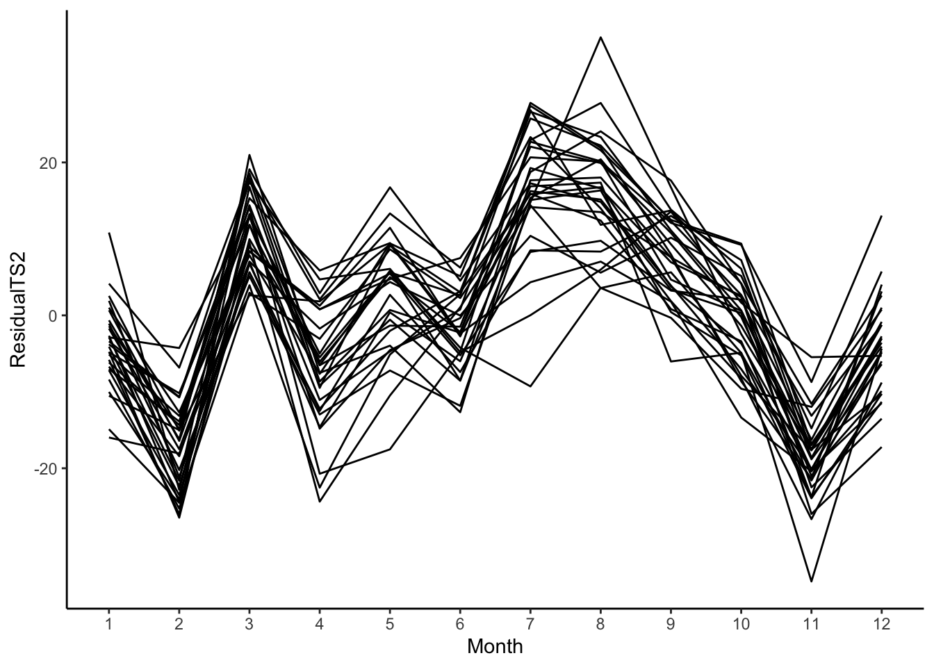
Since we still see a pattern in these residuals, this is not a good way to estimate the cyclic pattern in this particular data set.
Data Example 3
Here is daily temperature data in San Francisco in 2011. We only have one year, but we can see the cycle shape is closer to a cosine curve. The period, length of one cycle, of a cosine or sine curve is \(2*\pi\), so we need to adjust the period when we fit a cosine or sine curve to our data. In the case below, the period is 365 since our time variable is DayinYear where 1 unit is 1 day in the year (Jan 1 is 1 and Dec 31 is 365).
load('./data/sfoWeather2011.RData')
sfoWeather <- sfoWeather %>%
  mutate(DayinYear = 1:365)
sfoWeather %>%
  ggplot(aes(x = DayinYear, y = High)) +
  geom_line() +
  theme_classic()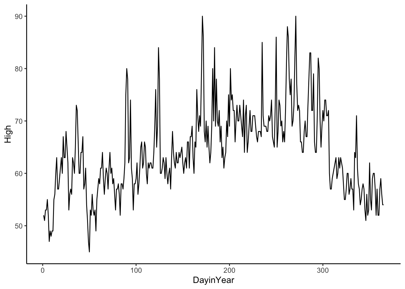
CosSeason <- lm(High ~ cos(2*pi*(DayinYear-60)/365), data = sfoWeather) # frequency is 1/365 because a unit in DayinYear is 1 day
CosSeason
##
## Call:
## lm(formula = High ~ cos(2 * pi * (DayinYear - 60)/365), data = sfoWeather)
##
## Coefficients:
## (Intercept) cos(2 * pi * (DayinYear - 60)/365)
## 64.249 -7.022sfoWeather %>%
mutate(Season = predict(CosSeason)) %>%
ggplot(aes(x = DayinYear, y = High)) +
geom_point() +
geom_line(aes(x = DayinYear, y = Season), color = 'blue', size = 1.5) +
theme_classic()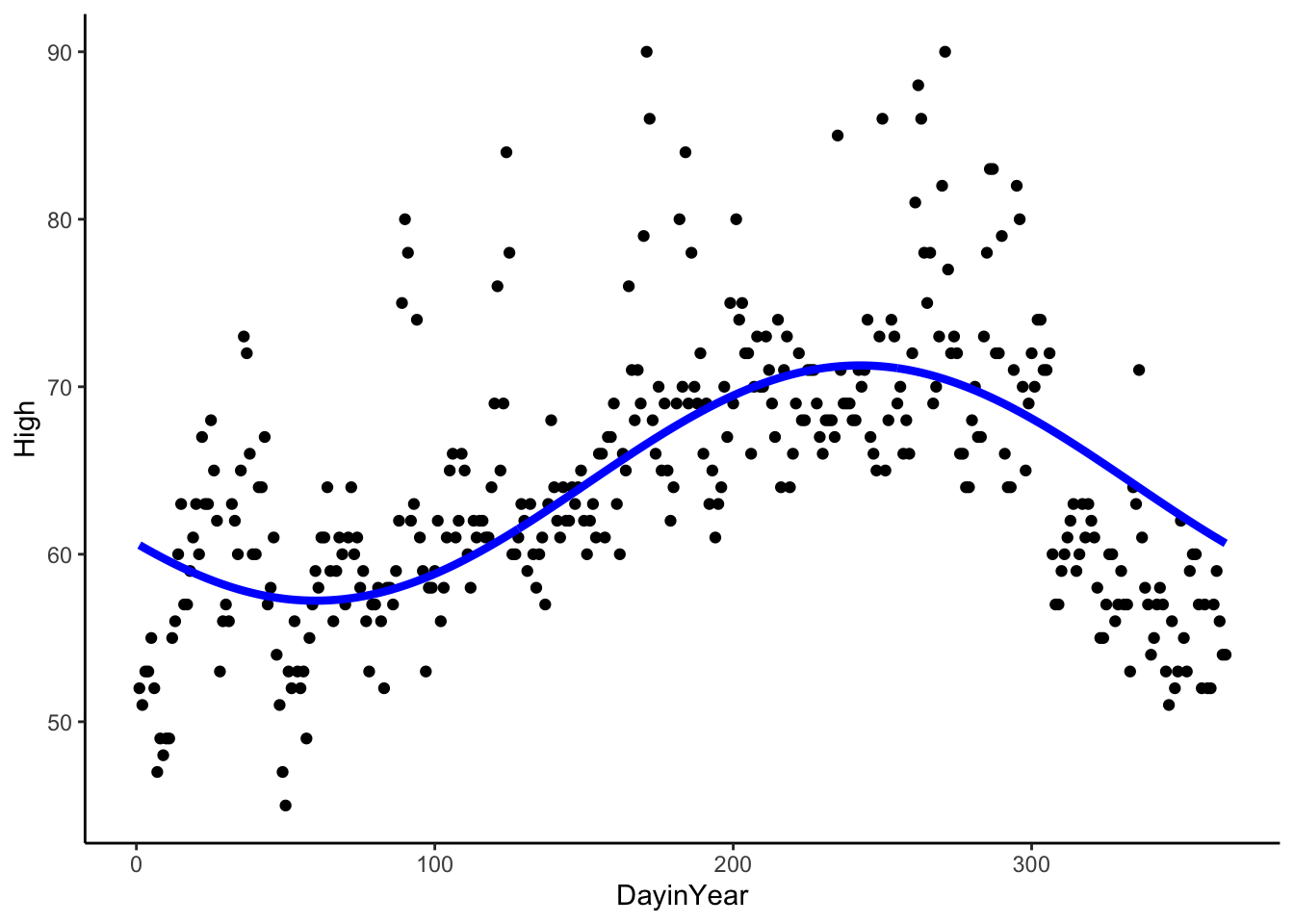
To recap:
For a cosine function,
\[A\cos(Bx + C) + D\]
the period is \(\frac{2*\pi}{|B|}\), the amplitude is \(A\) (the coefficient in our linear model), the phase shift is \(C\) (included in our model above) and the vertical shift is \(D\) (intercept in our linear model).
4.2.2 Nonparametric Approaches
Similar estimating the trend, we could use local regression or moving averages to estimate both the trend and seasonality as long as we defined the local area small enough to pick up the cycles.
The disadvantage of this approach is that we will not be able to use the estimate to make predictions in the future because we do not learn general patterns of trend and seasonality.
4.2.2.1 Differencing to Remove Seasonality
Like removing a trend, we can use differencing to remove seasonality if we don’t need to estimate it. Rather than a difference between neighboring observations, we will take differences between observations that are approximately one period apart. So if the period, length of one cycle, is \(k\) observations, such that \(y_t\) is similar to \(y_{t-k}\) and \(y_{t-2k}\), then we’ll take differences between observations that are \(k\) observations apart.
For example, if you have monthly data, you’d want to take differences between observations that are 12 lags apart (12 months apart). See the simulated monthly data below.
t <- 1:48
y <- ts(2 + 20*sin(2*pi*t/12) + rnorm(48,sd = 5), frequency=12)
plot(y)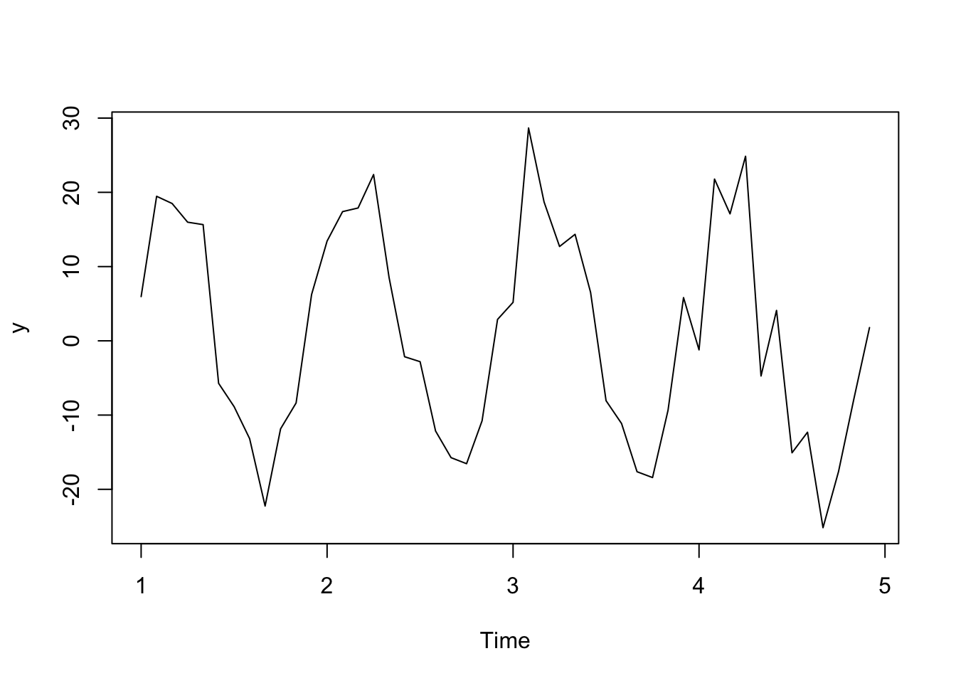
plot(diff(y, lag = 12, differences = 1)) #first order difference of lag 12 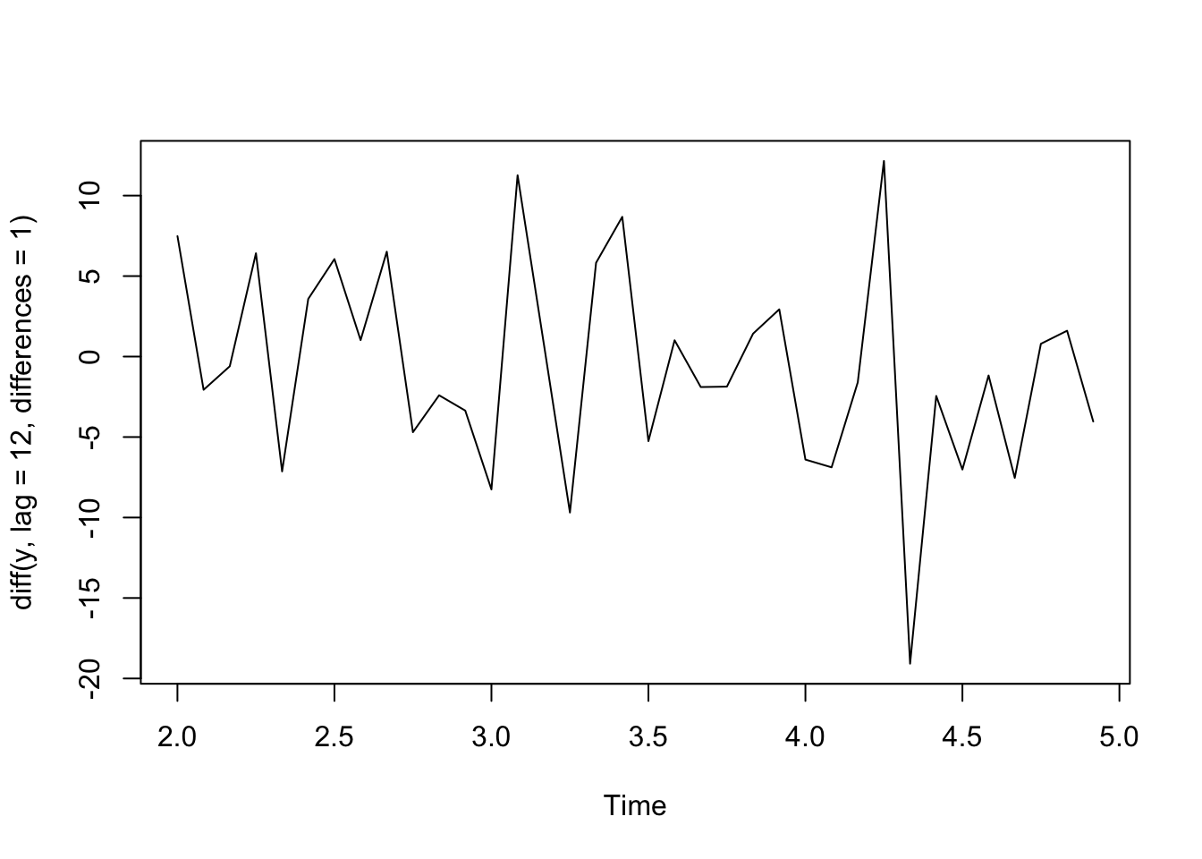
Let’s try this approach with the birth data since we saw annual seasonality by month. First, we take first differences of neighboring values to remove the trend, then we’ll take first differences of lag 12 to remove the seasonality. We see that there are no obvious trends or seasonality remaining in the data and it is centered around 0.
plot(diff(diff(birth,differences = 1), lag = 12, differences = 1))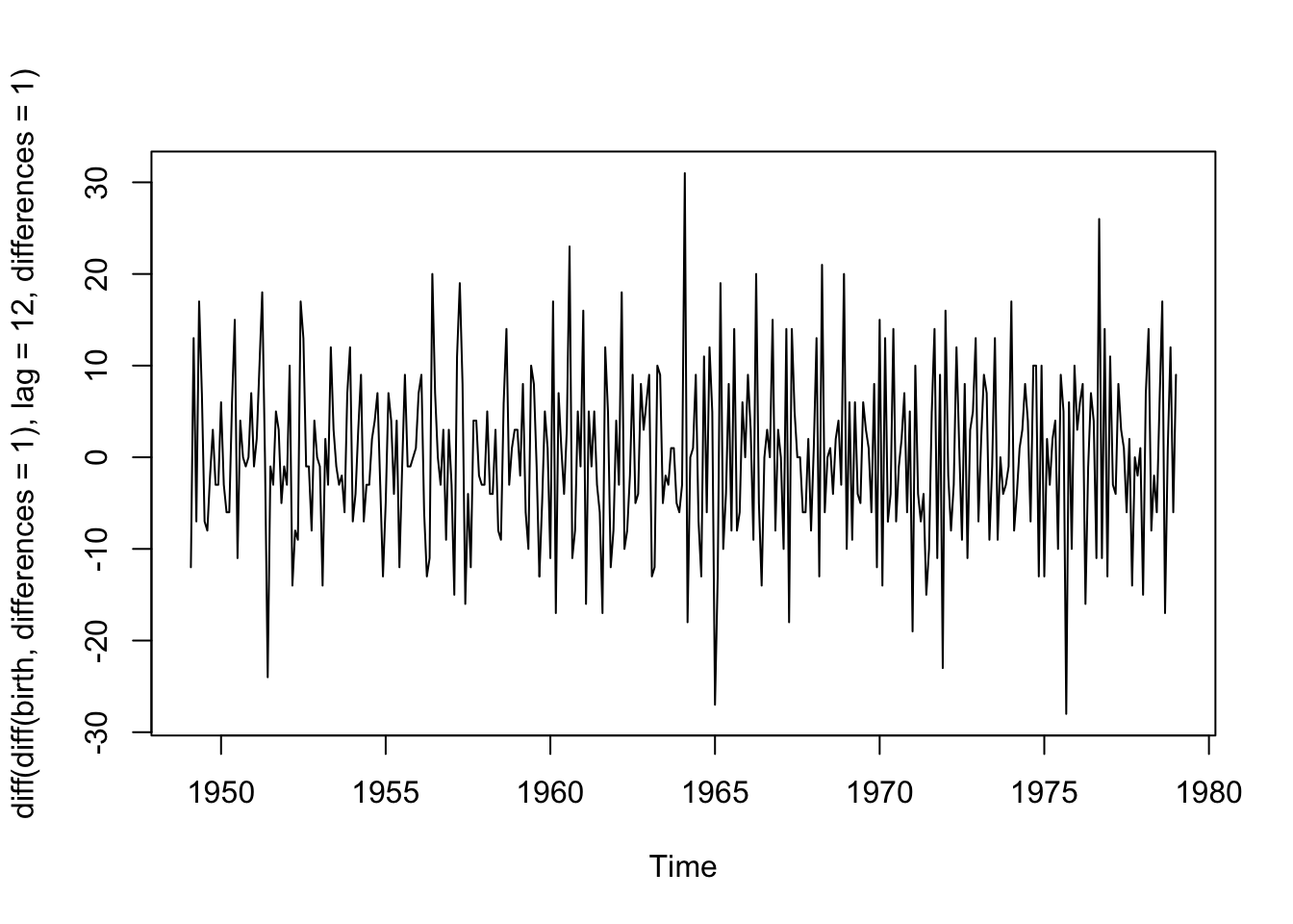
4.2.3 Decomposition of Series
We have talked about a few options to model and remove two model components: the trend and the seasonality.
One way to visualize this decomposition of the series is with decompose() which uses a moving average to estimate the trend and then finds the average for each unit the cycle (in our case months) to estimate the season.
plot(decompose(birth)) #you can decompose a ts object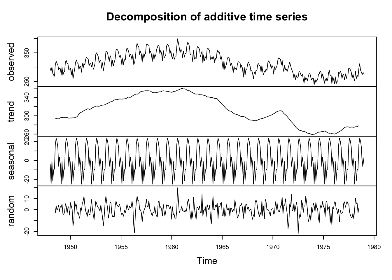
What is left over, the random errors, are what we need to worry about now.