4.1 Modeling the Trend
Let’s start by focusing on the trend component. Our goal here is to estimate the overall outcome pattern over time.
To check to see if we’ve successfully estimated and removed the trend, we’ll plot the residuals (what is leftover) over time. We’ll look to see if the average residual is fairly constant across time. If not, we’ll need to try a different approach to model/remove the trend.
4.1.1 Parametric Approaches
4.1.1.1 Global Transformations
If the trend, \(f(x_t)\), is linearly increasing or decreasing in time (with no seasonality), then we could use a linear regression model to estimate the trend with the following model,
\[Y_t = \beta_0 + \beta_1x_t + \epsilon_t\] where \(x_t\) is some measure of time (e.g. age, time from baseline, etc.).
If the overall mean trend is quadratic, we could include a \(x_t^2\) term in the regression model,
\[Y_t = \beta_0 + \beta_1x_t+ \beta_2x_t^2 + \epsilon_t\]
In fact, any standard regression technique for non-linear relationships (polynomials, splines, etc.) could also be used here to model the trend. As we have talked about in Chapter 1, we can use ordinary least squares (OLS), lm() in R, to get unbiased estimate of these coefficients in linear regression. But remember, the standard errors and subsequent inference (p-values, confidence intervals) may not be valid due to correlated noise.
Let’s look at some example data and see how we can model the trend.
Data Example 1
Below is the quarterly earnings per share of the company, Johnson and Johnson from 1960-1980. The first observation is the 1st quarter of 1960 (\(t=1\)) and the second is the 2nd quarter of 1960 (\(t=2\))
library(astsa) # R package for time series
jj
## Qtr1 Qtr2 Qtr3 Qtr4
## 1960 0.710000 0.630000 0.850000 0.440000
## 1961 0.610000 0.690000 0.920000 0.550000
## 1962 0.720000 0.770000 0.920000 0.600000
## 1963 0.830000 0.800000 1.000000 0.770000
## 1964 0.920000 1.000000 1.240000 1.000000
## 1965 1.160000 1.300000 1.450000 1.250000
## 1966 1.260000 1.380000 1.860000 1.560000
## 1967 1.530000 1.590000 1.830000 1.860000
## 1968 1.530000 2.070000 2.340000 2.250000
## 1969 2.160000 2.430000 2.700000 2.250000
## 1970 2.790000 3.420000 3.690000 3.600000
## 1971 3.600000 4.320000 4.320000 4.050000
## 1972 4.860000 5.040000 5.040000 4.410000
## 1973 5.580000 5.850000 6.570000 5.310000
## 1974 6.030000 6.390000 6.930000 5.850000
## 1975 6.930000 7.740000 7.830000 6.120000
## 1976 7.740000 8.910000 8.280000 6.840000
## 1977 9.540000 10.260000 9.540000 8.729999
## 1978 11.880000 12.060000 12.150000 8.910000
## 1979 14.040000 12.960000 14.850000 9.990000
## 1980 16.200000 14.670000 16.020000 11.610000class(jj) # ts stands for time series R class## [1] "ts"plot(jj) # plot() is smart enough to make the right x-axis because jj is ts object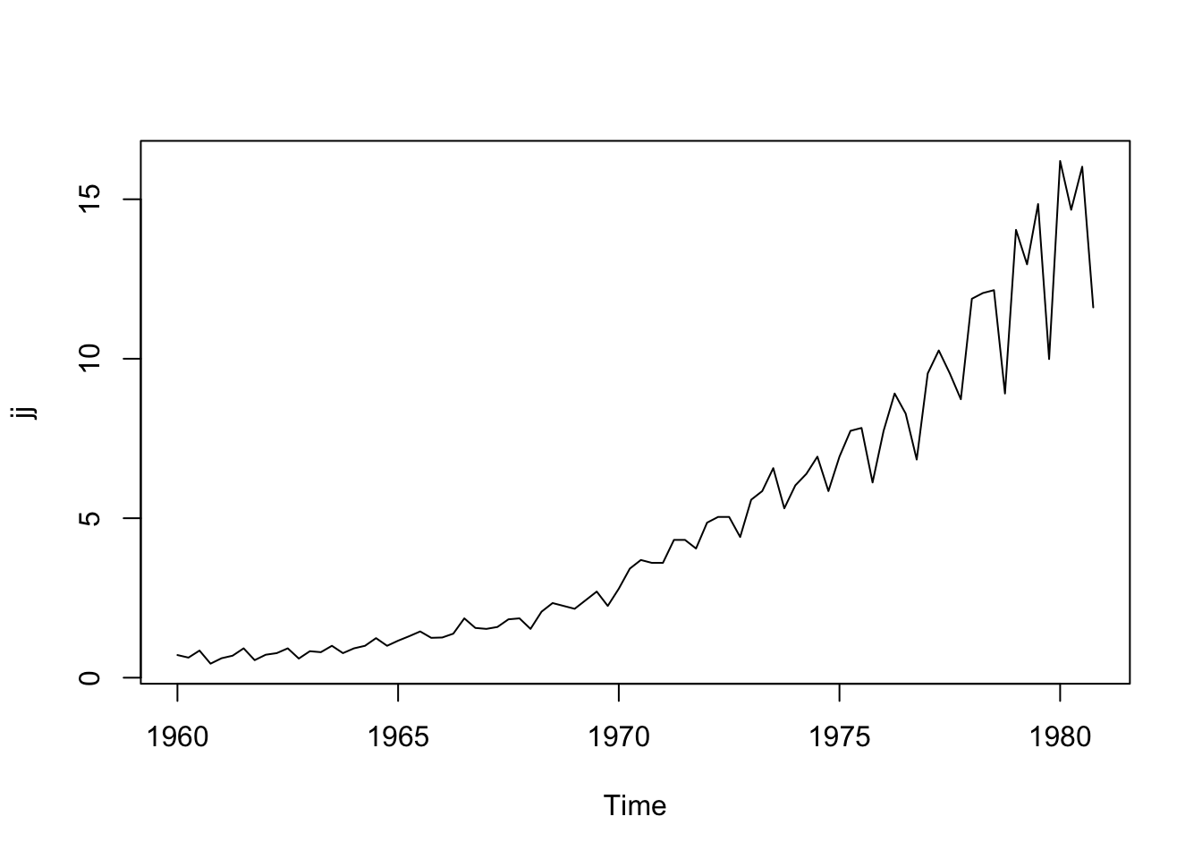
We see that the earnings are overall increasing over time, but a bit faster than a linear relationship (there is some curvature in the trend). Let’s transform this dataset into a data frame so that we can use ggplot2, an alternative graphing package in R.
library(ggplot2)
library(dplyr)

jjTS <- data.frame(
  Value = as.numeric(jj),
  Time = time(jj), # time() works on ts objects
  Quarter = cycle(jj)) # cycle() works on ts objects

quadTrendMod <- lm(Value ~ poly(Time, degree = 2, raw = TRUE), data = jjTS) # poly() fits a polynomial trend model

jjTS <- jjTS %>%
  mutate(Trend = predict(quadTrendMod)) # Add the estimated trend to the dataset

jjTS %>%
  ggplot(aes(x = Time, y = Value)) +
  geom_point() +
  geom_line() +
  geom_line(aes(x = Time, y = Trend), color = 'blue', size = 1.5) +
  theme_classic()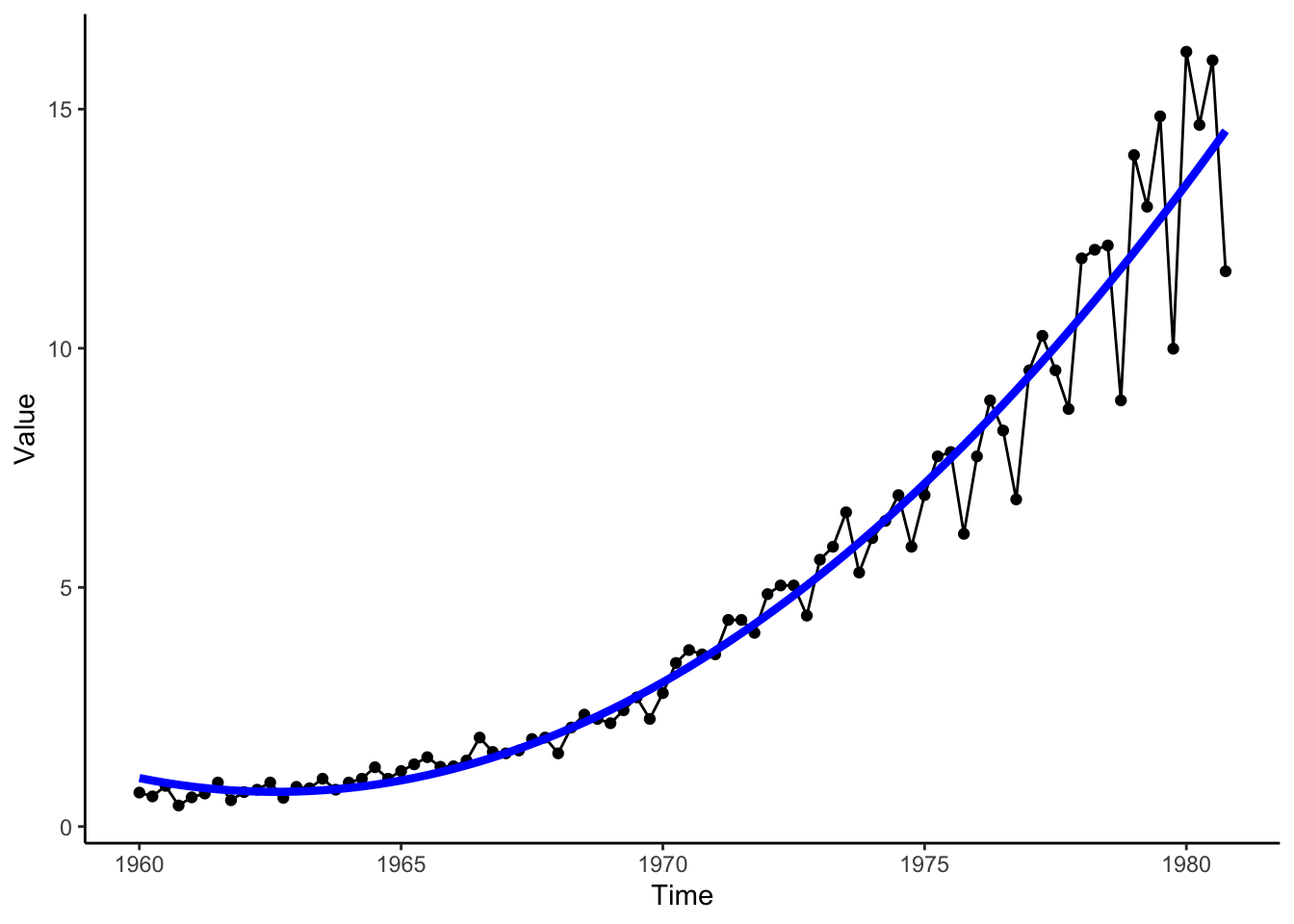
Data Example 2
Below we have the monthly counts (in thousands) of live births in the United States from 1948 to 1979. The first measurement is from January 1948 (\(t=1\)), then February 1948 (\(t=2\)), etc.
birth## Jan Feb Mar Apr May Jun Jul Aug Sep Oct Nov Dec
## 1948 295 286 300 278 272 268 308 321 313 308 291 296
## 1949 294 273 300 271 282 285 318 323 313 311 291 293
## 1950 297 273 294 259 276 294 316 325 315 312 292 301
## 1951 304 282 313 296 313 307 328 334 329 329 304 312
## 1952 312 300 317 292 300 311 345 350 344 336 315 323
## 1953 322 296 315 287 307 321 354 356 348 334 320 340
## 1954 332 302 324 305 318 329 359 363 359 352 335 342
## 1955 329 306 332 309 326 325 354 367 362 354 337 345
## 1956 339 325 345 309 315 334 370 383 375 370 344 355
## 1957 346 317 348 331 345 348 380 381 377 376 348 356
## 1958 344 320 347 326 343 338 361 368 378 374 347 358
## 1959 349 323 358 331 338 343 374 380 377 368 346 358
## 1960 338 329 347 327 335 336 370 399 385 368 351 362
## 1961 358 333 356 335 348 346 374 386 384 372 343 346
## 1962 346 318 359 328 333 329 366 373 367 363 337 346
## 1963 355 314 343 322 336 327 362 366 361 358 327 330
## 1964 336 326 337 316 331 331 359 350 356 347 328 336
## 1965 315 292 322 291 302 310 330 335 333 318 305 313
## 1966 301 281 302 291 297 291 311 319 317 317 296 307
## 1967 295 265 300 271 291 290 310 318 310 304 285 288
## 1968 277 260 282 274 288 287 308 312 306 304 282 305
## 1969 284 273 286 284 294 288 315 322 317 309 295 306
## 1970 300 275 301 292 298 306 326 332 329 328 308 324
## 1971 299 284 306 290 292 285 295 306 317 305 294 287
## 1972 278 261 275 256 270 264 265 284 284 275 269 275
## 1973 259 244 267 255 260 253 267 277 277 264 255 260
## 1974 261 238 257 246 254 255 273 276 286 283 261 276
## 1975 264 243 259 250 262 253 280 288 270 273 241 266
## 1976 257 242 266 241 252 250 281 278 286 278 260 272
## 1977 274 256 276 259 273 272 297 296 290 282 262 275
## 1978 262 251 285 260 272 265 296 312 289 282 274 281
## 1979 277class(birth) # ts stands for time series R class## [1] "ts"plot(birth) # plot() is smart enough to make the right x-axis because birth is ts object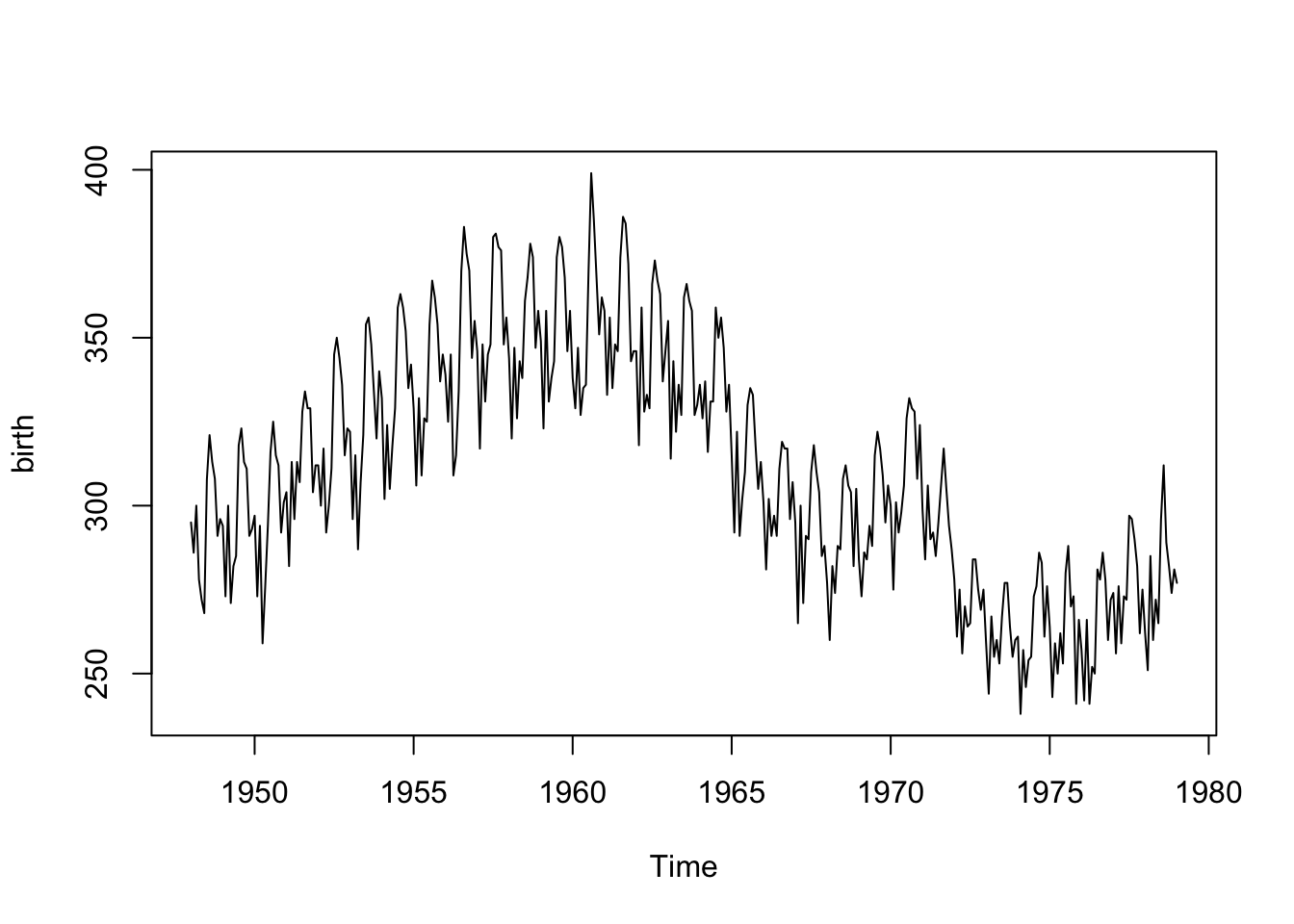
Looking at the plot (time ordered points are connected with a line segment), we note a positive linear relationship from about 1948 to 1960 and a somewhat negative relationship between 1960 to 1968, with another slight increase and then drop around 1972. This is not a polynomial trend over time. We’ll need another approach!
Let’s also transform this dataset into a data frame so that we can use ggplot2.
birthTS <- data.frame(
  Year = floor(as.numeric(time(birth))), # time() works on ts objects
  Month = as.numeric(cycle(birth)), # cycle() works on ts objects
  Value = as.numeric(birth))

birthTS <- birthTS %>%
  mutate(DecimalTime = Year + (Month-1)/12)

birthTS %>%
  ggplot(aes(x = DecimalTime, y = Value)) +
  geom_line() +
  theme_classic()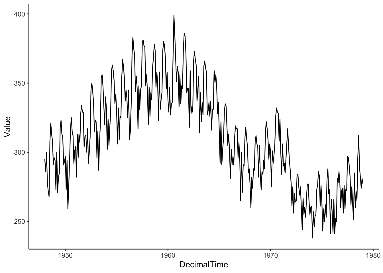
4.1.1.2 Splines
Let’s try a regression basis spline, which is a smooth piecewise polynomial. This means that we break up the x-axis into intervals using knots or break points and model a different polynomial in each interval. In particular, let’s fit a quadratic polynomial with knots/breaks at 1965 and 1972.
library(splines)

TrendSpline <- lm(Value ~ bs(DecimalTime, degree = 2, knots = c(1965,1972)), data = birthTS)
summary(TrendSpline)
##
## Call:
## lm(formula = Value ~ bs(DecimalTime, degree = 2, knots = c(1965,
## 1972)), data = birthTS)
##
## Residuals:
## Min 1Q Median 3Q Max
## -46.178 -12.789 -0.974 12.350 49.973
##
## Coefficients:
## Estimate Std. Error t value Pr(>|t|)
## (Intercept) 274.249 3.527 77.762 < 2e-16
## bs(DecimalTime, degree = 2, knots = c(1965, 1972))1 119.206 6.817 17.486 < 2e-16
## bs(DecimalTime, degree = 2, knots = c(1965, 1972))2 25.459 3.961 6.428 4.02e-10
## bs(DecimalTime, degree = 2, knots = c(1965, 1972))3 -20.140 6.115 -3.294 0.00108
## bs(DecimalTime, degree = 2, knots = c(1965, 1972))4 7.062 6.006 1.176 0.24039
##
## (Intercept) ***
## bs(DecimalTime, degree = 2, knots = c(1965, 1972))1 ***
## bs(DecimalTime, degree = 2, knots = c(1965, 1972))2 ***
## bs(DecimalTime, degree = 2, knots = c(1965, 1972))3 **
## bs(DecimalTime, degree = 2, knots = c(1965, 1972))4
## ---
## Signif. codes: 0 '***' 0.001 '**' 0.01 '*' 0.05 '.' 0.1 ' ' 1
##
## Residual standard error: 18.46 on 368 degrees of freedom
## Multiple R-squared: 0.7287, Adjusted R-squared: 0.7258
## F-statistic: 247.1 on 4 and 368 DF, p-value: < 2.2e-16birthTS <- birthTS %>%
mutate(SplineTrend = predict(TrendSpline))
birthTS %>%
ggplot(aes(x = DecimalTime, y = Value)) +
geom_point() +
geom_line() +
geom_line(aes(x = DecimalTime, y = SplineTrend), color = 'blue', size = 1.5) +
theme_classic()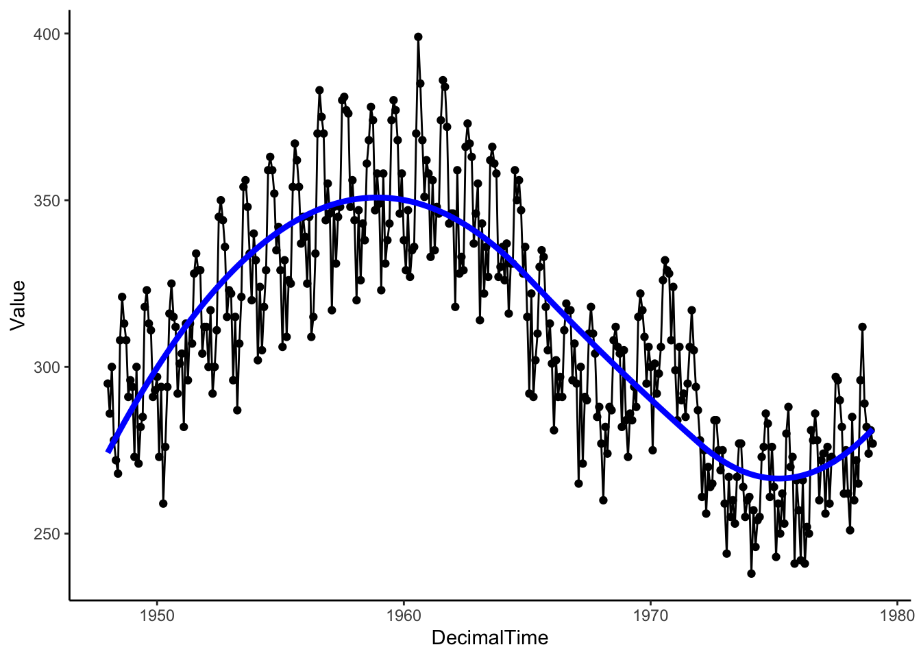
Then let’s see what is leftover by plotting the residuals after removing the estimated trend. Is the mean constant? If so, the we can be sure that we’ve estimated and removed the long-range trend.
# Plotting residuals
birthTS %>%
  ggplot(aes(x = DecimalTime, y = resid(TrendSpline))) +
  geom_line() +
  geom_smooth(se = FALSE) +
  theme_classic()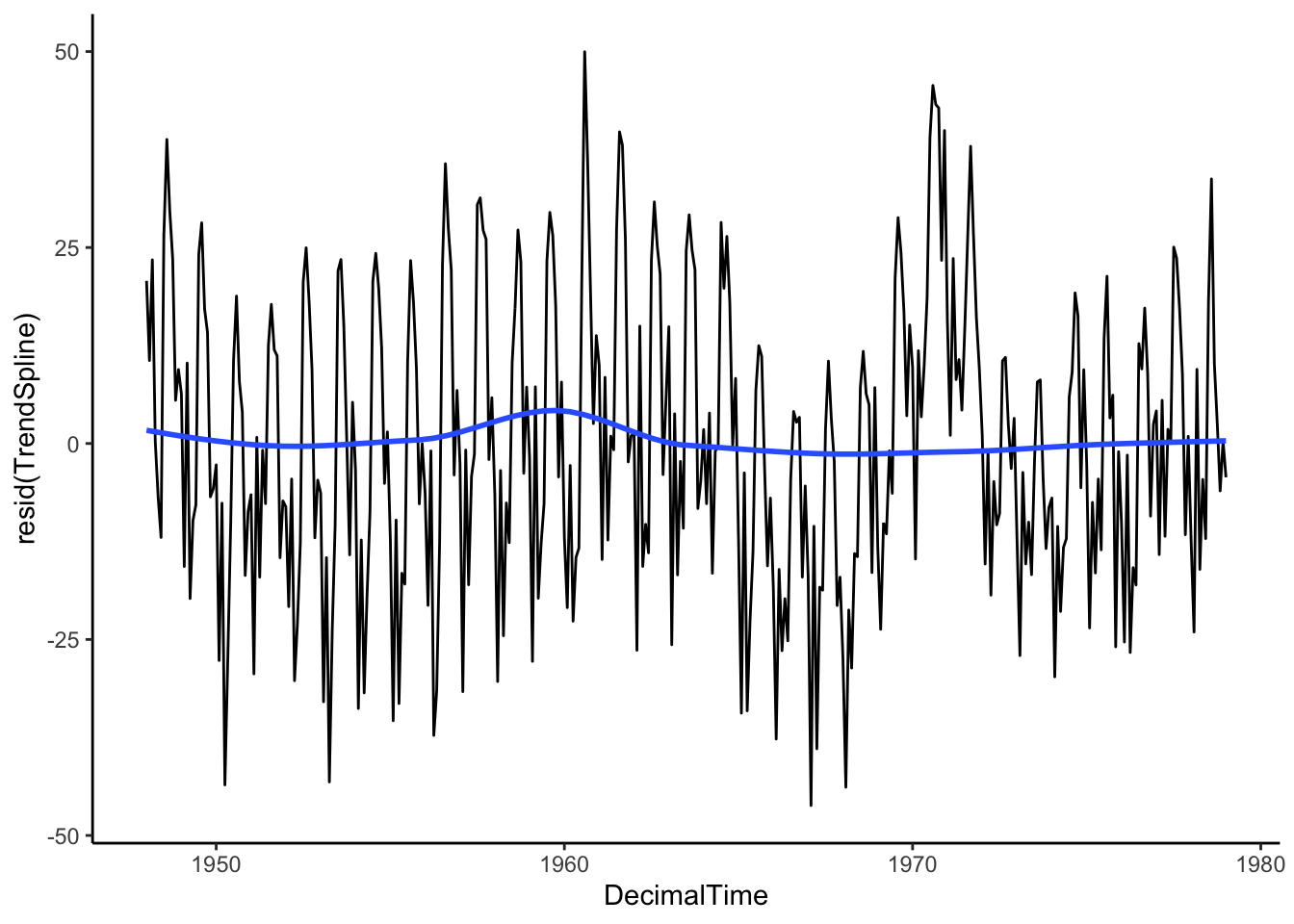
These parametric approaches give us an estimated function to plug in times and get a predicted trend value, but they might not quite pick up the full trend.
What are alternative methods for estimating non-linear trends?
4.1.2 Nonparametric Approaches
Nonparametric methods for estimating a trend use algorithms (steps of a process) rather than parametric functions (linear, polynomial, splines) with a finite number of parameters to estimate.
4.1.2.1 Local Regression
Have you ever wondered how geom_smooth() estimates that blue smooth curve?
If you look at the documentation for geom_smooth(), you’ll see that for smaller data sets, it uses the loess() function. This method of estimating the trend is locally estimated scatterplot smoothing, also called local regression.
The loess algorithm is to predict the outcome (estimate the trend) at a point on the x-axis, \(x_0\), follow the steps below:
- Distance: calculate the distance between \(x_0\) and each observed points \(x\), \(d(x,x_0)=|x-x_0|\).
- Find Local Area: keep the closest \(s\) proportion of observed data points (\(s\) determined by span parameter)
- Fit Model: fit a linear or quadratic regression model to the local area, weighting points close to \(x_0\) higher (weighting determined by a chosen weighting kernel function)
- Predict: use that local model to make a prediction of the outcome at \(x_0\)
That process is repeated for a sequence of values along the x-axis to make a plot like the one below (blue: loess, purple: spline).
birthTS %>%
  ggplot(aes(x = DecimalTime, y = Value)) +
  geom_point() +
  geom_line() +
  geom_smooth(se = FALSE, color = 'blue') + # uses loess
  geom_line(aes(x = DecimalTime, y = SplineTrend), color = 'purple', size = 1.5) +
  theme_classic()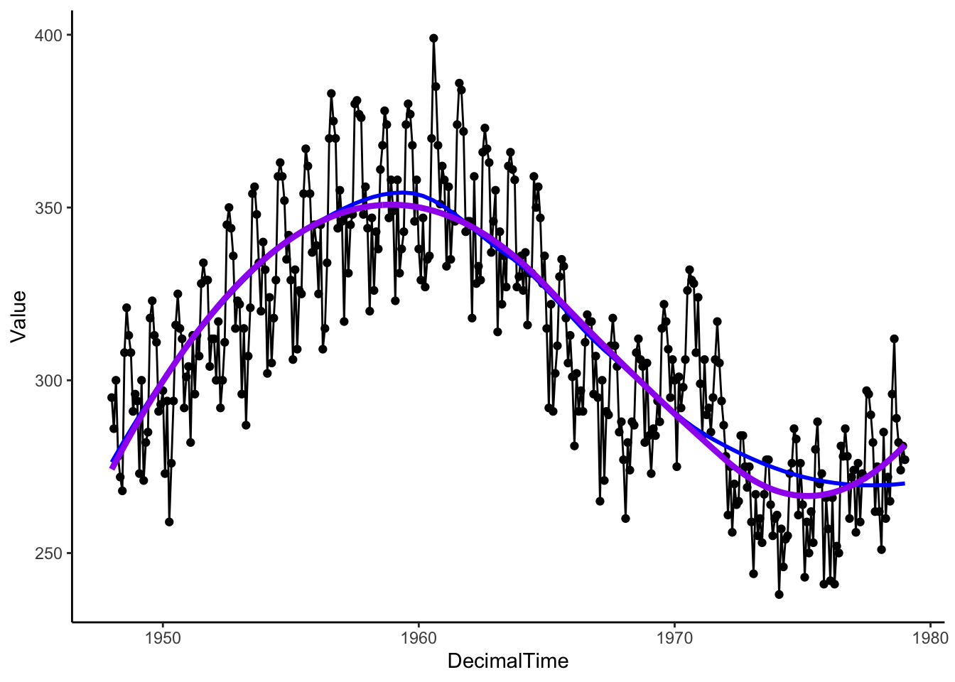
We can get the estimated trend with the loess() function as well.
# Running loess separately
LocalReg <- loess(Value ~ DecimalTime, data = birthTS, span = .75)
birthTS <- birthTS %>%
  mutate(LoessTrend = predict(LocalReg))

birthTS %>%
  ggplot(aes(x = DecimalTime, y = Value)) +
  geom_point() +
  geom_line() +
  geom_line(aes(x = DecimalTime, y = LoessTrend), color = 'blue', size = 1.5) +
  geom_line(aes(x = DecimalTime, y = SplineTrend), color = 'purple', size = 1.5) +
  theme_classic()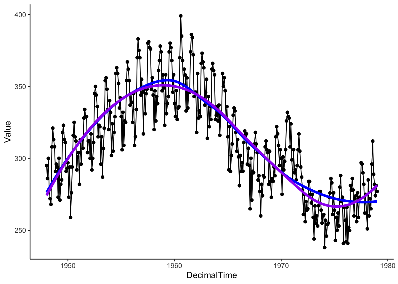
# Plotting residuals
birthTS %>%
  ggplot(aes(x = DecimalTime, y = resid(LocalReg))) +
  geom_line() +
  geom_smooth(se = FALSE) +
  theme_classic()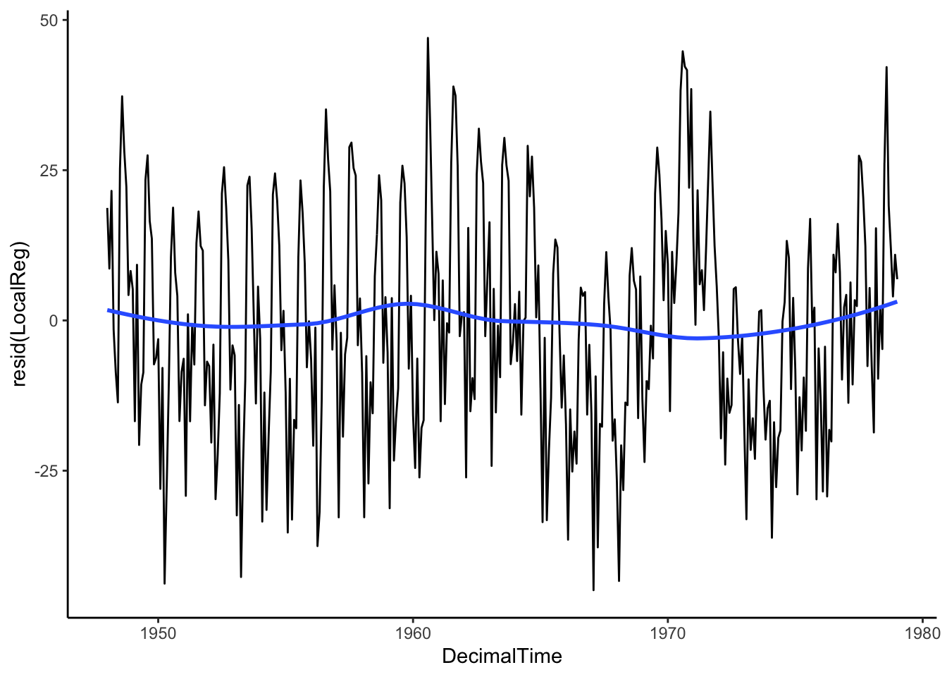
4.1.2.2 Moving Average Filter
Local regression is an extension of a simple idea called a moving average filter.
Imagine a window that only shows you what is “local” or right in front of you and we can adjust the width of this window to include more or less data. In the illustration below, we have drawn a 2-year window around January 1960. When we are considering information around Jan 1960, the window is limiting our view to only those 1 year before and 1 year after (from Jan 1959-Jan 1961).
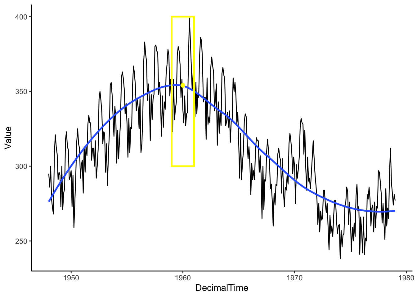
For our circumstances, the “local” window will include an odd number of observations (number of points = \(1+2a\) for a given \(a\) value). Among that small local group of observations, we take the average to estimate the mean at the center of those points (rather than fit a linear regression model),
\[\hat{f}(x_t) = (1+2a)^{-1}\sum^a_{k=-a}y_{t+k}\]

Then, we move the window and calculate the mean within that window. Continue until you have a smooth curve estimate for each point in the time range of interest.
Box <- data.frame(x = 1965, y = 325, w = 2) #2-year window around 1980
Mean <- birthTS %>%
  filter(DecimalTime < 1965 + 1 & DecimalTime > 1965 - 1) %>%
  summarize(M = mean(Value)) %>% #Mean value of points in the window
  mutate(x = 1965)

birthTS %>%
  ggplot(aes(x = DecimalTime, y = Value)) +
  geom_line() +
  geom_smooth(se = FALSE) +
  geom_tile(data = Box, aes(x = x,y=y,width=w),height = 100, fill=alpha("grey",0), colour = 'yellow',size = 1) +
  geom_point(data = Mean, aes(x = x, y = M), colour = 'yellow', size = 2)+
  theme_classic()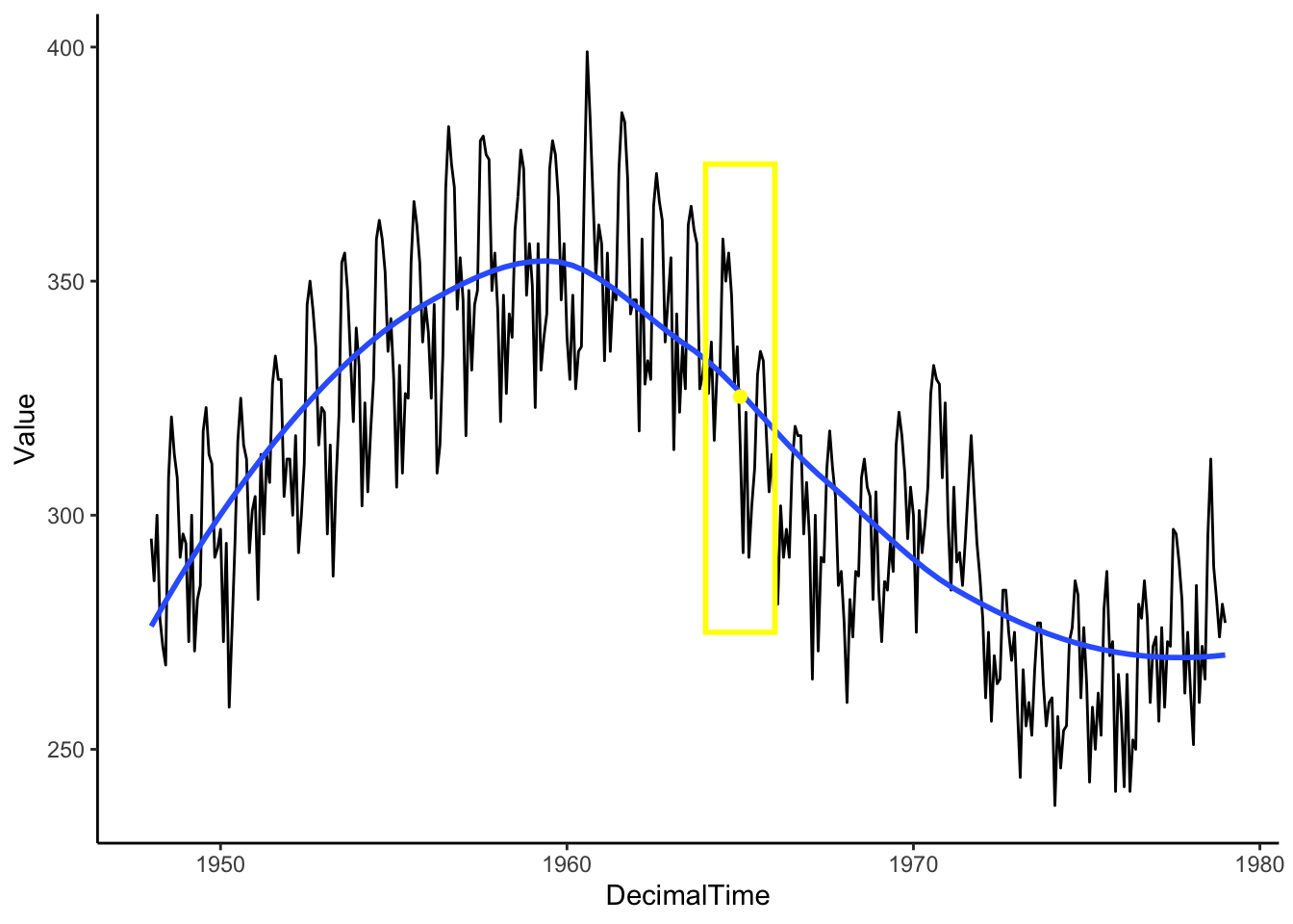
This method works really well for windows of odd-numbered length (equal number of points around the center), but it can be adjusted if you desire an even-number length window by adding 1/2 of the two extreme lags so that the middle value lines up with time \(t\).
For the above monthly data example, we might want a 12-point moving average, so we would have
\[\hat{f}(x_t) = \frac{0.5y_{t-6}+y_{t-5}+y_{t-4}+y_{t-3}+y_{t-2}+y_{t-1}+y_{t}+y_{t+1}+y_{t+2}+y_{t+3}+y_{t+4}+y_{t+5}+0.5y_{t+6} }{12}\]
fltr <- c(0.5, rep(1, 11), 0.5)/12 # weights for the weighted average above
birthTrend <- stats::filter(birth, filter = fltr, method = 'convo', sides = 2) #use the ts object rather than the data frame
plot(birthTrend)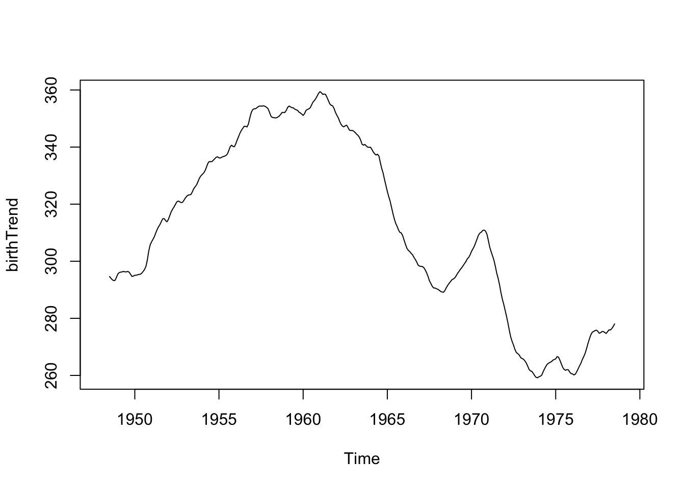
Now if we increase the width of the window (24 point moving window), you should see a smoother curve.
\[\hat{f}(x_t) = \frac{0.5y_{t-12}+ y_{t-11}+...+y_{t-1}+y_{t}+y_{t+1}+...+y_{t+11}+0.5y_{t+12} }{24}\]
fltr <- c(0.5, rep(1, 23), 0.5)/24 # weights for moving average
birthTrend <- stats::filter(birth, filter = fltr, method = 'convo', sides = 2) # use the ts object rather than the data frame
plot(birthTrend)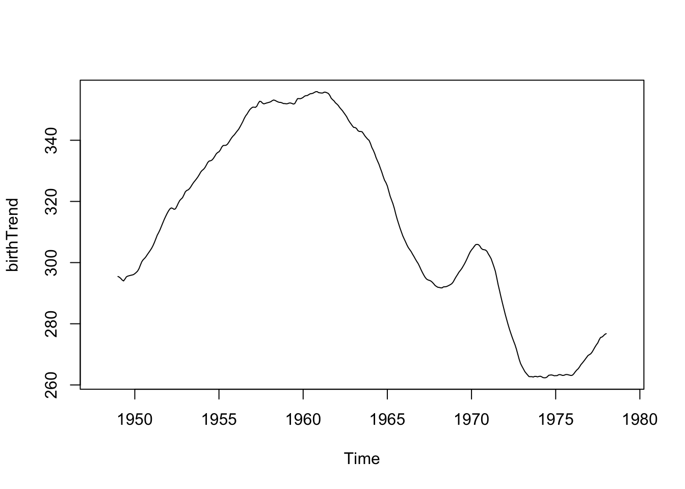
What if we did a 5-point moving average, instead of a 12 or 24-point moving average?
fltr <- rep(1, 5)/5
birthTrend2 <- stats::filter(birth, filter = fltr, method = 'convo', sides = 2)
plot(birthTrend2)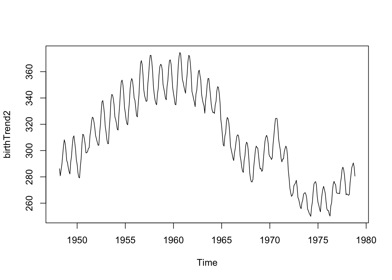
We see the seasonality (repeating cycles) because the 5-point window averages about half of the year’s data for each estimate, thus the highs and lows don’t balance each other out.
You must be mindful of the width of the window for the moving average, depending on the context of the data and the existing cycles in the data.
Let’s see what is leftover. Is the mean of the residuals constant across time (which would indicate that we have fully removed the trend)?
birthTS <- birthTS %>%
  mutate(Trend = birthTrend) %>%
  mutate(Residual = Value - Trend)

birthTS %>%
  ggplot(aes(x = DecimalTime, y = Residual)) +
  geom_point() +
  geom_smooth(se = FALSE) +
  theme_classic()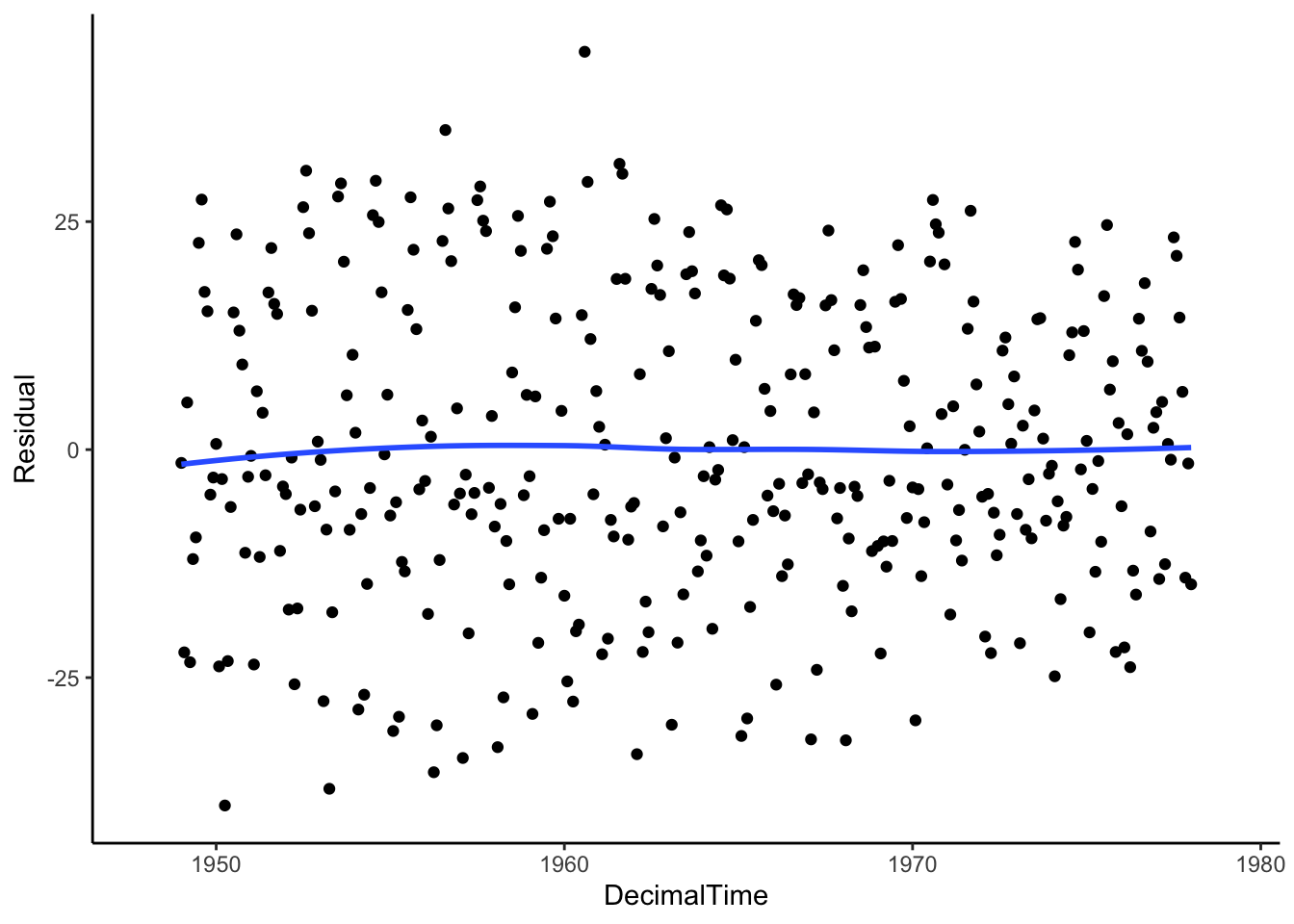
If we connect the points, we might see a cyclic pattern…
birthTS %>%
  ggplot(aes(x = DecimalTime, y = Residual)) +
  geom_line() +
  geom_smooth(se = FALSE) +
  theme_classic()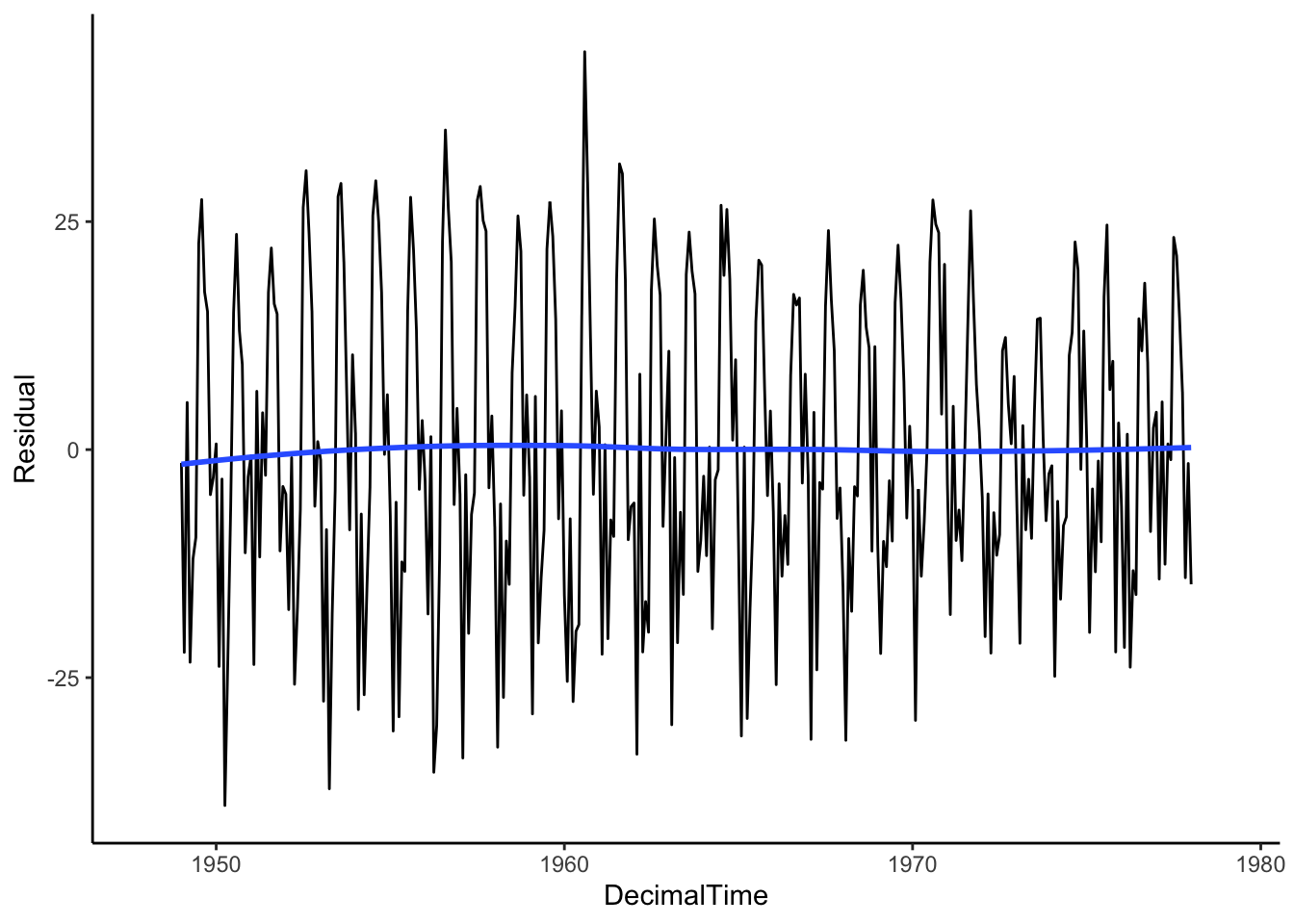
We still have to deal with seasonality (we’ll get there), but the moving average does a fairly good job at removing the trend because we see on average, the trend of the residuals is 0!
The moving average filter did a decent job of estimating the trend because of its flexibility, but we can’t write down a function statement for that trend. This is the downside of non-parametric methods.
4.1.2.3 Differencing to Remove Trend
If we don’t necessarily care about estimating the trend for prediction, we could use differencing to explicitly remove a trend.
We’ll talk about first and second order differences, which are applicable if we have a linear or quadratic trend.
Linear Trend - First Difference
If we have a linear trend such that \(Y_t = b_0 + b_1 t + \epsilon_t\), then taking the difference between neighboring outcomes (1 time unit apart) will essentially remove that trend.
Take the outcome at time \(t\) and an outcome that lags behind 1 time unit:
\[Y_t - Y_{t-1} = (b_0 + b_1 t + \epsilon_t) - (b_0 + b_1 (t-1) + \epsilon_{t-1})\] \[= b_0 + b_1 t + \epsilon_t - b_0 - b_1t + b_1 - \epsilon_{t-1}\] \[= b_1 + \epsilon_t - \epsilon_{t-1}\] which is constant with respect to time, \(t\).
See below for a simulated example.
t <- 1:36
y <- ts(2 + 5*t + rnorm(36,sd = 10), frequency=12)
plot(y)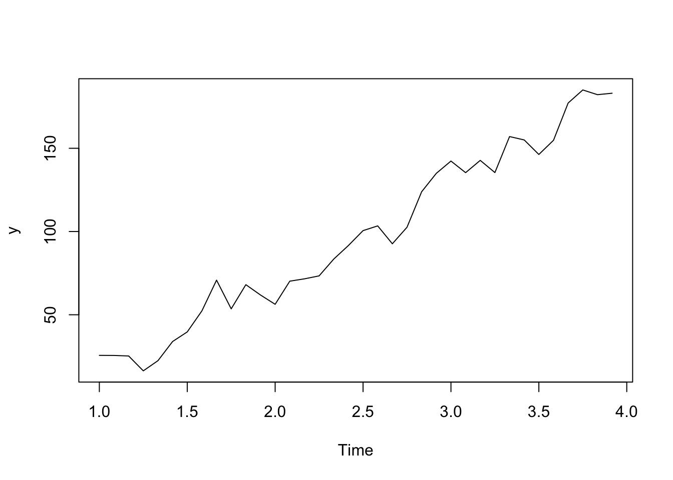
plot(diff(y, lag = 1, differences = 1))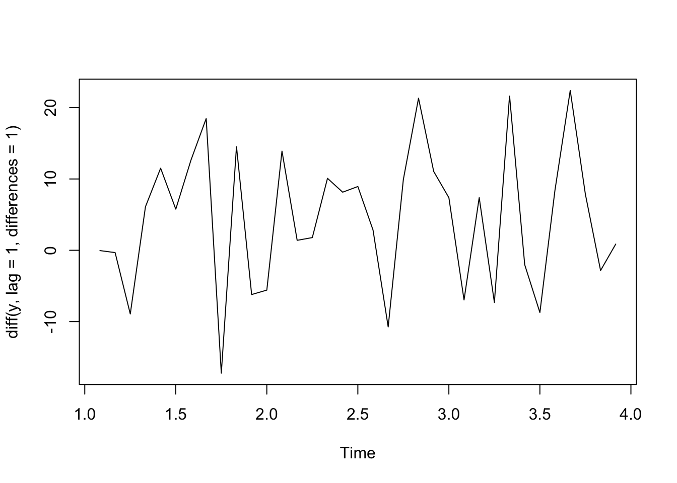
Quadratic Trend - Second Order Differences
If we have a quadratic relationship such that \(Y_t = b_0 + b_1 t+ b_2 t^2 + \epsilon_t\), then taking the second order difference between neighboring outcomes will remove that trend.
Take the outcome at time \(t\) and an outcome that lags behind 1 time unit (first difference): \[(Y_t - Y_{t-1}) = (b_0 + b_1 t+ b_2 t^2 + \epsilon_t) - (b_0 + b_1 (t-1)+ b_2 (t-1)^2 + \epsilon_{t-1})\] \[= b_0 + b_1 t + b_2 t^2 + \epsilon_t - b_0 - b_1 x_t + b_1 - b_2 t^2 + 2b_2t - b_2^2 - \epsilon_{t-1}\] \[= b_1- b_2^2 + 2b_2t + \epsilon_t - \epsilon_{t-1}\] and thus, the second order difference is the differences in the neighboring first differences:
\[(Y_t - Y_{t-1}) - (Y_{t-1} - Y_{t-2}) = (b_1- b_2^2 + 2b_2t + \epsilon_t - \epsilon_{t-1}) - (b_1- b_2^2 + 2b_2(t-1) + \epsilon_{t-1} - \epsilon_{t-2})\] \[= 2b_2 + \epsilon_t - 2\epsilon_{t-1} + \epsilon_{t-2}\] which is constant with respect to time, \(t\).
See below for an example of simulated data.
t <- 1:36
y <- ts(2 + 1.5*t + .3*t^2 + rnorm(36,sd = 10), frequency=12)
plot(y)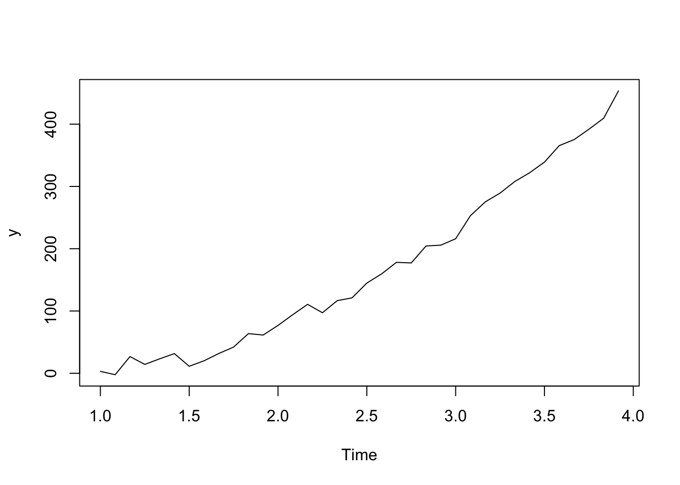
plot(diff(y, lag = 1, differences = 1)) #first difference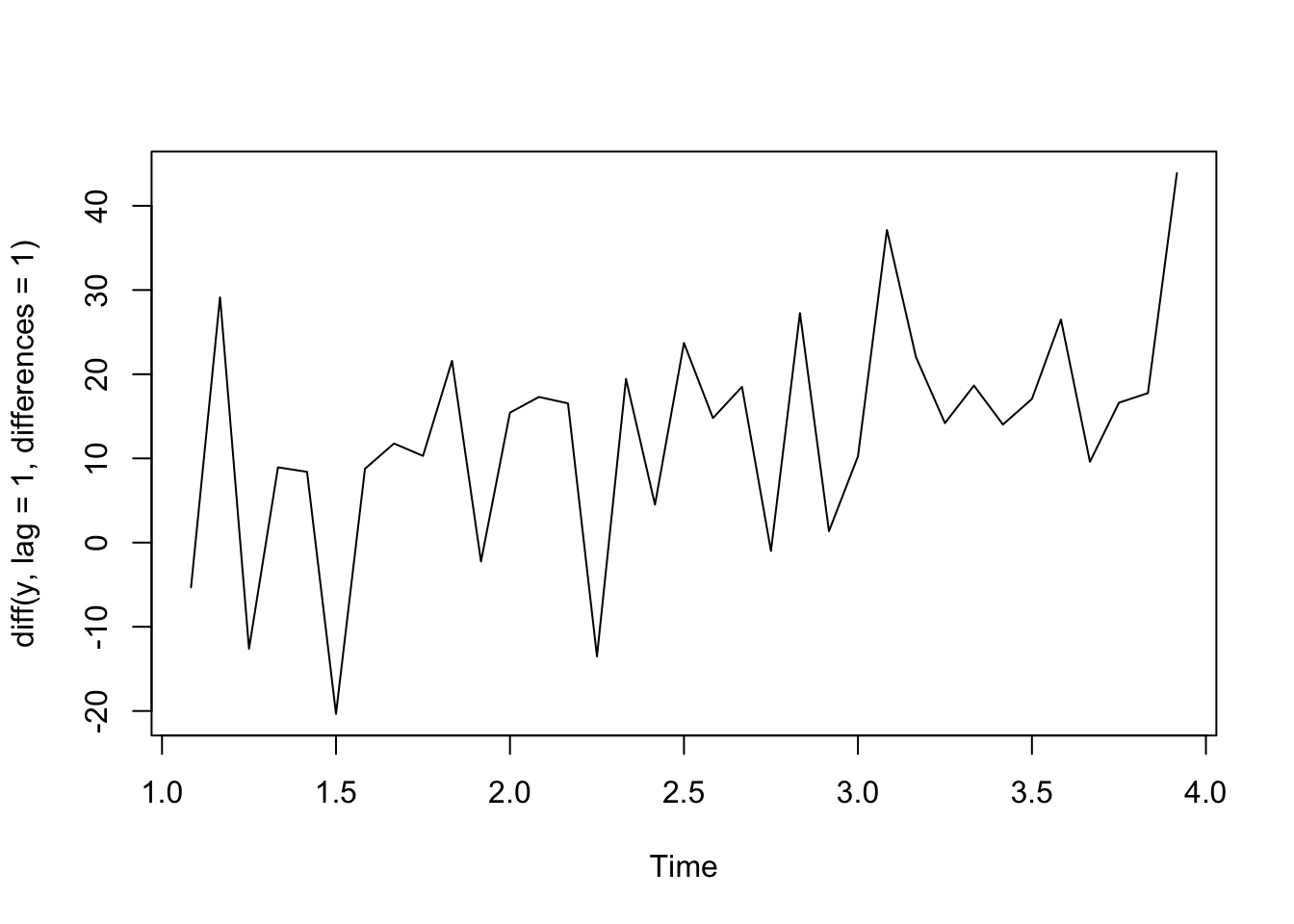
plot(diff(y, lag = 1, differences = 2)) #second order difference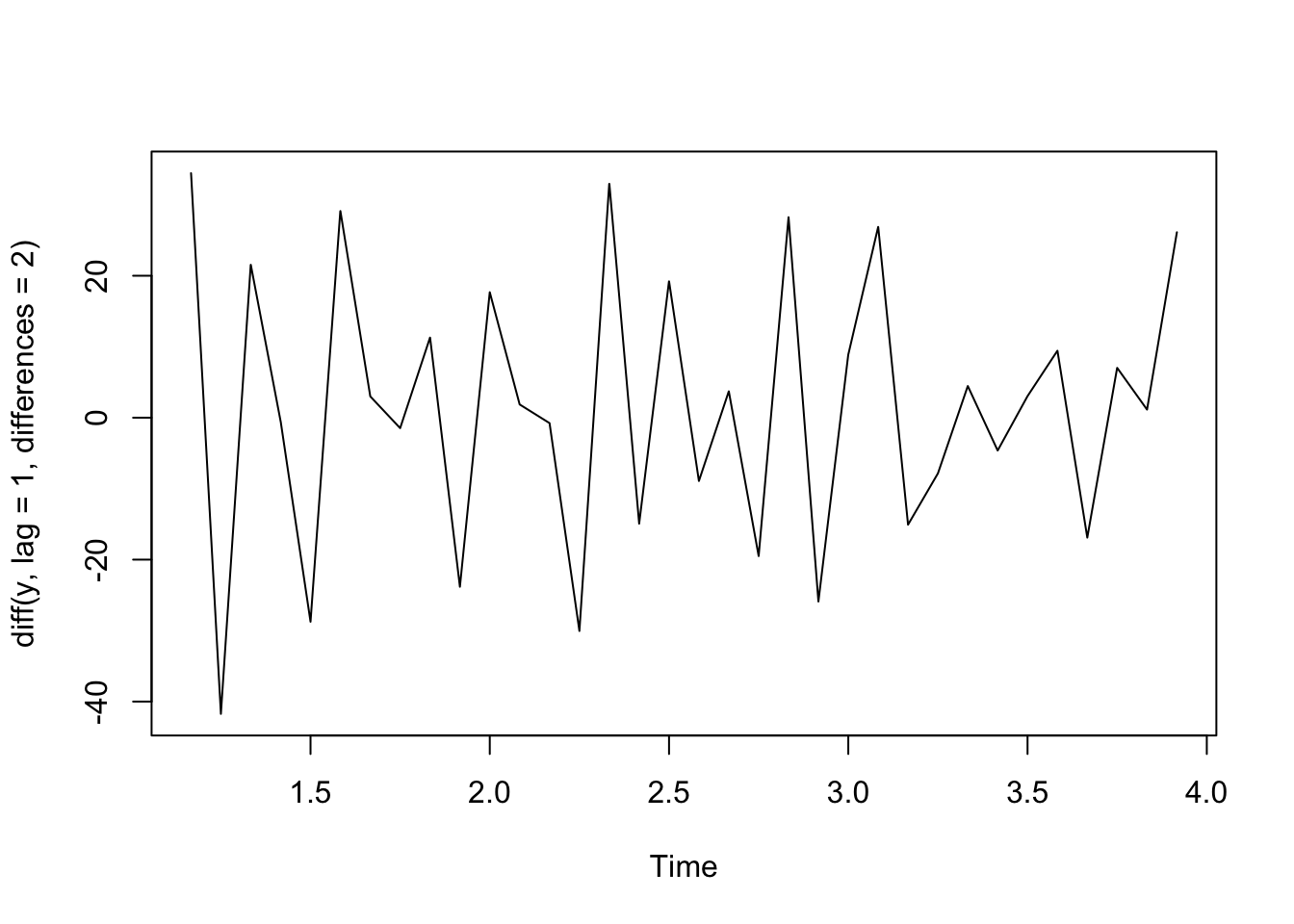
Let’s see what we get when we use differencing on the real birth count data. It looks like first differences resulted in a data with no overall trend despite the complex trend over time!
birthTS %>%
  mutate(Diff = c(NA, diff(Value, lag = 1, differences = 1))) %>%
  ggplot(aes(x = DecimalTime, y = Diff)) +
  geom_point() +
  geom_line() +
  geom_hline(yintercept = 0) +
  geom_smooth(se = FALSE) +
  theme_classic()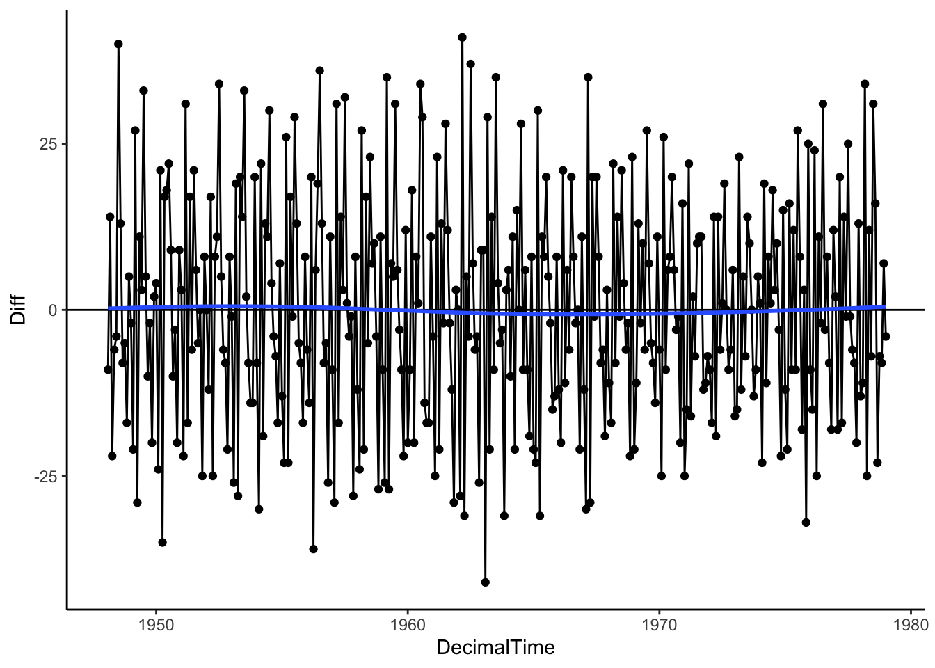
4.1.3 In Practice: Estimate vs. Remove
We have a few methods to estimate the trend,
- Parametric Regression: Global Transformations (polynomials)
- Parametric Regression: Spline basis
- Nonparametric: Local Regression
- Nonparametric: Moving Average Filter
Among the estimation methods, two are parametric in that we estimate slope parameters or coefficients (regression techniques) and two are nonparametric in that we do not have any parameters to estimate but rather focus on the whole function.
Things to consider when choosing an estimation method:
- How well does it approximate the true underlying trend? Does it systematically under or overestimate the trend for certain time periods or are the residuals on average zero across time?
- Do you want to use past trends to make a prediction in the future? If so, you may want to consider parametric approach.
We have two approaches to removing the trend,
- Estimate, then Residuals. Estimate the trend first, then subtract trend from observations to get residuals, \(y_t - \hat{f}(x_t)\).
- Difference. Skip the estimating and try first or second order differencing of neighboring observations.
Things to consider when choosing an approach for removing the trend:
- How well does it remove the underlying trend? Are the residuals (what is leftover) close to zero on average or are there still long-range patterns in the data?
- Do you want to report on the estimated trend? Then estimate first.
- If you main goal is prediction, try differencing.