data_by_dist <- read_rds("Enter the correct relative path to diverse_data_by_dist.rds")
data_by_year <- read_csv("Enter the correct relative path to diverse_data_by_year.csv")18 Interactive visualization
Settling In
Data Storytelling Moment
Learning goals
After this lesson, you should be able to:
- Evaluate when it would be useful to use an interactive visualization or an animation and when it might not be necessary
- Construct interactive visualizations and animations with
plotly - Build a Shiny app that enables user to adjust visualization choices and explore linked visualizations
Background: Interactivity
The goal of interactivity should be to allow users to explore data more quickly and/or more deeply than is possible with static data representations.
Pros and Cons
Pros
- Users can click, hover, zoom, and pan to get more detailed information
- Users can get quickly and deeply explore the data via linked data representations
- Allows guided exploration of results without needing to share data
. . .
Cons
- Takes longer to design
- Analyst might spend longer exploring an interactive visualization than a series of static visualizations
- Poor design could result in information overload
Common features of interactive visualizations
Common features of interactive visualizations include (reference):
- Changing data representation: providing options to change the type of plot displayed (e.g., allowing users to visualize temperature patterns over a month vs. over years)
- Focusing and getting details: mousing over part of a visualization to see an exact data value, zooming and panning
- Data transformation: e.g., changing color scale, switching to/from log scale
- Data selection and filtering: highlighting and brushing regions of a plot to focus the selected points; reordering and filtering data show in tables
- Finding corresponding information in multiple views: linked views that update dynamically based on interaction in another plot (often by zooming, panning, or selecting certain points)
Motivation / Inspiration
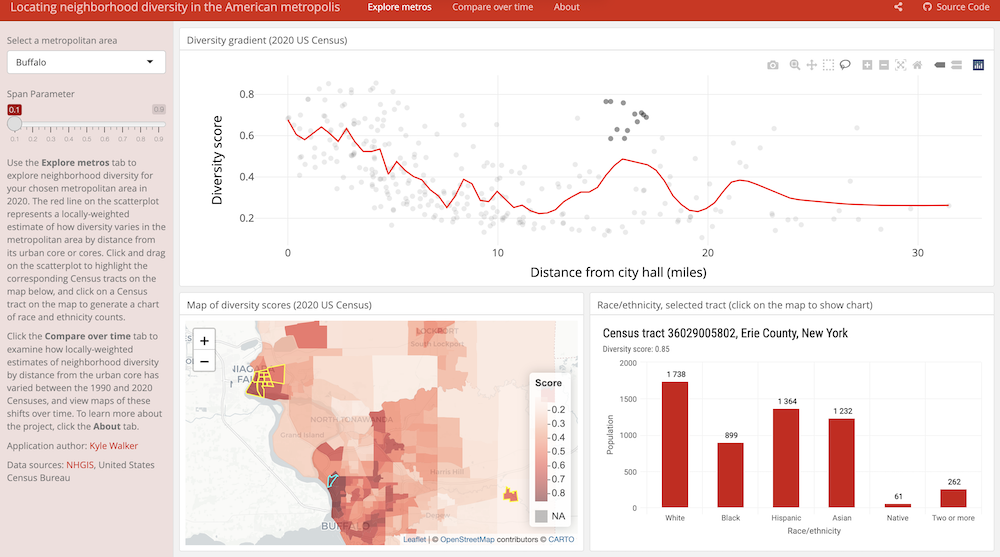
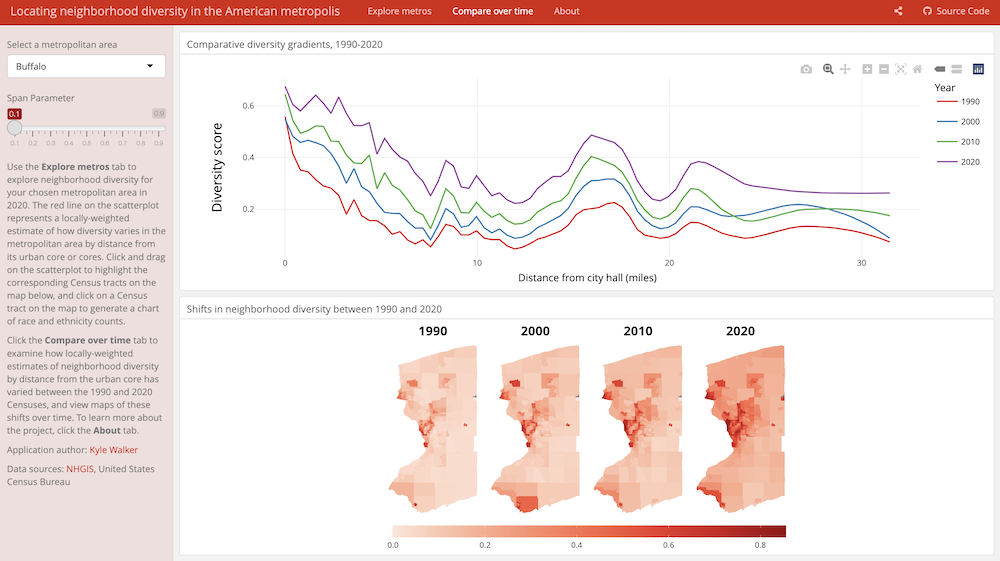
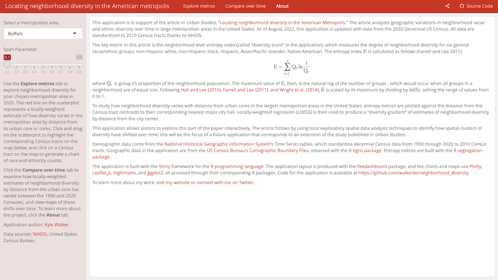
This interactive application made by Kyle Walker allows exploration of neighborhood diversity across time and space. It showcases major packages and features of interactive visualization.
Our goal is to recreate the core parts of this app from scratch!
App exploration
ONE person in each group should open the neighborhood diversity app and navigate around the app for the group. (We don’t want to overload the author’s Shiny server.)
Catalog the app’s layout and interactivity features. Make note of where user inputs are located and how different parts of the app respond to user input.
Evaluate the design of this app.
- Is the interactivity in this app needed? Does the interactivity actually help you gain more insight (and perhaps more quickly) than a series of static visualizations?
- What explorations/comparisons are you curious to explore that are not enabled well by the app?
In case the app doesn’t load, use the following screenshots:
Shiny
Shiny facilitates building interactive web applications using R code without needing extensive knowledge of web coding technologies (e.g., HTML, CSS, and Javascript).
Getting Started
The neighborhood diversity app was made with the Shiny toolkit available in the shiny R package.
Download and leave open the Shiny cheatsheet.
. . .
Let’s look at an example app together. RStudio will create a template app when you go to File > New File > Shiny Web App.
- Application name: Enter
neighborhood_diversity. - Application type: Use the default “Single file (app.R)”.
This creates a folder in your current directory called neighborhood_diversity with a single R code file called app.R.
. . .
Click the Run App button in the top right of the source code editor to view the app in action.
The app.R has three components:
- a user interface object (
ui): this sets up the layout of the app - a server function (
server): this defines how the app will react to user input - a call to the
shinyApp()function: this launches the app using the UI object (ui) and server function (server) created above
Setup and getting acquainted
Setup part 1: Load required packages at the top of app.R: shiny, tidyverse, sf, and plotly.
Setup part 2: Data download and folder setup
Save the two files, diverse_data_by_dist.rds and diverse_data_by_year.csv, with the folder setup below:
- 📂
YOUR_CLASS_FOLDER- 📂
interactive_viz- 📂
neighborhood_diversityapp.R- 📂
datadiverse_data_by_dist.rdsdiverse_data_by_year.csv
- 📂
- 📂
Setup part 3: Below your library() calls, add the following commands to read in the data:
Getting acquainted with the app and underlying code: Take a few minutes to explore the code:
- In the
uisection: how are functions nested inside each other, and how does this seem to relate to the visual appearance of the app? - What names/labels in the User Interface (
ui) part of the app seem to be shared with theserverpart of the app?
Data Codebook
The data_by_dist dataset is an sf object (cases = census tracts) with the following variables:
metro_id: numeric ID for the citymetro_name: city namegeometry: information about the spatial geometry for the tracttract_id: numeric census tract IDdistmiles: distance in miles from this tract to city hallentropy: a measure of the diversity of a census tract (a diversity “score”)- Race variables (each of these is the number of people)
aian: American Indianasianblackhispanictwo_or_morewhite
The data_by_year dataset has a subset of the above variables as well as a year variable.
*Input() functions
What do these do? The *Input() functions collect inputs from the user.
. . .
Where are these functions on the cheatsheet? Right-hand side of the first page
. . .
Where do these go in the app?
- All
*Input()functions go in theuipart of the app. - Pay careful attention to the nesting of the functions in the
uisection. For example, in asidebarLayout(), these*Input()functions should go in thesidebarPanel()(as opposed to themainPanel()). - Separate multiple
*Input()functions with commas.
. . .
How do the function arguments work? In all the *Input() functions, the first two arguments are the same:
inputIdis how you will refer to this input in theserverportion later. You can call this anything you want, but make this ID describe the information that the user is providing.labelis how this will actually be labeled in your UI (what text shows up in the app).
Each function has some additional arguments depending what you want to do.
Your Turn
Add the following two user inputs to your app:
- Dropdown to select the city name
- Slider to choose the span parameter for the scatterplot smooth
- This parameter varies from 0 to 1. Lower values result in a wiggly smoothing line, and higher values result in a smoother line.
Use the Shiny cheatsheet to find the *Input() functions that correspond to the two inputs above. Add them to the appropriate place within the ui object. Use commas to separate the inputs.
Parentheses Pandemonium
Carefully formatting your code will be crucial here! With shiny UIs, it is very easy to lose or mismatch parentheses, which leads to frustrating errors. My suggestion is to place parentheses as follow:
sliderInput(
    argument1 = value1,
    argument2 = value2,
    argument3 = value3
)
Note how the left parenthesis is on the same line as the function, and the right parenthesis is on its own line and left-aligned with the start of the function name.
Helpful tip: In RStudio, you can place your cursor next to any parenthesis to highlight the matching parenthesis (if there is one).
You will have to look at the documentation for the *Input() functions to know how to use arguments beyond inputId and label. To view this documentation, type ?function_name in the Console.
To get the collection of city names from the data_by_dist dataset, you can use the following:
metro_names <- data_by_dist %>% pull(metro_name) %>% unique()Put this metro_names code just beneath where you read in the data.
Once you finish, run your app. Make sure you can select and move things around as expected. You won’t see any plots yet—we’ll work on those in the next exercises.
*Output() functions
What do these do? *Output() functions in the ui portion work with the render*() functions in the server portion to to add R output (like plots and tables) to the UI.
. . .
Where are these functions on the cheatsheet? Bottom-center of the first page
. . .
Where do these go in the app?
- All
*Output()functions go in theuipart of the app. - Pay careful attention to the nesting of the functions in the
uisection. For example, in asidebarLayout(), these*Output()functions should go in themainPanel()(as opposed to thesidebarPanel()). - Separate multiple
*Output()functions with commas.
. . .
How do the function arguments work? In all the *Output() functions, the first argument is the same:
outputIdworks just likeinputIdfor*Input()functions. This is how you will refer to this output in theserverportion later. You can call this anything you want, but make this ID describe the output being created.
Your Turn
Add 3 outputs to the ui that will eventually be:
- A scatterplot of diversity score (
entropy) versus distance to city hall (distmiles) with a smoothing line (smoothness controlled by the span parameter on your slider input) - A map of diversity scores across the counties in the selected city
- A bar chart of the overall race distribution in the selected city (i.e., the total number of people in each race category in the city)
For now, don’t worry that the layout of the plots exactly matches the original neighborhood diversity app. (You will update this in your homework.)
Run the app with the output. Notice that nothing really changes. Think of the outputs you just placed as placeholders—the app knows there will be a plot in the UI, but the details of what the plots will look like and the R code to create them will be in the server portion. Let’s talk about that now!
render*() functions
What do these do? The render*() functions use R code (i.e., standard ggplot code) to communicate with (“listen to”) the user inputs to create the desired output.
. . .
Where are these functions on the cheatsheet? Bottom-center of the first page. The render*() function you use will depend on the desired output. The bottom center of the cheatsheet shows how *Output() and render*() functions connect.
. . .
Where do these go in the app? The render*() functions go in the server function of the app.
. . .
In general, the server section of code will look something like this:
# Suppose the following are somewhere in the UI part
numericInput(inputId = "min_year")
numericInput(inputId = "max_year")
plotOutput(outputId = "plot_over_years")

server <- function(input, output) {
    output$plot_over_years <- renderPlot({ # Note the curly braces that enclose the R code below
        ggplot(...) +
            scale_x_continuous(limits = c(input$min_year, input$max_year))
    })
}
Your Turn
While our main goals is to make 3 plots, you will just make one of them in this exercise.
Add a renderPlot() functions inside the server portion of the code to make the scatterplot of diversity score (entropy) versus distance to city hall (distmiles) with a smoothing line. Use the data_by_dist dataset. Reference the inputs you’ve already created in previous exercises by using filter() and ggplot() to render the desired interactive plot.
Note: the geom_??? used to create the smoothing line has a span parameter. (Check out the documentation for that geom by entering ?geom_??? in the Console.)
Run the app and check that the scatterplot displays and reacts to the chosen city and span parameter.
As part of Homework 9, you will finish this Shiny app.
#plotly package {.unnumbered .smaller}
The plotly package provides tools for creating interactive web graphics and is a nice complement to Shiny.
Getting Started
library(plotly)A wonderful feature of plotly is that an interactive graphic can be constructed by taking a regular ggplot graph and putting it inside the ggplotly() function:
data(babynames, package = "babynames")
bnames <- babynames %>% filter(name %in% c("Brianna", "Briana", "Breanna"))

p <- ggplot(bnames, aes(x = year, y = prop, color = sex, linetype = name)) +
    geom_line() +
    theme_classic() +
    labs(x = "Year", y = "Proportion of names", color = "Gender", linetype = "Name")

ggplotly(p)
The plotly package can also create animations by incorporating frame and ids aesthetics.
frame = year: This makes the frame of the animation correspond to year–so the animation shows changes across time (years).ids = country: This ensures smooth transitions between objects with the sameid(which helps facilitate object constancy throughout the animation). Here, each point is a country, so this makes the animation transition smoothly from year to year for a given country. (For more information, see here.)
data(gapminder, package = "gapminder")
p <- ggplot(gapminder, aes(x = gdpPercap, y = lifeExp, color = continent, size = pop)) +
    geom_point(aes(frame = year, ids = country)) +
    scale_x_log10() +
    labs(x = "GDP per capita", y = "Life expectancy (years)", color = "Continent", size = "Population") +
    theme_classic()
ggplotly(p)
Your Turn
In a web application, having plots be plotly objects is just nice by default because of the great mouseover, zoom, and pan features.
Inside app.R, change plotOutput to plotlyOutput and renderPlot to renderPlotly for the scatterplot and the barplot. Make sure to add calls to ggplotly() too.
As part of Homework 9, you will incorporate advanced plotly into the Shiny App.
Publishing Shiny apps
To share your work publically, you’ll need to publish your Shiny app.
Shinyapps.io
The steps below take you through publishing via shinyapps.io.
The first step is to install and load the rsconnect library.
You will be able to share your app with any individual with internet access unless you make it password-protected.
- Register for an account at https://www.shinyapps.io/admin/#/signup.
- Once you are logged in to shinyapps.io, go to Account –> Tokens and click the Show button.
- Copy and paste the code into the Console in R. This will connect your account to RStudio.
- When you create an app, save it as
app.Rin a folder. It MUST be namedapp.R. In theapp.Rfile, load all packages you use in your code. Try not to load extra packages—this can make publishing take longer and slow down the app for users. Any data that your app uses needs to be read in within the app. If the data are local to your computer, you need to have the data in the same folder as the app. - Run the app. In the upper right-hand corner, there is an option to publish the app. Click on that. It will take a bit of time to do it the first time. Once published, you can go to the app via the webpage provided.
The instructions are set out in more detail here.
Resources
- Creating dashboard layouts
- The
shinydashboardpackage provides a nice way to style your app like a dashboard. - The
flexdashboardpackage provides alternate syntax within an RMarkdown context to creating dashboards.flexdashboardtutorial.
- The
- Theory of dashboard design: principles for building useful dashboards
- Dig deeper with
shinyandplotly- Curated set of Shiny resources
- Getting started with Shiny: A set of tutorials for learning more about interactivity
- Online book about
plotly
- Examples of Shiny apps to inspire your own
After Class
- Take a look at the Schedule page to see how to prepare for the next class
- Work on Homework 9.