3.8 Conditions for Linear Regression Models
We have talked about ways to measure if the model is a good fit to the data. But we should also back up and talk about whether it even makes sense to fit a linear model. In order for a linear regression model to make sense,
- Relationships between each pair of quantitative \(X\)’s and \(Y\) are straight enough (check scatterplots and residual plot)
- There is about equal spread of residuals across fitted values (check residual plot)
- There are no extreme outliers (points with extreme values in \(X\)’s can have leverage to change the line)
3.8.1 Residual Plot
To check the first two conditions, we look at the original scatterplot as well as a plot of the residuals against fitted or predicted values,
augment(lm.gpa, data = sat) %>%
    ggplot(aes(x = .fitted, y = .resid)) +
    geom_point() +
    geom_smooth(se = FALSE) +
    geom_hline(yintercept = 0) +
    labs(x = "Fitted values (predicted values)", y = "Residuals") +
    theme_classic()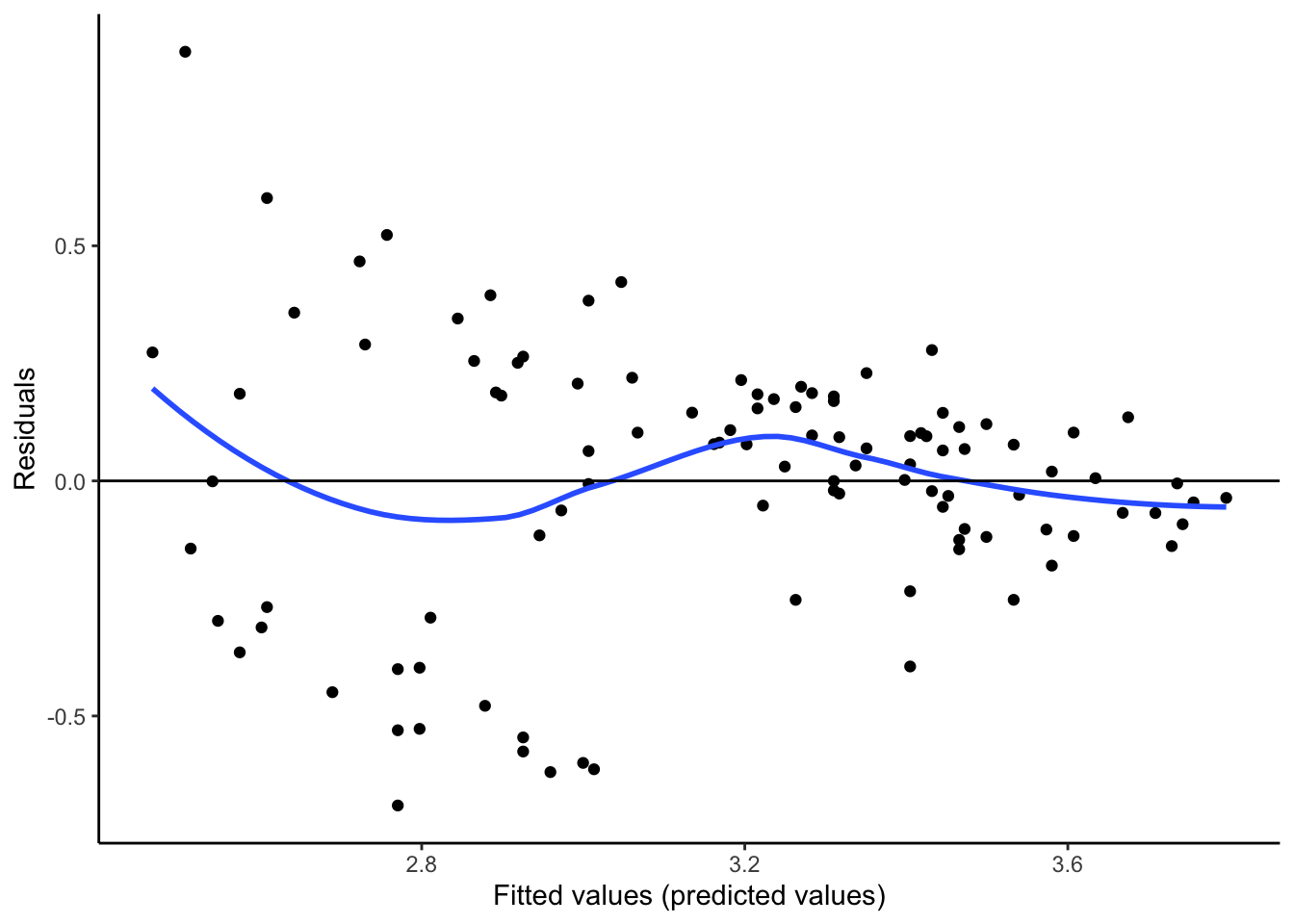
What do you think?
- Is there any pattern in the residuals? (Is the original scatterplot straight enough?)
- Is there equal spread in residuals across prediction values?
Studying the residuals can highlight subtle non-linear patterns and thickening in the original scatterplot. Think the residual plot as a magnifying glass that helps you see these patterns.
If there is a pattern in the residuals, then we are systematically over or underpredicting our outcomes. What if we are systematically overpredicting the outcome for a group? What if we are systematically underpredicting the outcome for a different group? Consider a model for predicting home values for Zillow or consider an admissions model predicting college GPA. What are the real human consequences if there is a pattern in the residuals?
3.8.2 Sensitivity Analysis
Additionally, we want to avoid extreme outliers because points that are both far from the mean of \(X\) and do not fit the overall relationship have leverage or the ability to change the line. We can fit the model with and without the outliers to see how sensitive the model is to those points (this is called sensitivity analysis).
See the example below. See how the relationship changes with the addition of one point, one extreme outlier.
dat %>%
  ggplot(aes(x = x,y = y)) +
  geom_point() +
  geom_smooth(method='lm', se = FALSE) +
theme_classic() 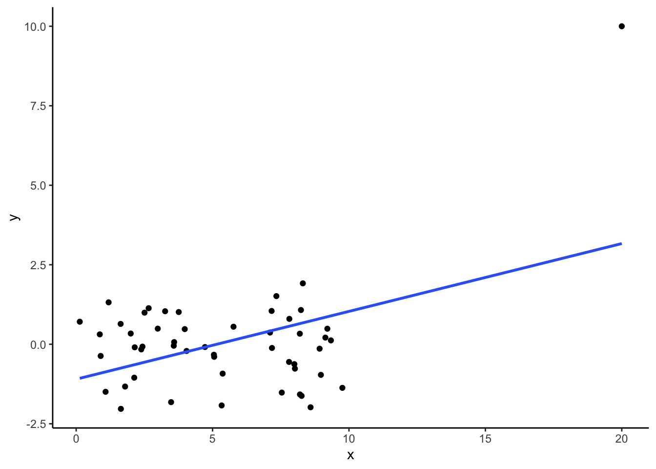
dat %>%
  filter(x < 15 & y < 5) %>% #filter out outliers
  ggplot(aes(x,y)) +
  geom_point() +
  geom_smooth(method='lm', se = FALSE) +
theme_classic() 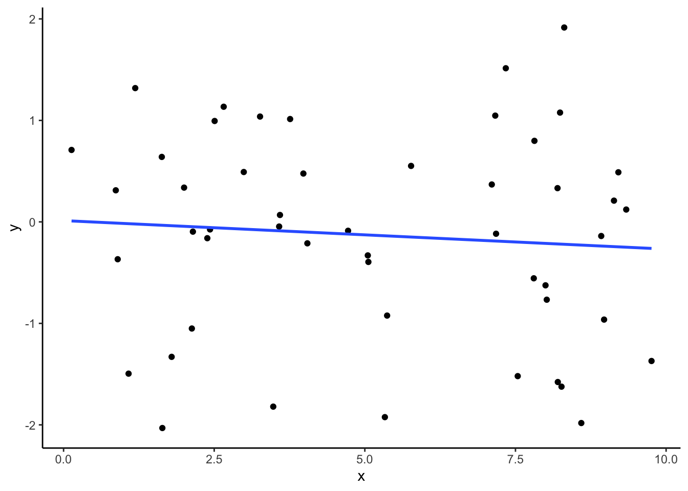
Check out this interactive visualization to get a feel for outlier points and their potential leverage: http://omaymas.github.io/InfluenceAnalysis/
3.8.3 Issues and Solutions
If the observed data do not satisfy the conditions above, what can we do? Should we give up using a statistical model? No, not necessarily!
- Issue: Both variables are NOT Quantitative
- If your x-variable is categorical, we’ll turn it into a quantitative variable using indicator variables (coming up)
- If you have a binary variable (exactly 2 categories) that you want to predict as your y variable, we’ll use logistic regression models (coming up)
- Issue: Relationship is NOT Straight Enough
- We can try to use the Solutions for Curvature.
- Problem: Spread is NOT the same throughout
- You may be able to transform the y-variable using mathematical functions (\(log(y)\), \(y^2\), etc.) to make the spread more consistent (one approach is to use Box-Cox Transformation – take more statistics classes to learn more)
- Be careful in interpreting the standard deviation of the residuals; be aware of the units. (For example, if you take a log transformation of the outcome, the units of the standard deviation of the residuals will be on the log scale.)
- Problem: You have extreme outliers
- Look into the outliers. Determine if they could be due to human error or explain their unusual nature using the context. Think carefully about them, dig deep.
- Do a sensitivity analysis: Fit a model with and without the outlier and see if your conclusions drastically change (see if those points had leverage to change the model).
3.8.4 Solutions for Curvature
If we notice a curved relationship between two quantitative variables, it doesn’t make sense to use a straight line to approximate the relationship.
What can we do?
3.8.4.0.1 Transform Variables
One solution to deal with curved relationships is to transform the predictor (\(X\)) variables or transform the outcome variable (\(Y\)).
Guideline #1: If there is unequal spread around the curved relationship, focus first on transforming \(Y\). If the spread is roughly the same around the curved relationship, focus on transforming \(X\).
When we say transform a variable, we are referring to taking the values of a variable and plugging them into a mathematical function such as \(\sqrt{x}\), \(\log(x)\) (which represents natural log, not log base 10), \(x^2\), \(1/x\), etc.
Guideline #2: To choose the mathematical function, we focus on power functions and organize them in a Ladder of Powers of \(y\) (or \(x\)):
\[\begin{align} \vdots\\ y^3\\ y^2\\ \mathbf{y = y^1}\\ \sqrt{y}\\ y^{1/3}\\ y^{0} ~~~ (\hbox{we~use}~\log(y)~\hbox{here; natural log with base e)}\\ y^{-1/3}\\ 1/\sqrt{y}\\ 1/y\\ 1/y^2\\ \vdots \end{align}\]
To choose a transformation, we start at \(y\) (power = 1) and think about going up or down the ladder.
But which way?
Our friend J.W. Tukey (the same guy who invented the boxplot) came up with an approach to help us decide. You must ask yourself: Which part of the circle does the scatterplot most resemble (in terms of concavity and direction)? Which quadrant?
Common misunderstanding: When using the circle above to help you decide to go up or down the ladder of power, you are comparing the direction and concavity of your scatterplot to the direction and concavity of the circle in the four quadrants. You are NOT looking at the sign of the observed values of x and y.
Guideline #3: The sign of \(x\) and \(y\) in the chosen quadrant tells you the direction to move on the ladder (positive = up, negative = down).
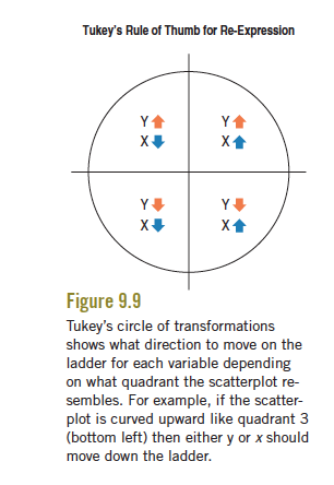
Practice: Which quadrant of the circle does this relationship below resemble?
require(gapminder)

gapminder %>%
  filter(year > 2005) %>%
  ggplot(aes(y = lifeExp, x =  gdpPercap)) +
  geom_point() +
  theme_classic()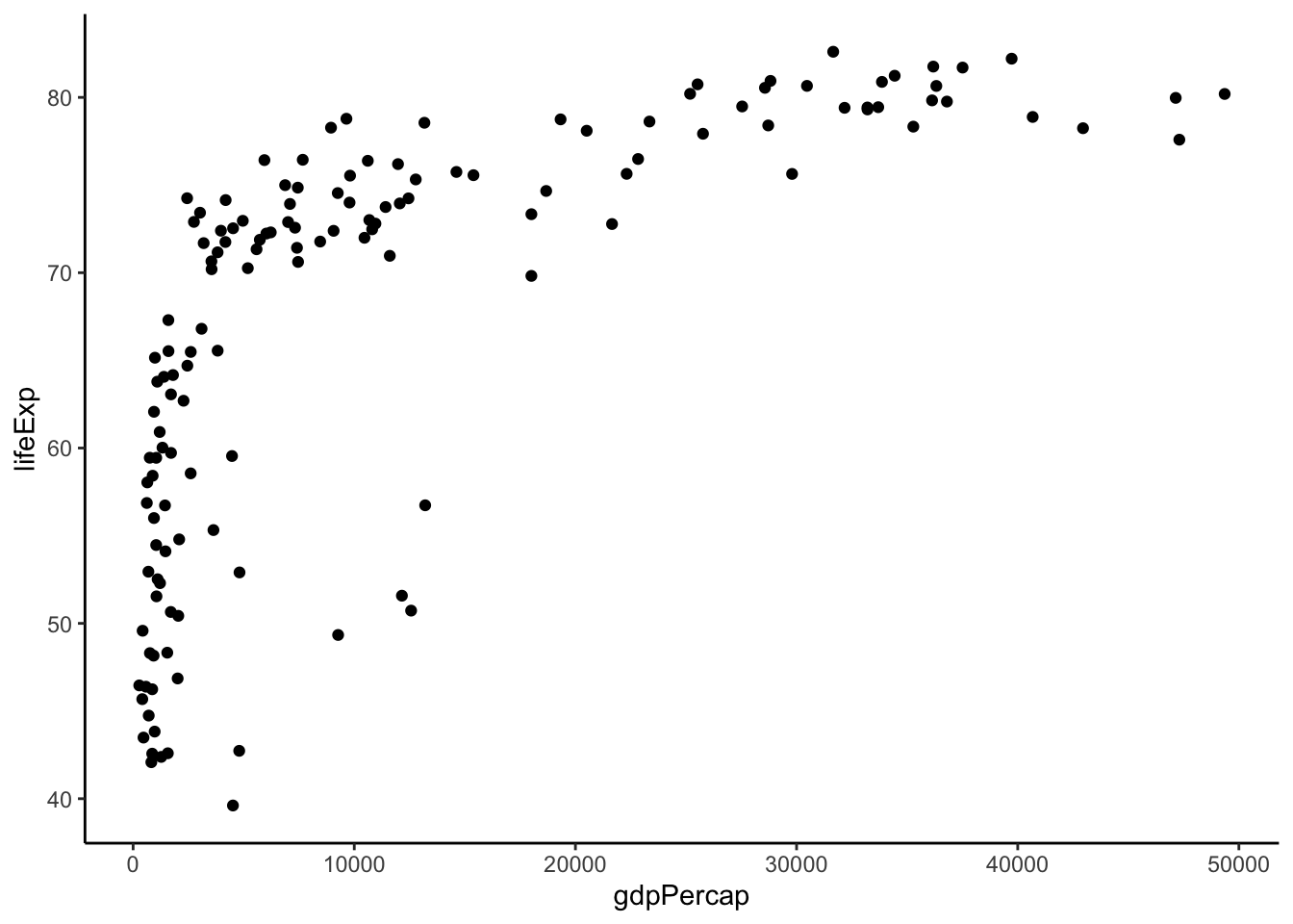
Based on this plot, we see that the spread is roughly equal around the curved relationship (-> focus on transforming \(X\)) and that it is concave down and positive (quadrant 2: top left). This suggests that we focus on going down the ladder with \(X\).
Try these transformations until you find a relationship that is roughly straight. If you go too far, the relationship will become more curved again.
Let’s try going down the ladder.
gapminder %>%
  filter(year > 2005) %>%
  mutate(TgdpPercap = sqrt(gdpPercap)) %>% #power = 1/2
  ggplot(aes(y = lifeExp, x =  TgdpPercap)) +
  geom_point() +
  theme_classic()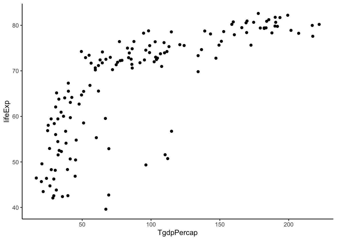
Not quite straight. Let’s keep going.
gapminder %>%
  filter(year > 2005) %>%
  mutate(TgdpPercap = gdpPercap^(1/3)) %>% #power = 1/3
  ggplot(aes(y = lifeExp, x =  TgdpPercap)) +
  geom_point() +
  theme_classic()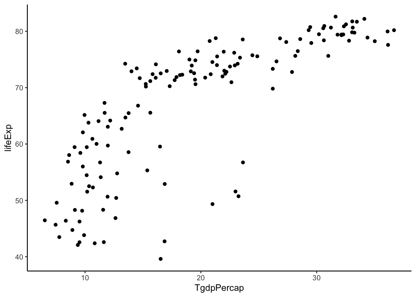
Not quite straight. Let’s keep going.
gapminder %>%
  filter(year > 2005) %>%
  mutate(TgdpPercap = log(gdpPercap)) %>% #power = 0
  ggplot(aes(y = lifeExp, x =  TgdpPercap)) +
  geom_point() +
  theme_classic()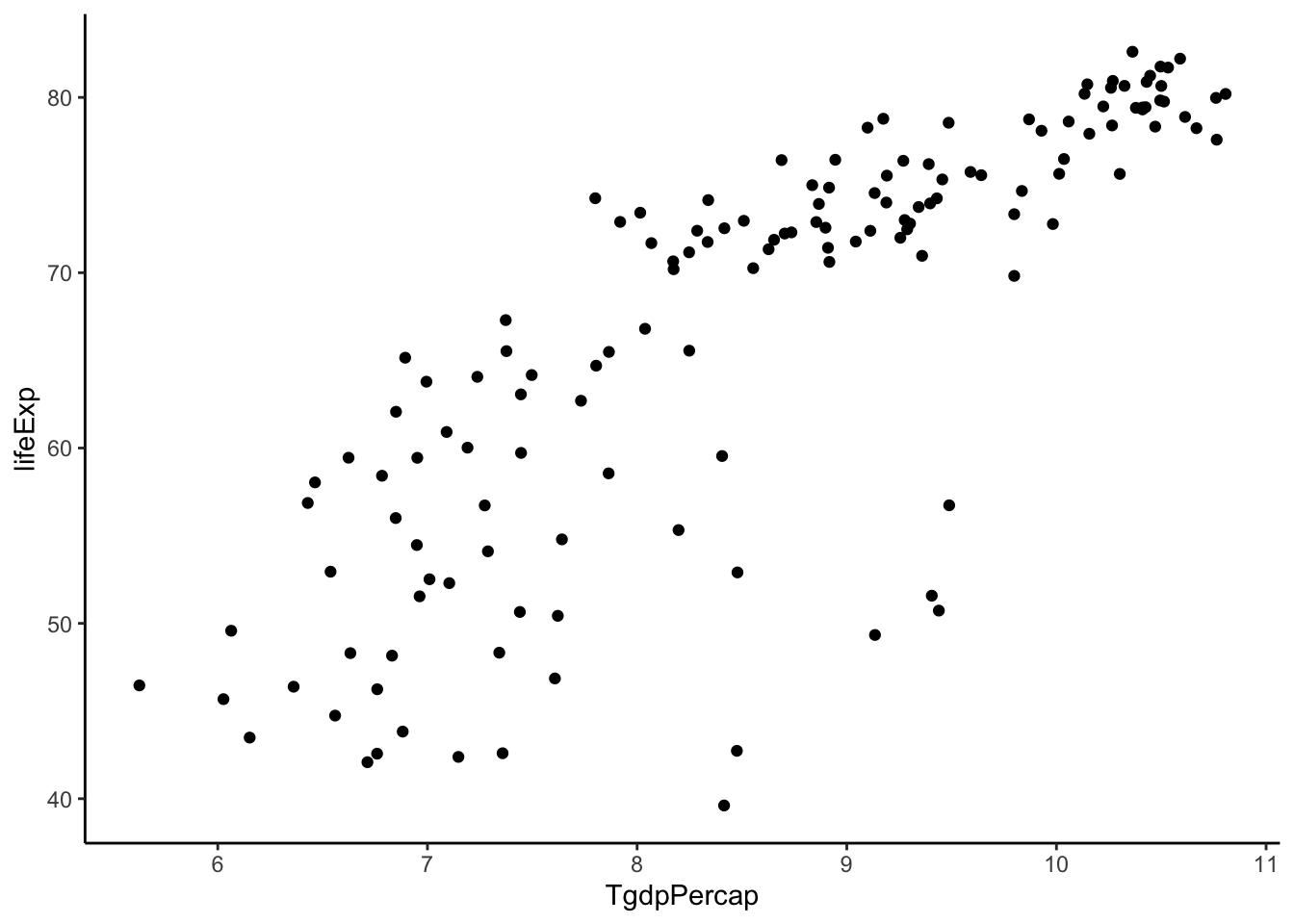
Getting better. Let’s try to keep going.
#power = -1 (added a negative sign to maintain positive relationship)
gapminder %>%
  filter(year > 2005) %>%
  mutate(TgdpPercap = -1/gdpPercap) %>%
  ggplot(aes(y = lifeExp, x =  TgdpPercap)) +
  geom_point() +
  theme_classic()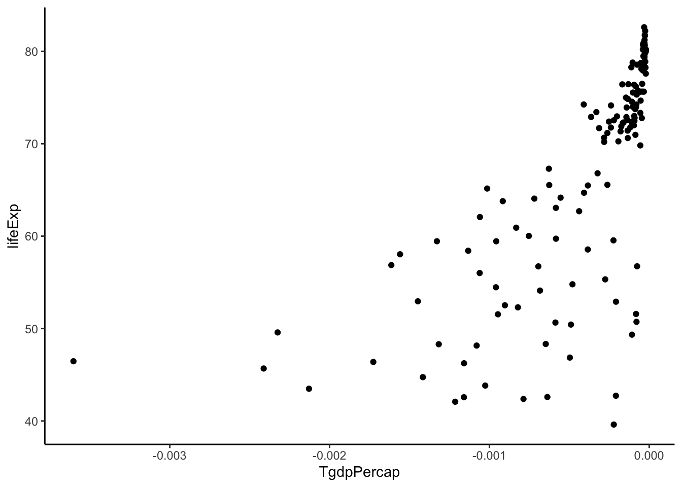
TOO FAR! Back up. Let’s stick with log(gdpPercap).
Now we see some unequal spread so let’s also try transforming \(Y\).
gapminder %>%
  filter(year > 2005) %>%
  mutate(TgdpPercap = log(gdpPercap)) %>%
  mutate(TlifeExp = lifeExp^2) %>%
  ggplot(aes(y = TlifeExp, x =  TgdpPercap)) +
  geom_point() +
  theme_classic()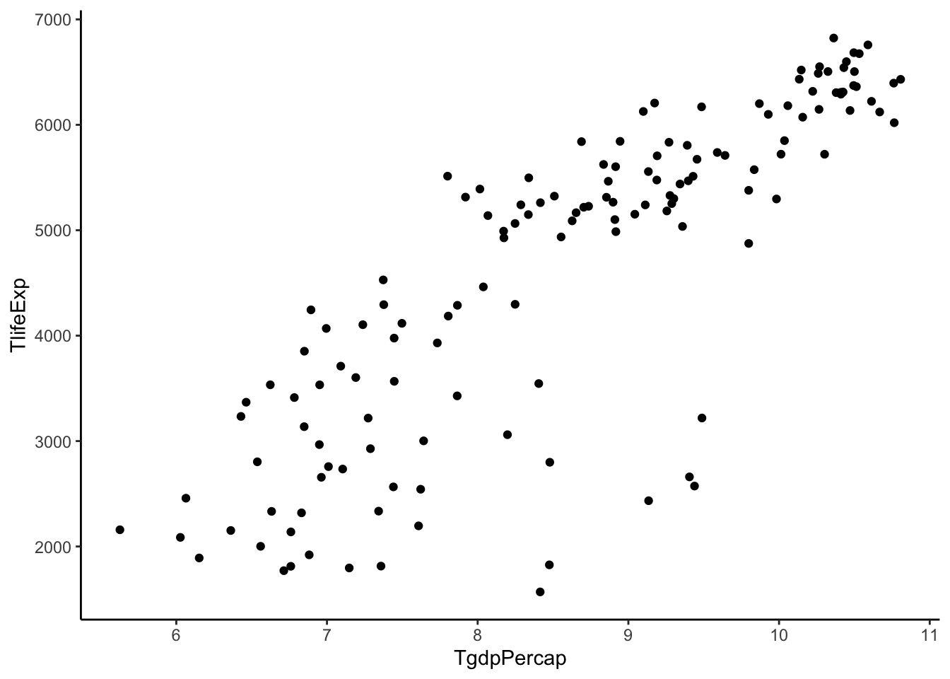
That doesn’t change it much. Maybe this is as good as we are going to get.
Transformations can’t make relationships look exactly linear with equal spread, but sometimes we can make it closer to that ideal.
Let’s try and fit a model with these two variables.
lm.gap <- gapminder %>%
  filter(year > 2005) %>%
  mutate(TgdpPercap = log(gdpPercap)) %>%
  with(lm(lifeExp ~ TgdpPercap))

lm.gap %>%
  tidy()
## # A tibble: 2 x 5
## term estimate std.error statistic p.value
## <chr> <dbl> <dbl> <dbl> <dbl>
## 1 (Intercept) 4.95 3.86 1.28 2.02e- 1
## 2 TgdpPercap 7.20 0.442 16.3 4.12e-34Interpretations
What does the estimated slope of this model, \(\hat{\beta}_1 = 7.2028\), mean in this data context? Let’s write out the model.
\[E[\hbox{Life Expectancy} | \hbox{GDP} ] = \beta_0 + \beta_1 log(\hbox{GDP})\]
The slope, \(\beta_1\) is the the additive increase in the expected \(\hbox{Life Expectancy}\) when \(log(\hbox{GDP})\) increases by 1 unit to \(log(\hbox{GDP}) + 1\).
Let’s think about \(log(\hbox{GDP}) + 1\). Using some rules of logarithms:
\[log(\hbox{GDP}) + 1 = log(\hbox{GDP}) + log(e^1) = log(e*\hbox{GDP}) = log(2.71*\hbox{GDP})\] So adding 1 to \(log(\hbox{GDP})\) is equivalent to multiplying GDP by \(e=2.71\).
In our model, we note that if a country’s income measured by GDP increased by a multiplicative factor of 2.71, the estimated expected life expectancy of a country increases by about 7.2 years.
For the sake of illustration, imagine we fit a model where we had transformed life expectancy with a log transformation. What would the slope, \(\beta_1\), mean in this context?
\[E[log(\hbox{Life Expectancy}) | \hbox{GDP} ] = \beta_0 + \beta_1 \hbox{GDP}\]
The slope is the the additive increase in \(E[log(\hbox{Life Expectancy}) | \hbox{GDP} ]\) when \(\hbox{GDP}\) increases to \(\hbox{GDP} + 1\).
Let’s think about the expected \(log(\hbox{Life Expectancy})\) changing by \(\beta_1\). Using rules of logarithms, the expected value changes: \[log(\hbox{Life Expectancy}) + \beta_1 = log(\hbox{Life Expectancy}) + log(e^{\beta_1}) = log(\hbox{Life Expectancy} * e^{\beta_1}) \] The additive increase of \(\beta_1\) units in the expected value of \(log(\hbox{Life Expectancy})\) is equivalent to a multiplicative increase of \(\hbox{Life Expectancy}\) by a factor of \(e^{\beta_1}\).
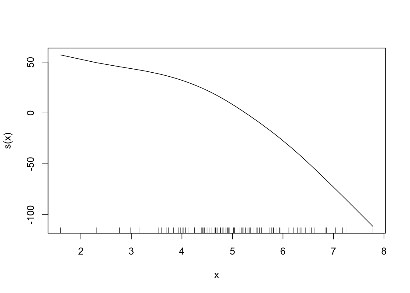
3.8.4.0.2 Alternative Solutions
We could also model curved relationships by including higher power terms in a multiple linear regression model like the example below. By using poly() (short for polynomial), we now include \(X\) and \(X^2\) as variables in the model.
x <- rnorm(100, 5, 1)
y <- 200 + 20*x - 5*x^2 + rnorm(100,sd = 10)
dat <- data.frame(x,y)

dat %>%
    ggplot(aes(x = x, y = y)) +
    geom_point() +
    geom_smooth(se = FALSE) +
    theme_classic()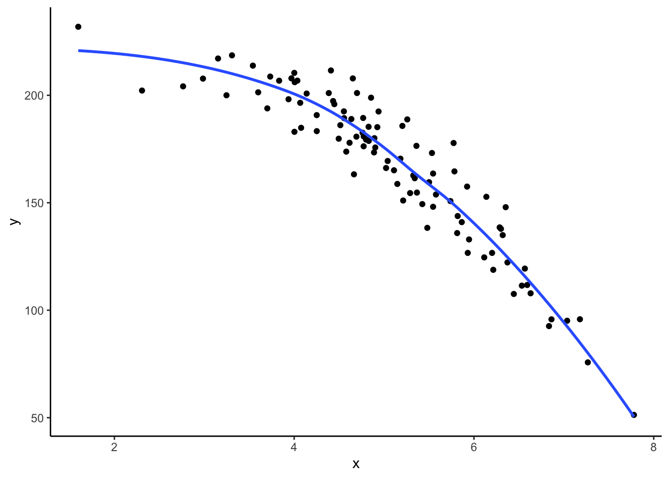
##
## Call:
## lm(formula = y ~ poly(x, degree = 2, raw = TRUE))
##
## Coefficients:
##                      (Intercept)  poly(x, degree = 2, raw = TRUE)1
##                          190.588                            23.728
## poly(x, degree = 2, raw = TRUE)2
##                           -5.347
A more advanced solution (which is not going to be covered in class) is a generalized additive model (GAM), which allows you to specify which variables have non-linear relationships with \(Y\) and estimates that relationship for you using spline functions (super cool stuff!). We won’t talk about how this model is fit or how to interpret the output, but there are other cool solutions out there that you can learn about in future Statistics classes!