# Load the tidyverse package
# We'll need this to plot and summarize the data!
library(tidyverse)

# Read in the Dear Abby data
abby <- read_csv("https://mac-stat.github.io/data/dear_abby.csv")2 Univariate visualization and summaries
Settling In
- Per class policy, put away cell phones and clear your laptop of everything except RStudio and the online course manual. Why? It’s better for your learning, for the learning of those around you, building community, etc
- Sit in groups of 3-4. Your group should include:
- people that you DON’T know.
- at least 1 person who has used RStudio before this semester
- Meet each other!
- Share your names, pronouns, major / minor.
- Check in with each other as human beings. Life in the Twin Cities is hard right now.
- Discuss what classes you’re taking.
- Help each other get ready to take notes!
- Open your notebook. Take notes.
- We’ll do a brief recap; this is an opportunity to clarify basic concepts and answer questions that you had from the videos.
- Open the online manual to the “Course Schedule” and click on today’s activity. That brings you here!
- Download “02-univariate-notes.qmd” and open it in RStudio. Read the “Organizing your files” directions at the top of the file!!
- Open your notebook. Take notes.
Recap
ImportantStatistical superpowers
On its own, a dataset is just a pile of numbers, words, etc. Univariate summaries, both numerical and visual, can turn this into meaningful information.
NoteLearning goals
- Describe what the following features of a dataset represent:
- cases (or units of analysis)
- variables
- Explore various numerical and visual summaries for a single variable of interest. Understand how to…
- identify appropriate univariate visual & numerical summaries, depending upon the type of variable, quantitative or categorical.
- obtain univariate numerical & visual summaries in R.
- interpret univariate numerical & visual summaries.
- Code
- Review basic functionality of RStudio.
- Learn about the pipe function
%>%.
NoteAdditional resources
Required videos
- Quarto docs
- Univariate summaries (slides)
Optional
- Reading: Sections 2.1-2.4, 2.6 in the STAT 155 Notes
- Videos:
Data Principles
Tidy Data
- each row = a case or unit of observation
- each column = a measure on some variable of interest, which is either…
- quantitative (numbers with units)
- categorical (discrete possibilities or categories)
Data Collection
- The 5 W’s + H: who (rows), what (columns), when, where, why, and how?
- Sampling bias occurs when a sampling method produces samples that are not representative of the population of interest, thus can produce biased results.
- Response bias: Even if we design a good sample, there might still be response bias: when subjects give incorrect responses (purposely or not)
Data Analysis
- correlation vs causation
- exploratory vs inferential questions
- data ethics: What are the implications and impact of the data collection and analysis, both individual and societal?
Categorical Variable
Definition: values (words or numbers) that represent categories, does not have units of measure (e.g. inches, rides, degrees)
Numerical Summaries: counts (known as frequency) → proportions/percentages (known as relative frequency)
Visual Summary: bar plot
Pairs: One close your eyes
A: Describe in words the relevant information from the plot, in context.
B: Try to imagine the plot in your mind. Was enough information given? What details would have been helpful?
- What should you interpret?
Solution
Height = count
Extremes: categories with the highest counts, categories with the lowest counts
Groups: categories with similar counts
Differences: relative differences in counts, especially between extremes
Context: do the extremes, groups, differences make sense based on your understanding of the data context or are they surprising?
Quantitative Variable
Definition: numerical values with units of measure (e.g. inches, rides, degrees)
Numerical Summaries:
- Central tendency: mean, median
- Spread/variability: range, IQR, standard deviation, variance
Visual Summary: histogram, density plot, boxplot
Pairs: One close your eyes
A: Describe in words the relevant information from the plot, in context.
- What should you interpret?
Solution
- Shape:
- Is it symmetric (can you fold it in half and the sides match up)? or
- is it skewed to the right or left? (A distribution is left-skewed if there is a long left tail and right-skewed if it has a long right tail.)
- How many modes (“peaks”/“bumps” in the distribution) do you see?
- Center: Where is a typical value located?
- Spread: How spread out are the values? Concentrated around one or more values or spread out?
- Unusual features: Are there outliers (points far from the rest)? Are there gaps? Why?
- Context: do the shape, center, spread, unusual features make sense based on your understanding of the data context or are they surprising?
NoteOrganize your files
This qmd file is where you’ll type notes, code, etc. Directions:
- Save this file in the
inclass_activitiessub-folder of thestat155folder you created before today’s class. Use a file name related to the activity number and/or today’s date (eg: “activity 2” or “2 univariate analysis”). - “Render” the qmd into an HTML file using the button in the menu bar at the top of this file. Scroll through and check out how the qmd and HTML correspond. Neat!
- For Practice sets and other assignments, you’ll need to submit an HTML file. Let’s practice finding & checking that file.
- Find this HTML in your laptop files (not in RStudio). To find it, navigate to the
inclass_activitiessub-folder within yourstat155folder (or wherever you saved the qmd). - Open the HTML. It will pop up in your browser instead of within RStudio.
- Make sure the HTML is correctly formatted.
- Find this HTML in your laptop files (not in RStudio). To find it, navigate to the
Warm-up
Guiding question
What anxieties have been on Americans’ minds over the decades?
Context
Dear Abby is America’s longest running advice column. Started in 1956 by Pauline Phillips under the pseudonym Abigail van Buren, the column continues to this day under the stewardship of her daughter Jeanne. We’ll explore the contents of these letters!
EXAMPLE 1: Background
The Pudding, a data journalism site, published a visual article called 30 Years of American Anxieties exploring themes in Dear Abby letters from 1985 to 2017. Check out what they explored.
Go to the “Data and Method” section at the very end of the article. In thinking about the 5 W’s + H (who, what, when, where, why, and how) of data context, what concerns/limitations surface with regards to using this data to learn about concerns over the decades?
NoteREMINDER: RStudio = a hammer, You = a carpenter
During the first few weeks of the semester, you will learn most of the code we’ll need for this class. It will be a lot and will be distracting! And you’ll make so many mistakes (which is necessary to learning). Throughout, remember:
RStudio = a hammer (simply a tool needed for statistical modeling that you’ll learn through lots of practice, trial, and error)
You = a carpenter (somebody with knowledge about designing statistical models that are useful and correct)
EXAMPLE 2: Import the data
Let’s import the Dear Abby data collected by The Pudding. The codebook, i.e. description of the variables, is available here.
Throughout this activity, we’ll work only with the most recent year of data, from 2017:
# Wrangle the Dear Abby data
# Ignore this code for now!
abby <- abby %>%
  filter(year == 2017) %>%
  mutate(month = month(month, label = TRUE)) %>%
  mutate(
    parents = str_detect(question_only, "mother|mama|mom|father|papa|dad"),
    marriage = str_detect(question_only, "marriage|marry|married"),
    money = str_detect(question_only, "money|finance")
  ) %>%
  rowwise() %>%
  mutate(
    themes = c(
      if (parents) "parents",
      if (marriage) "marriage",
      if (money) "money"
    ) %>% paste(collapse = ", "),
    themes = ifelse(themes == "", "other", themes)
  ) %>%
  ungroup() %>%
select(year, month, day, question_only, bing_pos, themes)- Pull up the
abbydataset from the Environment tab. The variables are:year,month,day: datequestion_only: contents of the letter to Dear Abbybing_pos: sentiment of the letter as measured by the proportion of the words that are positive (0-1)themes: general themes of the letter (among the list that we defined)
- In this tidy dataset:
- rows
The cases or units of observation are single questions or letters. - columns
We have multiple quantitative variables (eg:bing_pos,year) and multiple categorical variables (eg:month,themes)
- rows
EXAMPLE 3: Get to know the data using R code
NOTE: Code = communication. We’ll use # to comment our code. This provides critical signposts for our future selves and others.
# How many cases & variables are there?# Print out the first 6 rows# Print out the first 10 rows# Print out the variable / column labels
EXAMPLE 4: Streamlining code with pipes
Compare the code & output in the following 2 chunks:
# Apply the head() function to the abby data
head(abby)
# Pipe the abby data into the head() function
abby %>%
head()Compare the code & output in the following 2 chunks:
# Apply the dim() function to the head() function to the abby data
dim(head(abby))
# Pipe the abby data into the head() function
# Then pipe that into the dim() function
abby %>%
head() %>%
dim()The second chunks use the pipe function %>%:
object %>% function()is the samefunction(object)Pipes allow us to build and communicate our code in a sequential, logical order.
What’s next?!?
This data seems interesting! For example, it brings to mind the following questions:
- What
themesare most common? Least? - How do the
bing_possentiment scores vary from letter to letter? What’s a typical score? The spread in scores? The shape of the distribution in scores (e.g. are there clusters of negative vs positive letters, are the scores uniformly distributed across the range, etc)?
These are pretty straightforward univariate questions (having to do with 1 variable at a time, not the relationships among variables).
But it’s impossible to answer these questions by just scanning the dataset. We need to turn this data into information!!
head(abby)
Exercises
GOALS
- Now that we have a sense for the structure of the data, you’ll explore the trends, variability, and patterns in the
themesand sentiments (bing_pos) of the Dear Abby questions using numerical and visual summaries. - Practice “tidy” coding practices.
DIRECTIONS
You’ll work on these exercises in your groups. Collaboration is a key learning goal in this course.
Why? Discussion & collaboration deepens your understanding of a topic while also improving confidence, communication, community, & more. (eg: Deeply learning a new language requires more than working through Duolingo alone. You need to talk with and listen to others!)
How? You are expected to:
- Use your group members’ names & pronouns. It’s ok to ask if you don’t remember!
- Actively contribute to discussion. Don’t work on your own.
- Actively include all other group members in discussion.
- Create a space where others feel comfortable sharing ideas & questions.
We won’t discuss these exercises as a class. With that, when you get stuck:
- Carefully re-read the problem. Make sure you didn’t miss any directions – it can be tempting to skip words and go straight to an R chunk, but don’t :).
- Discuss any questions you have with your group.
- If the question is unresolved by the group, ask the instructor!
- Remember that there are solutions in the online manual, at the bottom of the activity.
Exercise 1: Data wrangling with select and summarize
We’ll typically need to wrangle our data throughout an analysis. We’ll use two wrangling “verbs” or functions from the tidyverse today: select() and summarize(). Don’t worry about memorizing anything – just take note of how each function works & what output it produces.
# ???
# NOTE: We're including head() just to check things out.
# Otherwise, all of the rows would be printed in your rendered HTML!
abby %>%
  select(themes, bing_pos) %>%
  head()
# ???
abby %>%
summarize(mean(bing_pos))# ???
abby %>%
summarize(mean = mean(bing_pos, na.rm = TRUE))
Exercise 2: Categorical variable summaries
Let’s explore the themes in the Dear Abby letters. Since themes is a categorical variable, a simple numerical summary is provided by a table of counts:
# Construct a table of counts
abby %>%
  count(themes)
Since themes is a categorical variable, a simple visual summary is provided by a bar plot. Before making the plot, share what you expect the plot might look like. (Clearly defining your expectations first is good scientific practice to avoid confirmation bias.)
Now check your intuition! Separately run each chunk below and add a comment (#) about what you observe. The goal isn’t to memorize the code, but to start observing patterns in how the code works.
# ???
abby %>%
  ggplot(aes(x = themes))
# ???
abby %>%
ggplot(aes(x = themes)) +
geom_bar()# ???
abby %>%
ggplot(aes(x = themes)) +
geom_bar() +
theme(axis.text.x = element_text(angle = 90, vjust = 0.5, hjust=1))Reflection
Describe what you learned about the themes. For example, after “other”, what are the 2 most common themes (or combination of themes)? The least common?
Exercise 3: Numerical summaries for quantitative variables
Next let’s explore the quantitative bing_pos variable which measures the sentiment of each question to Dear Abby. Fill in the code to calculate some numerical summaries:
# What's a typical sentiment?
# Calculate the mean & median (measures of central tendency)
___ %>%
  ___(mean = mean(___, na.rm = TRUE),
      median = median(___, na.rm = TRUE))
# How varied are the sentiments?
# Calculate the min, max, & sd (measures of spread)
___ %>%
___(minimum = min(___, na.rm = TRUE),
maximum = max(___, na.rm = TRUE),
stdev = sd(___, na.rm = TRUE))# What's the range of the middle 50% of sentiments, i.e. the interquartile range (IQR)?
# Calculate the 25th and 75th percentiles (i.e. 1st and 3rd quartiles)
abby %>%
summarize(first_q = quantile(bing_pos, 0.25, na.rm = TRUE),
third_q = quantile(bing_pos, 0.75, na.rm = TRUE))
Pause: Theory box
Below is an example of a “theory box”. You are not required to memorize, nor will you be assessed on, any formulas presented in this or any future theory box. They serve 3 purposes:
- To emphasize that there’s “theory” / a formal structure behind what we’re doing.
- To provide students that plan to continue studying Statistics a glimpse into the formal statistical theory they’ll explore in later courses.
- To make happy the students that are simply interested in the theory!
NoteTHEORY BOX: Univariate numerical summaries
Let (y_1, y_2, ..., y_n) be a sample of n data points.
mean: \overline{y} = \frac{y_1 + y_2 + \cdots + y_n}{n} = \frac{\sum_{i=1}^n y_i}{n}
variance: \text{var}(y) = \frac{(y_1 - \overline{y})^2 + (y_2 - \overline{y})^2 + \cdots + (y_n - \overline{y})^2}{n - 1} = \frac{\sum_{i=1}^n (y_i - \overline{y})^2}{n - 1}
standard deviation: \text{sd}(y) = \sqrt{\text{var}(y)}
Exercise 4: Visualizing a quantitative variable
Let’s complement the numerical summaries with visual summaries of bing_pos. Before class, you learned about 3 possible visualizations for quantitative variables: boxplots, histograms, and density plots.
Part a (boxplots)
Let’s start with a boxplot. Separately run each chunk below and add a comment (#) about what you observe.
# ???
abby %>%
  ggplot(aes(x = bing_pos))
# ???
abby %>%
ggplot(aes(x = bing_pos)) +
geom_boxplot()Reflection
Make sure that you can connect the boxplot to 5 of your numerical summaries from the previous exercise:
- minimum = 0
- 25th percentile = 0.167
- median = 0.333
- 75th percentile = 0.5
- maximum = 1
Part b (histograms)
Build a histogram of the bing_pos variable:
abby %>%
  ggplot(aes(x = bing_pos)) +
  geom_histogram()
FOLLOW-UP QUESTION
Roughly, what was the most common range of bing_pos scores (i.e. the range with the highest bar)? Roughly how many letters scored in this range?
Part c (density plots)
Using the code for other plots as a guide, try to make a density plot of the bing_pos variable:
# Density plotFOLLOW-UP QUESTION
This density plot is somewhat tri-modal, having 3-ish peaks. These 3 peaks signal that there might be 3 common types of Dear Abby letters. How would you “classify” or “label” these 3 types of letters?
Exercise 5: What did we learn about sentiment?
Part a
You’ve built various numerical and visual summaries of bing_pos. In words, summarize what you these tell us about the sentiment of questions to Dear Abby. Be sure to weave in information about:
- central tendency (typical sentiment)
- spread (variability in sentiments)
- shape of the distribution
- any outliers you observe
Part b
Each of the 3 visualization approaches has pros and cons.
What is one pro about the boxplot in comparison to the histogram and density plot?
What is one con about the boxplot in comparison to the histogram and density plots?
In this example, which plot do you prefer and why?
Exercise 6: Customizing plots
Color is one of many ways to customize a plot. It can be an effective tool (e.g. to highlight key features or to align a plot with the aesthetics of a report). It can also be simply gratuitous and distracting. Play around with the following chunks!
# Recall our histogram
abby %>%
  ggplot(aes(x = bing_pos)) +
  geom_histogram()
# What does "color" do?
# Is this useful or gratuitous?
abby %>%
ggplot(aes(x = bing_pos)) +
geom_histogram(color = "white")# What's the difference between "color" and "fill"?
# Is this useful or gratuitous?
abby %>%
ggplot(aes(x = bing_pos)) +
geom_histogram(color = "blue", fill = "orange")# How do you think "color" and "fill" will work on the density plot?
# Try it! Modify the code below.
abby %>%
ggplot(aes(x = bing_pos)) +
geom_density()# Check out the full set of colors: https://r-charts.com/colors/
# Pick 2 of them for your color and fill
abby %>%
ggplot(aes(x = bing_pos)) +
geom_density(color = "___", fill = "___")
Exercise 7: Looking ahead
In this activity, you explored Dear Abby data, focusing on one variable at a time: themes then sentiments (bing_pos). What further curiosities do you have about the data? Specifically, what relationships between the variables in the abby dataset might be interesting to explore?
Reflection
Learning goals
Go to the top of this file and review the learning goals for today’s activity.
- Which do you have a good handle on?
- Which are struggling with? What feels challenging right now?
- What are some wins from the day?
Code
In addition to exploring the learning goals, you learned some new code.
If you haven’t already, you’re highly encouraged to start tracking and organizing new code in a cheat sheet (eg: a Google doc). This will be a handy reference for you, and the act of making it will help deepen your understanding and retention.
Reflect upon the
ggplot()function.- First, think about the first set of lines:
___ %>% ggplot(aes(x = ___))- What does this first set of lines produce?
- What information goes into the first argument (set of blanks)?
- What information goes into the second argument,
x? - What do you think
aesis short for?
- Next, think about the next set of lines:
___ %>% ggplot(aes(x = ___)) + ___- What’s the purpose of putting a
+at the end of theggplot()line? - Why do you think we’re using
+instead of%>%? - What’s the purpose of the next line (the one that comes after the
ggplot()line?
- What’s the purpose of putting a
- First, think about the first set of lines:
Extra practice
You’re highly encouraged to work on some extra practice problems, either during or after class.
Exercise 8: Import and get to know the weather data
Daily weather data are available for 3 locations in Perth, Australia. A codebook is here.
# Import the data and name it "weather"
___ <- ___("https://mac-stat.github.io/data/weather_3_locations.csv")
Now check out the basic features of the weather data:
# Examine the first six cases

# Find the dimensions of the data
What’s the unit of observation in this data, i.e. what does a “case” represent?
Exercise 9: Exploring rainfall
The raintoday variable contains information about rainfall.
- Is this variable quantitative or categorical?
- Create an appropriate visualization of
raintoday. - Compute appropriate numerical summaries of
raintoday. - Reflect on the correspondence between the visual and numerical summaries.
- What do you learn about rainfall in Perth?
# Visualization

# Numerical summaries
Exercise 10: Exploring temperature
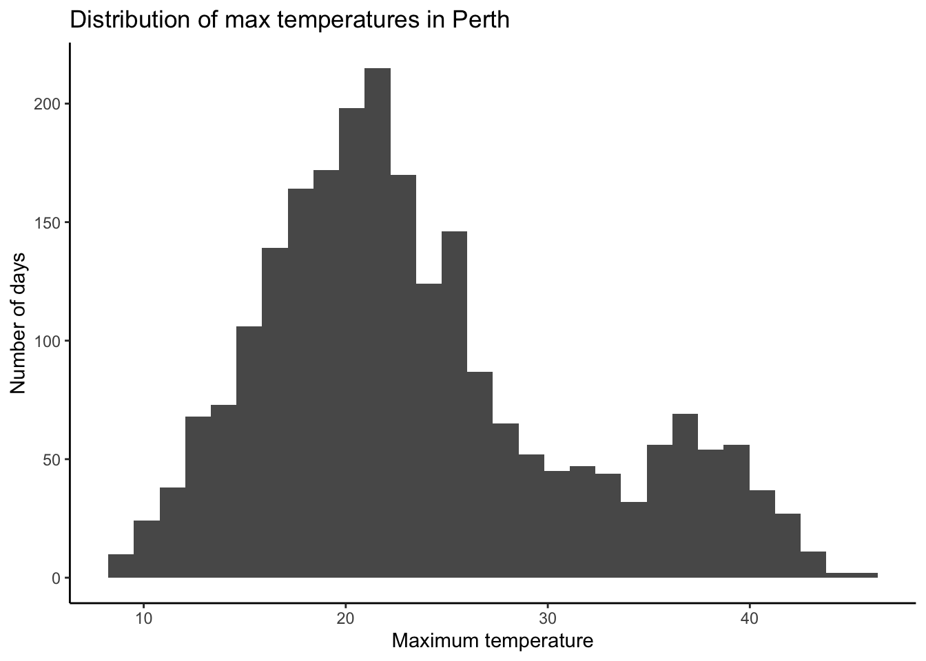
The maxtemp variable contains information on the daily high temperature.
- Is this variable quantitative or categorical?
- Create an appropriate visualization of
maxtemp. - Compute appropriate numerical summaries of the central tendency in
maxtempand the variability inmaxtempfrom day to day. - Reflect on the correspondence between the visual and numerical summaries.
- What do you learn about high temperatures in Perth?
# Visualization

# Numerical summaries
Exercise 11: Customizing! (CHALLENGE)
Though you will naturally absorb some RStudio code throughout the semester, being an effective statistical thinker and “programmer” does not require that we memorize all code. That would be impossible! In contrast, using the foundation you built today, do some digging online to learn how to customize your visualizations.
Part a
For the histogram below, add a title and more meaningful axis labels. Specifically:
- title the plot “Distribution of max temperatures in Perth”
- change the x-axis label to “Maximum temperature”
- change the y-axis label to “Number of days”
HINT: Do a Google search for something like “add axis labels ggplot”.
# Add a title and axis labels
weather %>%
  ggplot(aes(x = maxtemp)) +
  geom_histogram()
Part b
Check out the ggplot2 cheat sheet. Try making some of the other kinds of univariate plots outlined there.
Part c
What else would you like to change about your plot? Try it!
Exercise 12: Optional challenge
At the top of this activity, we searched for words related to some topics of interest (parents, marriage, money) and combined them into a single theme variable. It looked something like this:
abby_new <- abby %>%
  mutate(
    parents = str_detect(question_only, "mother|mama|mom|father|papa|dad"),
    marriage = str_detect(question_only, "marriage|marry|married"),
    money = str_detect(question_only, "money|finance")
  ) %>%
  rowwise() %>%
  mutate(
    themes = c(
      if (parents) "parents",
      if (marriage) "marriage",
      if (money) "money"
    ) %>% paste(collapse = ", "),
    themes = ifelse(themes == "", "other", themes)
  ) %>%
  ungroup()
Check it out:
head(abby_new)Part a
Understand the code!
Inside
mutate()the lineparents = str_detect(question_only, "mother|mama|mom|father|papa|dad")created a new variable calledparents. This variable takes onTRUEorFALSE. Explain whatTRUEandFALSEmean here.The
themesvariable combines the information from theparents,marriage, andmoneyvariables. Check out thethemesfor the first 3 rows / data points. Convince yourself that you understand how it corresponds to theparents,marriage, andmoneyvariables.
Part b
Beyond parents, marriage, and money, what are some other topics that might pop up in the Dear Abby letters (and that you’re interested in exploring)? Modify the code below to explore those topics! Update the themes variable accordingly.
abby_new <- abby %>%
  mutate(
    parents = str_detect(question_only, "mother|mama|mom|father|papa|dad"),
    marriage = str_detect(question_only, "marriage|marry|married"),
    money = str_detect(question_only, "money|finance")
  ) %>%
  rowwise() %>%
  mutate(
    themes = c(
      if (parents) "parents",
      if (marriage) "marriage",
      if (money) "money"
    ) %>% paste(collapse = ", "),
    themes = ifelse(themes == "", "other", themes)
  ) %>%
  ungroup()

# Check out the raw data
head(abby_new)

# Check out the number of letters belonging to each theme
abby_new %>%
  count(themes)
Wrap Up
Please:
Visit office hours! It would be highly unusual to never have a question or to never need help. Myself and the preceptors are here to support you. Check the dates, times, and locations on the calendar at the top of Moodle.
Consider joining the MSCS community listserv (directions here). This is where the Mathematics, Statistics, and Computer Science department (MSCS) shares student-related information about department events, internship opportunities, etc.
- NOTE: You must be signed into your Macalester email.
Upcoming due dates:
- Friday
- CP 2 (10 minutes before your section)
- Next Monday
- CP 3 (10 minutes before your section)
- PS 1. Start today! This is not designed to finish in 1 sitting. If you start the day before it’s due, or later, you will not finish on time.
Solutions
Warm Up
EXAMPLE 1: Background
Solution
- Results of brainstorming themes will vary
- From the “Data and Method” section at the end of the Pudding article:
The writers of these questions likely skew roughly 2/3 female (according to Pauline Phillips, who mentions the demographics of responses to a survey she disseminated in 1987), and consequently, their interests are overrepresented; we’ve been unable to find other demographic data surrounding their origins. There is, doubtless, a level of editorializing here: only a fraction of the questions that people have written in have seen publication, because agony aunts (the writers of advice columns) must selectively filter what gets published. Nevertheless, the concerns of the day seem to be represented, such as the HIV/AIDS crisis in the 1980s. Additionally, we believe that the large sample of questions in our corpus (20,000+) that have appeared over recent decades gives a sufficient directional sense of broad trends.
- Writers of the questions are predominately female. The 2/3 proportion was estimated in 1987, so it would be useful to understand shifts in demographics over time.
- What questions were chosen to be answered on the column? Likely a small fraction of what got submitted. What themes tended to get cut out?
EXAMPLE 2: Import the data
EXAMPLE 3: Get to know the data using R code
Solution
# How many cases & variables are there?
# First number = number of rows / cases
# Second number = number of columns / variables
dim(abby)
[1] 514 6nrow(abby)[1] 514# Print out the first 6 rows
head(abby)# A tibble: 6 × 6
year month day question_only bing_pos themes
<dbl> <ord> <chr> <chr> <dbl> <chr>
1 2017 Aug 30 "i moved to the philippines five years ago.… 0.75 paren…
2 2017 Aug 30 "under what circumstances do you ask your a… NA money
3 2017 Aug 28 "i'm not a dog person. i'm not even an anim… 0.333 other
4 2017 Aug 28 "my 62-year-old father has recently started… 0.143 paren…
5 2017 Aug 27 "i have a friend, \"charlene,\" whom i met … 0.222 other
6 2017 Aug 27 "i have been selected to attend a symposium… 0.333 other # Print out the first 10 rows
head(abby, 10)# A tibble: 10 × 6
year month day question_only bing_pos themes
<dbl> <ord> <chr> <chr> <dbl> <chr>
1 2017 Aug 30 "i moved to the philippines five years ago… 0.75 paren…
2 2017 Aug 30 "under what circumstances do you ask your … NA money
3 2017 Aug 28 "i'm not a dog person. i'm not even an ani… 0.333 other
4 2017 Aug 28 "my 62-year-old father has recently starte… 0.143 paren…
5 2017 Aug 27 "i have a friend, \"charlene,\" whom i met… 0.222 other
6 2017 Aug 27 "i have been selected to attend a symposiu… 0.333 other
7 2017 Aug 27 "i am the mother of a large family. on sun… 0.5 paren…
8 2017 Aug 26 "my daughter will turn 6 soon, and she is … 0.571 other
9 2017 Aug 26 "i feel uncomfortable when people end conv… 0.333 other
10 2017 Aug 25 "i am the mother of two teenaged girls (13… 0.1 paren…# Print out the names of the variables / columns
names(abby)[1] "year" "month" "day" "question_only"
[5] "bing_pos" "themes"
EXAMPLE 4: Streamlining code with pipes
Solution
Follow the example :)
Exercises
Exercise 1: Data wrangling with select and summarize
Solution
# select specific columns of interest
abby %>%
  select(themes, bing_pos) %>%
  head()
# A tibble: 6 × 2
themes bing_pos
<chr> <dbl>
1 parents, marriage 0.75
2 money NA
3 other 0.333
4 parents 0.143
5 other 0.222
6 other 0.333# Calculate the mean of the bing_pos scores
abby %>%
summarize(mean(bing_pos))# A tibble: 1 × 1
`mean(bing_pos)`
<dbl>
1 NA# Remove NAs (missing data) from the mean calculation
# Name the mean calculation "mean"
abby %>%
summarize(mean = mean(bing_pos, na.rm = TRUE))# A tibble: 1 × 1
mean
<dbl>
1 0.365
Exercise 2: Categorical variable summaries
Solution
abby %>%
  count(themes)
# A tibble: 8 × 2
themes n
<chr> <int>
1 marriage 75
2 marriage, money 5
3 money 21
4 other 234
5 parents 127
6 parents, marriage 33
7 parents, marriage, money 4
8 parents, money 15# Set up a blank "canvas" with axis labels
abby %>%
ggplot(aes(x = themes))
# Add bars
abby %>%
  ggplot(aes(x = themes)) +
  geom_bar()
# Rotate the x axis labels
abby %>%
  ggplot(aes(x = themes)) +
  geom_bar() +
  theme(axis.text.x = element_text(angle = 90, vjust = 0.5, hjust = 1))
Exercise 3: Numerical summaries for quantitative variables
Solution
# What's a typical sentiment?
# Calculate the mean & median (measures of central tendency)
abby %>%
  summarize(mean = mean(bing_pos, na.rm = TRUE),
            median = median(bing_pos, na.rm = TRUE))
# A tibble: 1 × 2
mean median
<dbl> <dbl>
1 0.365 0.333# How varied are the sentiments?
# Calculate the min, max, & sd (measures of spread)
abby %>%
summarize(minimum = min(bing_pos, na.rm = TRUE),
maximum = max(bing_pos, na.rm = TRUE),
stdev = sd(bing_pos, na.rm = TRUE))# A tibble: 1 × 3
minimum maximum stdev
<dbl> <dbl> <dbl>
1 0 1 0.279# What's the range of the middle 50% of sentiments?
# Calculate the 25th and 75th percentiles (i.e. 1st and 3rd quartiles)
abby %>%
summarize(first_q = quantile(bing_pos, 0.25, na.rm = TRUE),
third_q = quantile(bing_pos, 0.75, na.rm = TRUE))# A tibble: 1 × 2
first_q third_q
<dbl> <dbl>
1 0.167 0.5
Exercise 4: Visualizing a quantitative variable
Part a (boxplots)
Solution
# Set up a blank canvas
abby %>%
  ggplot(aes(x = bing_pos))
# Add a boxplot
abby %>%
ggplot(aes(x = bing_pos)) +
geom_boxplot()
Part b (histograms)
Solution
abby %>%
  ggplot(aes(x = bing_pos)) +
  geom_histogram()
The most common range of bing_pos scores was around 0. Roughly 87 letters scored in this range.
Part c (density plots)
Solution
abby %>%
  ggplot(aes(x = bing_pos)) +
  geom_density()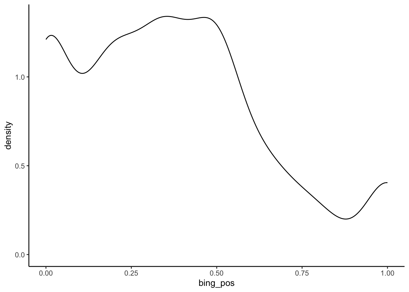
There seem to be 3 types of questions: extremely negative, slightly negative, and extremely positive.
Exercise 5: What did we learn about sentiment?
Part a
Solution
In a typical question, 33% of words are positive (meaning questions tend to be negative in nature!). However, there are also clusters of extremely negative questions with (roughly 0% of words being positive) and extremely positive questions with (roughly 100% of words being positive).
Part b
Solution
- Boxplots very clearly show key summary statistics like median, 1st and 3rd quartile.
- Boxplots can oversimplify by not showing the shape of the distribution.
- Answers will vary, but the histogram and density plot are more effective than the boxplot in this example!
Exercise 6: Customizing plots
Solution
# Recall our histogram
abby %>%
  ggplot(aes(x = bing_pos)) +
  geom_histogram()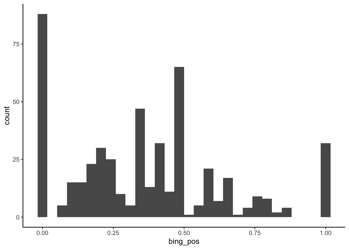
# This adds white lines around the bars.
# It's useful here because it helps distinguish between the bars
abby %>%
  ggplot(aes(x = bing_pos)) +
  geom_histogram(color = "white")
# "color" draws outlines around the bars
# "fill" fills in the bars with color
# This is pretty gratuitous here.
abby %>%
  ggplot(aes(x = bing_pos)) +
  geom_histogram(color = "blue", fill = "orange")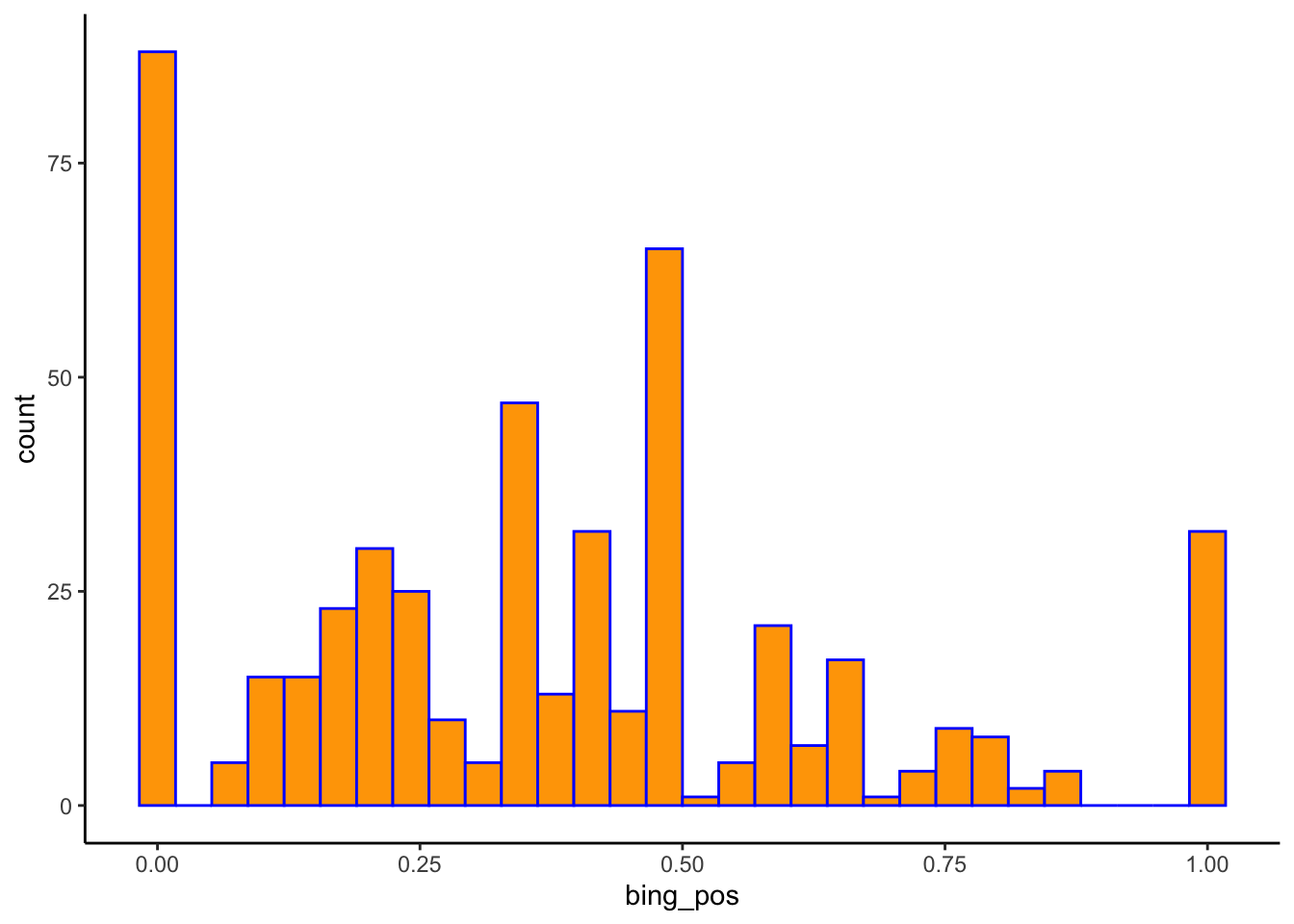
# "color" outlines the density curve
# "fill" fills in the area under the density curve with color
abby %>%
  ggplot(aes(x = bing_pos)) +
  geom_density(color = "blue", fill = "orange")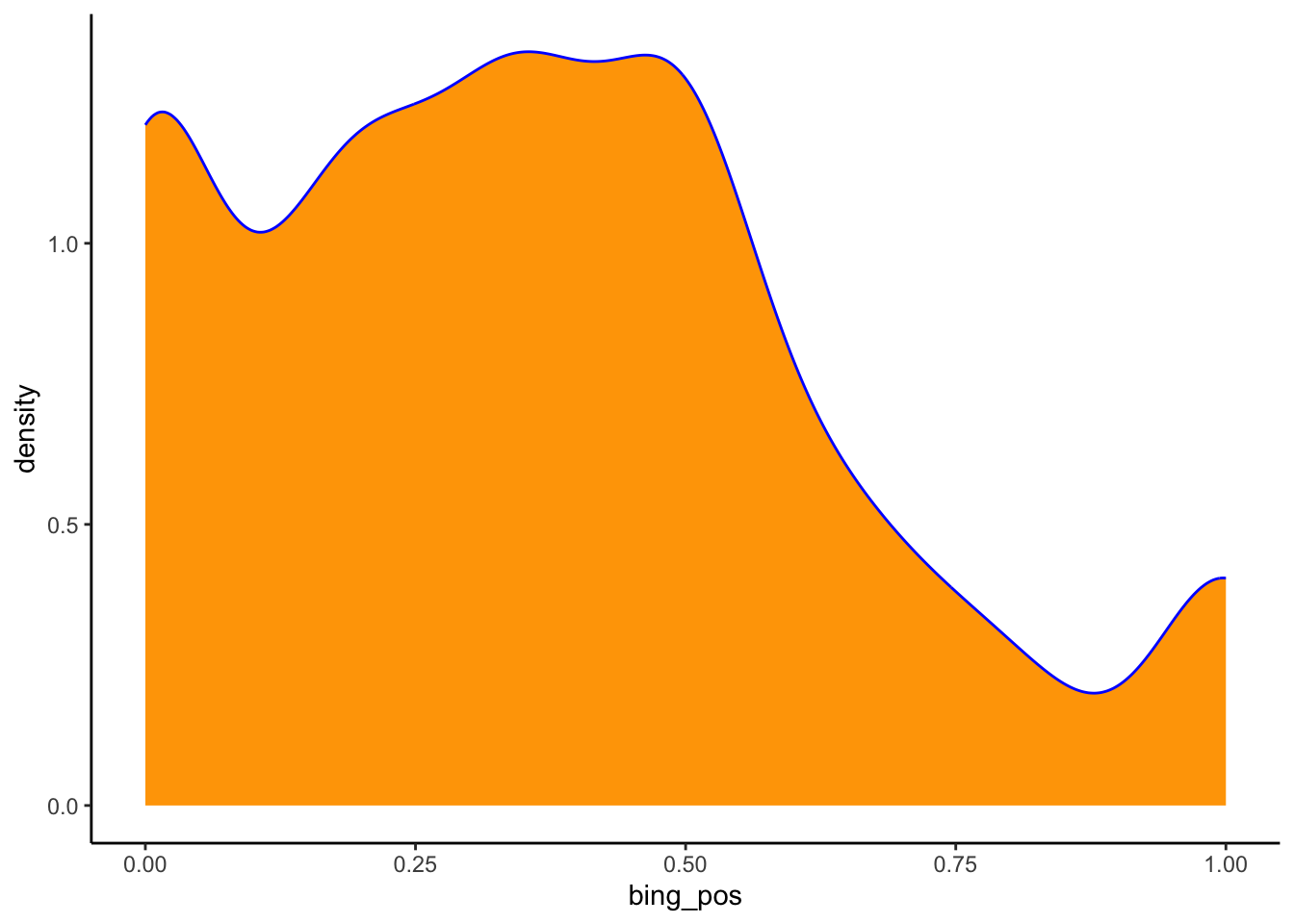
Exercise 7: Looking ahead
Solution
Answers will vary.
Exercise 8: Import and get to know the weather data
Solution
weather <- read_csv("https://mac-stat.github.io/data/weather_3_locations.csv")

# Examine the first six cases
head(weather)
# A tibble: 6 × 24
date location mintemp maxtemp rainfall evaporation sunshine windgustdir
<date> <chr> <dbl> <dbl> <dbl> <dbl> <dbl> <chr>
1 2020-01-01 Wollongo… 17.1 23.1 0 NA NA SSW
2 2020-01-02 Wollongo… 17.7 24.2 0 NA NA SSW
3 2020-01-03 Wollongo… 19.7 26.8 0 NA NA NE
4 2020-01-04 Wollongo… 20.4 35.5 0 NA NA SSW
5 2020-01-05 Wollongo… 19.8 21.4 0 NA NA SSW
6 2020-01-06 Wollongo… 18.3 22.9 0 NA NA NE
# ℹ 16 more variables: windgustspeed <dbl>, winddir9am <chr>, winddir3pm <chr>,
# windspeed9am <dbl>, windspeed3pm <dbl>, humidity9am <dbl>,
# humidity3pm <dbl>, pressure9am <dbl>, pressure3pm <dbl>, cloud9am <dbl>,
# cloud3pm <dbl>, temp9am <dbl>, temp3pm <dbl>, raintoday <chr>,
# risk_mm <dbl>, raintomorrow <chr># Find the dimensions of the data
dim(weather)[1] 2367 24A case represents a day of the year in a particular area (Hobart, Uluru, Wollongong as seen by the location variable).
Exercise 9: Exploring rainfall
Solution
raintodayis categorical (No, Yes)- It is more common to have no rain.
# Visualization
weather %>%
  ggplot(aes(x = raintoday)) +
  geom_bar()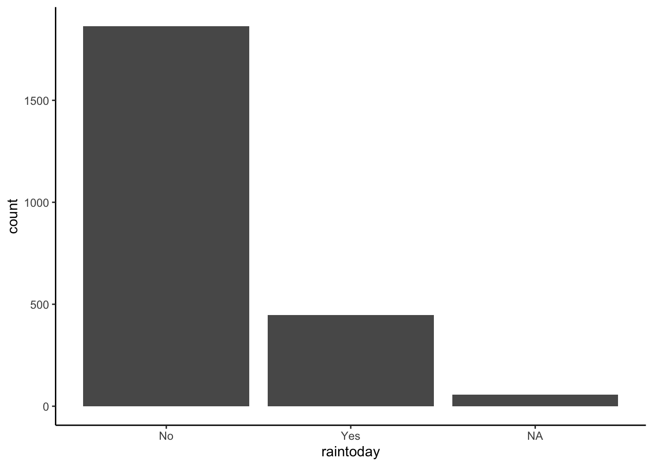
# Numerical summaries
weather %>%
  count(raintoday)
# A tibble: 3 × 2
raintoday n
<chr> <int>
1 No 1864
2 Yes 446
3 <NA> 57
Exercise 10: Exploring temperature
Solution
maxtempis quantitative- The typical max temperature is around 23 degrees Celsius (with an average of 23.62 and a median of 22 degrees). The max temperatures ranged from 8.6 to 45.4 degrees. Finally, on the typical day, the max temp falls about 7.8 degrees from the mean. There are multiple modes in the distribution of max temperature—this likely reflects the different cities in the dataset.
# Visualization (you could also do a boxplot or density plot)
weather %>%
  ggplot(aes(x = maxtemp)) +
  geom_histogram(color = "white")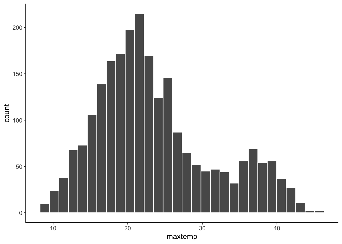
# Numerical summaries - central tendency
weather %>%
  summarize(mean = mean(maxtemp, na.rm = TRUE),
            median = median(maxtemp, na.rm = TRUE))
# A tibble: 1 × 2
mean median
<dbl> <dbl>
1 23.6 22# Numerical summaries - spread
weather %>%
summarize(min = min(maxtemp, na.rm = TRUE),
max = max(maxtemp, na.rm = TRUE),
sd = sd(maxtemp, na.rm = TRUE))# A tibble: 1 × 3
min max sd
<dbl> <dbl> <dbl>
1 8.6 45.4 7.80
Exercise 11: Customizing! (CHALLENGE)
Solution
weather %>%
  ggplot(aes(x = maxtemp)) +
  geom_histogram() +
  labs(x = "Maximum temperature", y = "Number of days", title = "Distribution of max temperatures in Perth")