# Load data and packages
library(tidyverse)
climbers <- read.csv("https://mac-stat.github.io/data/climbers_sub.csv") %>%
select(peak_name, success, age, oxygen_used, year, season)17 Multiple logistic regression
Settling In
- Sit with your draft group (see Slack)
- Introduce yourself
- Chat about data sets that you were interested in.
- Help each other get ready to take notes!
- Open your notebook.
- Open the online manual to the “Course Schedule” and click on today’s activity. That brings you here!
- Download “17-logistic-multivariate.qmd” and open it in RStudio. Read the “Organizing your files” directions at the top of the file!!
- Open your notebook.
Recap
ImportantStatistical superpowers
Just as with linear regression models, we can expand our simple logistic regression models (with 1 predictor) to multiple logistic regression models (with 2+ predictors). Letting “odds” represent that odds that our binary categorical response variable Y is “1”:
\log(\text{odds } | X_1, X_2, ..., X_p) = \beta_0 + \beta_1 X_1 + \beta_2 X_3 + ... + \beta_p X_p
And, just as with linear regression, we must evaluate the quality of a logistic regression model before trusting, using, and reporting it!
NoteLearning goals
By the end of this lesson, you should be able to:
- Construct multiple logistic regression models in R
- Interpret coefficients in multiple logistic regression models
- Use multiple logistic regression models to make predictions
- Evaluate the quality of logistic regression models by using predicted probability boxplots and by computing and interpreting accuracy, sensitivity, specificity, false positive rate, and false negative rate
NoteAdditional resources
Required:
- Interpreting logistic regression coefficients
- Evaluating logistic regression models
- Required: Part 1: Concepts (script)
- Optional: Part 2: R Code (script)
Additional material:
- Reading: Section 4.4 in the STAT 155 Notes
Logistic Regression
Let Y be a binary categorical response variable:
Y = \begin{cases} 1 & \; \text{ if event happens} \\ 0 & \; \text{ if event doesn't happen} \\ \end{cases}
Further define
\begin{split}
p & = \text{ probability event happens} \\
1-p & = \text{ probability event doesn't happen} \\
\text{odds} & = \text{ odds event happens} = \frac{p}{1-p} \\
\end{split}
Then a logistic regression model of Y by X is
\log(\text{odds}) = \beta_0 + \beta_1 X
We can transform this to get (curved) models of odds and probability:
\begin{split} \text{odds} & = e^{\beta_0 + \beta_1 X} \\ p & = \frac{\text{odds}}{\text{odds}+1} = \frac{e^{\beta_0 + \beta_1 X}}{e^{\beta_0 + \beta_1 X}+1} \\ \end{split}
Coefficient interpretation for quantitative X
\begin{split} \beta_0 & = \text{ LOG(ODDS) when all } X=0 \\ e^{\beta_0} & = \text{ ODDS when all } X=0 \\ \beta_1 & = \text{ change in LOG(ODDS) per 1 unit increase in } X \\ e^{\beta_1} & = \text{ multiplicative change in ODDS per 1 unit increase in } X \text{ (ie. the odds ratio)} \\ \end{split}
Coefficient interpretation for categorical X
\begin{split} \beta_0 & = \text{ LOG(ODDS) when all X are at the reference category } \\ e^{\beta_0} & = \text{ ODDS when all X are at the reference category } \\ \beta_1 & = \text{ unit change in LOG(ODDS) relative to the reference} \\ e^{\beta_1} & = \text{ multiplicative change in ODDS relative to the reference } \text{ (ie. the odds ratio)} \\ \end{split}
NoteTheory Box
In R, we use glm(y~x, data, family = 'binomial') to fit Logistic Regression models.
The family='binomial' refers to an assumed distribution for our outcome Y.
The Binomial distribution describes the number of “successes” (k) in a fixed number of independent trials (n), where each trial has the same probability of success (p).
The probability that we get k successes in n trials is:
\frac{n!}{k!(n-k)!}p^k(1-p)^{n-k}
In the context of logistic regression, we focus on n=1 so modeling the probability that k=1, p using explanatory variables.
Warm-up
We’ve learned two foundational modeling tools: “Normal” linear regression (when Y is quantitative) and logistic regression (when Y is binary).
- Normal linear regression examples
- model a person’s reaction time (Y) by how long they slept (X)
- model a person’s reaction time (Y) by whether or not they took a nap (X)
- logistic regression examples
- model whether or not a person believes in climate change (Y) based on their age (X)
- model whether or not a person believes in climate change (Y) based on their location (X)
Example 1: Probability, odds, odds ratio review
In this and the previous activity, we’ll be modeling the success of a mountain climber. Consider the following example calculations:
| event | prob | odds |
|---|---|---|
| climber A is successful | 0.50 | 1 |
| climber B is successful | 0.66 (2/3) | 2 |
| climber C is successful | 0.75 | ? |
Calculate & interpret the conditional odds of success for climber C:
Odds(success | climber C) =
Calculate & interpret the odds ratio of success, comparing climber C to climber B:
Odds(success | Climber C) / Odds(success | Climber B) =
Calculate & interpret the odds ratio of success, comparing climber A to climber B:
Odds(success | Climber A) / Odds(success | Climber B) =
Example 2: Success over time
Load the climbers data:
To better understand how climbing success rates have changed over time, let’s explore success by year:
# Bad plot!!
# Shows how year (X) varies by success (Y), not vice versa
climbers %>%
  ggplot(aes(x = year, y = success)) +
  geom_boxplot()
# Bad plot!! How to interpret this?!
climbers %>%
ggplot(aes(x = year, y = success)) +
geom_point() # Better plot!
climbers %>%
group_by(year) %>%
summarize(success_rate = mean(success)) %>%
ggplot(aes(x = year, y = success_rate)) +
geom_point() +
theme(axis.text.x = element_text(angle = 60, vjust = 1, hjust=1, size = 8))climbers %>%
mutate(year_bracket = cut(year, breaks = 10)) %>%
group_by(year_bracket) %>%
summarize(success_rate = mean(success)) %>%
ggplot(aes(x = year_bracket, y = success_rate)) +
geom_point() +
theme(axis.text.x = element_text(angle = 60, vjust = 1, hjust=1, size = 8))- Let’s now model that relationship…
# Build the model
success_by_year <- ___(success ~ year, data = climbers, ___)
# Get the model summary table
coef(summary(success_by_year))- Write out the model formula.
___ = -119.36215 + 0.05934year
- Interpret both model coefficients on the odds scale.
# Exponentiate the coefficientsExample 3: Success by season
Next, let’s explore success rates by season:
# Visualize the relationship
# Bad plot! Shows dependence of season (X) on success (Y), not vice versa
climbers %>%
ggplot(aes(fill = season, x = success)) +
geom_bar(position = "fill")# Better plot!
# x = X, fill = Y
climbers %>%
ggplot(aes(x = season, fill = success)) +
geom_bar(position = "fill")# Model the relationship
success_by_season <- glm(success ~ season, data = climbers, family = "binomial")
coef(summary(success_by_season))Thus the estimated model formula is:
log(odds of success | season) = -0.6492953 + 0.3801896 seasonSpring + 14.2153618 seasonSummer - 1.0453004 seasonWinter
- Interpret the intercept coefficient on the odds scale. Choose one.
exp(-0.6492953)- The odds of success are 0.52, i.e. success is roughly half as likely as failure.
- The odds of success are 0.52 in Autumn, i.e. success is roughly half as likely as failure in Autumn.
- The odds of success are roughly half (52%) as big in Autumn than in Summer.
- Interpret the
seasonWintercoefficient on the odds scale. Choose one.
exp(-1.0453004)- The odds of success are 0.35 in Winter.
- The odds of success are 0.35 higher in Winter than in Autumn.
- The odds of success in Winter are 35% higher than the odds of success in Autumn.
- The odds of success in Winter are 35% as high as (i.e. 65% lower than) the odds of success in Autumn.
Example 4: Predictions
Suppose your friend plans an expedition in Winter. Their probability of success is roughly 0.16:
# By hand
log_odds <- -0.6492953 - 1.0453004*1
log_odds
odds <- exp(log_odds)
odds
prob <- odds / (odds + 1)
prob# Check our work
# Note the use of type = "response"! If we left this off we'd get a prediction on the log(odds) scale
predict(success_by_season, newdata = data.frame(season = "Winter"), type = "response")Suppose we had to translate the probability calculation into a yes / no prediction. Yes or no: do you predict that your friend will be successful?
In logistic regression, we don’t measure the accuracy of a prediction by a residual. Our prediction is either right or wrong! For example, suppose that your friend does successfully summit their peak. Was our prediction right or wrong?
Exercises
Context: In this activity, we’ll look at data from an experiment conducted in 2001-2002 that investigated the influence of race and gender on job applications. The researchers created realistic-looking resumes and then randomly assigned a name to the resume that “would communicate the applicant’s gender and race” (e.g., they they assumed the name Emily would generally be interpreted as a white woman, whereas the name Jamal would generally be interpreted as a black man). They then submitted these resumes to job postings in Boston and Chicago and waited to see if the applicant got a call back from the job posting.
You can find a full description of the variables in this dataset here. Today, we’ll focus on the following variables:
received_callback: indicator that the resume got a call back from the job postinggender: inferred binary gender associated with the first name on the resumerace: inferred race associated with the first name on the resume
Our research question is: does an applicant’s inferred gender and race have an effect on the chance that they receive a callback after submitting their resume for an open job posting?
library(tidyverse)
#library(ggmosaic)
resume <- read_csv("https://mac-stat.github.io/data/resume.csv")Exercise 1: Graphical and numerical summaries
Our research question involves three categorical variables: received_callback (1 = yes, 0 = no), gender (f = female, m = male), and race (Black, White). Let’s start by creating a mosaic plot to visually compare inferred binary gender and callbacks:
ggplot(resume) +
geom_bar(aes(x = gender, fill = factor(received_callback)),position='fill') +
scale_fill_manual("Received Callback? \n(1 = yes, 0 = no)", values = c("lightblue", "steelblue")) +
labs(x = "Inferred Binary Gender (f = female, m = male)", y = "Received Callback? (1 = yes, 0 = no)")
# create mosaic plot of callback vs gender
#ggplot(resume) +
# geom_mosaic(aes(x = product(gender), fill = received_callback)) +
# scale_fill_manual("Received Callback? \n(1 = yes, 0 = no)", values = c("lightblue", "steelblue")) +
# labs(x = "Inferred Binary Gender (f = female, m = male)", y = "Received Callback? (1 = yes, 0 = no)")In this activity, we’re also interested in looking at the relationship between inferred race and callbacks. One way we can add a third variable to a plot is to use the facet_grid function, particularly when that third variable is categorical. Let’s try that now:
ggplot(resume) +
geom_bar(aes(x = gender, fill = factor(received_callback)), position='fill')+
facet_grid(. ~ race) +
scale_fill_manual("Received Callback? \n(1 = yes, 0 = no)", values = c("lightblue", "steelblue")) +
labs(x = "Inferred Binary Gender (f = female, m = male)", y = "Received Callback? (1 = yes, 0 = no)")
# create mosaic plot of callback vs gender and race
#ggplot(resume) +
# geom_mosaic(aes(x = product(gender), fill = received_callback)) +
# facet_grid(. ~ race) +
# scale_fill_manual("Received Callback? \n(1 = yes, 0 = no)", values = c("lightblue", "steelblue")) +
# labs(x = "Inferred Binary Gender (f = female, m = male)", y = "Received Callback? (1 = yes, 0 = no)")Here’s another way of looking at the relationship between these three variables, switching the placement of gender and race in the mosaic plot:
ggplot(resume) +
geom_bar(aes(x = race, fill = factor(received_callback)), position='fill')+
facet_grid(. ~ gender) +
scale_fill_manual("Received Callback? \n(1 = yes, 0 = no)", values = c("lightblue", "steelblue")) +
labs(x = "Inferred Race", y = "Received Callback? (1 = yes, 0 = no)")
# create mosaic plot of callback vs gender and race
#ggplot(resume) +
# geom_mosaic(aes(x = product(received_callback, race), fill = received_callback)) +
# facet_grid(. ~ gender) +
# scale_fill_manual("Received Callback? \n(1 = yes, 0 = no)", values = c("lightblue", "steelblue")) +
# labs(x = "Inferred Race", y = "Received Callback? (1 = yes, 0 = no)")When we are comparing three categorical variables, a useful numerical summary is to calculate relative frequencies/proportions of cases falling into each category of the outcome variable, conditional on which categories of the explanatory variables they fall into. Run this code chunk to calculate the conditional proportion of resumes that did nor did not receive a callback, given the inferred gender and race of the applicant:
# corresponding numerical summaries
resume %>%
group_by(race, gender) %>%
count(received_callback) %>%
group_by(race, gender) %>%
mutate(condprop = n/sum(n))Write a short description that summarizes the information you gain from these visualizations and numerical summaries. Write this summary using good sentences that tell a story and do not resemble a checklist. Don’t forget to consider the context of the data, and make sure that your summary addresses our research question: does an applicant’s inferred gender or race have an effect on the chance that they receive a callback?
Exercise 2: Logistic regression modeling
Next, we’ll fit a logistic regression model to these data, modeling the log odds of receiving a callback as a function of the applicant’s inferred gender and race:
\log(Odds[ReceivedCallback = 1 \mid gender, race]) = \beta_0 + \beta_1 genderm + \beta_2 racewhite
Fill in the blanks in the code below to fit this logistic regression model.
# fit logistic model and save it as object called "mod1"
mod1 <- glm(received_callback ~ gender + race, data = ___, family = ___)Then, run the code chunk below to get the coefficient estimates and exponentiated estimates:
# Original estimates
coef(mod1)
# Exponentiated estimates
exp(coef(mod1))Write an interpretation of each of the exponentiated coefficients in your logistic regression model.
Exercise 3: Interaction terms
Do you think it would make sense to add an interaction term (between gender and race) to our logistic regression model? Why/why not?
Let’s try adding an interaction between gender and race. Update the code below to fit this new interaction model.
# fit logistic model and save it as object called "mod2"
mod2 <- glm(received_callback ~ ___, data = resume, family = ___)Then, run the code chunk below to get the coefficient estimates and exponentiated estimates for this interaction model:
# Original estimates
coef(mod2)
# Exponentiated estimates
exp(coef(mod2))- (CHALLENGE) Write out the logistic regression model formula separately for males and for females. Based on this how would we interpret the exponentiated coefficients in this model?
Exercise 4: Prediction
We can use our models to predict whether or not a resume will receive a call back based on the inferred gender and race of the applicant. Run the code below to use the predict() function to predict the probability of getting a call back for four job applicants: a person inferred to be a black female, a person inferred to be black male, a person inferred to be a white female, and a person inferred to be a white male.
# set up data frame with people we want to predict for
predict_data <- data.frame(
gender = c("f", "m", "f", "m"),
race = c("black", "black", "white", "white")
)
print(predict_data)
# prediction based on model without interaction
mod1 %>%
predict(newdata = predict_data, type = "response")
# prediction based on model with interaction
mod2 %>%
predict(newdata = predict_data, type = "response")Report and compare the predictions we get from predict(). Do they make sense to you based on your understanding of the data? Combine insights from visualizations and modeling to write a few sentences summarizing findings for our research question: does an applicant’s inferred gender and race have an effect on the chance that they receive a callback after submitting their resume for an open job posting?
Exercise 5: Evaluating logistic models with plots
We’ll fit one more model that adds on to the interaction model to also include years of college, years of work experience, and resume quality. The code below takes our fitted models and stores the predicted probabilities in a variable called .fitted. Then we use boxplots to show the predicted probabilities of receiving a callback in those who actually did and did not receive a callback.
mod3 <- glm(received_callback ~ gender*race + years_college + years_experience + resume_quality, data = resume, family = "binomial")
# mod1 predicted probabilities
mod1_output <- resume %>%
mutate(.fitted = predict(mod1, newdata = ., type = "response"))
mod1_output %>%
ggplot(aes(x = factor(received_callback), y = .fitted)) +
geom_boxplot()
# mod2 predicted probabilities
mod2_output <- resume %>%
mutate(.fitted = predict(mod2, newdata = ., type = "response"))
mod2_output %>%
ggplot(aes(x = factor(received_callback), y = .fitted)) +
geom_boxplot()
# mod3 predicted probabilities
mod3_output <-resume %>%
mutate(.fitted = predict(mod3, newdata = ., type = "response"))
mod3_output %>%
ggplot(aes(x = factor(received_callback), y = .fitted)) +
geom_boxplot()Summarize what you learn about the ability of the 3 models to differentiate those who actually did and did not receive a callback. What model seems best, and why?
If you had to draw a horizontal line across each of the boxplots that vertically separates the left and right boxplots well, where would you place them?
Exercise 6: Evaluating logistic models with evaluation metrics
Sometimes we may need to go beyond the predicted probabilities from our model and try to classify individuals into one of the two binary outcomes (received or did not receive a callback). How high of a predicted probability would we need from our model in order to be convinced that the person actually got a callback? This is the idea behind the horizontal lines that we drew in the previous exercise.
Let’s explore using a probability threshold of 0.08 (8%) to make a binary prediction for each case:
- If a model’s predicted probability of getting a callback is greater than or equal to 8.5%, we’ll predict they got a callback.
- If the predicted probability is below 8%, we’ll predict they didn’t get a callback.
We can visualize this threshold on our predicted probability boxplots:
ggplot(mod1_output, aes(x = factor(received_callback), y = .fitted)) +
geom_boxplot() +
geom_hline(yintercept = 0.08, color = "red")
ggplot(mod2_output, aes(x = factor(received_callback), y = .fitted)) +
geom_boxplot() +
geom_hline(yintercept = 0.08, color = "red")
ggplot(mod3_output, aes(x = factor(received_callback), y = .fitted)) +
geom_boxplot() +
geom_hline(yintercept = 0.08, color = "red")Next, we can use our threshold to classify each person in our dataset based on their predicted probability of getting a callback: we’ll predict that everyone with a predicted probability higher than our threshold got a callback, and otherwise they did not. Then, we’ll compare our model’s prediction to the true outcome (whether or not they actually did get a callback).
# get binary predictions for mod1 and compare to truth
threshold <- 0.08
mod1_output %>%
mutate(predictCallback = .fitted >= threshold) %>% ## predict callback if probability greater than or equal to threshold
count(received_callback, predictCallback) ## compare actual and predicted callbacks
mod2_output %>%
mutate(predictCallback = .fitted >= threshold) %>%
count(received_callback, predictCallback)
mod3_output %>%
mutate(predictCallback = .fitted >= threshold) %>%
count(received_callback, predictCallback)We can use the count() output to fill create contingency tables of the results. (These tables are also called confusion matrices.)
- Fill in the confusion matrix for Model 3.
Models 1 and 2: (Both models result in the same confusion matrix.)
| Predict callback | Predict no callback | Total | |
|---|---|---|---|
| Actually got callback | 235 | 157 | 392 |
| Actually did not | 2200 | 2278 | 4478 |
| Total | 2435 | 2435 | 4870 |
Model 3:
| Predict callback | Predict no callback | Total | |
|---|---|---|---|
| Actually got callback | ____ | ____ | ____ |
| Actually did not | ____ | ____ | ____ |
| Total | ____ | ____ | ____ |
- Now compute the following evaluation metrics for the models:
Models 1 and 2:
- Accuracy: P(Predict Y Correctly)
- Sensitivity: P(Predict Y = 1 | Actual Y = 1)
- Specificity: P(Predict Y = 0 | Actual Y = 0)
- False negative rate: P(Predict Y = 0 | Actual Y = 1)
- False positive rate: P(Predict Y = 1 | Actual Y = 0)
Model 3:
- Accuracy: P(Predict Y Correctly)
- Sensitivity: P(Predict Y = 1 | Actual Y = 1)
- Specificity: P(Predict Y = 0 | Actual Y = 0)
- False negative rate: P(Predict Y = 0 | Actual Y = 1)
- False positive rate: P(Predict Y = 1 | Actual Y = 0)
- Imagine that we are a career center on a college campus and we want to use this model to help students that are looking for jobs. Consider the consequences of incorrectly predicting whether or not an individual will get a callback. What are the consequences of a false negative? What about a false positive? Which one is worse?
Reflection
What are some similarities and differences between how we interpret and evaluate linear and logistic regression models?
Response: Put your response here.
Extra practice
Build 2 models that you’ll use below, the first of which you explored in the previous activity:
# Load data
climbers <- read.csv("https://mac-stat.github.io/data/climbers_sub.csv") %>%
select(peak_name, success, age, oxygen_used, year, season)
# Build 2 models
climb_model_1 <- glm(success ~ age, climbers, family = "binomial")
climb_model_2 <- glm(success ~ age + oxygen_used, climbers, family = "binomial")Exercise 7: climb_model_2
climb_model_1uses onlyageas a predictor:
# Plot climb_model_1
climbers %>%
ggplot(aes(y = as.numeric(success), x = age)) +
geom_smooth(method = "glm", se = FALSE, method.args = list(family = "binomial")) +
labs(y = "probability of success")In contrast, the multiple logistic regression model climb_model_2 includes 2 predictors of success: age and oxygen_used. In comparison to the above plot of climb_model_1, what do you anticipate climb_model_2 looking like?
- Check your intuition! Summarize, in words, what you learn about the relationship of success with age and oxygen use from the below plots.
# Plot climb_model_2
climbers %>%
ggplot(aes(y = as.numeric(success), x = age, color = oxygen_used)) +
geom_smooth(method = "glm", se = FALSE, method.args = list(family = "binomial")) +
labs(y = "probability of success")# Just for fun zoom out!
climbers %>%
ggplot(aes(y = as.numeric(success), x = age, color = oxygen_used)) +
geom_smooth(method = "glm", se = FALSE, method.args = list(family = "binomial"),
fullrange = TRUE) +
labs(y = "probability of success") +
lims(x = c(-300, 400))- The estimated model formula is:
log(odds of success | age, oxygen_used) = -0.520 - 0.022 age + 2.896 oxygen_usedTRUE
# Get the model summary table
coef(summary(climb_model_2))
# Exponentiated coefficients
exp(coef(climb_model_2))Interpret the age coefficient on the odds scale. Don’t forget to “control for…”!
- Interpret the
oxygen_usedTRUEcoefficient on the odds scale. Don’t forget to “control for…”!
Exercise 8: Model evaluation using plots
Recall our 2 models of climbing success:
| model | predictors |
|---|---|
climb_model_1 |
age |
climb_model_2 |
age, oxygen_used |
Let’s compare the quality of these models. To begin, the code below calculates the probability of success for every climber in our dataset using climb_model_1, and stores it as the .fitted variable:
climbers %>%
mutate(.fitted = predict(climb_model_1, newdata = ., type = "response")) %>%
head()A visual way to evaluate the quality of our model is to compare the probability of success it assigns to climbers that were and were not actually successful:
# Compare the climb_model_1 probability of success calculations for those that were & weren't successful
climbers %>%
mutate(.fitted = predict(climb_model_1, newdata = ., type = "response")) %>%
ggplot(aes(x = success, y = .fitted)) +
geom_boxplot()Similarly, check out the probability calculations using climb_model_2:
# Compare the climb_model_2 probability of success calculations for those that were & weren't successful
climbers %>%
mutate(.fitted = predict(climb_model_2, newdata = ., type = "response")) %>%
ggplot(aes(x = success, y = .fitted)) +
geom_boxplot()Summarize what you learn from the plots about the ability of
climb_model_1andclimb_model_2to differentiate between those who were and were not actually successful. Comment on which model seems better, and why.Focus on the plot for
climb_model_2. Sometimes we may need to go beyond the probability calculations and make a binary prediction about whether a climber will succeed or fail. Suppose we used a 0.5 probability threshold: If the probability of success exceeds 0.5, then predict success. Otherwise, predict failure. In pictures:
climbers %>%
mutate(.fitted = predict(climb_model_2, newdata = ., type = "response")) %>%
ggplot(aes(x = success, y = .fitted)) +
geom_boxplot() +
geom_hline(yintercept = 0.5, color = "red")Discuss:
What do you think of the 0.5 threshold? Would it lead to good predictions? Would it do better at predicting when climbers will succeed or when they’ll fail?
If we used the 0.5 threshold, what would the specificity be: less than 25%, between 25% & 50%, between 50% & 75%, or above 75%? Answer this using only the plot.
If we used the 0.5 threshold, what would the sensitivity be: less than 25%, between 25% & 50%, between 50% & 75%, or above 75%? Answer this using only the plot.
If you don’t like the 0.5 threshold, what do you think would be a better option? Why?
Exercise 9: Model evaluation using evaluation metrics
Let’s explore using a probability threshold of 0.25 (25%) to make a binary prediction of success / failure for each climber in our dataset:
- If a model’s probability of success is greater than or equal to 25%, we’ll predict that they’ll succeed.
- If the probability is below 25%, we’ll predict that they’ll fail.
We can visualize this threshold on our predicted probability boxplots for our 2 models:
climbers %>%
mutate(.fitted = predict(climb_model_1, newdata = ., type = "response")) %>%
ggplot(aes(x = success, y = .fitted)) +
geom_boxplot() +
geom_hline(yintercept = 0.25, color = "red")
climbers %>%
mutate(.fitted = predict(climb_model_2, newdata = ., type = "response")) %>%
ggplot(aes(x = success, y = .fitted)) +
geom_boxplot() +
geom_hline(yintercept = 0.25, color = "red")To evaluate the quality of the resulting predictions, we essentially want to count up how many climbers fell on the “correct” side of the threshold, both overall and within both groups (successful and unsuccessful climbers). Let’s start with climb_model_1. Using the 0.25 threshold, this model predicted success for the first 6 climbers – 5 of these predictions were correct (5 of the 6 were actually successful) and 1 was wrong:
threshold <- 0.25
climbers %>%
mutate(.fitted = predict(climb_model_1, newdata = ., type = "response")) %>%
mutate(predictSuccess = .fitted >= threshold) %>%
select(success, age, oxygen_used, .fitted, predictSuccess) %>%
head()But that’s just the first 6 climbers! We can build a tabyl() to compare the observed success to the predictSuccess for all climbers in our dataset:
# Rows = actual / observed success (FALSE or TRUE)
# Columns = predicted success (FALSE or TRUE)
library(janitor)
climbers %>%
mutate(.fitted = predict(climb_model_1, newdata = ., type = "response")) %>%
mutate(predictSuccess = .fitted >= threshold) %>%
tabyl(success, predictSuccess) %>%
adorn_totals(c("row", "col"))- Use the confusion matrix to prove that
climb_model_1has an overall accuracy rate of 40%. That is:
P(Predict Y Correctly) = 0.40
HINT: Divide the total number of correct predictions by the total number of climbers.
climb_model_1has a sensitivity (aka true positive rate) of 99%, hence a false negative rate of 1%
Sensitivity: P(Predict Y = success | Actual Y = success) = 0.99
Among (conditioned on) successful climbers, the probability of the model correctly predicting success is 99%.False negative rate: P(Predict Y = failure | Actual Y = success) = 0.01 Among (conditioned on) successful climbers, the probability of the model INcorrectly predicting failure is 1%.
Prove these calculations using the confusion matrix:
climb_model_1has a specificity (aka true negative rate) of only 2%, hence a false positive rate of 98%:
Specificity: P(Predict Y = failure | Actual Y = failure) = 0.02
Among (conditioned on) unsuccessful climbers, the probability of the model correctly predicting failure is only 2%.False positive rate: P(Predict Y = success | Actual Y = failure) = 0.98 Among (conditioned on) unsuccessful climbers, the probability of the model INcorrectly predicting success is 98%.
Prove these calculations using the confusion matrix:
Exercise 10: More confusion matrices
Obtain the confusion matrix, overall accuracy, sensitivity (true positive rate), and specificity (true negative rate) for climb_model_2 (with a 0.25 probability threshold). NOTE: The correct metrics are outlined in the next exercise if you want to check your work.
# Confusion matrix
# Overall accuracy
# Sensitivity
# SpecificityExercise 11: Model comparison
We’ve now considered 2 models of climbing success, and evaluated their predictive performance using a 0.25 probability threshold:
| model | predictors | overall | sensitivity | specificity |
|---|---|---|---|---|
| 1 | age | 0.40 | 0.99 | 0.02 |
| 2 | age, oxygen_used | 0.75 | 0.69 | 0.79 |
- Fill in the blanks with the model number.
Model ___ had the higher overall accuracy.
Model ___ was better at predicting when a climber would succeed.
Model ___ was better at predicting when a climber would not succeed.
- Imagine that you are planning an expedition. Consider the consequences of incorrectly predicting whether or not you will be successful. What are the consequences of a false negative? What about a false positive? Which one is worse? With that in mind, which climbing model do you prefer?
Wrap-up
- PS 5 has been posted since Tuesday and is due Tuesday night after spring break
Solutions
Warm Up
Example 1: Probability, odds, odds ratio review
Solution
| event | prob | odds |
|---|---|---|
| climber A is successful | 0.50 | 1 |
| climber B is successful | 0.66 (2/3) | 2 |
| climber C is successful | 0.75 | 3 |
Calculate & interpret the conditional odds of success for climber C:
Odds(success | climber C) = P(success | climber C) / (1 - P(success | climber C)) = P(success | climber C) / P(failure | climber C) = 0.75 / (1 - 0.75) = 3
The odds of success for climber C is 3, i.e. they are 3x more likely to succeed than to fail.
Calculate & interpret the odds ratio of success, comparing climber C to climber B:
Odds(success | Climber C) / Odds(success | Climber B) = 3 / 2 = 1.5
The odds of success are one and a half times higher (50% higher) for climber C than climber B.
Calculate & interpret the odds ratio of success, comparing climber A to climber B:
Odds(success | Climber A) / Odds(success | Climber B) = 1 / 2 = 0.5
The odds of success are half as high (50% lower) for climber A than climber B.
Example 2: Success over time
Solution
# Load data and packages
library(tidyverse)
climbers <- read_csv("https://mac-stat.github.io/data/climbers_sub.csv") %>%
select(peak_name, success, age, oxygen_used, year, season)
# Bad plot!!
# Shows how year (X) varies by success (Y), not vice versa
climbers %>%
ggplot(aes(x = year, y = success)) +
geom_boxplot() 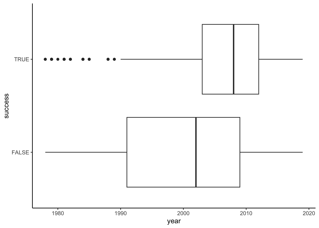
# Bad plot!! How to interpret this?!
climbers %>%
  ggplot(aes(x = year, y = success)) +
geom_point() 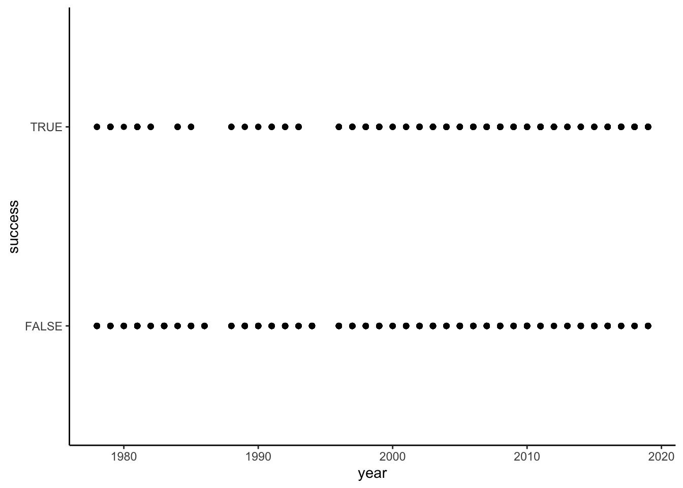
# Better plot
climbers %>%
group_by(year) %>%
summarize(success_rate = mean(success)) %>%
ggplot(aes(x = year, y = success_rate)) +
geom_point() +
theme(axis.text.x = element_text(angle = 60, vjust = 1, hjust=1, size = 8))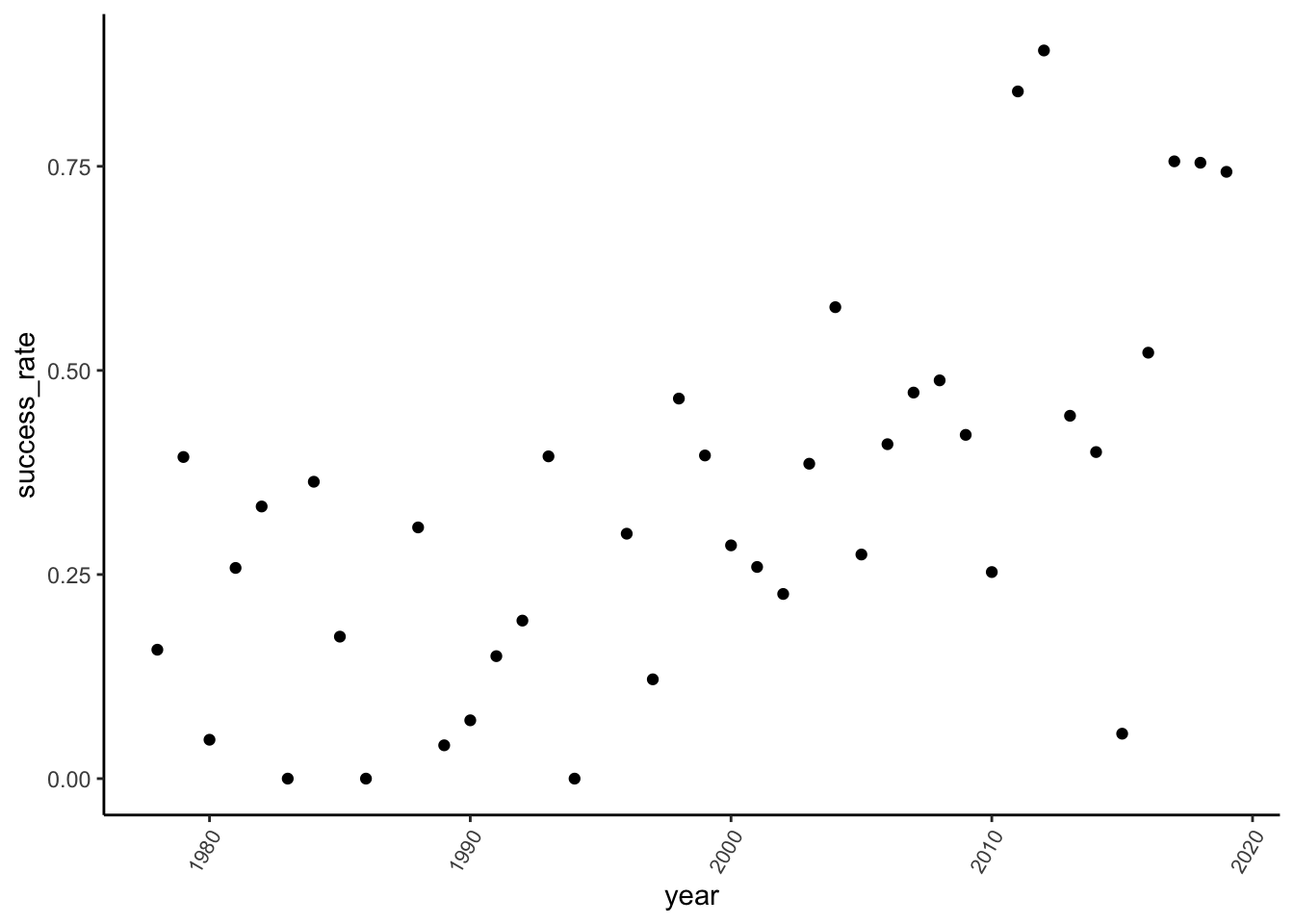
climbers %>%
  mutate(year_bracket = cut(year, breaks = 10)) %>%
  group_by(year_bracket) %>%
  summarize(success_rate = mean(success)) %>%
  ggplot(aes(x = year_bracket, y = success_rate)) +
  geom_point() +
  theme(axis.text.x = element_text(angle = 60, vjust = 1, hjust=1, size = 8))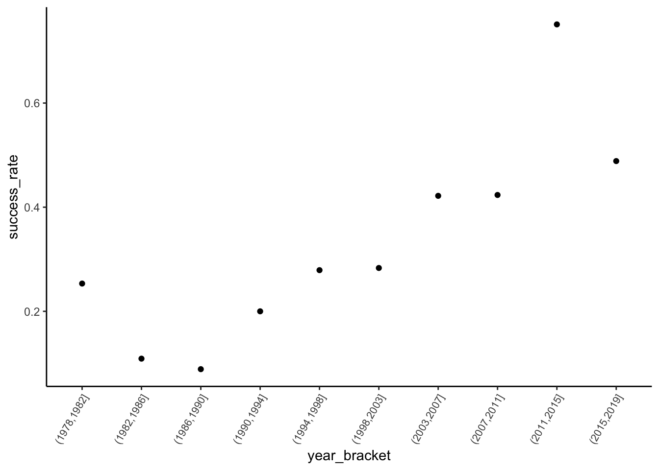
.
# Build the model success_by_year <- glm(success ~ year, data = climbers, family = "binomial") # Get the model summary table coef(summary(success_by_year))Estimate Std. Error z value Pr(>|z|) (Intercept) -119.36214950 9.560766495 -12.48458 9.062082e-36 year 0.05934127 0.004768784 12.44369 1.513454e-35log(odds of success | year) = -119.36215 + 0.05934year
.
# Exponentiate the coefficients exp(-119.36215)[1] 1.451032e-52exp(0.05934)[1] 1.061136
- The odds of success in year 0 (not contextually meaningful) were essentially 0.
- A 1-year increase in time is associated with a 6% increase (1.06 multiplicative increase) in the odds of success. That is, odds(success in year X + 1) / odds(success in year X) = 1.06
Example 3: Success by season
Solution
# Visualize the relationship
# Bad plot! Shows dependence of season (X) on success (Y), not vice versa
climbers %>%
  ggplot(aes(fill = season, x = success)) +
  geom_bar(position = "fill")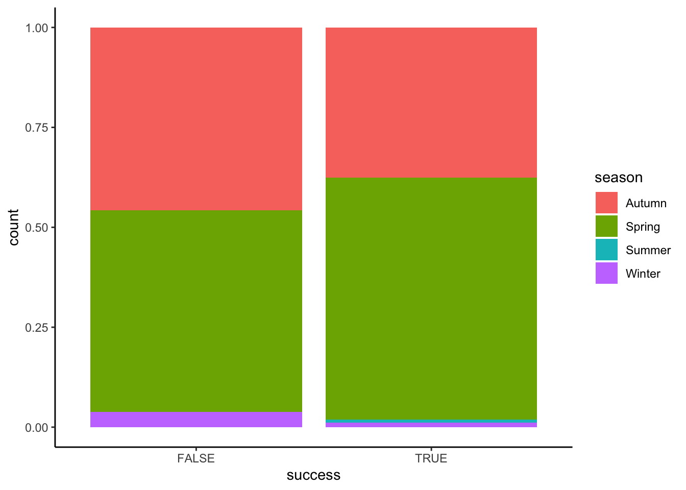
# Better plot!
# x = X, fill = Y
climbers %>%
  ggplot(aes(x = season, fill = success)) +
  geom_bar(position = "fill")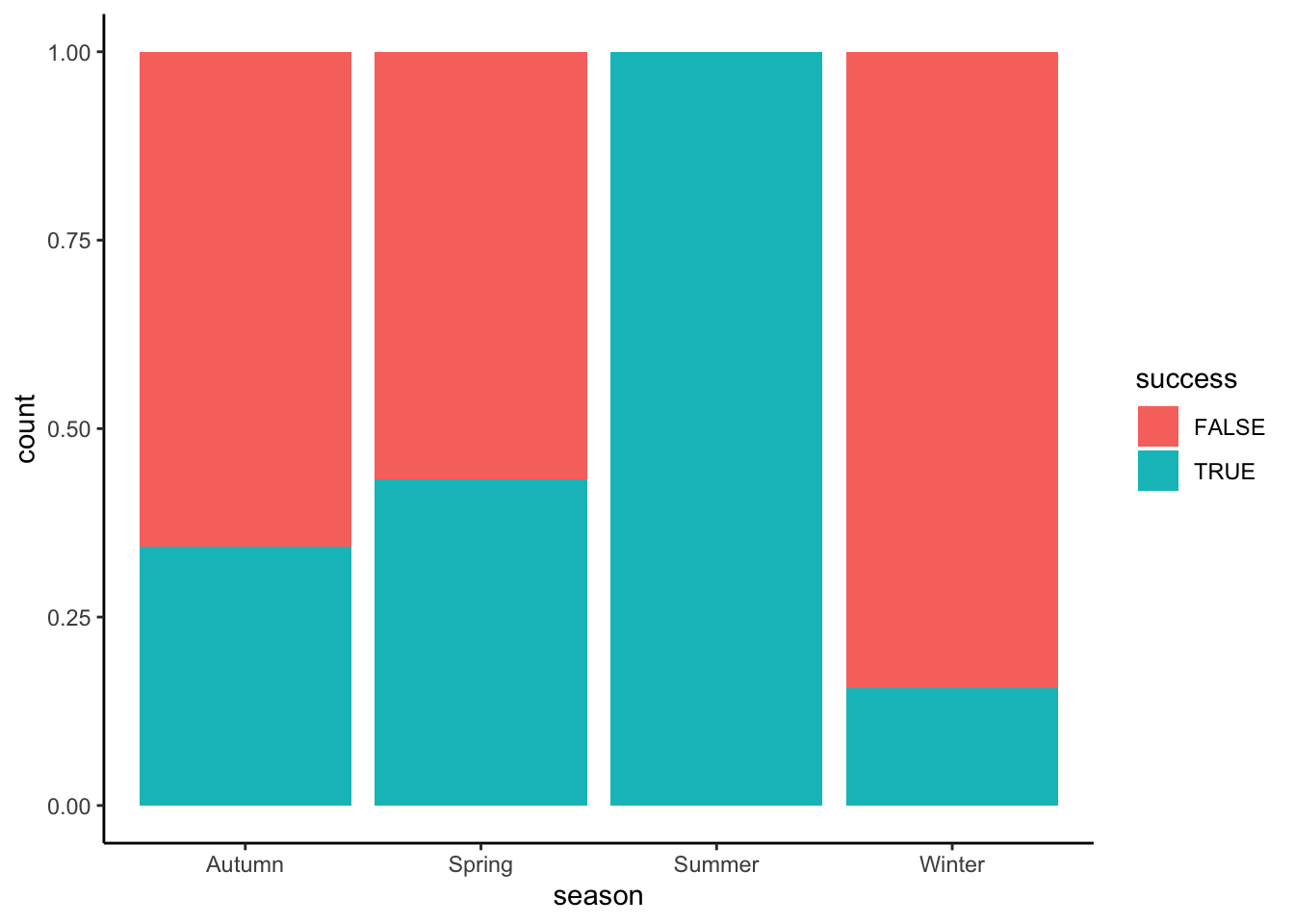
# Model the relationship
success_by_season <- glm(success ~ season, data = climbers, family = "binomial")
coef(summary(success_by_season)) Estimate Std. Error z value Pr(>|z|)
(Intercept) -0.6492953 0.07088348 -9.16003677 5.187964e-20
seasonSpring 0.3801896 0.09290833 4.09209392 4.274954e-05
seasonSummer 14.2153618 218.58070571 0.06503484 9.481463e-01
seasonWinter -1.0453004 0.36951826 -2.82881942 4.672005e-03# Exponentiate the coefficients
exp(-0.6492953)[1] 0.5224138exp(-1.0453004)[1] 0.3515862- The odds of success are 0.52 in Autumn, i.e. success is roughly half as likely as failure in Autumn.
- The odds of success in Winter are 35% as high as (i.e. 65% lower than) the odds of success in Autumn. That is, odds(success in Winter) / odds(success in Autumn) = 0.35
Example 4: Predictions
Solution
# By hand
log_odds <- -0.6492953 - 1.0453004*1
odds <- exp(log_odds)
prob <- odds / (odds + 1)
prob[1] 0.1551724# Check our work
# Note the use of type = "response"! If we left this off we'd get a prediction on the log(odds) scale
predict(success_by_season, newdata = data.frame(season = "Winter"), type = "response") 1
0.1551724 - No. They are more likely to fail than succeed (probability of success < 0.5).
- Wrong!
Exercises
Exercise 1: Graphical and numerical summaries
Solution
ggplot(resume) +
geom_mosaic(aes(x = product(gender), fill = received_callback)) +
scale_fill_manual("Received Callback? \n(1 = yes, 0 = no)", values = c("lightblue", "steelblue")) +
labs(x = "Inferred Binary Gender (f = female, m = male)", y = "Received Callback? (1 = yes, 0 = no)")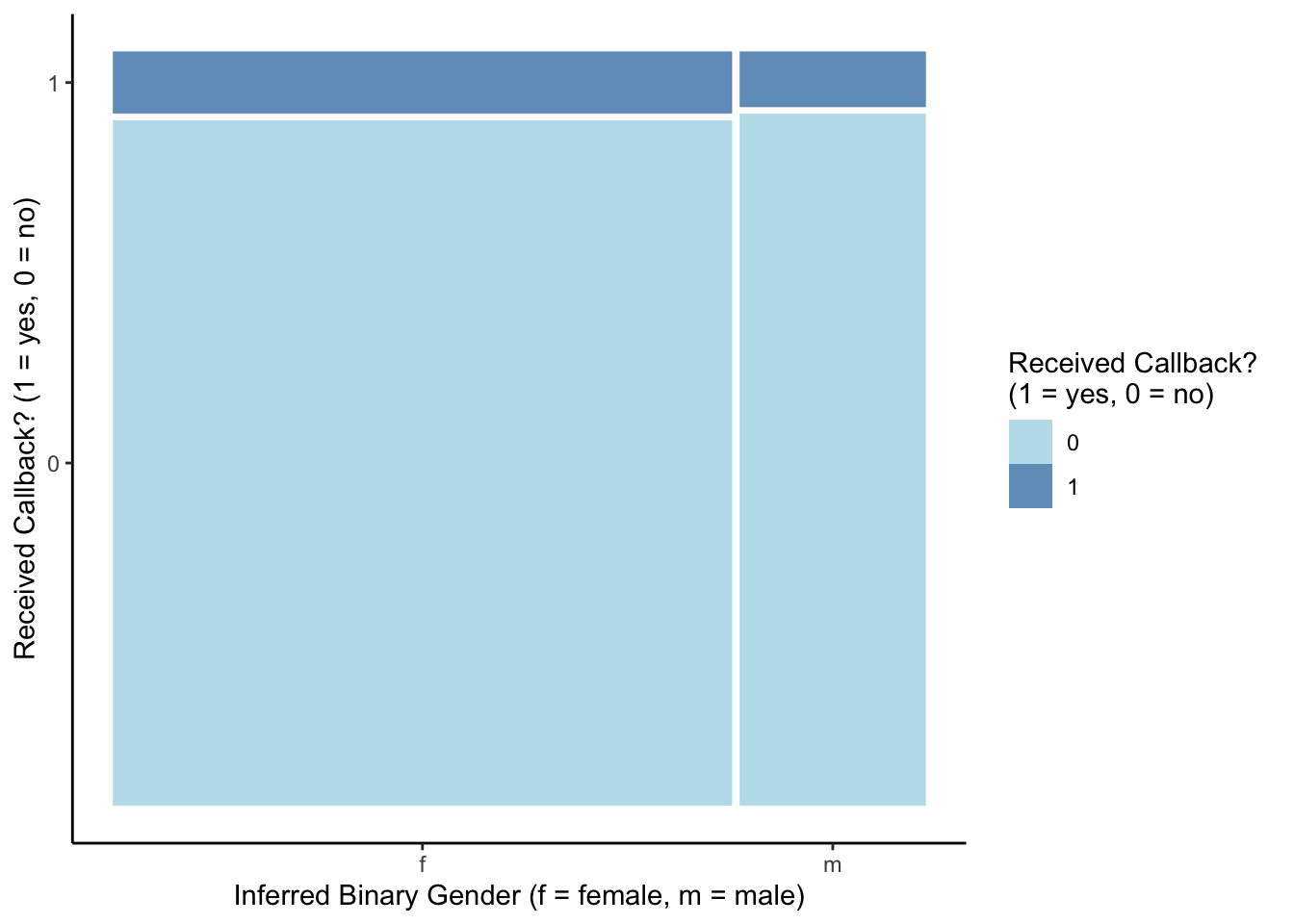
ggplot(resume) +
geom_mosaic(aes(x = product(gender), fill = received_callback)) +
facet_grid(. ~ race) +
scale_fill_manual("Received Callback? \n(1 = yes, 0 = no)", values = c("lightblue", "steelblue")) +
labs(x = "Inferred Binary Gender (f = female, m = male)", y = "Received Callback? (1 = yes, 0 = no)")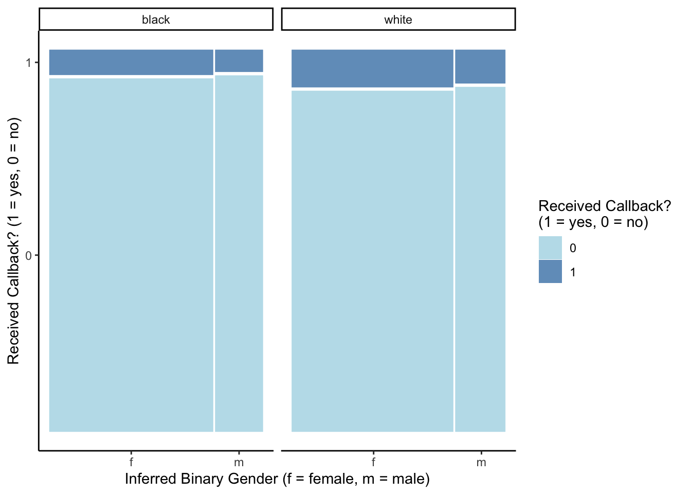
ggplot(resume) +
geom_mosaic(aes(x = product(received_callback, race), fill = received_callback)) +
facet_grid(. ~ gender) +
scale_fill_manual("Received Callback? \n(1 = yes, 0 = no)", values = c("lightblue", "steelblue")) +
labs(x = "Inferred Race", y = "Received Callback? (1 = yes, 0 = no)")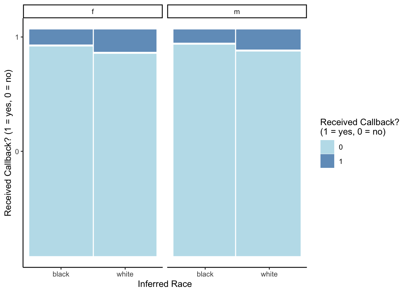
resume %>%
group_by(race, gender) %>%
count(received_callback) %>%
group_by(race, gender) %>%
mutate(condprop = n/sum(n))# A tibble: 8 × 5
# Groups: race, gender [4]
race gender received_callback n condprop
<chr> <chr> <dbl> <int> <dbl>
1 black f 0 1761 0.934
2 black f 1 125 0.0663
3 black m 0 517 0.942
4 black m 1 32 0.0583
5 white f 0 1676 0.901
6 white f 1 184 0.0989
7 white m 0 524 0.911
8 white m 1 51 0.0887Overall, a small proportion of applicants received a callback, with those who were inferred to be black males being least likely to get a callback (5.8%) and those inferred to be white females being most likely to get a callback (9.9%). In general, job applicants whose race was inferred to be white were more likely to receive a callback than those whose race was inferred to be black, regardless of their inferred gender. On the other hand, inferred gender does not seem to have as much of an effect on the chance of receiving a callback, with perhaps just a slight advantage for females.
Exercise 2: Logistic regression modeling
Solution
mod1 <- glm(received_callback ~ gender + race, data = resume, family = "binomial")
coef(mod1)(Intercept) genderm racewhite
-2.6473729 -0.1270306 0.4395841 exp(coef(mod1))(Intercept) genderm racewhite
0.07083706 0.88070675 1.55206159 - exp(Intercept): We estimate the odds of getting a callback among those inferred to be black females is only 0.07, meaning that the chance of getting a callback is 0.07 times as large as the chance of not getting a callback (or, inversely, the chance of not getting a callback is 1/0.07 = 14.29) times greater than the chance of getting a callback).
- exp(genderm): Comparing applicants of the same inferred race, we estimate that those inferred to be male have an odds of getting a callback that is 0.88 times as high as (or, equivalently, 12% lower than) the odds of getting a callback for those inferred to be female.
- exp(racewhite): We estimate that the odds of getting a callback are 1.55 times higher for applicants whose race was inferred to be white as compared to those who were inferred to be black but the same gender.
Exercise 3: Interaction terms
Solution
Including an interaction term in our model would allow us to investigate whether the effect of race on getting a callback depends on your gender or, vice versa, if the effect of gender on getting a callback depends on a race. In other words, we could ask questions like: is there more of a discrepancy in callbacks between black and white males than there is among black and white females? Is there more of a discrepancy in callbacks between male and female blacks than there is among male and female whites?
Let’s try adding an interaction between gender and race. Update the code below to fit this new interaction model.
mod2 <- glm(received_callback ~ gender * race, data = resume, family = "binomial")
coef(mod2) (Intercept) genderm racewhite genderm:racewhite
-2.64532337 -0.13698360 0.43609385 0.01654707 exp(coef(mod2)) (Intercept) genderm racewhite genderm:racewhite
0.0709824 0.8719845 1.5466539 1.0166847 - Overall logistic regression model formula in terms of beta coefficients:
\log(Odds[ReceivedCallback = 1 \mid gender, race]) = \beta_0 + \beta_1 genderm + \beta_2 racewhite + \beta_3 genderm \times racewhite
The model formula for males:
\log(Odds[ReceivedCallback = 1 \mid gender=m, race]) = (\beta_0 + \beta_1) + (\beta_2 + \beta_3) racewhite
The model formula for females:
\log(Odds[ReceivedCallback = 1 \mid gender=f, race]) = \beta_0 + \beta_2 racewhite Focusing first on the female model formula, we can see that this is a simple logistic regression model.
- exp(beta0): Odds of callback for black females
- exp(beta2): This is the odds ratio for race among females. That is, white females have exp(beta2) times the odds of callback than black females.
Then focusing on the male model formula, we can see that this is also a simple logistic regression model.
- exp(beta0+beta1): Odds of callback for black males
- exp(beta2+beta3): This is the odds ratio for race among males. White males have exp(beta2+beta3) times the odds of callback than black males.
Comparing the male to the female model formula, we have:
- exp(beta1): Black males have exp(beta1) times the odds of a callback than black females
- exp(beta3): This tells us how many times higher the odds ratio for race is in males as compared to females.
Exercise 4: Prediction
Solution
# set up data frame with people we want to predict for
predict_data <- data.frame(
gender = c("f", "m", "f", "m"),
race = c("black", "black", "white", "white")
)
print(predict_data) gender race
1 f black
2 m black
3 f white
4 m white# prediction based on model without interaction
mod1 %>%
predict(newdata = predict_data, type = "response") 1 2 3 4
0.06615111 0.05872314 0.09905323 0.08828000 # prediction based on model with interaction
mod2 %>%
predict(newdata = predict_data, type = "response") 1 2 3 4
0.06627784 0.05828780 0.09892473 0.08869565 The predicted probabilities from our logistic regression models show that we estimate those inferred to be black males have the lowest chance of receiving a callback (5.87% based on mod1 and 5.83% based on mod2), followed by black females (6.62% and 6.63%), white males (8.83% and 8.87%), and then white females (9.91% and 9.89%). This matches the trend we observed that those inferred to be white have a greater chance of getting a callback, regardless of gender, and that those who are inferred to be female have a slightly higher chance of getting a callback than those inferred to be male.
Exercise 5: Evaluating logistic models with plots
Solution
mod3 <- glm(received_callback ~ gender*race + years_college + years_experience + resume_quality, data = resume, family = "binomial")
# mod1 predicted probabilities
mod1_output <- resume %>%
mutate(.fitted = predict(mod1, newdata = ., type = "response"))
mod1_output %>%
ggplot(aes(x = factor(received_callback), y = .fitted)) +
geom_boxplot()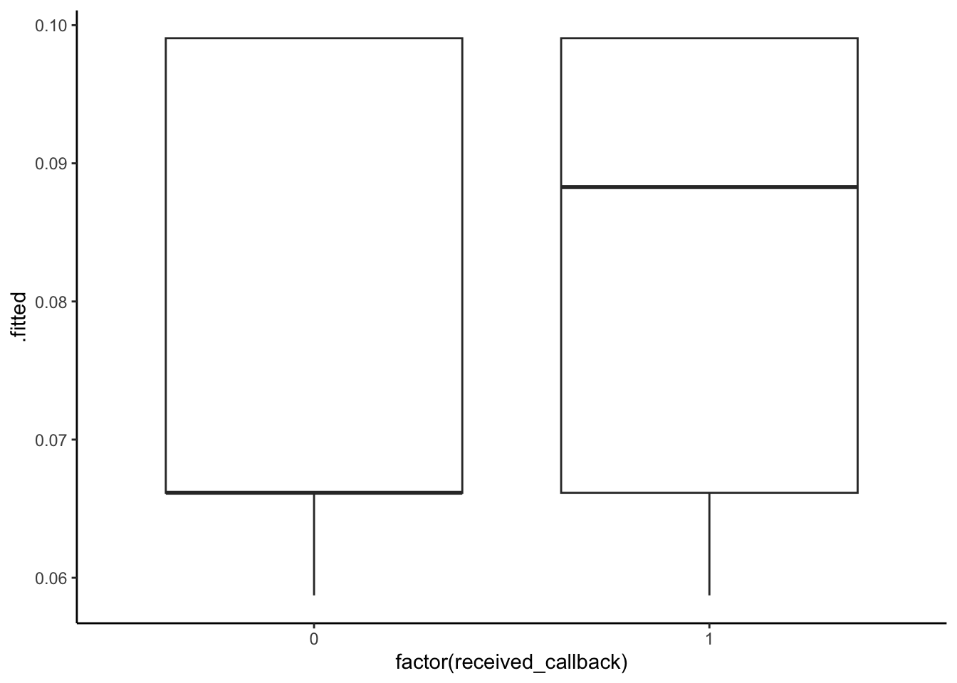
# mod2 predicted probabilities
mod2_output <- resume %>%
mutate(.fitted = predict(mod2, newdata = ., type = "response"))
mod2_output %>%
ggplot(aes(x = factor(received_callback), y = .fitted)) +
geom_boxplot()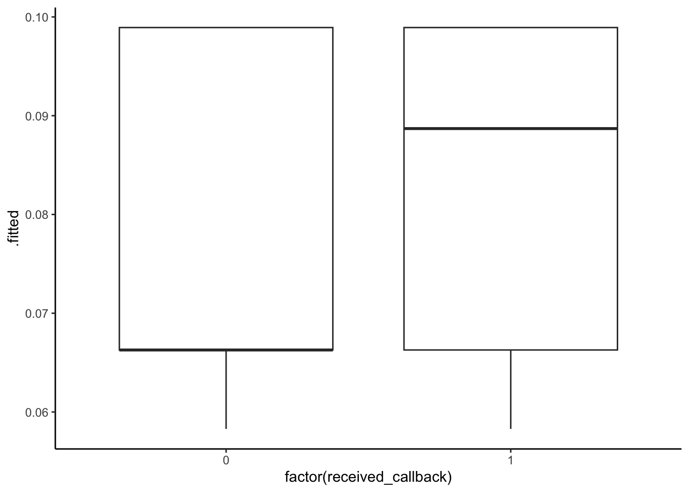
# mod3 predicted probabilities
mod3_output <-resume %>%
mutate(.fitted = predict(mod3, newdata = ., type = "response"))
mod3_output %>%
ggplot(aes(x = factor(received_callback), y = .fitted)) +
geom_boxplot()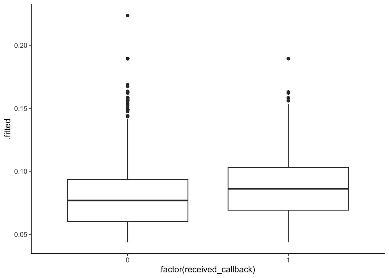
All 3 models show that those who actually received a callback had higher predicted probabilities of a callback. Models 1 and 2 are very similar–although predicted probabilites of callback are high for those who did actually receive a callback, there is substantial overlap in the boxplots. There is more separation between the boxplots in the third model, perhaps model 3 is best in terms of accuracy.
We would want to place the vertical lines such that as much of the left boxplot was below the line (low predicted probabilities for those with Y = 0) and as much of the right boxplot was above the line (high predicted probabilities for those with Y = 1).
Exercise 6: Evaluating logistic models with evaluation metrics
Solution
ggplot(mod1_output, aes(x = factor(received_callback), y = .fitted)) +
geom_boxplot() +
geom_hline(yintercept = 0.08, color = "red")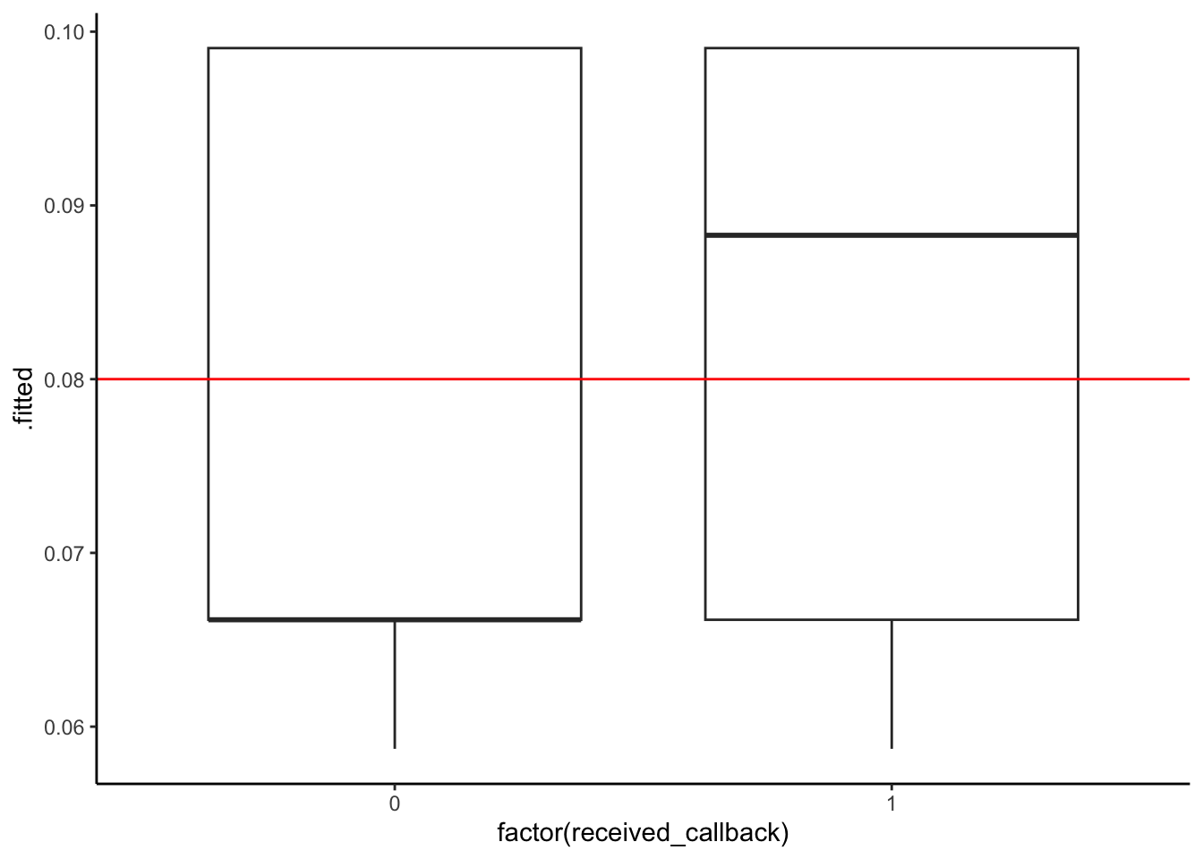
ggplot(mod2_output, aes(x = factor(received_callback), y = .fitted)) +
geom_boxplot() +
geom_hline(yintercept = 0.08, color = "red")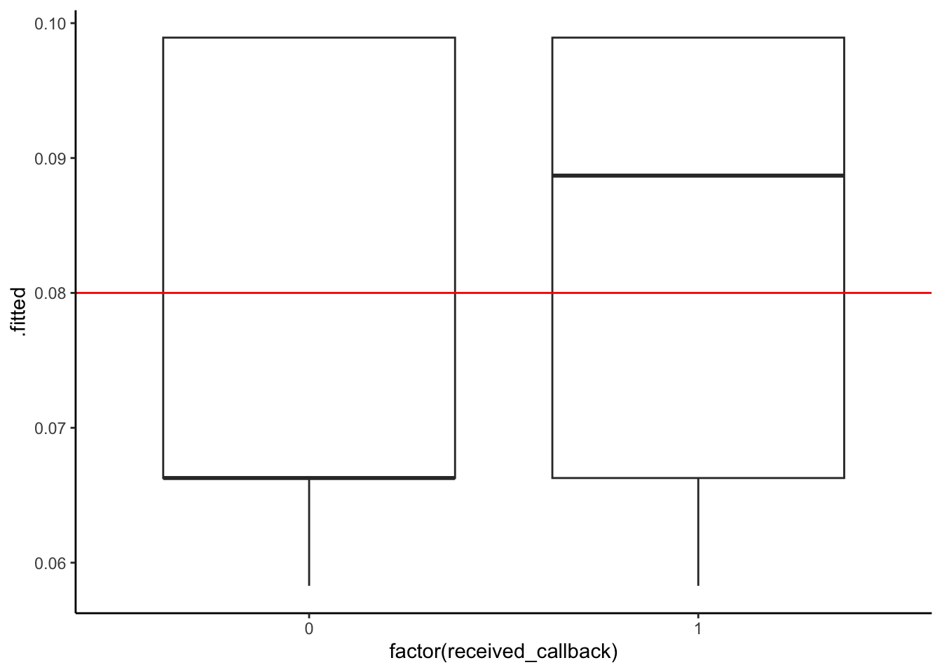
ggplot(mod3_output, aes(x = factor(received_callback), y = .fitted)) +
geom_boxplot() +
geom_hline(yintercept = 0.08, color = "red")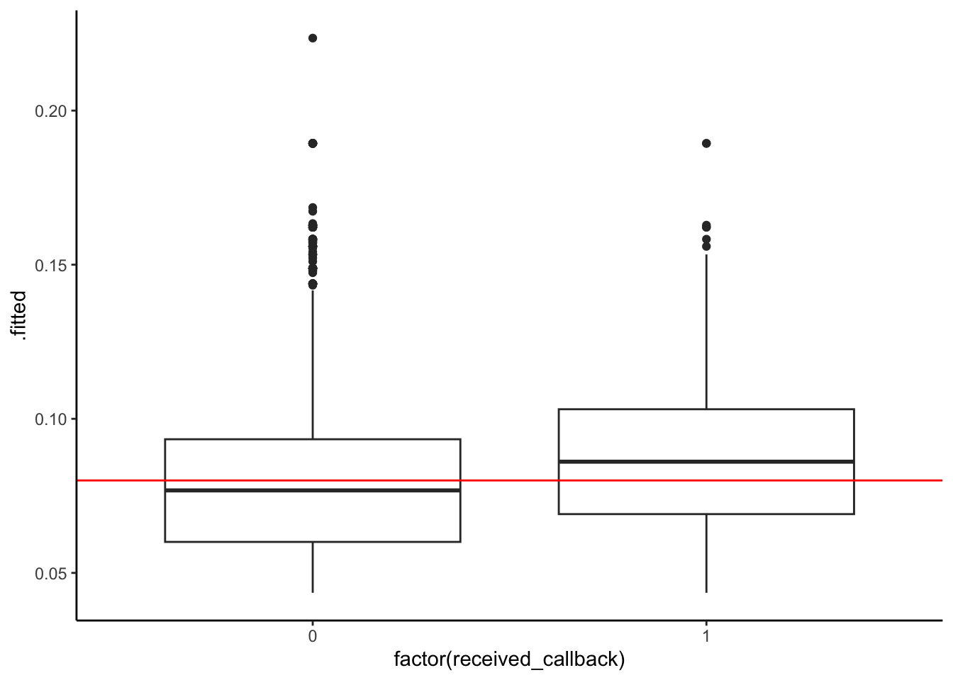
Next, we can use our threshold to classify each person in our dataset based on their predicted probability of getting a callback: we’ll predict that everyone with a predicted probability higher than our threshold got a callback, and otherwise they did not. Then, we’ll compare our model’s prediction to the true outcome (whether or not they actually did get a callback).
threshold <- 0.08
mod1_output %>%
mutate(predictCallback = .fitted >= threshold) %>%
count(received_callback, predictCallback) # A tibble: 4 × 3
received_callback predictCallback n
<dbl> <lgl> <int>
1 0 FALSE 2278
2 0 TRUE 2200
3 1 FALSE 157
4 1 TRUE 235mod2_output %>%
mutate(predictCallback = .fitted >= threshold) %>%
count(received_callback, predictCallback)# A tibble: 4 × 3
received_callback predictCallback n
<dbl> <lgl> <int>
1 0 FALSE 2278
2 0 TRUE 2200
3 1 FALSE 157
4 1 TRUE 235mod3_output %>%
mutate(predictCallback = .fitted >= threshold) %>%
count(received_callback, predictCallback)# A tibble: 4 × 3
received_callback predictCallback n
<dbl> <lgl> <int>
1 0 FALSE 2465
2 0 TRUE 2013
3 1 FALSE 159
4 1 TRUE 233Models 1 and 2: (Both models result in the same confusion matrix.)
| Predict callback | Predict no callback | Total | |
|---|---|---|---|
| Actually got callback | 235 | 157 | 392 |
| Actually did not | 2200 | 2278 | 4478 |
| Total | 2435 | 2435 | 4870 |
Model 3:
| Predict callback | Predict no callback | Total | |
|---|---|---|---|
| Actually got callback | 233 | 159 | 392 |
| Actually did not | 2013 | 2465 | 4478 |
| Total | 2246 | 2624 | 4870 |
- Now compute the following evaluation metrics for the models:
Models 1 and 2:
- Accuracy: P(Predict Y Correctly) = (235 + 2278)/(235 + 157 + 2200 + 2278) = 0.5160164
- Sensitivity: P(Predict Y = 1 | Actual Y = 1) = 235/(235 + 157) = 0.5994898
- Specificity: P(Predict Y = 0 | Actual Y = 0) = 2278/(2200 + 2278) = 0.5087092
- False negative rate: P(Predict Y = 0 | Actual Y = 1) = 157/(235 + 157) = 0.4005102 (notice that this is equal to 1 - Sensitivity)
- False positive rate: P(Predict Y = 1 | Actual Y = 0) = 2200/(2200 + 2278) = 0.4912908 (notice that this is equal to 1 - Specificity)
Model 3:
- Accuracy: P(Predict Y Correctly) = (233 + 2465)/(233 + 159 + 2013 + 2465) = 0.5540041
- Sensitivity: P(Predict Y = 1 | Actual Y = 1) = 233/(233 + 159) = 0.5943878
- Specificity: P(Predict Y = 0 | Actual Y = 0) = 2465/(2013 + 2465) = 0.550469
- False negative rate: P(Predict Y = 0 | Actual Y = 1) = 159/(233 + 159) = 0.4056122 (notice that this is equal to 1 - Sensitivity)
- False positive rate: P(Predict Y = 1 | Actual Y = 0) = 2013/(2013 + 2465) = 0.449531 (notice that this is equal to 1 - Specificity)
- Imagine that we are a career center on a college campus and we want to use this model to help students that are looking for jobs. Consider the consequences of incorrectly predicting whether or not an individual will get a callback. What are the consequences of a false negative? What about a false positive? Which one is worse?
- False Negatives (predicting no callback, but actually got callback): this would be a lost opportunity if a student decided not to submit their resume, thinking they wouldn’t get a callback, when actually they would have.
- False Positives (predicting callback, but actually didn’t get callback): this would be a disappointment for the student, thinking they were going to get a callback but they ended up not getting one.
Exercise 7: climb_model_2
Solution
# Load data
climbers <- read.csv("https://mac-stat.github.io/data/climbers_sub.csv") %>%
  select(peak_name, success, age, oxygen_used, year, season)

# Build 2 models
climb_model_1 <- glm(success ~ age, climbers, family = "binomial")
climb_model_2 <- glm(success ~ age + oxygen_used, climbers, family = "binomial")- We should expect this to turn into 2 curves, 1 for each category of
oxygen_used.
# Plot climb_model_1
climbers %>%
  ggplot(aes(y = as.numeric(success), x = age)) +
  geom_smooth(method = "glm", se = FALSE, method.args = list(family = "binomial")) +
  labs(y = "probability of success")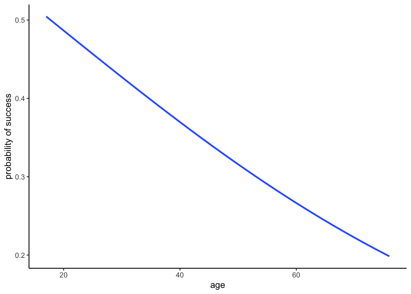
- The probability of success decreases with age, both among climbers that use oxygen and among those that don’t. Further, at any age, the probability of success is higher among people that use oxygen.
# Plot climb_model_2
climbers %>%
  ggplot(aes(y = as.numeric(success), x = age, color = oxygen_used)) +
  geom_smooth(method = "glm", se = FALSE, method.args = list(family = "binomial")) +
  labs(y = "probability of success")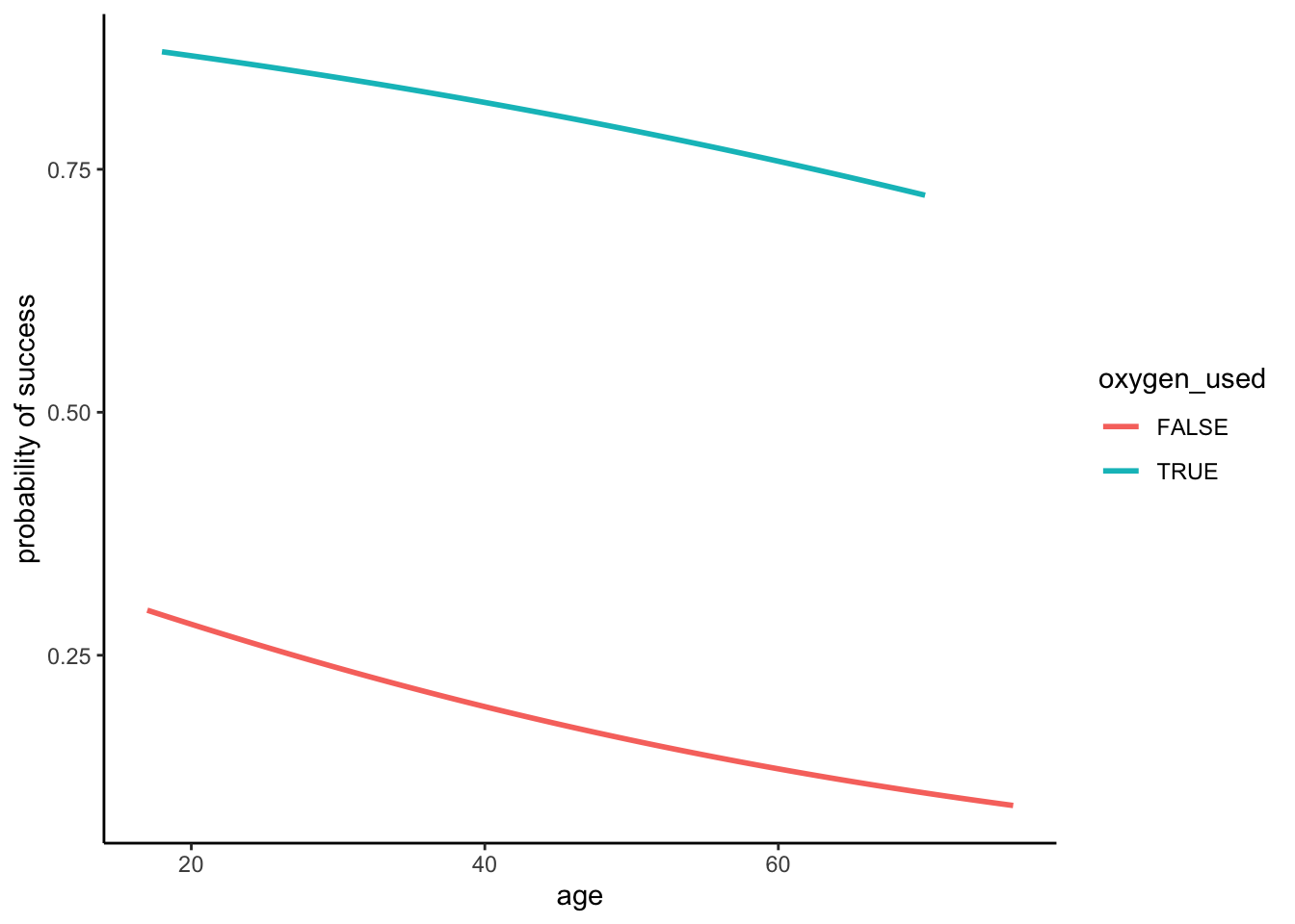
# Just for fun zoom out!
climbers %>%
  ggplot(aes(y = as.numeric(success), x = age, color = oxygen_used)) +
  geom_smooth(method = "glm", se = FALSE, method.args = list(family = "binomial"),
              fullrange = TRUE) +
  labs(y = "probability of success") +
  lims(x = c(-300, 400))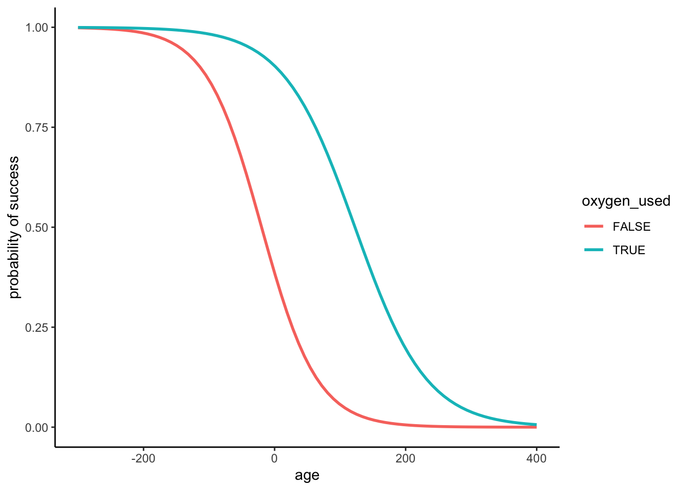
- When controlling for oxygen use, the odds of success are 97.8% as high (2.2% lower) for every additional year in age, on average.
# Get the model summary table
coef(summary(climb_model_2)) Estimate Std. Error z value Pr(>|z|)
(Intercept) -0.51957247 0.207331212 -2.506002 1.221049e-02
age -0.02197407 0.005459778 -4.024718 5.704361e-05
oxygen_usedTRUE 2.89559690 0.126370801 22.913496 3.408591e-116# Exponentiated coefficients
exp(coef(climb_model_2)) (Intercept) age oxygen_usedTRUE
0.5947748 0.9782656 18.0942987 - When controlling for age, the odds of success are roughly 18 times higher for people that use oxygen.
Exercise 8: Model evaluation using plots
Solution
climbers %>%
  mutate(.fitted = predict(climb_model_1, newdata = ., type = "response")) %>%
head() peak_name success age oxygen_used year season .fitted
1 Ama Dablam TRUE 28 FALSE 1981 Spring 0.4389240
2 Ama Dablam TRUE 27 FALSE 1981 Spring 0.4448359
3 Ama Dablam TRUE 35 FALSE 1981 Spring 0.3981129
4 Ama Dablam TRUE 37 FALSE 1981 Spring 0.3866827
5 Ama Dablam TRUE 43 FALSE 1981 Spring 0.3531755
6 Ama Dablam FALSE 38 FALSE 1981 Spring 0.3810132# Compare the climb_model_1 probability of success calculations for those that were & weren't successful
climbers %>%
mutate(.fitted = predict(climb_model_1, newdata = ., type = "response")) %>%
ggplot(aes(x = success, y = .fitted)) +
geom_boxplot()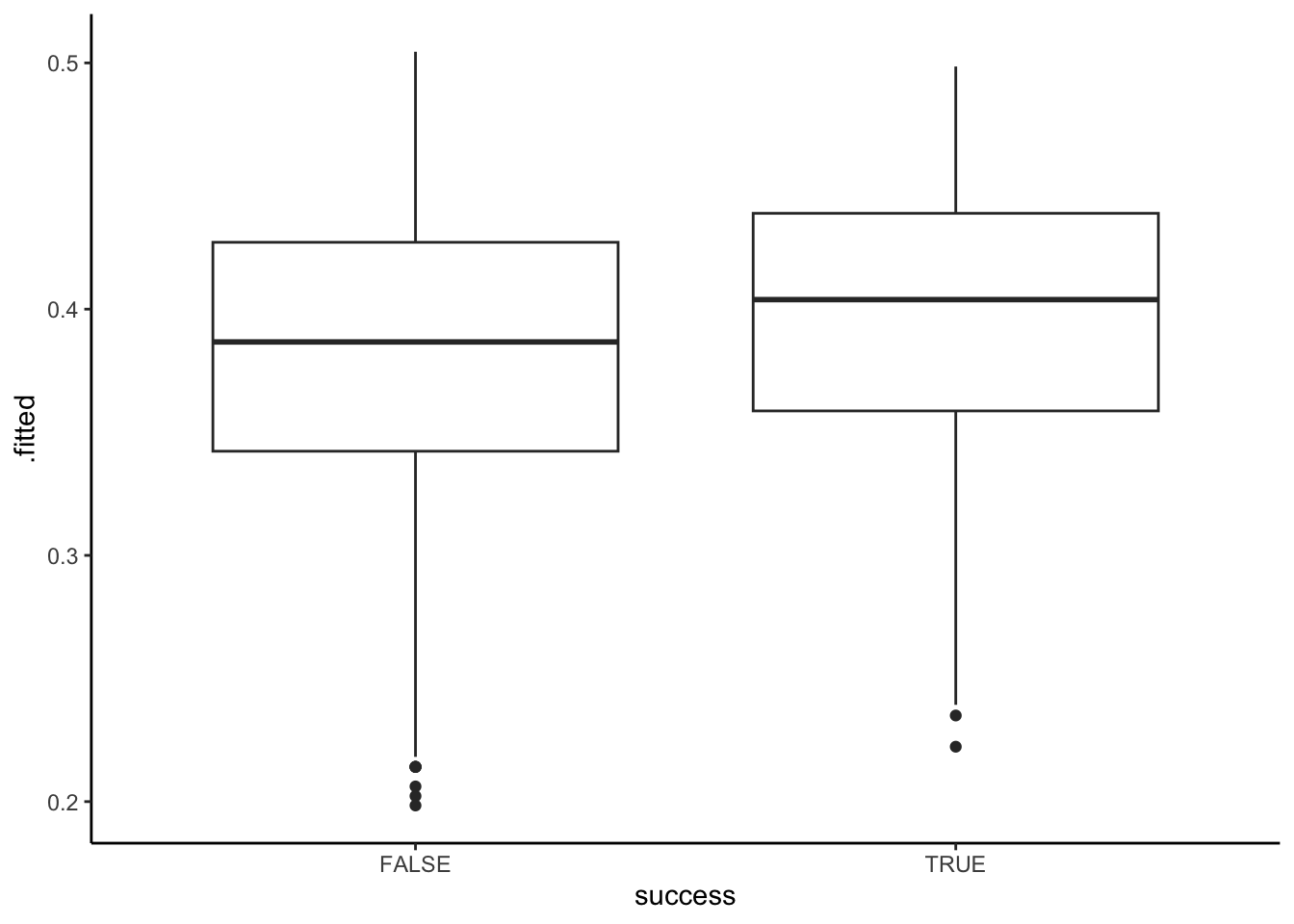
# Compare the climb_model_2 probability of success calculations for those that were & weren't successful
climbers %>%
  mutate(.fitted = predict(climb_model_2, newdata = ., type = "response")) %>%
  ggplot(aes(x = success, y = .fitted)) +
  geom_boxplot()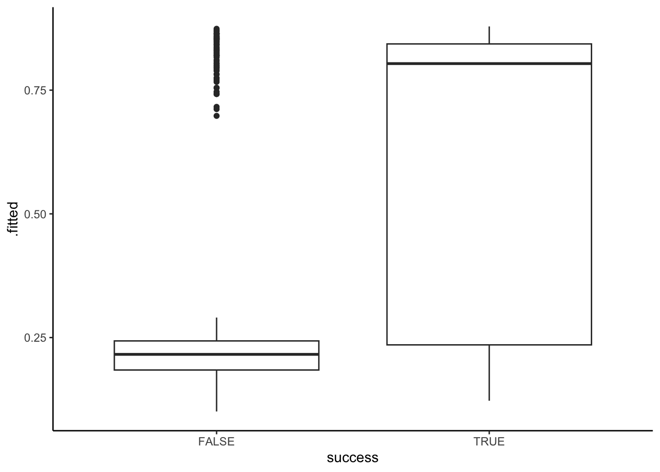
climb_model_2does a better job differentiating between those who were and were not actually successful – it tends to predict higher probabilities of success for those that were actually successful. In contrast,climb_model_1assigns pretty similar probabilities of success for both people that were actually successful and those that weren’t.
climbers %>%
  mutate(.fitted = predict(climb_model_2, newdata = ., type = "response")) %>%
  ggplot(aes(x = success, y = .fitted)) +
  geom_boxplot() +
  geom_hline(yintercept = 0.5, color = "red")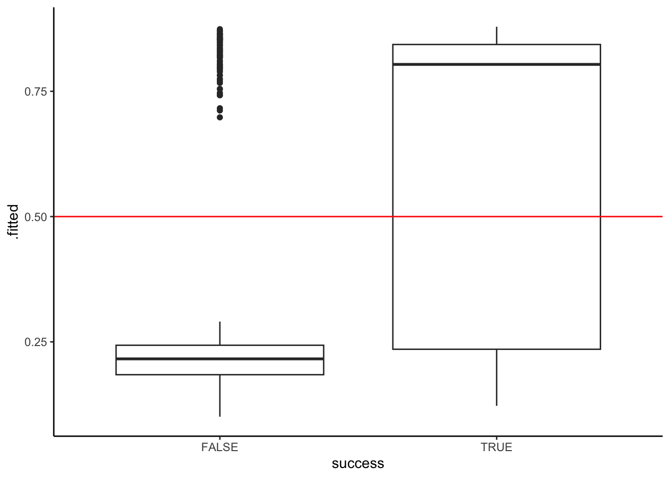
The 0.5 threshold would be bad. It would do a good job of predicting when climbers will fail, but will often predict failure for people that eventually succeed (i.e. it would have a high false negative rate).
The specificity be above 75% – the entire box is below the threshold, meaning at least 75% of failed climbers had predicted probability of success below 0.5.
The sensitivity would be between 50% & 75% – more than half of successful climbers but less than 75% had predicted probability of success above 0.5.
0.25ish better separates the 2 groups: Most climbers that failed had a probability prediction below 0.25, and most climbers that succeeded had a probability prediction above 0.25.
Exercise 9: Model evaluation using evaluation metrics
Solution
climbers %>%
mutate(.fitted = predict(climb_model_1, newdata = ., type = "response")) %>%
ggplot(aes(x = success, y = .fitted)) +
geom_boxplot() +
geom_hline(yintercept = 0.25, color = "red")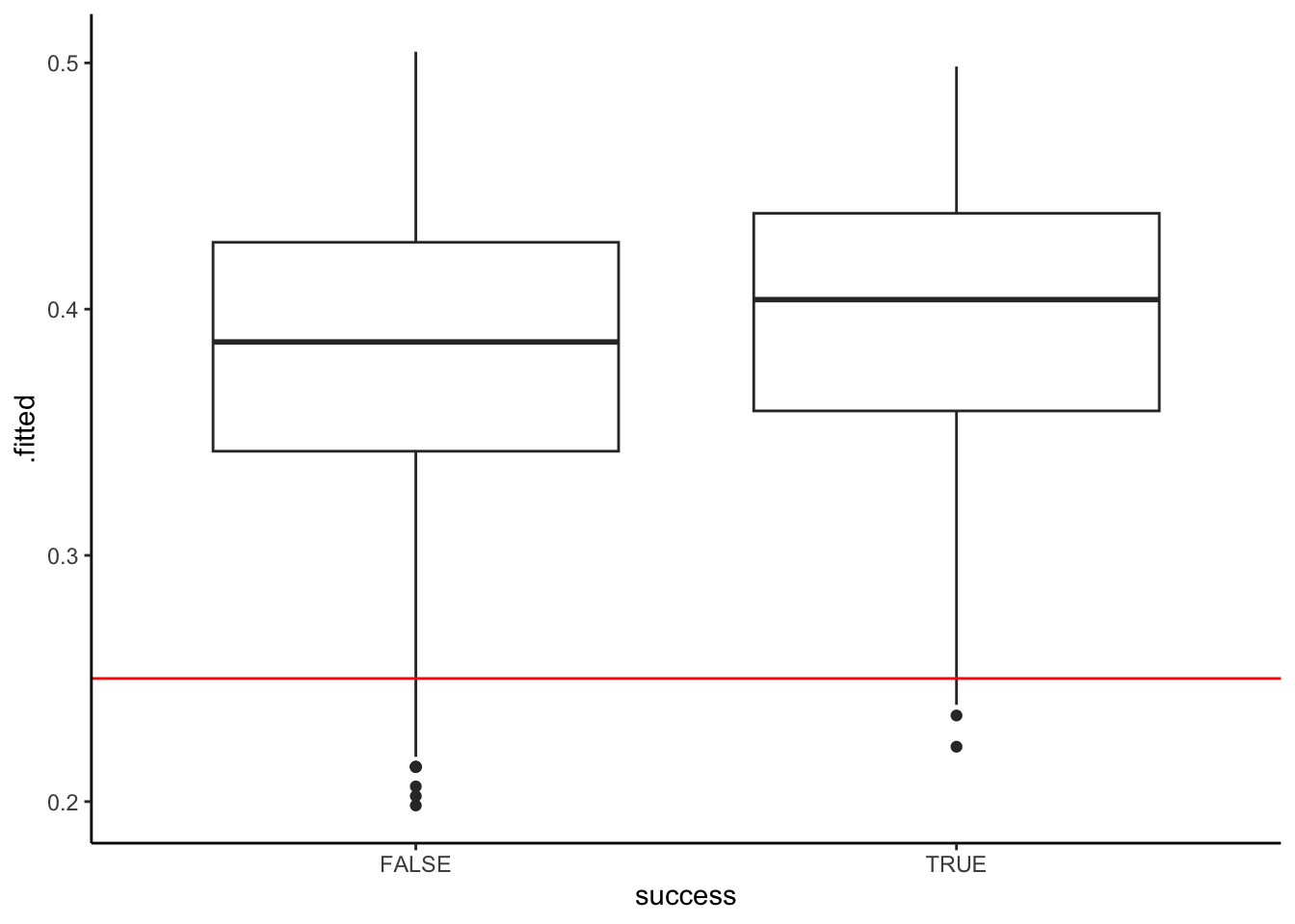
climbers %>%
mutate(.fitted = predict(climb_model_2, newdata = ., type = "response")) %>%
ggplot(aes(x = success, y = .fitted)) +
geom_boxplot() +
geom_hline(yintercept = 0.25, color = "red")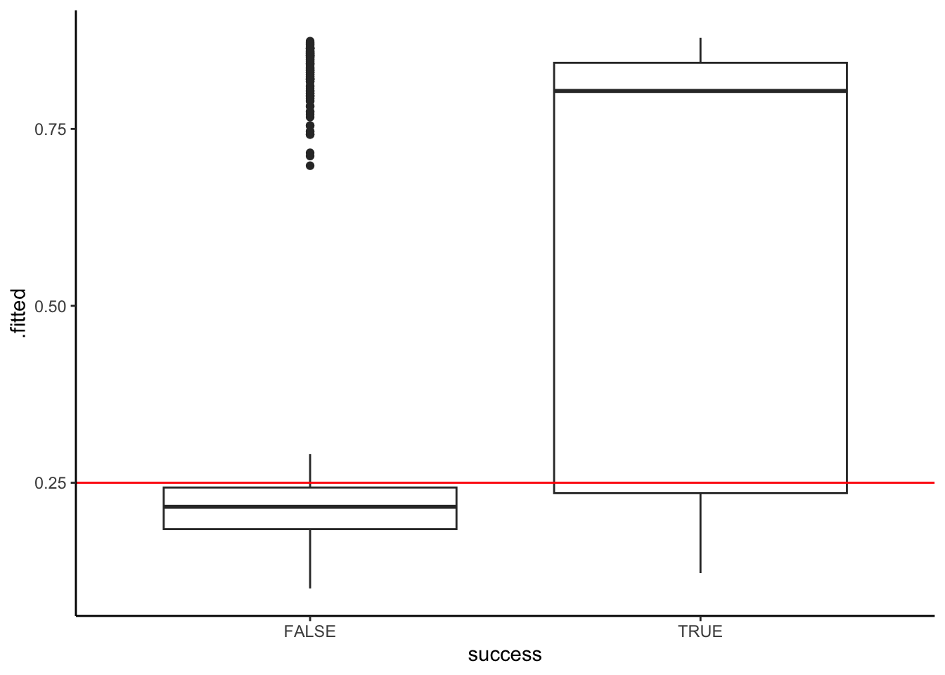
threshold <- 0.25
climbers %>%
  mutate(.fitted = predict(climb_model_1, newdata = ., type = "response")) %>%
  mutate(predictSuccess = .fitted >= threshold) %>%
  select(success, age, oxygen_used, .fitted, predictSuccess) %>%
head() success age oxygen_used .fitted predictSuccess
1 TRUE 28 FALSE 0.4389240 TRUE
2 TRUE 27 FALSE 0.4448359 TRUE
3 TRUE 35 FALSE 0.3981129 TRUE
4 TRUE 37 FALSE 0.3866827 TRUE
5 TRUE 43 FALSE 0.3531755 TRUE
6 FALSE 38 FALSE 0.3810132 TRUE# Rows = actual / observed success (FALSE or TRUE)
# Columns = predicted success (FALSE or TRUE)
library(janitor)
climbers %>%
mutate(.fitted = predict(climb_model_1, newdata = ., type = "response")) %>%
mutate(predictSuccess = .fitted >= threshold) %>%
tabyl(success, predictSuccess) %>%
adorn_totals(c("row", "col")) success FALSE TRUE Total
FALSE 25 1244 1269
TRUE 7 800 807
Total 32 2044 2076# a
# Total number of correct predictions / total number of climbers
(25 + 800) / 2076[1] 0.3973988# b
# Number of successful climbers that were predicted to be successful / total number of successful climbers
800 / 807[1] 0.9913259# c
# Number of unsuccessful climbers that were predicted to be unsuccessful / total number of unsuccessful climbers
25 / 1269[1] 0.01970055Exercise 10: More confusion matrices
Solution
# Confusion matrix
climbers %>%
  mutate(.fitted = predict(climb_model_2, newdata = ., type = "response")) %>%
  mutate(predictSuccess = .fitted >= threshold) %>%
  tabyl(success, predictSuccess) %>%
  adorn_totals(c("row", "col"))
success FALSE TRUE Total
FALSE 1008 261 1269
TRUE 249 558 807
Total 1257 819 2076# Overall accuracy
(1008 + 558) / 2076[1] 0.7543353# Sensitivity
558 / 807[1] 0.6914498# Specificity
1008 / 1269[1] 0.7943262Exercise 11: Model comparison
Solution
| model | predictors | overall | sensitivity | specificity |
|---|---|---|---|---|
| 1 | age | 0.40 | 0.99 | 0.02 |
| 2 | age, oxygen_used | 0.75 | 0.69 | 0.79 |
- Model 2 had the higher overall accuracy.
- Model 1 was better at predicting when a climber would succeed. (it had higher sensitivity)
- Model 2 was better at predicting when a climber would not succeed. (it had higher specificity)
- In my opinion, specificity is more important. Climbing can be dangerous and so maybe it’s better to anticipate when you might not succeed.