# Load packages and import data
library(tidyverse)

lifts <- read_csv("https://mac-stat.github.io/data/powerlifting.csv")3 Simple linear regression: Introduction
Settling In
- Put away your cell phones and clear your laptops of anything not related to STAT 155.
- Sit with new people and meet each other!
- Help each other get ready to take notes!
- Open your notebook. Take notes of key concepts.
- Open the online manual to the “Course Schedule” and click on today’s activity. That brings you here!
- Download “03-slr-intro.qmd” and open it in RStudio. Read the “Organizing your files” directions at the top of the file!!
Recap
ImportantStatistical superpowers
When using data, our interests or research questions are typically about relationships between variables, not about how a single variable behaves on its own:
- How is voter participation (Y) related to demographic variables such as age (X)?
- How are albums’ critic reviews (Y) related to their user reviews (X)?
- How are tadpole speeds (Y) related to the length of the tadpole (X)?
Linear regression models are THE most important, fundamental tool for exploring such relationships.
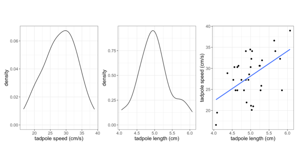
- Data from a study by Tim Watkins, a former Mac Biology faculty member.
NoteLearning goals
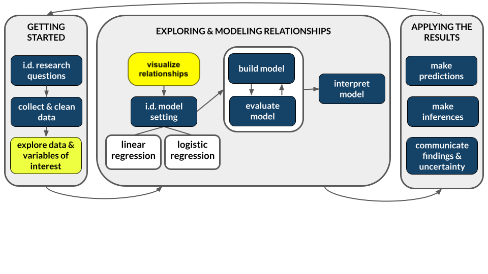
Explore numerical and visual summaries for the relationship between a quantitative response (aka outcome) variable and a quantitative predictor (aka explanatory variable):
- Construct and interpret a scatterplot visualization of the relationship.
- Describe/identify weak / strong, and positive / negative correlation from a point cloud
- Compute and interpret the linear correlation between the 2 variables.
- Build intuition for fitting lines to quantify / model the relationship between the 2 variables.
NoteAdditional resources
After class, watch the following required videos (part of CP2):
- Simple linear regression Part 1: motivation & scatterplots
- Simple linear regression Part 2: correlation
- Simple linear regression Part 3: simple linear regression models
After class, review the following optional material:
- Reading: Sections 2.8, 3.1-3.3, 3.6 in the STAT 155 Notes
- Videos: R Code for Fitting a Linear Model (Time: 11:07)
Let’s look at our R Cheatsheet that we’ve been creating…
- Each activity will introduce you to a few new tools that we can learn to wield.
NoteOrganize your files
This qmd file is where you’ll type notes, code, etc. Directions:
- Save this file in the
inclass_activitiessub-folder of thestat155folder you created before today’s class. Use a file name related to the activity number and/or today’s date (eg: “activity 3” or “3 simple linear regression”).
Exercises
Context: Today we’ll explore data from a weightlifting competition. The data originally came from Kaggle and OpenPowerlifting. Our main goal will be to explore the relationship between strength (TotalKg) and body weight (BodyweightKg). Read in the data below.
Exercise 1: Get to know the data
Create a new code chunk by clicking the green “C” button with a green + sign in the top right of the menu bar. In this code chunk, use an appropriate function to look at the first few rows of the data.
Create a new code chunk, and use an appropriate function to learn how much data we have (in terms of cases and variables).
What does a case represent?
Navigate to the FAQ page and read the response to the “How does this site work? Do you just download results from the federations?” question. What do you learn about data quality and completeness from this response?
Exercise 2: Get to know the outcome/response variable
TotalKg is of primary interest – how much a competitor lifted in total. Let’s get acquainted with this variable.
- Construct an appropriate plot to visualize the distribution of this variable, and compute appropriate numerical summaries. THINK: Is
TotalKgcategorical or quantitative?
- In the tidyverse package, whereas
select()subsets our data to include only certain columns / variables of interest,filter()subsets our data to include only certain rows / cases of interest. If we wanted to explore the lifters who lifted the greatest total, we could filter to see only those lifts whereTotalKgis greater than 1000 kg.
lifts %>%
  filter(TotalKg > 1000)
Write a good paragraph interpreting the plot and numerical summaries.
What follow-up questions do you have about
TotalKg?!
Exercise 3: Data visualization - two quantitative variables
A natural follow-up question is: what explains why TotalKg varies from competitor to competitor? For example, is TotalKg related to body weight? Let’s explore! Let’s visualize the relationship of TotalKg with body weight. A scatterplot (or informally, a “point cloud”) allows us to do this!
- Run all chunks below and add a brief comment on the outcome of the code:
# ???
lifts %>%
  ggplot(aes(x = BodyweightKg, y = TotalKg))
# ???
lifts %>%
ggplot(aes(x = BodyweightKg, y = TotalKg)) +
geom_point()# ???
lifts %>%
ggplot(aes(x = BodyweightKg, y = TotalKg)) +
geom_point(alpha = 0.1)This is your first bivariate data visualization (visualization for two variables)! What differences do you notice in the code structure when creating a bivariate visualization, compared to univariate visualizations we’ve worked with before?
What similarities do you notice in the code structure?
Does there appear to be some sort of pattern in the structure of the point cloud? Describe it, in no more than three sentences! Comment on:
- the shape of the relationship between the two variables (curved? linear?)
- the direction of the relationship between the two variables (positive? negative?)
- the strength of the relationship (are the points dispersed? close together?)
Exercise 4: Scatterplots - patterns in point clouds
Adding a smoothing line to our scatterplot can sometimes help illustrate a pattern in our point cloud:
# scatterplot with smoothing line
lifts %>%
  ggplot(aes(x = BodyweightKg, y = TotalKg)) +
  geom_point(alpha = 0.5) +
  geom_smooth()
Review your answer to Exercise 3. Does the smoothing line assist you in seeing a pattern, or change your answer at all? Why or why not?
Does there appear to be a linear relationship between body weight and TotalKg (i.e. would a straight line do a decent job at summarizing the relationship between these two variables)? Why or why not?
Exercise 5: Correlation
In a previous exercise you were asked about the strength and direction of the relationship between TotalKg and BodyweightKg. We can more precisely answer these questions using a numerical summary known as correlation (sometimes known as a “correlation coefficient” or “Pearson’s correlation”). It works as follows:
Properties
Correlation ranges from -1 to 1. A correlation of 0 indicates that there is no linear relationship between the two quantitative variables. A correlation of -1 or 1 indicates a perfect linear relationship.Strength
- Correlation measures whether the linear relationship between x and y is strong, weak, or moderate. This has to do with how dispersed our point clouds are around the trend line.
- Stronger correlations will be further from 0 (closer to -1 or 1).
Direction
- Correlation indicates whether the linear relationship between x and y is positive or negative. That is, does y go “up” when x goes “up” (positive), or does y go “down” when x goes “up” (negative)?
- Positive and negative correlations will have the appropriate respective sign (above or below zero).
Let’s explore…
- Rather than a smooth trend line, we can force the line we add to our scatterplots to be linear using
geom_smooth(method = 'lm'), as below:
# scatterplot with LINEAR trend line
lifts %>%
  ggplot(aes(x = BodyweightKg, y = TotalKg)) +
  geom_point(alpha = 0.5) +
geom_smooth(method = "lm")- Based on the above scatterplot, how would you describe the correlation between body weight and TotalKg, in terms of strength and direction?
- Make a guess as to what numerical value the correlation between body weight and TotalKg will have, based on your response to part (b).
Pause: Theory Box
So how is correlation actually calculated? The below “Theory Box” provides the formula behind this number. As with other theory boxes, you are not required to memorize, nor will you be assessed on, anything in the theory boxes. If you plan on continuing with Statistics courses at Macalester (or are interested in the fundamental theory behind everything!), these theory boxes are for you!
NoteTheory Box: Calculating correlation
The Pearson correlation coefficient, r_{x, y}, of x and y is the (almost) average of products of the z-scores of variables x and y:
r_{x, y} = \frac{\sum z_x z_y}{n - 1}
Exercise 6: Computing correlation in R
We can compute the correlation between body weight and TotalKg using summarize and cor functions. Is the computed correlation close to what you guessed earlier?
# correlation

# Note: the order in which you put your two quantitative variables into the cor
# function doesn't matter! Try switching them around to confirm this for yourself
# Because of the missing data, we need to include the use = "complete.obs" - otherwise the correlation would be computed as NA
lifts %>%
    summarize(cor(TotalKg, BodyweightKg, use = "complete.obs"))
Exercise 7: Limitations of correlation
We previously noted that correlation was a numerical summary of the linear relationship between two variables. We’ll now go through some examples of relationships between quantitative variables to demonstrate why it is incredibly important to visualize our data in addition to just computing numerical summaries!
For this exercise, we’ll be working with the anscombe dataset, which is built in to R. To load this dataset into our environment, we run the following code:
# load anscombe data
data("anscombe")
The anscombe dataset contains four different pairs of quantitative variables:
x1,y1x2,y2x3,y3x4,y4
Adapt the code we used in Exercise 7 to compute the correlation between each of these four pairs of variables, below:
# correlation between x1, y1

# correlation between x2, y2

# correlation between x3, y3

# correlation between x4, y4- What do you notice about each of these correlations (if the answer to this isn’t obvious, double-check your code)?
- Describe these correlations in terms of strength and direction, using only the numerical summary to assist you in your description.
- Draw an example on the white board or at your tables of what you think the point clouds for these pairs of variables might look like.
- Make four distinct scatterplots for each pair of quantitative variables in the
anscombedataset. You do not need to add a smooth trend line or a linear trend line to these plots.
# scatterplot: x1, y1

# scatterplot: x2, y2

# scatterplot: x3, y3

# scatterplot: x4, y4- Based on the above correlations and scatterplots, what is the message of this last exercise as it relates to the limits of correlation?
Exercise 8: Discovery – Lines of “best fit”
In this activity, we’ve learned how to fit straight lines to data, to help us visualize the relationship between two quantitative variables. So far, ggplot has chosen the line for us. How does it know which line is “best”, and what does “best” even mean?
Consider the relationship between x1 and y1 in the anscombe dataset. Run the following code, which creates a scatterplot with a fitted line to our data using the function geom_abline:
# scatterplot with a fitted line, whose slope is 0.4 and intercept is 3
anscombe %>%
  ggplot(aes(x = x1, y = y1)) +
  geom_point() +
  geom_abline(slope = 0.4, intercept = 3, col = "blue", size = 1)
Describe the line that you see. Do you think the line is “good”? What are you using to define “good”? Some things to think about:
- How many points are above the line?
- How many points are below the line?
- Are the distances of the points above and below the line roughly similar, or is there meaningful difference?
Now add another line to our plot. Which line do you think is better suited for this data? Why? Be specific!
# scatterplot with a fitted line, whose slope is 0.4 and intercept is 3
anscombe %>%
  ggplot(aes(x = x1, y = y1)) +
  geom_point() +
  geom_abline(slope = 0.4, intercept = 3, col = "blue", size = 1) +
  geom_abline(slope = 0.5, intercept = 4, col = "orange", size = 1)
It’s usually quite simple to note when a line is bad, but more difficult to quantify when a line is a good fit for our data. Consider the following line:
# scatterplot with a fitted line, whose slope is 0.4 and intercept is 3
anscombe %>%
  ggplot(aes(x = x1, y = y1)) +
  geom_point() +
  geom_abline(slope = -0.5, intercept = 10, col = "red", size = 1)
In the next activity, we’ll formalize the principle of least squares, which will give us one particular definition of a line of best fit that is commonly used in statistics! We’ll take advantage of the vertical distances between each point and the fitted line (residuals), which will help us define (mathematically) a line that best fits our data:
anscombe %>%
  mutate(.fitted = predict(lm(y1 ~ x1, .))) %>%
  ggplot(aes(x = x1, y = y1)) +
  geom_smooth(method = "lm", se = FALSE) +
  geom_segment(aes(xend = x1, yend = .fitted), col = "red") +
  geom_point()
Reflection
Much of statistics is about making (hopefully) reasonable assumptions in attempt to summarize observed relationships in data. Today we started considering assumptions of linear relationships between quantitative variables.
Review the learning objectives at the top of this file and today’s activity. How do you imagine assumptions of linearity might be useful in terms of quantifying relationships between quantitative variables? How do you imagine these assumptions could sometimes fall short, or even be unethical in certain cases?
Response: Put your response here.
Extra practice
Exercise 9: Correlation and extreme values
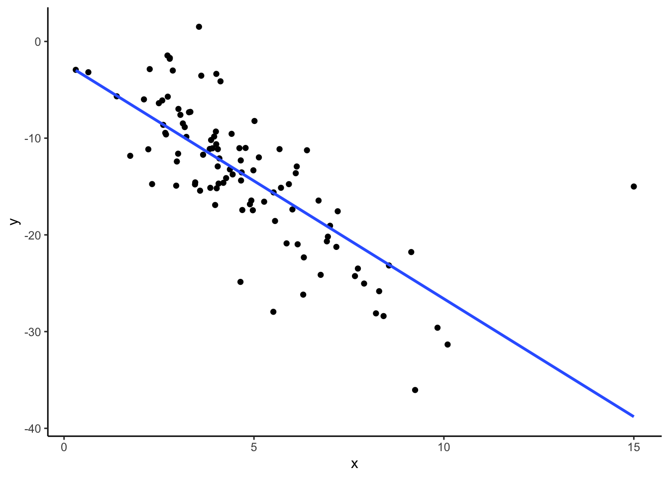
Let’s explore how correlation changes with the addition of extreme values, or observations. We’ll begin by generating a toy dataset called dat with two quantitative variables, x and y. Run the code below to create the dataset.
while not required, recall that you can look up function documentation in R using the ? in front of a function name to figure out what that function is doing!
# create a toy dataset
set.seed(1234)
dat <- data.frame(x = rnorm(100, mean = 5, sd = 2)) %>%
mutate(y = -3 * x + rnorm(100, sd = 4))- Make a scatterplot of
xvs.y.
# scatterplot- Based on your scatterplot, describe the correlation between
xandyin terms of strength and direction. - Guess the correlation (the numerical value) between
xandy. - Compute the correlation between
xandy. Was your guess from part (c) close?
# correlation- Suppose we observe an additional observation with
x = 15andy = -45. We can create a new data frame,dat_new1, that contains this observation in addition to the original ones as follows:
# creating dat_new1
new_observation <- data.frame(x = 15, y = -45)
dat_new1 <- dat %>%
  rbind(new_observation)
Now make a scatterplot of x vs. y for this new data frame, and compute the correlation between x and y. Did your correlation change very much with the addition of this observation? Hypothesize why or why not.
# scatterplot

# correlation- Suppose instead of our additional observation having values
x = 15andy = -45, we instead observex = 15andy = -15. We can create a new data frame,dat_new2, that contains this observation in addition to the original ones as follows:
# creating dat_new2
new_observation <- data.frame(x = 15, y = -15)
dat_new2 <- dat %>%
  rbind(new_observation)
Now make a scatterplot of x vs. y for this new data frame, and compute the correlation between x and y. Did your correlation change very much with the addition of this observation? Hypothesize why or why not.
# scatterplot

# correlation
What do you think the takeaway message is of this exercise?
Challenge Add linear trend lines to your scatterplots from parts (e) and (f). Does this give you any additional insight into why the correlations may have changed in different ways with the addition of a new observation?
Wrap Up
- General
- Finish the activity and check the solutions in the online manual.
- If you didn’t finish activities 1 and 2, I highly recommend you go back through those.
- Visit office hours!
- Consider joining the MSCS community listserv (directions here).
- Friday
- CP 2 (10 minutes before your section)
- Next Monday
- CP 3 (10 minutes before your section)
- PS 1. Start today, if you haven’t already!
- Course highlight: Tips + AI policies for PS
Solutions
Exercises
Exercise 1: Get to know the data
Solution
- .
head(lifts)# A tibble: 6 × 21
Name Sex Event Equipment Age BodyweightKg Best3SquatKg Best3BenchKg
<chr> <chr> <chr> <chr> <dbl> <dbl> <dbl> <dbl>
1 Natalya Po… F D Raw 37 58.4 NA NA
2 Fatima Rod… F SBD Single-p… NA 74.8 NA NA
3 Josh Kelley M SBD Single-p… NA 72.4 147. 97.5
4 Timothy Ca… M D Raw 16 72.9 NA NA
5 M Moynihan M B Raw NA 67.5 NA 100
6 Lucas Wegr… M B Raw 23.5 103. NA 188.
# ℹ 13 more variables: Best3DeadliftKg <dbl>, TotalKg <dbl>, Place <chr>,
# Dots <dbl>, Wilks <dbl>, Glossbrenner <dbl>, Goodlift <dbl>, Tested <chr>,
# Country <chr>, State <chr>, Date <date>, MeetCountry <chr>, MeetState <chr>- .
dim(lifts)[1] 100000 21A case represents an individual lifter at a single weightlifting competition.
It looks like some meets may be missing if they weren’t detected by the web scraper used by the maintainers of the Open Powerlifting database. They don’t describe in detail the process used for transferring PDFs of results to their database, so it’s unclear what errors in transcription might have resulted. Still, it’s worth taking a moment to appreciate the labor they put into making these results available for passionate powerlifters to explore.
Exercise 2: Get to know the outcome/response variable
Solution
- Construct an appropriate plot to visualize the distribution of this variable, and compute appropriate numerical summaries.
lifts %>%
  ggplot(aes(x = TotalKg)) +
  geom_histogram(color = "white")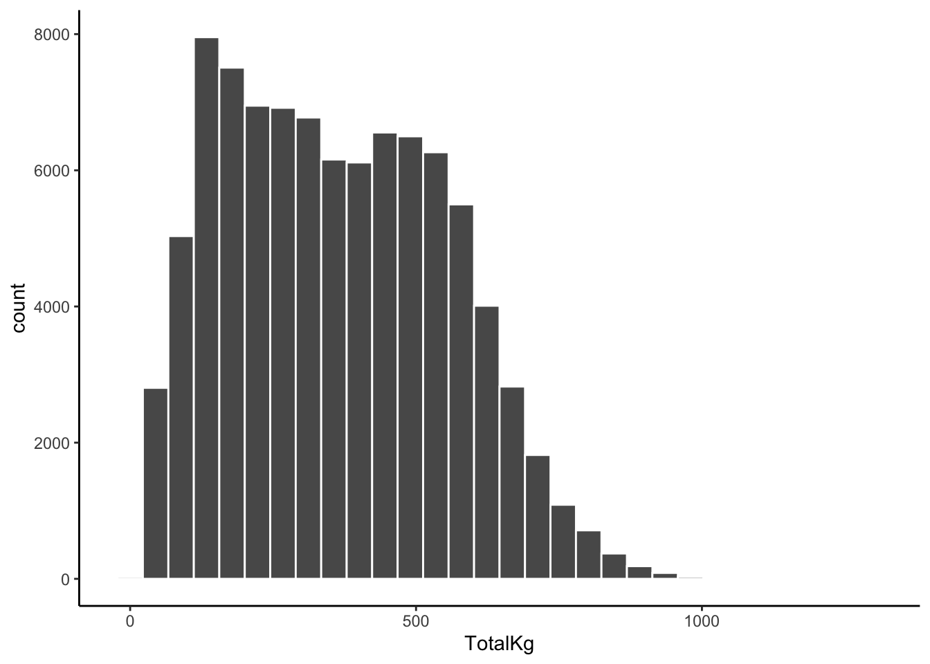
lifts %>%
  summarize(mean(TotalKg, na.rm = TRUE), min(TotalKg, na.rm = TRUE), max(TotalKg, na.rm = TRUE), sd(TotalKg, na.rm = TRUE))
# A tibble: 1 × 4
`mean(TotalKg, na.rm = TRUE)` min(TotalKg, na.rm = TR…¹ max(TotalKg, na.rm =…²
<dbl> <dbl> <dbl>
1 363. 7.48 1300.
# ℹ abbreviated names: ¹`min(TotalKg, na.rm = TRUE)`,
# ²`max(TotalKg, na.rm = TRUE)`
# ℹ 1 more variable: `sd(TotalKg, na.rm = TRUE)` <dbl>lifts %>%
filter(TotalKg > 1000)# A tibble: 40 × 21
Name Sex Event Equipment Age BodyweightKg Best3SquatKg Best3BenchKg
<chr> <chr> <chr> <chr> <dbl> <dbl> <dbl> <dbl>
1 Amanpreet… M SBD Single-p… 34 159. 435 272.
2 James Leb… M SBD Multi-ply 38 135. 458. 288.
3 Mika Virt… M SBD Multi-ply 28.5 110 400 260
4 Graham Hi… M SBD Wraps 33.5 164. 440 270
5 T. Hender… M SBD Single-p… NA 125 395. 238.
6 Zach Hudak M SBD Single-p… NA 119. 387. 277.
7 Ethan Dre… M SBD Multi-ply 26 109. 426. 284.
8 Bill Mast… M SBD Multi-ply 26 140 412. 280
9 Justin Os… M SBD Unlimited 39 119. 458. 248.
10 Todd Gren… M SBD Multi-ply NA 145 475 270
# ℹ 30 more rows
# ℹ 13 more variables: Best3DeadliftKg <dbl>, TotalKg <dbl>, Place <chr>,
# Dots <dbl>, Wilks <dbl>, Glossbrenner <dbl>, Goodlift <dbl>, Tested <chr>,
# Country <chr>, State <chr>, Date <date>, MeetCountry <chr>, MeetState <chr>- Write a good paragraph interpreting the plot and numerical summaries.
The total amounts lifted range from 7.48kg to 1299.54kg, with a mean of 363.33kg. Total amounts lifted vary about 192kg above and below the mean, on average. We observe that most competitors lifted between ~50 and 500kg, with a slight right-skew to the data. There are about 40 individuals who lifted more than 1000kg in total. The distribution appears to be slightly bimodal, suggesting two groups of lifters.
Exercise 3: Data visualization - two quantitative variables
Solution
- Run all chunks below and add a brief comment on the outcome of the code:
# creates an empty canvas with an TotalKg scale on the y-axis
# and BodyweightKg scale on the x-axis
lifts %>%
  ggplot(aes(x = BodyweightKg, y = TotalKg))
# adds points
# each point represents the TotalKg and BodyweightKg for one of our sample cases
lifts %>%
  ggplot(aes(x = BodyweightKg, y = TotalKg)) +
  geom_point()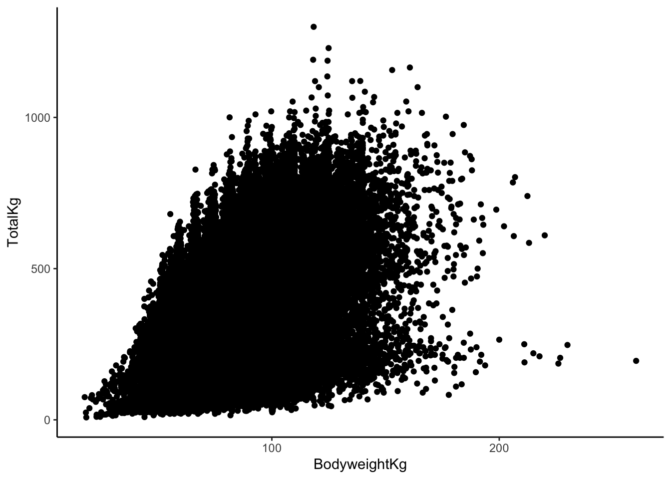
# makes the points more transparent
lifts %>%
  ggplot(aes(x = BodyweightKg, y = TotalKg)) +
  geom_point(alpha = 0.1)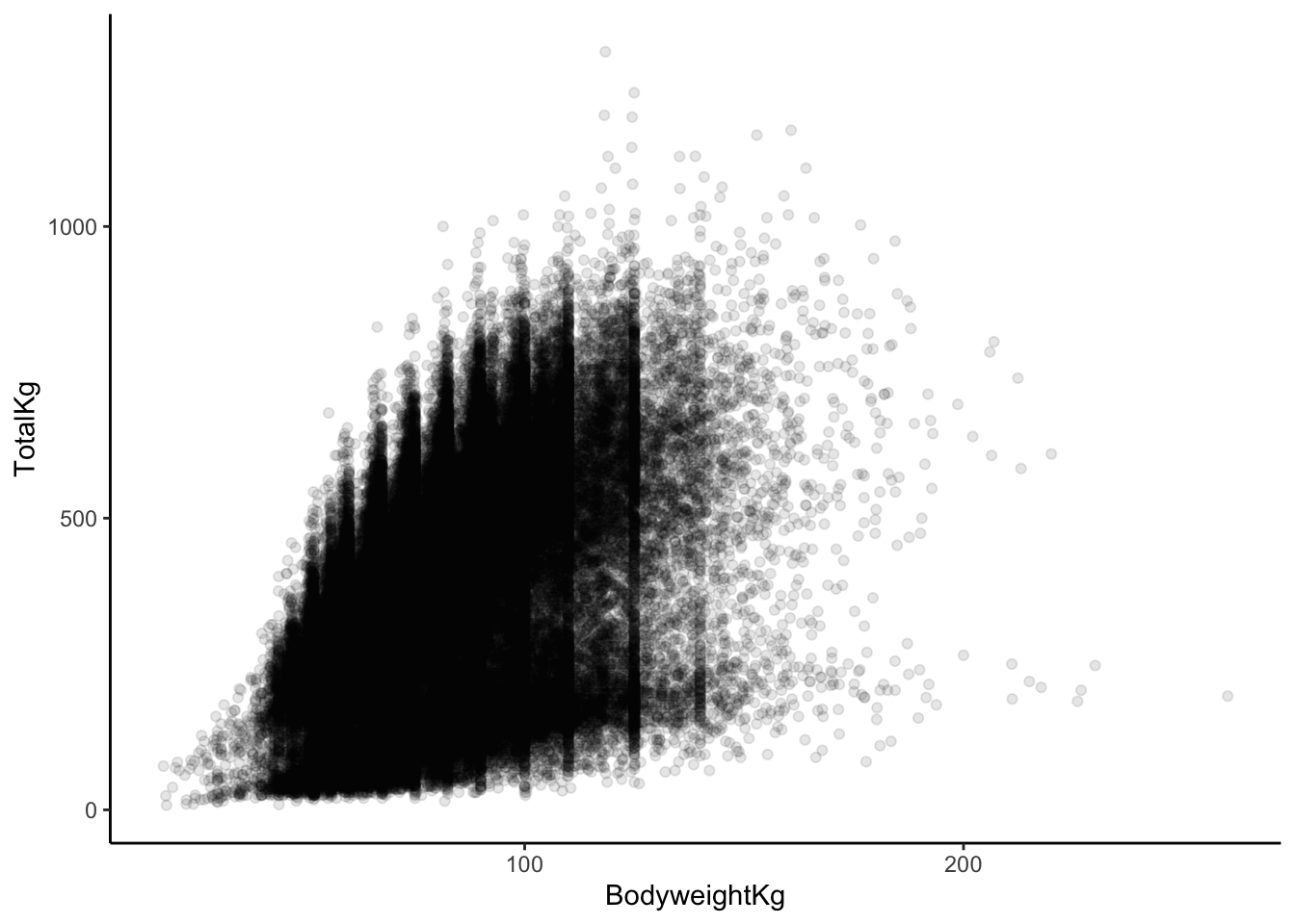
b & c. In our plot aesthetics, we now have two variables listed (an “x” and a “y”) as opposed to just a single variable. The “geom” for a scatterplot is geom_point. Otherwise, the code structure remains very similar!
- In general, it seems as though
TotalKgs increases relatively quick with body weight, but there are diminishing returns. Once body weight is greater than 100kg, the relationship between body weight and TotalKg appears to be non-existent or maybe even negative. The points are very dispersed, indicating that there is a good amount of variation in this relationship (hence the term “weak”).
Exercise 4: Scatterplots - patterns in point clouds
Solution
# scatterplot with smoothing line
lifts %>%
  ggplot(aes(x = BodyweightKg, y = TotalKg)) +
  geom_point(alpha = 0.5) +
  geom_smooth()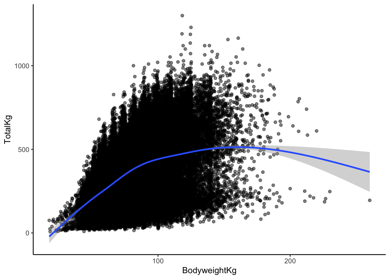
This doesn’t change my answer much (but it may have changed yours, and that’s okay!).
I would say that yes, a linear relationship here seems reasonable! Even though there is some curvature in the smoothed trend line later on, that is based on very few data points. Those data points with higher body weights aren’t enough to convince me that the relationship couldn’t be roughly linear between body weight and TotalKg.
Exercise 5: Correlation
Solution
# scatterplot with LINEAR trend line
lifts %>%
  ggplot(aes(x = BodyweightKg, y = TotalKg)) +
  geom_point(alpha = 0.5) +
  geom_smooth(method = "lm")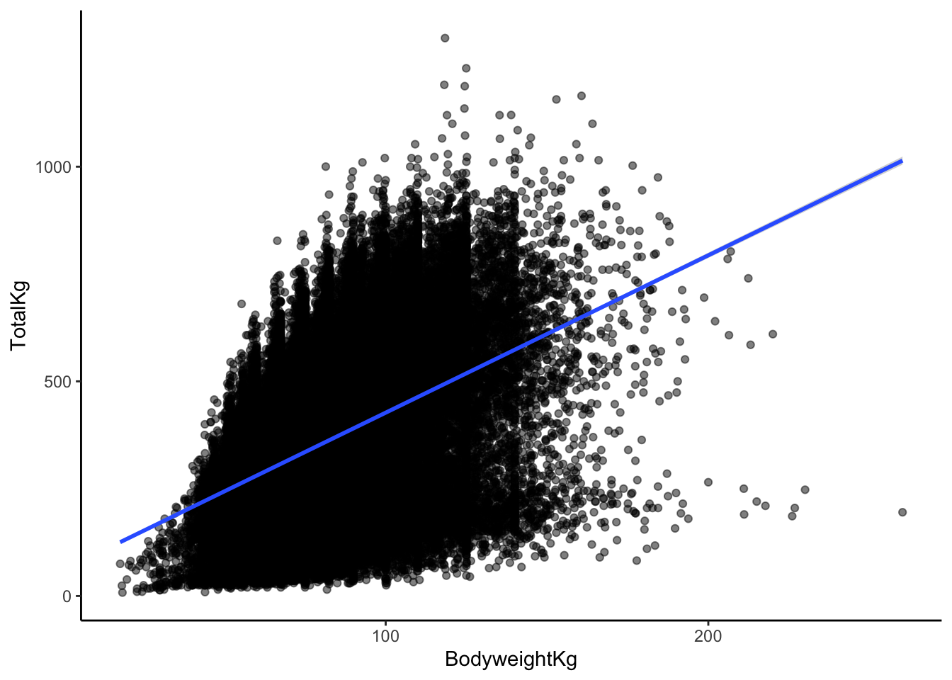
I would describe the correlation between body weight and TotalKg as weak and positive.
I’ll guess 0.3, since the line is positive, and the points are very dispersed around the line!
Exercise 6: Computing correlation in R
Solution
# correlation

# Note: the order in which you put your two quantitative variables into the cor
# function doesn't matter! Try switching them around to confirm this for yourself
# Because of the missing data, we need to include the use = "complete.obs" - otherwise the correlation would be computed as NA
lifts %>%
    summarize(cor(TotalKg, BodyweightKg, use = "complete.obs"))
# A tibble: 1 × 1
`cor(TotalKg, BodyweightKg, use = "complete.obs")`
<dbl>
1 0.412Exercise 7: Limitations of correlation
Solution
# correlation between x1, y1
anscombe %>% summarize(cor(x1, y1))
cor(x1, y1)
1 0.8164205# correlation between x2, y2
anscombe %>% summarize(cor(x2, y2)) cor(x2, y2)
1 0.8162365# correlation between x3, y3
anscombe %>% summarize(cor(x3, y3)) cor(x3, y3)
1 0.8162867# correlation between x4, y4
anscombe %>% summarize(cor(x4, y4)) cor(x4, y4)
1 0.8165214Each of these correlations are nearly the same!
Each of these correlations is relatively strong, and positive, since 0.8 is positive and closer to 1 than 0.
# scatterplot: x1, y1
anscombe %>%
  ggplot(aes(x = x1, y = y1)) +
  geom_point()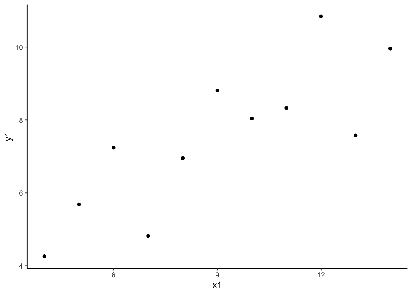
# scatterplot: x2, y2
anscombe %>%
  ggplot(aes(x = x2, y = y2)) +
  geom_point()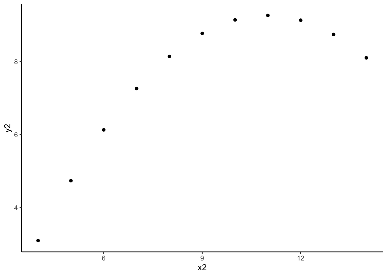
# scatterplot: x3, y3
anscombe %>%
  ggplot(aes(x = x3, y = y3)) +
  geom_point()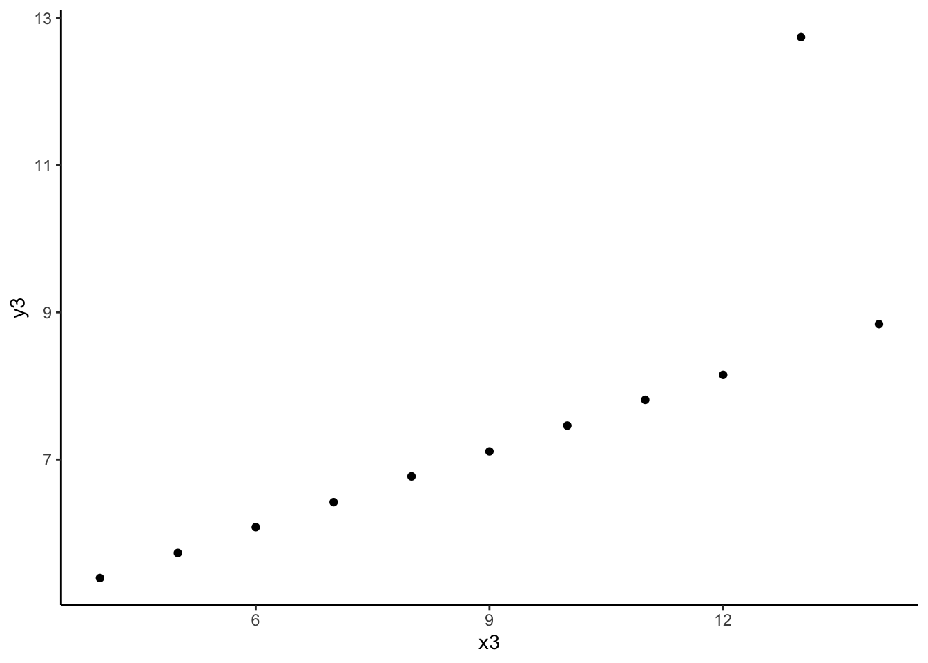
# scatterplot: x4, y4
anscombe %>%
  ggplot(aes(x = x4, y = y4)) +
  geom_point()
- The message of this exercise is that data visualization is important in addition to numerical summaries! Many different sets of points can have nearly the same correlation, but display very different patterns in point clouds upon closer inspection. Reporting correlation alone is not enough to summarize the relationship between two quantitative variables, and should be accompanied by a scatter plot!
Exercise 9: Correlation and extreme values
Solution
# create a toy dataset
set.seed(1234)
dat <- data.frame(x = rnorm(100, mean = 5, sd = 2)) %>%
  mutate(y = -3 * x + rnorm(100, sd = 4))
# scatterplot
dat %>%
ggplot(aes(x = x, y = y)) +
geom_point()
- The correlation between x and y is moderately strong and negative.
- I’ll guess -0.6, since the relationship is negative and is sort of in-between weak and strong.
# correlation
dat %>%
  summarize(cor(x, y))
cor(x, y)
1 -0.8295483# creating dat_new1
new_observation <- data.frame(x = 15, y = -45)
dat_new1 <- dat %>%
rbind(new_observation)
# scatterplot
dat_new1 %>%
ggplot(aes(x, y)) +
geom_point()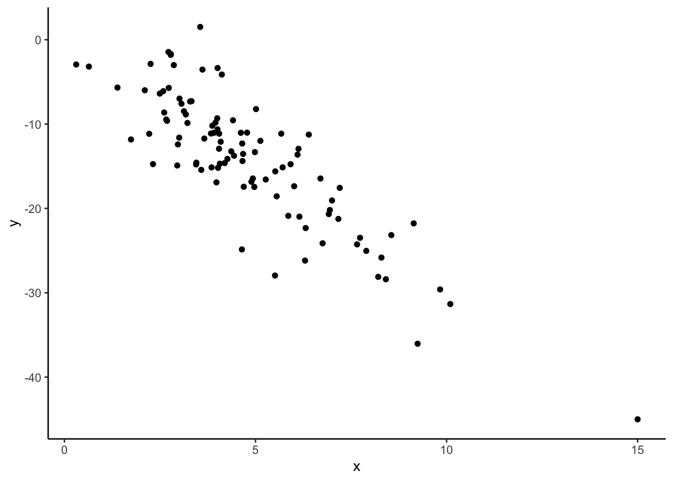
# correlation
dat_new1 %>%
  summarize(cor(x, y))
cor(x, y)
1 -0.8573567Our correlation stayed roughly the same with the addition of this new point!
# creating dat_new2
new_observation <- data.frame(x = 15, y = -15)
dat_new2 <- dat %>%
  rbind(new_observation)

# scatterplot
dat_new2 %>%
  ggplot(aes(x, y)) +
  geom_point()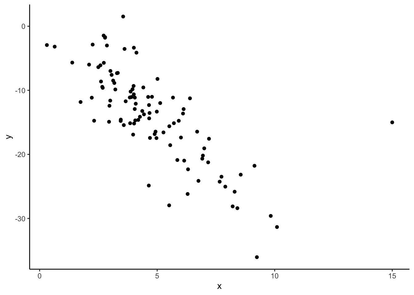
# correlation
dat_new2 %>%
  summarize(cor(x, y))
cor(x, y)
1 -0.7447099The correlation changes quite a bit with the addition of this new point! Something to note is that this new point does not follow the rough linear trend that the original points had, that the first point we considered adding also had. This line seems way off base, comparatively!
The takeaway message here is that even though both of these additional points might be considered “outliers” because they have extreme x values, one changes the relationship between x and y much more than the other. In this case, the second point we considered would be influential because it changes the observed relationship between all x’s and y’s much more than the first point we considered. Not all “outliers” are considered equal!
dat_new1 %>%
  ggplot(aes(x, y)) +
  geom_point() +
  geom_smooth(method = "lm", se = FALSE)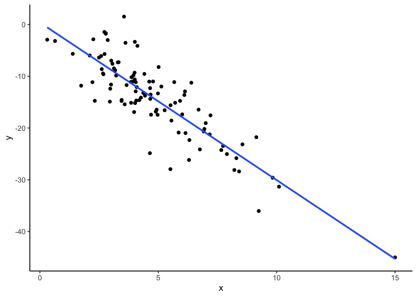
dat_new2 %>%
  ggplot(aes(x, y)) +
  geom_point() +
  geom_smooth(method = "lm", se = FALSE)