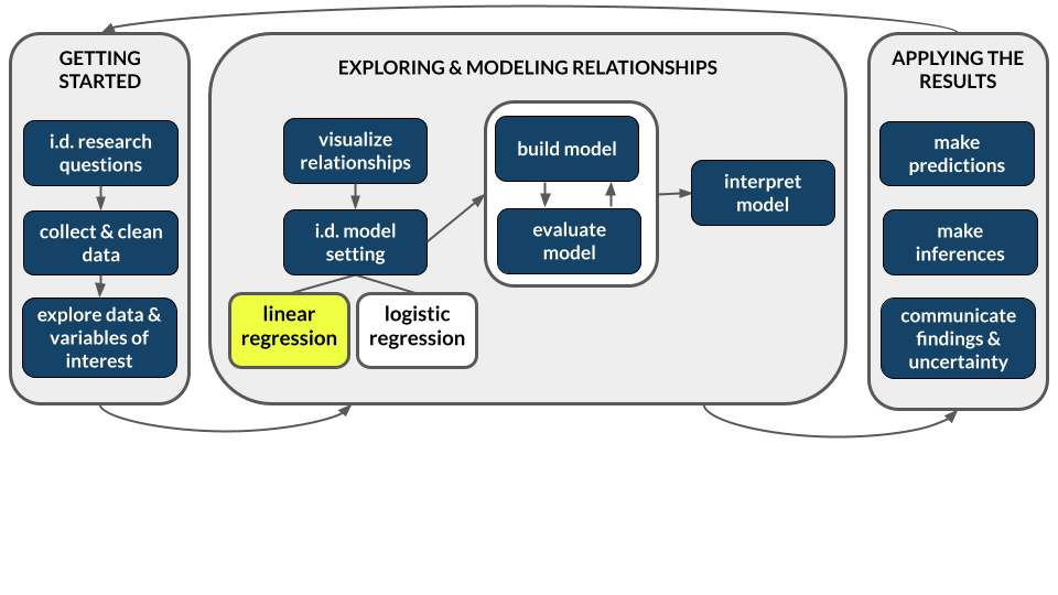
4 Simple linear regression: Formalization
Settling In
- Put away your cell phones and clear your laptops of anything not related to STAT 155.
- Sit with new people and meet each other!
- Help each other get ready to take notes!
- Open your notebook. Take notes.
- Open the online manual to the “Course Schedule” and click on today’s activity. That brings you here!
- Download “04-slr-formal.qmd” and open it in RStudio. Read the “Organizing your files” directions at the top of the file!!
Recap
ImportantStatistical superpowers
When using data, our interests or research questions are typically about relationships between variables, not about how a single variable behaves on its own:
- How is voter participation (Y) related to demographic variables such as age (X)?
- How are albums’ critic reviews (Y) related to their user reviews (X)?
- How are tadpole speeds (Y) related to the length of the tadpole (X)?
Linear regression models are THE most important, fundamental tool for exploring such relationships.
NoteLearning goals
Explore numerical and visual summaries for the relationship between a quantitative response (aka outcome) variable and a quantitative predictor (aka explanatory variable).
By the end of this lesson, you should be able to analyze and apply a simple linear regression model of the relationship:
- obtain and write a model formula
- interpret the model’s intercept and slope coefficients in context
- compute and interpret predictions (aka expected or fitted values) and residuals in context
- explain the connection between residuals and the least squares criterion
NoteAdditional resources
Required videos:
- Simple linear regression Part 1: motivation & scatterplots
- Simple linear regression Part 2: correlation
- Simple linear regression Part 3: simple linear regression models
Optional material:
- Reading: Sections 2.8, 3.1-3.3, 3.6 in the STAT 155 Notes
- Videos: R Code for Fitting a Linear Model (Time: 11:07)
Bivariate Relationships
Visual Summaries: Scatterplots
- What do I interpret?
Solution
- Direction of relationship: positive, negative, or neutral
- Form of relationship: linear, curved, none, or other
- Strength of relationship: compactness around the average relationship
- Unusual features: outliers (give info), differences in variability in y variable across different values of x variable
- Context: does it makes sense based on your understanding of the context and why or is it surprising?
Numerical Summaries: Correlation coefficient
A numerical measure of the strength and direction of the linear relationship between two quantitative variables, Y and X.
Properties:
- -1 \le r \le 1
- the sign of r indicates the direction of a linear relationship
- the magnitude of r indicates the strength of a linear relationship. Consider the extremes:
- r = 0 indicates no linear relationship
- r = 1 indicates a perfect positive linear relationship
- r = -1 indicates a perfect negative linear relationship
NoteTheory Box: Correlation
The correlation r of 2 quantitative variables Y and X is the (almost) average of products of their z-scores:
r = \frac{\sum z_x z_y}{n - 1} = \frac{\left(\frac{y_1 - \overline{y}}{s_y}\right)\left(\frac{x_1 - \overline{x}}{s_x}\right) + \left(\frac{y_2 - \overline{y}}{s_y}\right)\left(\frac{x_2 - \overline{x}}{s_x}\right) + \cdots + \left(\frac{y_n - \overline{y}}{s_y}\right)\left(\frac{x_n - \overline{x}}{s_x}\right)}{n - 1} where (y_1, y_2, ..., y_n) are the observed data points of Y with mean \overline{y} and standard deviation s_y (similarly for the X terms).
Population simple linear regression model
Let
Y = a quantitative response variable
X = a quantitative predictor variable
Then the (population) simple linear regression model of the relationship of Y with X is:
E[Y | X] = \beta_0 + \beta_1 X
where
- E[Y | X] is the expected or average value of Y at a given X value
- \beta_0 (“beta 0”) is the y-intercept. It describes the typical value of Y when X = 0.
- \beta_1 (“beta 1”) is the slope. It describes the change in expected or average value of Y associated with a 1-unit increase in X.
Sample simple linear regression model
In practice, we don’t observe the entire population, thus don’t know the population model. Instead, we estimate this model using sample data. The result is the (sample) simple linear regression model:
E[Y | X] = \hat{\beta}_0 + \hat{\beta}_1 X
where the \hat{\beta} (“beta hat”) terms are estimates of the actual \beta values.
Least squares estimation
We calculate the sample estimates \hat{\beta}_0 and \hat{\beta}_1 using the least squares criterion: Choose the line that produces the smallest collection / sum of squared residuals, i.e. the “least squares”.
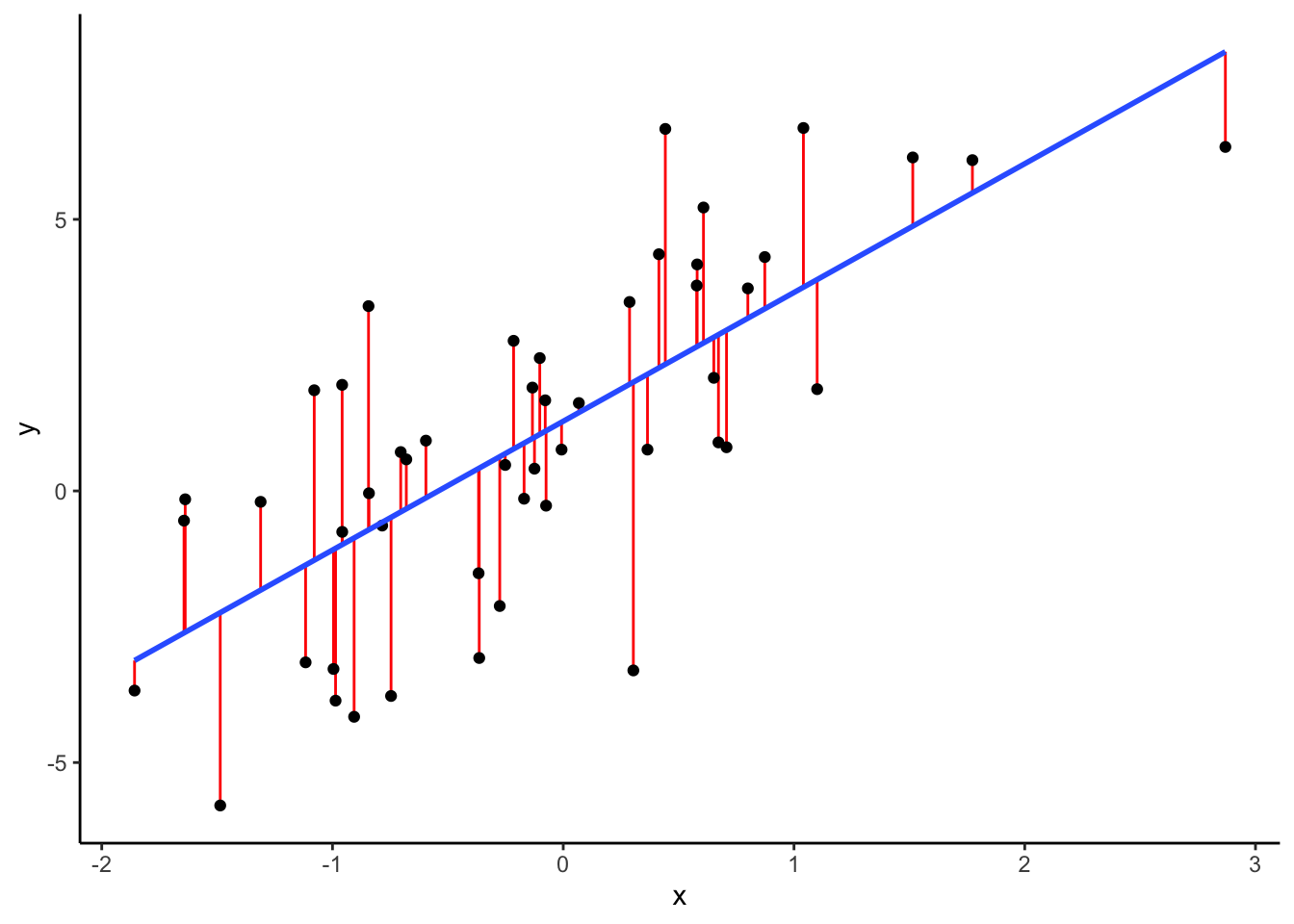
NoteTheory Box: Least squares estimates
Let
- (y_1, y_2, ..., y_n) = observed data
- E[Y|X] = \hat{\beta}_0 + \hat{\beta}_1 X = a possible sample model
- (\hat{y}_1, \hat{y}_2, ..., \hat{y}_n) = model predictions, e.g. \hat{y}_1 = \hat{\beta}_0 + \hat{\beta}_1 x_1
- (y_1 - \hat{y}_1, y_2 - \hat{y}_2, ..., y_n - \hat{y}_n) = model residuals
- \sum_{i=1}^n (y_i-\hat{y}_i)^2 = sum of squared residuals
Then the \hat{\beta}_0 and \hat{\beta}_1 that minimize the sum of squared residuals are:
\begin{split} \hat{\beta}_1 & = \frac{\sum_{i=1}^n(y_i - \overline{y})(x_i - \overline{x})}{\sum_{i=1}^n(x_i - \overline{x})^2} \\ \hat{\beta}_0 & = \overline{y} - \hat{\beta}_1 \overline{x} \\ \end{split}
You can derive these formulas using calculus and algebra by solving the system of two equations for the two unknowns, \beta_0,\beta_1:
\frac{\partial}{\partial \beta_0}\sum_{i=1}^n (y_i-(\beta_0 + \beta_1x_i))^2 = 0 \frac{\partial}{\partial \beta_1}\sum_{i=1}^n (y_i-(\beta_0 + \beta_1x_i))^2 = 0
NoteOrganize your files
This qmd file is where you’ll type notes, code, etc. Directions:
- Save this file in the
inclass_activitiessub-folder of thestat155folder you created before today’s class. Use a file name related to the activity number and/or today’s date (eg: “activity_4” or “4_simple_linear_regression”).
Warm-up
Guiding question
How is bikeshare ridership related to various weather factors?
Context
We’ll explore data from Capital Bikeshare, a company in Washington DC. Our main goal will be to explore daily ridership among registered users, as measured by rides.
# Load packages and import data
# Shorten the "riders_registered" variable to "rides"
# Keep only certain columns / variables
library(tidyverse)
bikes <- read_csv("https://mac-stat.github.io/data/bikeshare.csv") %>%
  rename(rides = riders_registered) %>%
  select(date, day_of_week, weekend, temp_feel, humidity, windspeed, rides)
EXAMPLE 1: Get to know the data
# Check out the first 6 rows
# What does a case represent, i.e. what's the unit of observation?


# How much data do we have?
NOTE
It’s important to think about the “who, what, when, where, why, and how” of a dataset. In this example, the where and when are particularly relevant. These data were collected in D.C. in 2011-12. The patterns we observe may not extend to other places and/or time periods!
EXAMPLE 2: Explore ridership
Let’s get acquainted with the rides variable. Remember: Code = communication. Pay special attention to formatting / readability.
# Calculate the average (central tendency) and standard deviation (variability) in daily ridership
bikes %>%
  ___(mean(___), sd(___))
# Construct a plot of how ridership varies from day to day
bikes %>%
___(aes(___))Follow-up
Summarize, in words, what you learned from the plot and numerical summaries. Remember to comment on: shape, central tendency, spread / variability, and, if relevant, any outliers.
EXAMPLE 3: Relationships
Now that we better understand ridership (rides), natural and important follow-up questions in nearly every statistical analysis are:
What explains why ridership varies from day to day, i.e. why there are more riders on some days than others?!
For example, is ridership related to / can it be predicted by various weather factors such as windspeed in miles per hour (mph), or the “feels like” temperature in degrees Fahrenheit (temp_feel)?
In this setting:
- response variable Y =
rides - potential predictors X =
windspeed,temp_feel
Let’s start with the relationship of rides with windspeed.
Part a: intuition
Quick:
Do you anticipate that rides is related to windspeed? If so, do you anticipate that the relationship is positive or negative? Strong, weak, or moderate?
Part b: visualization
It’s always good to start our analysis with a picture! We can visualize the relationship between these 2 quantitative variables using a scatterplot.
This will require some new code, but let’s start with what we know.
bikes %>%
  ggplot(aes(___))
Add the following two lines to your plot.
# Add a blue simple linear regression line (line of best fit)
# and a orange *curve* of best fit
PUT YOUR PLOT HERE +
  geom_smooth(method = "lm", se = FALSE) +
  geom_smooth(color = "orange", se = FALSE)
Part c: description
Summarize the relationship.
Remember to comment on: shape, direction, strength, and, if relevant, any outliers.
EXAMPLE 4: Correlation
Some of our above description is a bit vague, and somewhat subjective.
We can more precisely numerically measure the strength and direction of a linear relationship using correlation.
Guess the correlation between ridership and windspeed.
(You’ll calculate this in the exercises below.)
EXAMPLE 5: Simple linear regression (Part 1)
We can also more accurately summarize this relationship by finding a formula for the linear trend:
bikes %>%
  ggplot(aes(y = rides, x = windspeed)) +
  geom_point() +
  geom_smooth(method = "lm", se = FALSE)
Consider the sample linear regression model of this relationship, i.e. the formula for the line in the scatterplot:
E[ridership | windspeed] = \hat{\beta}_0 + \hat{\beta}_1 windspeed
In the exercises, you’ll show that:
E[ridership | windspeed] = 4490.10 - 65.34 windspeed
Consider the intercept coefficient 4490.10. Physically, this is the y-intercept of our model line (where it crosses the y-axis).
What’s the contextual meaning?
- A 1 mph increase in wind speed is associated with a 4490.10 increase in expected ridership.
- On days with wind speeds of 0 mph (no wind!), we expect 4490.10 riders.
- On average, there are 4490.10 riders per day.
EXAMPLE 6: Simple linear regression (Part 2)
Consider the windspeed coefficient, -65.34 Physically, this is the slope of our model line (rise over run).
Pick the most effective / correct interpretations of this slope below.
For each other option, indicate what’s wrong with the interpretation.
Part 1
- Increasing X by 1 is associated with a 65.34 decrease in the average Y value.
- A 1 mph increase in windspeed is associated with a decrease of 65.34 riders.
- A 1 mph increase in windspeed is associated with a decrease of 65.34 in average ridership.
- Windier weather discourages ridership. A 1 mph increase in windspeed produces 65.34 fewer riders on average.
- If tomorrow is 1 mph warmer than today, we should expect 65.34 fewer riders.
- A windspeed change of 1 is associated with a 65.34 decrease in average ridership.
- A 1 rider increase is associated with a 65.34 mph decrease in average windspeed.
Part 2
Keeping in mind the units and range of our variables, what do you think about the magnitude of the slope? Is a decrease of 65.34 in average ridership per 1-mph increase in windspeed meaningful in this context?
NoteInterpreting model coefficients
When interpreting model coefficients, remember to:
- interpret in context
- use non-causal language
- include units
- talk about averages rather than individual cases
NoteInterpreting intercept and slope
Language is fluid – there are many ways to phrase a correct interpretation of the intercept and slope! Here’s one general option, that can be translated into the context at hand:
E[Y|X] = a + bX
- Intercept: When X is 0 units, we expect Y to be a.
- Slope: A 1-unit increase in X is associated with a b-unit (increase / decrease) in the average Y value.
Exercises
DIRECTIONS
You’ll work on these exercises in your groups. Collaboration is a key learning goal in this course.
Why? Discussion & collaboration deepens your understanding of a topic while also improving confidence, communication, community, & more. (eg: Deeply learning a new language requires more than working through Duolingo alone. You need to talk with and listen to others!)
How? You are expected to:
- Use your group members’ names & pronouns. It’s ok to ask if you don’t remember!
- Actively contribute to discussion. Don’t work on your own.
- Actively include all other group members in discussion.
- Create a space where others feel comfortable sharing ideas & questions.
We won’t discuss these exercises as a class. With that, when you get stuck:
- Carefully re-read the problem. Make sure you didn’t miss any directions – it can be tempting to skip words and go straight to an R chunk, but don’t :).
- Discuss any questions you have with your group.
- If the question is unresolved by the group, be sure to ask the instructor!
- Remember that there are solutions in the online manual, at the bottom of the activity.
Exercise 1: Correlation
In the warm-up, you took a guess at the correlation between ridership and windspeed:
bikes %>%
  ggplot(aes(y = rides, x = windspeed)) +
  geom_point() +
  geom_smooth(method = "lm", se = FALSE)
Let’s check your intuition! Fill in the code below to calculate the correlation.
# HINT: What function is useful for calculating statistics (eg: means)?
bikes %>%
  ___(cor = cor(rides, windspeed))
Exercise 2: Build the model
You were told above that our (sample) simple linear regression model was:
E[ridership | windspeed] = 4490.10 - 65.34 windspeed
Verify this using the code below. Step through code chunk slowly, make note of new code.
# Construct and save the model as bike_model_1
# What's the purpose of "rides ~ windspeed"?
# What's the purpose of "data = bikes"?
bike_model_1 <- lm(rides ~ windspeed, data = bikes)
# A long summary of the model stored in bike_model_1
summary(bike_model_1)# A simplified model summary
coef(summary(bike_model_1))
Exercise 3: Predictions and residuals
On March 8, 2012, the windspeed was 29.58472 mph and there were 4896 riders:
# Note the use of filter() and select()
# You'll learn more about filter below!
bikes %>%
  filter(date == "2012-03-08") %>%
  select(rides, windspeed)
Part a
In the scatterplot below, locate the point that corresponds to March 8, 2012 (by eye, not using code). Is it close to the trend? Were there more riders than expected or fewer than expected?
bikes %>%
  ggplot(aes(y = rides, x = windspeed)) +
  geom_point() +
  geom_smooth(method = "lm", se = FALSE)
Part b
Using the model formula below, calculate how many riders we would have expected or predicted on March 8, 2012 based on its windspeed:
E[ridership | windspeed] = 4490.10 - 65.34 windspeed
# Calculate the prediction IN THIS CHUNK
# (Convince yourself that you can connect this to the scatterplot)
4490.10 - 65.34*___
Part c
Check your prediction using the predict() function.
# What is the purpose of including bike_model_1?
# What is the purpose of newdata = ___???
predict(bike_model_1, newdata = data.frame(windspeed = 29.58472))
Part d
How far does the observed ridership on March 8, 2012 fall from its model prediction? Calculate the residual or prediction error:
# Recall: residual = observed Y - predicted YPart e
Are positive residuals above or below the trend line?
When we have positive residuals, does the model over- or under-estimate ridership?
Are negative residuals above or below the trend line?
When we have negative residuals, does the model over- or under-estimate ridership?
Exercise 4: Ridership vs temp_feel (visualization)
Your turn! Let’s practice what you’ve learned in the preceding exercises to investigate the relationship between rides and temp_feel.
Part a
Below, you’ll plot the relationship of rides and temp_feel. What do you expect this to look like? Will it be…
- positive / negative?
- linear?
- strong / moderate / weak?
Part b
# Construct a visualization of the relationship of rides with temp_feel
# Include a representation of:
# - the individual data points
# - a simple linear regression line (line of best fit)
# - a *curve* of best fit
Part c
Summarize, in words, your findings from the plot. Remember: shape, direction, strength, and, if relevant, outliers.
Exercise 5: Filtering our data
The relationship of rides with temp_feel is nonlinear! Though we’ll soon learn techniques for handling nonlinear relationships, right now let’s focus on days with feels-like temperatures below 80 degrees (where the relationship is linear). In the tidyverse package, whereas select() subsets our data to include only certain columns / variables of interest, filter() subsets our data to include only certain rows / cases of interest. Let’s practice:
bikes %>%
  filter(rides > 6911)
bikes %>%
filter(rides >= 6911)bikes %>%
filter(rides == 6911)Your turn: show only days where temp_feel is under 80 degrees.
# There are many such days! Show only the first 6.
bikes %>%
filter(temp_feel ___) %>%
head()Now that you’ve convinced yourself that the filter works, store the cases where temp_feel is under 80 degrees as a new dataset called bikes_sub:
# Don't use head() here! Otherwise we'd only store the first 6 dates.
bikes_sub <- bikes %>%
filter(temp_feel ___)
Exercise 6: Ridership vs temp_feel (model)
Now that we’ve filtered the data, let’s explore the linear relationship of rides with temp_feel on dates with temperatures below 80 degrees. NOTE: We’ll be using the bikes_sub data now!!!
bikes_sub %>%
ggplot(aes(x = temp_feel, y = rides)) +
geom_point() +
geom_smooth(method = "lm", se = FALSE)Part a
# Use lm() to construct a model of rides vs temp_feel
# Save this as bike_model_2
# !!!Remember to use the bikes_sub data!!!# Get a short summary of bike_model_2Part b
Write out a formula for the sample model trend.
E[??? | ???] = ???????
Part c
Interpret the intercept and the temp_feel coefficients. NOTE: Your interpretation of the intercept should be “correct” but won’t make sense here since it extrapolates our model far beyond the range of our observed data.
Part d
How well would our model predict the ridership on October 29, 2012? Follow the steps below to calculate the residual on this date. Interpret this residual in words!
# Obtain the temp_feel and ridership on October 29, 2012
# (Once you obtain that info, identify the corresponding point on the scatterplot!)
# Predict ridership on this date using bike_model_2 (hence the temperature info)
# NOTE: Use predict() but also convince yourself you could do this from scratch
# Calculate the residual
Exercise 7: Data drill (filter, select, summarize)
This exercise is designed to help you practice your tidy data wrangling skills. We can’t do statistics or really understand data without these skills! We’ll work with a simpler set of 10 data points:
new_bikes <- bikes %>%
select(date, temp_feel, humidity, rides, day_of_week) %>%
head(10)Part a
Thus far, in the tidyverse grammar you’ve learned 3 verbs or action words: summarize(), select(), filter(). First, refresh your memory. Take note of the following code and the output it produces:
# First check out the data for a point of reference
new_bikes# summarize()
new_bikes %>%
summarize(mean(temp_feel), mean(humidity))# select()
new_bikes %>%
select(date, temp_feel)# select() again
new_bikes %>%
select(-date, -temp_feel)# filter()
new_bikes %>%
filter(rides > 850)# filter() again
new_bikes %>%
filter(day_of_week == "Sat")# filter() again
new_bikes %>%
filter(rides > 850, day_of_week == "Sat")Part b
Your turn. Use tidyverse verbs to complete each task below.
# Keep only information about the humidity and day of week
# Keep only information about the humidity and day of week using a different approach
# Calculate the maximum and minimum temperatures
# Keep only information for Sundays
# Keep only information for Sundays with temperatures below 50
# Calculate the median ridership on Sundays with temperatures below 50
Reflection
Learning goals
Recall the learning goals for today’s activity. Explore numerical and visual summaries for the relationship between a quantitative response (aka outcome) variable and a quantitative predictor (aka explanatory variable):
- Construct and interpret a scatterplot visualization of the relationship.
- Compute and interpret the linear correlation between the 2 variables.
- Analyze and apply a simple linear regression model of the relationship:
- obtain and write a model formula
- interpret the model’s intercept and slope coefficients in context
- compute and interpret predictions (aka expected or fitted values) and residuals in context
- explain the connection between residuals and the least squares criterion
Among these learning goals:
Which do you have a good handle on?
Which are struggling with? What feels challenging right now?
What are some wins from the day?
Statistics is a particular kind of language and collection of tools for channeling curiosity to improve our world. How do the concepts we practiced today facilitate curiosity?
Code
In addition to exploring the learning goals, you learned some new code.
If you haven’t already, you’re highly encouraged to start tracking and organizing new code in a cheat sheet (eg: a Google doc). This will be a handy reference for you, and the act of making it will help deepen your understanding and retention.
Reflect upon the
lm()function. This function takes 2 arguments. What are they and what’s their purpose? Mainly, what information does R need in order to build a model?Reflect upon the
predict()function. This function takes 2 arguments. What are they and what’s their purpose? Mainly, what information does R need in order to make a prediction?
Extra practice
After class, you’re encouraged to work through the optional exercises below. These explore the bills (beaks) of Chinstrap penguins:
data(penguins)
chinstraps <- penguins %>%
filter(species == "Chinstrap")Specifically, let’s explore the relationship of bill length with bill depth, both measured in mm:
# Visual summary
chinstraps %>%
ggplot(aes(y = bill_len, x = bill_dep)) +
geom_point() +
geom_smooth(method = "lm", se = FALSE)# Model summary
bill_model <- lm(bill_len ~ bill_dep, data = chinstraps)
coef(summary(bill_model))Exercise 8: model formulas
Which of the following is the correct (sample) model formula of this relationship:
- bill_dep = 1.92 + 13.43 bill_len
- bill_len = 1.92 + 13.43 bill_dep
- E[bill_dep | bill_len] = 1.92 + 13.43 bill_len
- E[bill_len | bill_dep] = 1.92 + 13.43 bill_dep
- bill_dep = 13.43 + 1.92 bill_len
- bill_len = 13.43 + 1.92 bill_dep
- E[bill_dep | bill_len] = 13.43 + 1.92 bill_len
- E[bill_len | bill_dep] = 13.43 + 1.92 bill_dep
Exercise 9: Coefficient interpretations
Part a
Interpret the slope: A 1 ___ increase in ___ is associated with a 1.92 ___ [increase/decrease] in ___ ___.
Part b
Does it make sense to interpret the intercept in context in this example?
Example 10: More predictions
Challenge yourself to use just the model coefficients to answer the below questions.
Part a
Predict the bill length of a penguin that has a bill depth of 0cm (which doesn’t make sense :)).
Part b
You come across 2 groups of penguins. In group “A”, all penguins have a bill depth of 19cm. In group “B”, all penguins have a bill depth of 20cm. Do you expect that the average bill length in group B is greater or less than that of group A? How much greater / less (provide a specific number).
Part c
Among penguins with bill depths of 17mm, the average bill length is 46.07mm. What’s the average bill length among penguins with bill depths of 18mm?
Example 11: Correlation
Using only the scatterplot, what do you think is the correlation between bill_len and bill_dep: -1, -0.95, -0.65, -0.15, 0, 0.15, 0.65, 0.95, or 1?
Wrap Up
- General
- Finish the activity and check the solutions in the online manual.
- Visit office hours!
- Next Monday
- CP 3 (10 minutes before your section)
- PS 1. Start asap, if you haven’t already!
- Next Wednesday
- CP 4 (10 minutes before your section)
Solutions
Warm Up
EXAMPLE 1: Get to know the data
Solution
# Check out the first 6 rows
# A case represents a day of the year
head(bikes)# A tibble: 6 × 7
date day_of_week weekend temp_feel humidity windspeed rides
<date> <chr> <lgl> <dbl> <dbl> <dbl> <dbl>
1 2011-01-01 Sat TRUE 64.7 0.806 10.7 654
2 2011-01-02 Sun TRUE 63.8 0.696 16.7 670
3 2011-01-03 Mon FALSE 49.0 0.437 16.6 1229
4 2011-01-04 Tue FALSE 51.1 0.590 10.7 1454
5 2011-01-05 Wed FALSE 52.6 0.437 12.5 1518
6 2011-01-06 Thu FALSE 53.0 0.518 6.00 1518# How much data do we have?
dim(bikes)[1] 731 7
EXAMPLE 2: Explore ridership
Solution
The distribution of ridership is fairly symmetric. On average there are about 3600 registered riders per day (mean = 3656). On any given day, the number of registered riders is about 1560 from the mean. There seem to be a small number of low outliers (minimum ridership was 20).
# Calculate the average (central tendency) and standard deviation (variability) in daily ridership
bikes %>%
summarize(mean(rides), sd(rides))# A tibble: 1 × 2
`mean(rides)` `sd(rides)`
<dbl> <dbl>
1 3656. 1560.# Construct a plot of how ridership varies from day to day
# Could also do a boxplot or density plot!
bikes %>%
ggplot(aes(x = rides)) +
geom_histogram(color = "white")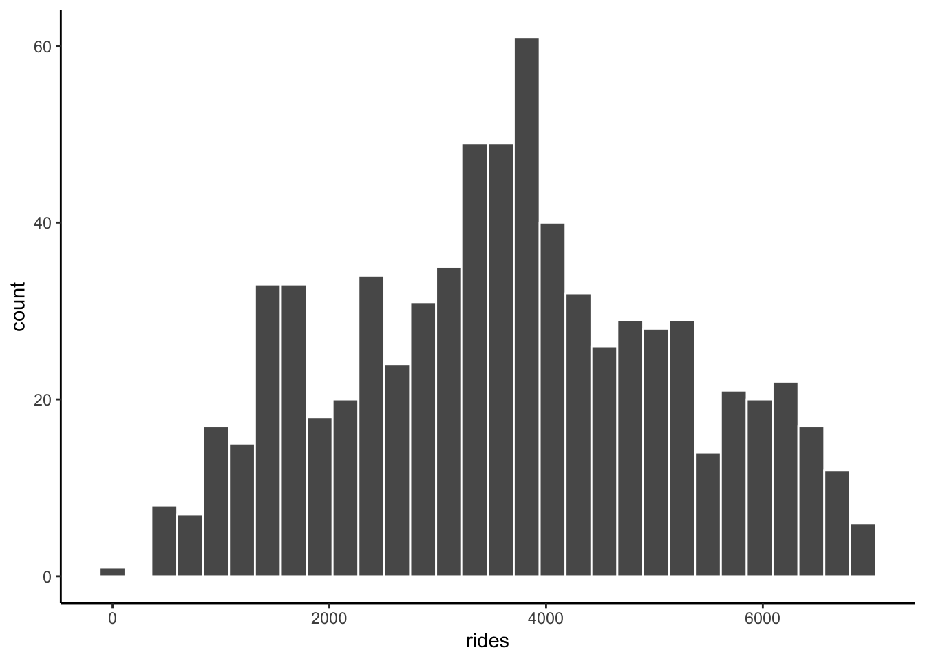
EXAMPLE 3: Relationships
Solution
intuition
bikes %>%
ggplot(aes(x = windspeed, y = rides)) +
geom_point()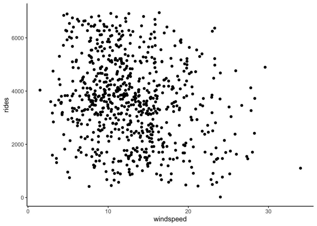
# Add a blue simple linear regression line (line of best fit)
# and a orange *curve* of best fit
bikes %>%
ggplot(aes(x = windspeed, y = rides)) +
geom_point() +
geom_smooth(method = "lm", se = FALSE) +
geom_smooth(color = "orange", se = FALSE)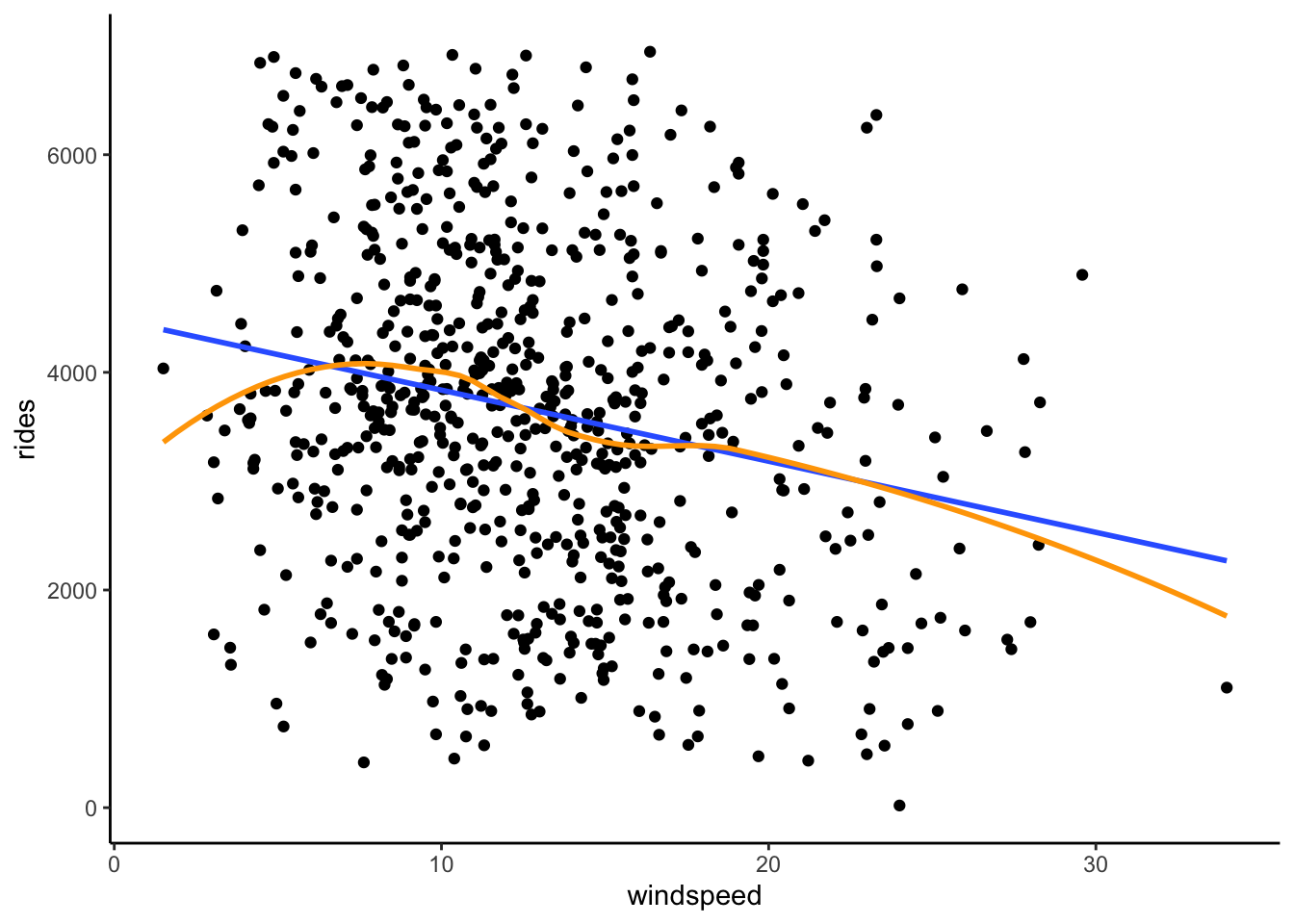
- There’s a weak linear relationship between ridership and windspeed. The windier it is, the fewer riders there tend to be.
EXAMPLE 4: Correlation
Solution
will vary
EXAMPLE 5: Simple linear regression (Part 1)
Solution
b
EXAMPLE 6: Simple linear regression (Part 2)
Part 1
Solution
- Doesn’t provide context.
- The slope tells us about differences in averages, not individual days.
- CORRECT
- Implies causation.
- The slope tells us about differences in averages, not individual days.
- Doesn’t include units.
- Reverses the role of X and Y.
Part 2
Solution
Yes! A 1-mph increase in windspeed is relatively small, but on the scale of ridership (which ranges from roughly 0 to 6500) is associated with a pretty big decrease in average ridership.
Exercises
Exercise 1: Correlation
Solution
bikes %>%
summarize(cor = cor(rides, windspeed))# A tibble: 1 × 1
cor
<dbl>
1 -0.217
Exercise 2: Build the model
Solution
bike_model_1 <- lm(rides ~ windspeed, data = bikes)
summary(bike_model_1)
Call:
lm(formula = rides ~ windspeed, data = bikes)
Residuals:
Min 1Q Median 3Q Max
-3575.7 -1126.8 -48.3 1089.2 3525.9
Coefficients:
Estimate Std. Error t value Pr(>|t|)
(Intercept) 4490.10 149.66 30.002 < 2e-16 ***
windspeed -65.34 10.86 -6.015 2.84e-09 ***
---
Signif. codes: 0 '***' 0.001 '**' 0.01 '*' 0.05 '.' 0.1 ' ' 1
Residual standard error: 1524 on 729 degrees of freedom
Multiple R-squared: 0.04728, Adjusted R-squared: 0.04598
F-statistic: 36.18 on 1 and 729 DF, p-value: 2.844e-09coef(summary(bike_model_1)) Estimate Std. Error t value Pr(>|t|)
(Intercept) 4490.09761 149.65992 30.002005 2.023179e-129
windspeed -65.34145 10.86299 -6.015053 2.844453e-09
Exercise 3: Predictions and residuals
Solution
More riders than expected – the point is far above the trend line
4490.10 - 65.34*29.58472[1] 2557.034- Matches our calculation, within rounding.
predict(bike_model_1, newdata = data.frame(windspeed = 29.58472)) 1
2556.989 # Residual = observed ridership - predicted ridership
4896 - 2556.989[1] 2339.011- Positive residuals are above the trend line—we under-estimate ridership.
- Negative residuals are below the trend line—we over-estimate ridership.
Exercise 4: Ridership vs temp_feel (visualization)
Part a
Solution
Intuition
Part b
Solution
ggplot(bikes, aes(x = temp_feel, y = rides)) +
geom_point() +
geom_smooth(method = "lm", se = FALSE)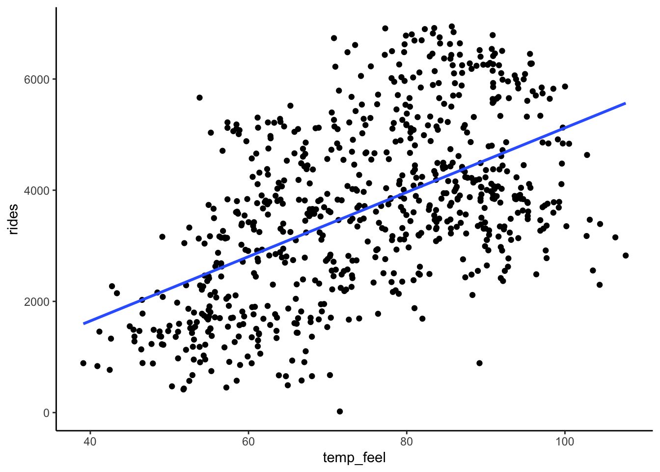
Part c
Solution
Ridership is moderately associated with temperature. Ridership linearly increases with temperature when temps are below 80 degrees Fahrenheit, but then decreases with temperatures above 80 degrees. (Mainly, more people bike when it’s warm up, but not if it’s too warm!)
Exercise 5: Filtering our data
Solution
# Keep only days / data points with ridership GREATER THAN 6911
bikes %>%
filter(rides > 6911)# A tibble: 2 × 7
date day_of_week weekend temp_feel humidity windspeed rides
<date> <chr> <lgl> <dbl> <dbl> <dbl> <dbl>
1 2012-09-21 Fri FALSE 83.5 0.669 10.3 6917
2 2012-09-26 Wed FALSE 85.7 0.631 16.4 6946# Keep only days / data points with ridership of AT LEAST 6911
bikes %>%
filter(rides >= 6911)# A tibble: 3 × 7
date day_of_week weekend temp_feel humidity windspeed rides
<date> <chr> <lgl> <dbl> <dbl> <dbl> <dbl>
1 2012-09-21 Fri FALSE 83.5 0.669 10.3 6917
2 2012-09-26 Wed FALSE 85.7 0.631 16.4 6946
3 2012-10-10 Wed FALSE 77.3 0.631 12.6 6911# Keep only days / data points with ridership of EXACTLY 6911
bikes %>%
filter(rides == 6911)# A tibble: 1 × 7
date day_of_week weekend temp_feel humidity windspeed rides
<date> <chr> <lgl> <dbl> <dbl> <dbl> <dbl>
1 2012-10-10 Wed FALSE 77.3 0.631 12.6 6911# Create a new dataset called bikes_sub that only keeps cases where temp_feel is under 80 degrees
bikes_sub <- bikes %>%
filter(temp_feel < 80)
Exercise 6: Ridership vs temp_feel (model)
Solution
bikes_sub %>%
  ggplot(aes(x = temp_feel, y = rides)) +
  geom_point() +
  geom_smooth(method = "lm", se = FALSE)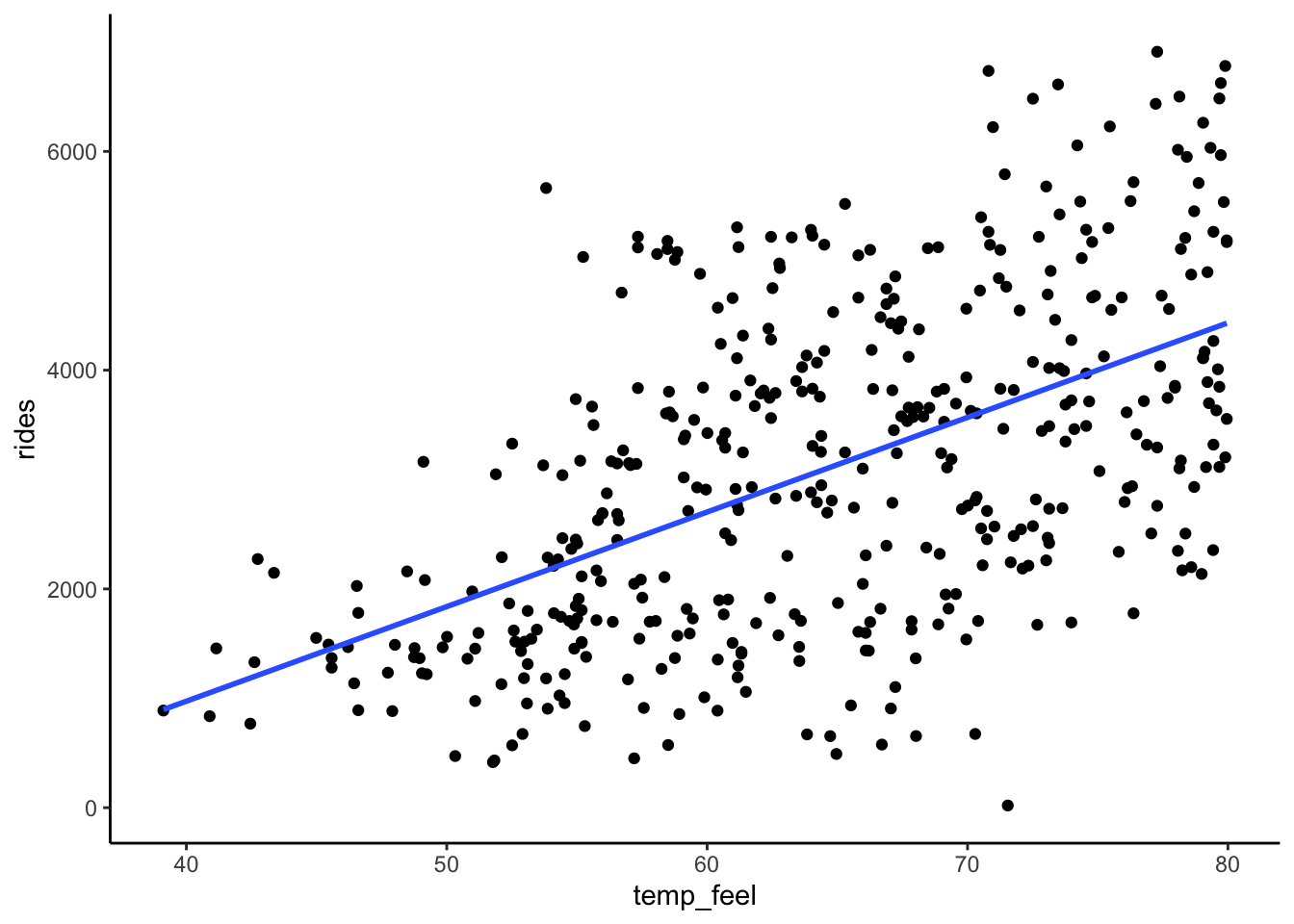
bike_model_2 <- lm(rides ~ temp_feel, data = bikes_sub)
# Get a short summary of this model
coef(summary(bike_model_2)) Estimate Std. Error t value Pr(>|t|)
(Intercept) -2486.41180 421.379174 -5.900652 7.368345e-09
temp_feel 86.49251 6.464247 13.380135 2.349753e-34E[ridership | temp_feel] = -2486.41 + 86.49 temp_feel
- Intercept: On 0-degree days, we expect -2486.41 riders. (This is “correct” but doesn’t make sense here since it extrapolates our model far beyond the range of our observed data.)
- Slope: A 1 degree increase in temperature is associated with a 86.49 increase in average ridership.
# Observed data
bikes_sub %>%
filter(date == "2012-10-29") %>%
select(rides, temp_feel)# A tibble: 1 × 2
rides temp_feel
<dbl> <dbl>
1 20 71.5# prediction
predict(bike_model_2, newdata = data.frame(temp_feel = 71.546)) 1
3701.781 -2486.41 + 86.49*71.546[1] 3701.604# Residual
20 - 3701.781[1] -3681.781
Exercise 7: Data drill (filter, select, summarize)
Solution
observe the code and output
new_bikes <- bikes %>%
  select(date, temp_feel, humidity, rides, day_of_week) %>%
  head(10)
# Keep only information about the humidity and day of week
new_bikes %>%
select(humidity, day_of_week)# A tibble: 10 × 2
humidity day_of_week
<dbl> <chr>
1 0.806 Sat
2 0.696 Sun
3 0.437 Mon
4 0.590 Tue
5 0.437 Wed
6 0.518 Thu
7 0.499 Fri
8 0.536 Sat
9 0.434 Sun
10 0.483 Mon # Keep only information about the humidity and day of week using a different approach
new_bikes %>%
select(-date, -temp_feel, -rides)# A tibble: 10 × 2
humidity day_of_week
<dbl> <chr>
1 0.806 Sat
2 0.696 Sun
3 0.437 Mon
4 0.590 Tue
5 0.437 Wed
6 0.518 Thu
7 0.499 Fri
8 0.536 Sat
9 0.434 Sun
10 0.483 Mon # Calculate the maximum and minimum temperatures
new_bikes %>%
summarize(min(temp_feel), max(temp_feel))# A tibble: 1 × 2
`min(temp_feel)` `max(temp_feel)`
<dbl> <dbl>
1 42.5 64.7# Keep only information for Sundays
new_bikes %>%
filter(day_of_week == "Sun")# A tibble: 2 × 5
date temp_feel humidity rides day_of_week
<date> <dbl> <dbl> <dbl> <chr>
1 2011-01-02 63.8 0.696 670 Sun
2 2011-01-09 42.5 0.434 768 Sun # Keep only information for Sundays with temperatures below 50
new_bikes %>%
filter(day_of_week == "Sun", temp_feel < 50)# A tibble: 1 × 5
date temp_feel humidity rides day_of_week
<date> <dbl> <dbl> <dbl> <chr>
1 2011-01-09 42.5 0.434 768 Sun # Calculate the median ridership on Sundays with temperatures below 50
new_bikes %>%
filter(day_of_week == "Sun", temp_feel < 50) %>%
summarize(median(rides))# A tibble: 1 × 1
`median(rides)`
<dbl>
1 768Exercise 8: model formulas
Solution
data(penguins)
chinstraps <- penguins %>%
  filter(species == "Chinstrap")
# Visual summary
chinstraps %>%
  ggplot(aes(y = bill_len, x = bill_dep)) +
  geom_point() +
  geom_smooth(method = "lm", se = FALSE)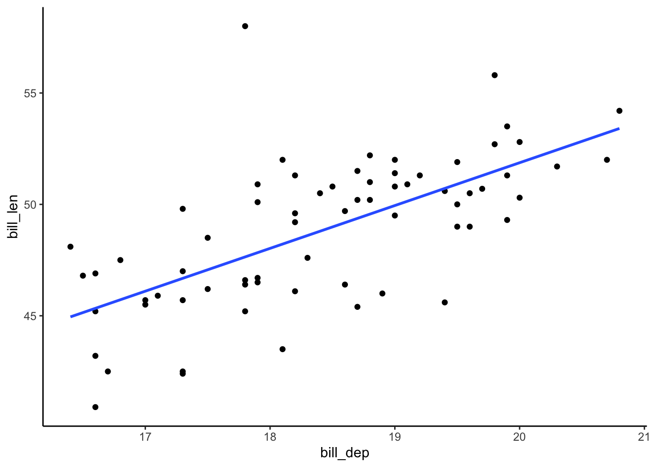
# Model summary
bill_model <- lm(bill_len ~ bill_dep, data = chinstraps)
coef(summary(bill_model)) Estimate Std. Error t value Pr(>|t|)
(Intercept) 13.427908 5.0568645 2.655382 9.920462e-03
bill_dep 1.922084 0.2740101 7.014647 1.525539e-09- E[bill_len | bill_dep] = 13.43 + 1.92 bill_dep
Exercise 9: Coefficient interpretations
Part a
Solution
Interpret the slope: A 1 mm increase in bill_dep is associated with a 1.92 mm increase in expected bill_len.
Part b
Solution
No. There are no penguins with bill depths of or even near 0mm.
Example 10: More predictions
Challenge yourself to use just the model coefficients to answer the below questions.
Part a
Solution
13.43. This is just the intercept! We could also find this by plugging in:
13.43 + 1.92*0[1] 13.43Part b
Solution
1.92mm greater. This is just the slope! We could also find this by plugging in:
# group A
13.43 + 1.92*19
[1] 49.91# group B
13.43 + 1.92*20[1] 51.83# group B - group A
51.83 - 49.91[1] 1.92Part c
Solution
46.07 + 1.92[1] 47.99# Or a longer approach
13.43 + 1.92*18[1] 47.99
Example 11: Correlation
Solution
0.65. Proof:
chinstraps %>%
  summarize(cor(bill_len, bill_dep))