# Load necessary packages
library(tidyverse)

# Import data
bigmac <- read_csv("https://mac-stat.github.io/data/bigmac.csv") %>%
  rename(income = gross_annual_teacher_income) %>%
  select(city, bigmac_mins, income)

# Check it out
head(bigmac)
dim(bigmac)6 Simple linear regression: transformations
Settling In
- Sit where you’d like
- Introduce yourself
- Share your names, pronouns, major / minor.
- Check in about how finishing PS1 went. What resources did you find helpful?
- Help each other get ready to take notes!
- Open your notebook. Take notes.
- We’ll do a brief recap; this is an opportunity to clarify basic concepts and answer questions that you had from the videos.
- Open the online manual to the “Course Schedule” and click on today’s activity. That brings you here!
- Download “06-transform.qmd” and open it in RStudio. Read the “Organizing your files” directions at the top of the file!!
- Open your notebook. Take notes.
Recap
ImportantStatistical superpowers
Consider a simple linear regression model:
E[Y | X] = \beta_0 + \beta_1 X
- This model makes specific (LINE) assumptions about the relationship between Y and X! Those might not actually be true in reality.
- Depending on how X is measured, the interpretations of \beta_0 and \beta_1 might not be contextually helpful or optimal.
Transforming our X variable might help. The superpower here is ours! We can adapt our tools to the context at hand.
NoteLearning goals
By the end of this lesson, you should be able to:
- Distinguish between the different motivations for transformations of variables (interpretation, regression assumptions, etc.)
- Determine when a particular transformation (center, scale, or log) may be appropriate
- Interpret regression coefficients after a transformation has taken place
NoteAdditional resources
Required:
Optional Reading:
- Section 3.8.4 in the STAT 155 Notes covers log transformations, and the “ladder of power,” which we will not cover in class.
Transformations
Consider a simple linear regression model:
E(Y | X) = \beta_0 + \beta_1 X
In some cases, we may want to transform X, i.e. to model Y vs some function of X:
E(Y | X) = \beta_0 + \beta_1 f(X)
NOTE: We may also want to transform Y, but won’t focus on that today!
WHEN SHOULD WE TRANSFORM X?
- Transforming X can improve the interpretability of the model.
For example, we may wish to change the units of measurement on X:- X = height in inches, f(X) = 2.54 X = height in cm
- X = ascent in feet, f(X) = X / 1000 = ascent in 1000’s of feet
- X = budget in dollars, f(X) = X / 1000000 = budget in millions of dollars
- X = temperature in Fahrenheit, f(X) = (X − 32)*5/9 = temperature in Celsius
- Transforming X can sometimes help correct our model when it’s wrong.
- Making our model less wrong, in turn, may make it stronger and/or more fair (by removing bias where the original model is not very effective).
- For example, if changes in our predictor X are more natural to think about in terms of percentages (or multiplicative changes) than raw units, Y vs X may be non-linear but Y vs log(X) may be linear.
- Transforming X for no reason is a bad idea!
Only transform X if it’s relevant to your scientific question / interpretations, and occasionally to handle “correctness” for your model. Excessive transformations can make your model more complicated, with little added benefit.
Location + Scale Transformations
- Location transformations, i.e. centering: E[Y | X - a] = \beta_0 + \beta_1 (X - a)
- We change what “X=0” means, called “centering” a variable. (e.g.: Year to Years since 1900)
- This changes the value and interpretation of the intercept.
- We change what “X=0” means, called “centering” a variable. (e.g.: Year to Years since 1900)
- Scale transformations: E[Y | bX] = \beta_0 + \beta_1 (bX)
- We change the units of the variable (e.g.: Budget to Budget in millions, ascent in feet to ascent in 1k ft)
- This changes the value, units, and interpretation of the slope.
- We change the units of the variable (e.g.: Budget to Budget in millions, ascent in feet to ascent in 1k ft)
- Location and scale transformations: E[Y | b(X - a)] = \beta_0 + \beta_1 (b(X - a))
- We change the units of the variable (e.g.: Fahrenheit to Celsius)
- This changes the values and interpretation of the slope and intercept.
- We change the units of the variable (e.g.: Fahrenheit to Celsius)
Logarithm
- Log transformations: E[Y | \log(X)] = \beta_0 + \beta_1 (\log(X))
- Definition: If x = b^z, then z is the logarithm of x to base b, written z = \log_b(x).
- This focuses on the exponents (multiplicative relationships, power, magnitude, etc.).
- We can model multiplicative relationships.
- Example: if every person who is sick spreads the illness to 2 people, then the number of sick individuals doubles, y = 2^x.
- If we look at the logarithm: \log(y) = x*\log(2) is a straight line relationship between x and \log(y).
- Common in Economics & Finance (e.g. GDP, investment growth, etc.)
- Example: if every person who is sick spreads the illness to 2 people, then the number of sick individuals doubles, y = 2^x.
- WARNING: Logarithms make interpretation messy; don’t transform unless you really need to and understand the consequences.
- Note: In statistics, we almost always use natural log with b = e = 2.7182... and use \log() as short hand for \log_e().
Taking to a Power (square root, square, etc.)
Taking x or y to a power can help straighten the relationship (similar to logarithm) so you can use a linear model.
WARNING: Power transformations make interpretation messy; don’t transform unless you really need to and understand the consequences.
NoteOrganize your files
This qmd file is where you’ll type notes, code, etc. Directions:
- Save this file in the
inclass_activitiessub-folder of thestat155folder you created before today’s class. Use a file name related to the activity number and/or today’s date (eg: “activity 6” or “6 transformations”).
Warm-up
Example 1: Modeling intuition
Since 1986, The Economist has published “The Big Mac Index” as a metric for comparing purchasing power between cities, giving rise to the phrase Burgernomics. It was developed (sort of jokingly) as a way to explain exchange rates in digestible terms. OPTIONAL: You can read more about the Big Mac index in The Economist.
The bigmac data below, collected in 2006, includes various information on 70 cities:
Included are 3 variables:
citybigmac_mins: average number of minutes of work it takes to afford 1 Big Macincome: the average gross teacher salary in 1 year (USD)
Our goal will be to explore the relationship of
bigmac_minswith teacherincome, i.e. the extent to which the work time needed to afford a Big Mac in a city might be explained by the average teacher income in that city. What do you expect this to look like? For example, willbigmac_minsincrease or decrease asincomeincreases? Will the relationship be linear? Will it be strong?Check your intuition! Construct and discuss a visualization of
bigmac_minsvsincome, including a representation of a simple linear regression model of their relationship.
___ %>%
  ___(___(y = ___, x = ___)) +
  geom___() +
geom___(method = ___, se = FALSE)- What might we do to fix things here?!?
NoteDiscussing plots of relationships
When discussing a visualization of the relationship between 2+ variables, remember to comment on:
- direction
- strength
- shape / form
- any outliers
Example 2: Transformations
In the image below, each row contains an example of a transformation:
- far left plot = y vs x
- middle plot = y vs transformed x
- right plot = models of y vs x and y vs transformed x on same frame
![]()
For each row, indicate how the transformation impacted the point cloud & model.
Row 1 (location transformation): X to X - 32
Row 2 (scale transformation): X to 5/9 X
Row 3 (location & scale transformation): X to 5/9 (X - 32)
Row 4 (log transformation): X to log(X)
Exercises
Goal
- Use visualizations to explore the impact of transforming a predictor variable.
- Explore how transformations of a predictor variable may change our regression models and their interpretations.
Exercise 1: mutate()
If we want to work with a transformed version of a variable in our dataset, we must define and store this variable using the mutate() function in the tidyverse. You learned about mutate() in PS 1.
# Define a variable called bigmac_hrs that records the BigMac info in hours, not minutes
bigmac %>%
  mutate(bigmac_hrs = ___) %>%
  head()
# If we want to use it later, we should store the bigmac_hrs variable in the bigmac dataset
# DO NOT INCLUDE head() OR WE'LL JUST SAVE 6 ROWS!
bigmac <- bigmac %>%
mutate(bigmac_hrs = ___)# Check our work!
head(bigmac)
dim(bigmac)
Exercise 2: Transformations can help make our model less wrong
Let’s return to our analysis of bigmac_min vs teacher income. We observed above that this relationship is non-linear, thus a linear regression model of bigmac_min by income would be wrong. Since changes in income are often thought of in terms of percentages than raw units (dollars), we might be able to fix this using a log transform of income:
# Create the log_income and log_bigmac variables
bigmac <- bigmac %>%
  mutate(log_income = log(income), log_bigmac = log(bigmac_mins))

head(bigmac)
Check out a series of plots:
# bigmac_mins vs income
bigmac %>%
  ggplot(aes(y = bigmac_mins, x = income)) +
  geom_point() +
  geom_smooth(method = 'lm', se = FALSE) +
  geom_smooth(color = 'red', se = FALSE)
# bigmac_mins vs log_income
bigmac %>%
ggplot(aes(y = bigmac_mins, x = log_income)) +
geom_point() +
geom_smooth(method = 'lm', se = FALSE) +
geom_smooth(color = 'red', se = FALSE) # log_bigmac vs log_income
bigmac %>%
ggplot(aes(y = log_bigmac, x = log_income)) +
geom_point() +
geom_smooth(method = 'lm', se = FALSE) +
geom_smooth(color = 'red', se = FALSE) # log_bigmac vs log_income
# BUT with axis labels on the scale of the original units (not logged units)
# Note that we use the original variables, then log them in the last 2 lines!
bigmac %>%
ggplot(aes(y = bigmac_mins, x = income)) +
geom_point() +
scale_x_continuous(trans = "log") +
scale_y_continuous(trans = "log") +
geom_smooth(method = 'lm', se = FALSE) +
geom_smooth(color = 'red', se = FALSE) FOLLOW-UPS
Which of the following models of Big Mac time by income would be the least “wrong”:
- E[Big Mac time | income] = \beta_0 + \beta_1 income
- E[Big Mac time | log(income)] = \beta_0 + \beta_1 log(income)
- E[log(Big Mac time) | log(income)] = \beta_0 + \beta_1 log(income)
Which of the models above would be the toughest to interpret? (What are the trade-offs between interpretability and “correctness”?)
Exercise 3: Transformations impact the meaning of our coefficients
In the previous exercise, a log transformation helped make our model less wrong, but we have to be careful when interpreting the new model! Let’s dig into the relationship of bigmac_mins vs log_income. This relationship is linear, though it still has unequal variance:
bigmac %>%
  ggplot(aes(y = bigmac_mins, x = log_income)) +
  geom_point() +
  geom_smooth(method = "lm", se = FALSE)
Let’s build and interpret this model:
log_model <- lm(bigmac_mins ~ log_income, data = bigmac)
summary(log_model)
The estimated model formula is:
E[bigmac_mins | log_income] = 210.875 - 18.142 log_income
Interpreting these on the logged average income scale isn’t very helpful:
210.875: In cities with a logged average income of 0 dollars, the average time it takes to afford 1 Big Mac is 210.875 minutes.
-18.142: A 1 dollar increase in logged income is associated with an 18.142 minute decrease in the average time it takes to afford 1 Big Mac.
CHALLENGE: Utilizing the summary box below, translate these interpretation sentences to the income not logged income scale.
210.875:
log(1.1)*-18.142:
log(1.1)*-18.142
NoteInterpreting coefficients for Y vs log(X)
E[ Y | X ] = \beta_0 + \beta_1 log(X)
- Intercept
- \beta_0 = expected value of Y when log(X) = 0
- \beta_0 = expected value of Y when X = 1 (i.e. when log(X) = 0)
- Slope
- \beta_1 = change in the expected value of Y associated with a 1 (logged) unit increase in log(X)
- log(1.1) * \beta_1 = change in the expected value of Y if we increase X by 10%.
Exercise 4 (OPTIONAL): logging Y
NOTE: This is technically optional for Stat 155 (it will not be on a quiz), but if you plan to continue taking courses in Statistics, Data Science, or Economics, take the time to go through this after class!!
Above we learned about the impact of logging X. Consider what happens if we log Y (but not X):
E[ log(Y) | X ] = \beta_0 + \beta_1 X
- Intercept
- \beta_0 = average log(Y) outcome when X = 0
- e^{\beta_0} = geometric average of Y when X = 0
- Slope
- \beta_1 = change in the average log(Y) outcome associated with a 1-unit increase in X
- e^{\beta_1} = multiplicative change in the geometric average of Y associated with a 1-unit increase in X
NOTE: The arithmetic average of log(Y) (left) is equivalent to the log of the geometric average of Y (right):
\frac{1}{n}(log(Y_1) + log(Y_2) + \cdots + log(Y_n)) = log\left[\left(Y_1*Y_2* \cdots *Y_n \right)^{1/n} \right]
Or in shorthand notation:
\frac{1}{n}\sum_{i=1}^n log(Y_i) = log\left[\left( \prod_{i=1}^n Y_i\right)^{1/n} \right]
Your turn:
- Build and discuss a plot of
log_bigmacvsincome(don’t use the logged income). - Fit a linear regression model of
log_bigmacbyincomeand interpret the coefficient estimates.
Exercise 5 (OPTIONAL): Proving the impacts of logs
NOTE: This is technically optional for Stat 155 (it will not be on a quiz), but if you plan to continue taking courses in Statistics, Data Science, or Economics, take the time to go through this after class!!
Above, you practiced interpreting coefficients on the logged and unlogged scales when our model includes a log transformation (either for Y or X):
E[Y | log(X)] = \beta_0 + \beta_1 log(X)
E[log(Y) | X] = \beta_0 + \beta_1 X
You did so using provided definitions.
If you’re curious to prove these definitions, and to explore what happens if we log both Y and X, check out this free resource on the topic.
Exercise 6: Transformations can help make our model easier to interpret
The log exercises above illustrate how transformations can help make our model less wrong. They can also make our model easier to interpret!! Let’s revisit the High Peaks hiking data with a goal of exploring the relationship of average hiking time in hours with distance (length):
# Import data & check it out
peaks <- read_csv("https://mac-stat.github.io/data/high_peaks.csv")
head(peaks)
Part a
Currently, hike length is measured in miles. But suppose we’re more comfortable with, hence prefer to work with, hike length in kilometers, not miles. Since 1 mile is roughly 1.60934 km, this would be a scale transformation. Fill in the code below to define & store length_km in the peaks dataset:
# Define length_km
peaks <- ___ %>%
  ___(length_km = 1.60934 * length)

# Check it out
peaks %>%
  select(time, length, length_km) %>%
  head()
Part b
Check out some plots of hiking time by distance:
# hiking time vs length in miles
peaks %>%
  ggplot(aes(y = time, x = length)) +
  geom_point() +
  geom_smooth(method = "lm", se = FALSE)
# hiking time vs length in km
peaks %>%
ggplot(aes(y = time, x = length_km)) +
geom_point() +
geom_smooth(method = "lm", se = FALSE)# both plots on the same axes
# Don't worry about the code!!
peaks %>%
select(time, length, length_km) %>%
pivot_longer(cols = -time, names_to = "Predictor", values_to = "length") %>%
ggplot(aes(y = time, x = length)) +
geom_point() +
geom_smooth(method = "lm", se = FALSE, fullrange = TRUE) +
facet_wrap(~ Predictor) +
lims(y = c(0, 20), x = c(0, 30))FOLLOW-UP:
What impact did the scale transformation have? Specifically, do these 2 models have the same intercepts? The same slopes?
From an interpretation perspective, you might prefer one model over the other depending on whether you’re more comfortable with miles or kilometers. Mathematically, is one model better than the other? For example, is one less wrong? Is one stronger / have a higher R-squared?
Exercise 7: Digging into scale transformations
Let’s explore how a predictor scale transformation, like changing length from miles to kilometers, impacts our coefficients (hence their interpretations). First, let’s model hiking time by length in MILES:
peaks_model_1 <- lm(time ~ length, data = peaks)
summary(peaks_model_1)The resulting estimated model formula is below:
E[time | length] = 2.04817 + 0.68427 length
where the length coefficient indicates that a 1 mile increase in hike length is associated with a 0.68427 hour increase in the expected hiking time.
Part a
In the previous exercise we performed a scale transformation to define length in kilometers, not miles:
length_km = 1.60934 * length
Suppose then that we modeled time by length_km instead of length (in miles):
E[time | length_km] = \beta_0 + \beta_1 length_km
We can interpret the model coefficients as follows:
- \beta_0 = the expected hiking time when
length_kmis 0, hence whenlengthis 0 (sincelength_km = 1.60934 * length) - \beta_1 = the change in the expected hiking time associated with a 1 km increase in length, i.e. a
1/1.60934mile increase in length sincelength_km = 1.60934 * length
Use these interpretations and the original peaks_model_1 (summarized below) to determine what the new coefficients should be:
- E[time | length] = 2.04817 + 0.68427 length
- E[time | length_km] = ??? + ??? length_km
Part b
Check your intuition!
# Fit a model of time vs length_km
peaks_model_2 <- lm(time ~ length_km, data = peaks)
# Display the model summary
summary(peaks_model_2)Part c
So we now have 2 models of average hiking time by hike length, as measured by length and length_km:
- E[time | length] = 2.04817 + 0.68427 length
- E[time | length_km] = 2.04817 + 0.42519 length_km
As indicated by the equal intercepts but differing slopes, these models have the same “location” but differing “scales” hence rates of change:
# Don't worry about the code right now!!
peaks %>%
select(time, length, length_km) %>%
pivot_longer(cols = -time, names_to = "Predictor", values_to = "length") %>%
ggplot(aes(y = time, x = length)) +
geom_point() +
geom_smooth(method = "lm", se = FALSE, fullrange = TRUE) +
facet_wrap(~ Predictor) +
lims(y = c(0, 20), x = c(0, 30))Importantly, they produce the same predictions! For example, use both models to predict the average hiking time of a 10 mile hike. These two predictions should be the same, within rounding.
# Predicting price with the peaks_model_1
2.04817 + 0.68427*___
# Predicting price with the peaks_model_2
2.04817 + 0.42519*___Part d (CHALLENGE)
Suppose we start with the model:
E[Y | X] = \beta_0 + \beta_1 X
Reflecting on your work above, summarize “rules” for how the intercept and slope are impacted if we perform a scale transformation, bX. (Do these change? If so, how do they change? How does this change depend upon “b”?) Either answer this in words, or by filling in the formula below:
E[Y | bX] = ___ + ___ (bX)
Exercise 8: Location transformations (Part 1)
Another type of transformation that can improve the interpretability of our model is a location transformation. The homes data includes 2006 data on homes in Saratoga County, New York:
# Import data
homes <- read_csv("https://mac-stat.github.io/data/homes.csv")
head(homes)Our goal is to understand the relationship of home Price ($) with Living.Area, the size of a home in square feet:
homes %>%
ggplot(aes(y = Price, x = Living.Area)) +
geom_point() +
geom_smooth(method = "lm", se = FALSE)Part a
Fit a linear regression model of Price by Living.Area:
# Fit the model
home_mod <- ___(Price ~ Living.Area, ___)
# Display model summary output
___(home_mod)Part b
In context, the intercept indicates that the average price of a 0 square foot home is $13,439.394. Confirm that you agree with this statement and explain why it isn’t meaningful / sensible.
Part c
The issue here is that the “baseline” of home_mod is 0 square foot homes, but the smallest house is 616 square feet (far from 0):
homes %>%
summarize(min(Living.Area))If we want a more meaningful baseline, we can use a location transformation to “start” the Living.Area predictor at a more reasonable value (not 0). Specifically, we can center this predictor at 600 square feet (a more meaningful number than 612 in this context) by defining a new predictor:
Living.Area.Shifted = Living.Area - 600
Fill in the code below define this predictor:
# Define Living.Area.Shifted
homes <- homes %>%
___(Living.Area.Shifted = Living.Area - 600)
# Check it out
homes %>%
select(Price, Living.Area, Living.Area.Shifted) %>%
head()
Exercise 9: Location transformations (Part 2)
Consider a new model that uses the new Living.Area.Shifted predictor:
E[Price | Living.Area.Shifted] = \beta_0 + \beta_1 Living.Area.Shifted
We can interpret the model coefficients as follows:
- \beta_0 = the expected home price when (living area - 600) is 0, i.e. when living area is 600
- \beta_1 = the change in the expected home price associated with a 1 square foot increase in (living area - 600), hence a 1 square foot increase in living area
Part a
Use the above coefficient interpretations and the original home_mod (summarized below) to determine what the new coefficients should be:
- E[Price | Living.Area] = 13439.394 + 113.123 Living.Area
- E[Price | Living.Area.Shifted] = ??? + ??? Living.Area.Shifted
Part b
Check your intuition!
# Fit a model of Price vs. Living.Area.Shifted
# Save this as home_mod_2
home_mod_2 <- lm(Price ~ Living.Area.Shifted, data = homes)
# Display the model summary
summary(home_mod_2)Part c
So we now have 2 models of Price by the size of a home, as measured by Living.Area and Living.Area.Shifted:
- E[Price | Living.Area] = 13439.394 + 113.123 Living.Area
- E[Price | Living.Area.Shifted] = 81312.919 + 113.123 Living.Area.Shifted
As indicated by the equal slopes but differing intercepts, these models simply have different locations:
# Don't worry about the code!!
homes %>%
select(Price, Living.Area, Living.Area.Shifted) %>%
pivot_longer(cols = -Price, names_to = "Predictor", values_to = "Size") %>%
ggplot(aes(y = Price, x = Size)) +
geom_point() +
geom_smooth(method = "lm", se = FALSE) +
facet_wrap(~ Predictor)Importantly, they produce the same predictions! For example, use both models to predict the price of a 1000 square foot home (without using the predict() function). These two predictions should be the same, within rounding.
# Predicting price with the home_mod
13439.394 + 113.123*___
# Predicting price with the home_mod_2
81312.919 + 113.123*___Part d: CHALLENGE
Suppose we start with the model:
E[Y | X] = \beta_0 + \beta_1 X
Reflecting on your work above, summarize “rules” for how the intercept and slope are impacted if we perform a location transformation, X - a. (Do these change? If so, how do they change? How does this change depend upon “a”?) Either answer this in words, or by filling in the formula below:
E[Y | X - a] = ___ + ___ (X - a)
Reflection
Two of the main motivations for transforming variables in our regression models is to (1) intentionally change the interpretation of regression coefficients, and (2) to better satisfy linear regression assumptions (e.g. remove “patterns” from our residual plots). The first is nearly always justified by the scientific context of the research questions you are trying to answer, while the second is a bit more muddy.
Think about the pros and cons of transforming your variables to satisfy linear regression assumptions. Is there a limit to how much you would be willing to transform your variables? Would transforming too much leave you with un-interpretable regression coefficients?
Response: Put your response here.
Extra exercises
Exercise 10: Univariate review
Recall our bigmac data:
head(bigmac)Included are 3 variables:
citybigmac_mins: average number of minutes of work it takes to afford 1 Big Macincome: the average gross teacher salary in 1 year (USD)
Let’s explore.
# What were the bigmac_mins in New York in 2006?
# Show just these 2 variables.
# Show data on the city that had the smallest bigmac_mins in 2006# Construct and discuss a visualization of bigmac_mins
# Choose a visualization that helps you answer the below question:
# In roughly how many cities were did it take between 50 and 75 minutes to afford a Big Mac?# Calculate the typical bigmac_mins across all cities in 2006
# (What's an appropriate measure here?)
NoteDiscussing univariate visualizations
When discussing a visualization for a single variable, remember to comment on:
- central tendency (what’s typical?)
- spread (how much variability is there?)
- shape of the distribution (normal? right-skewed? left-skewed? something else?)
- any outliers
Exercise 11: Modeling review
Fit the linear regression model of bigmac_mins vs income:
# Fit the model
bigmac_model_1 <- ___(___, ___)# Get a model summary tableWe already know this is a bad model! Let’s just use it to practice some concepts…
Write out the estimated model formula.
Interpret the
incomecoefficient. Remember: context, units, averages (not individuals), and association (not correlation).Predict the number of minutes it takes to afford a Big Mac in a city with an average teacher income of $4800.
Riga had an average teacher income of $4800 and a “Big Mac time” of 28 minutes. Calculate its residual, i.e. prediction error.
Exercise 12: Model evaluation review
1. Is it wrong?
Construct an appropriate evaluative plot of bigmac_model_1. Use it to discuss which of our LINE assumptions (linearity, independence, normality, equal variance) this model appears to violate.
# Residual plot
___ %>%
ggplot(aes(y = ___, x = ___)) +
geom___() +
geom_hline(yintercept = ___)
2. Is it strong?
Answer this question using an appropriate metric, and interpret that metric.
3. Is it fair?
For which cities does this model give poor predictions, hence a misleading conclusion about Big Mac affordability?
Wrap Up
- General
- Finish the activity and check the solutions in the online manual.
- Visit office hours!
- Next Monday
- CP 5 (10 minutes before your section)
- PS 2. Start today!
- Following Monday (2/16)
- Quiz 1! Start studying, if you haven’t already.
Solutions
Warm up
Example 1: Modeling intuition
Solution
# Load necessary packages
library(tidyverse)
# Import data
bigmac <- read_csv("https://mac-stat.github.io/data/bigmac.csv") %>%
rename(income = gross_annual_teacher_income) %>%
select(city, bigmac_mins, income)
# Check it out
head(bigmac)# A tibble: 6 × 3
city bigmac_mins income
<chr> <dbl> <dbl>
1 Amsterdam 19 41900
2 Athens 26 24800
3 Auckland 14 31600
4 Bangkok 67 3900
5 Barcelona 21 33100
6 Beijing 44 6000dim(bigmac)[1] 70 3intuition will vary
As annual teacher income gets higher, the time it takes to afford a Big Mac decreases, though the relationship is not linear. Big Mac time is very high when income is below about $10,000 where it sharply decreases. Big Mac time plateaus around ~15-20 minutes in cities with incomes above $20,000.
bigmac %>%
ggplot(aes(y = bigmac_mins, x = income)) +
geom_point() +
geom_smooth(method = "lm", se = FALSE)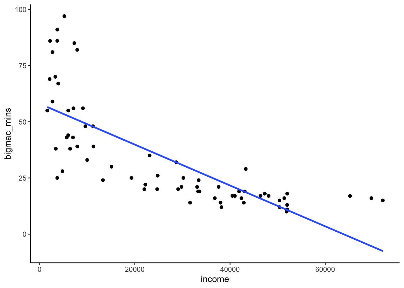
- transform income!!
Example 2: Transformations
Solution
Row 1 (location transformation): X to X - 32
- shifts the point cloud “left” by 32 units
- shifts the intercept down (not by 32), but slope is the same
Row 2 (scale transformation): X to 5/9 X
- scales the point cloud to a smaller X range
- increases the slope, but intercept is the same
Row 3 (location & scale transformation): X to 5/9 (X - 32)
- shifts the point cloud “left”, and scales the point cloud to a smaller X range
- shifts the intercept down and increases the slope
Row 4 (log transformation): X to log(X)
- straightens out the point cloud and model
Exercises
Exercise 1: mutate()
Solution
# Define a variable called bigmac_hrs that records the BigMac info in hours, not minutes
bigmac %>%
mutate(bigmac_hrs = bigmac_mins / 60) %>%
head()# A tibble: 6 × 4
city bigmac_mins income bigmac_hrs
<chr> <dbl> <dbl> <dbl>
1 Amsterdam 19 41900 0.317
2 Athens 26 24800 0.433
3 Auckland 14 31600 0.233
4 Bangkok 67 3900 1.12
5 Barcelona 21 33100 0.35
6 Beijing 44 6000 0.733# If we want to use it later, we should store the bigmac_hrs variable in the bigmac dataset
# If we included head() we'd just keep 6 rows!
bigmac <- bigmac %>%
mutate(bigmac_hrs = bigmac_mins / 60)
head(bigmac)# A tibble: 6 × 4
city bigmac_mins income bigmac_hrs
<chr> <dbl> <dbl> <dbl>
1 Amsterdam 19 41900 0.317
2 Athens 26 24800 0.433
3 Auckland 14 31600 0.233
4 Bangkok 67 3900 1.12
5 Barcelona 21 33100 0.35
6 Beijing 44 6000 0.733dim(bigmac)[1] 70 4
Exercise 2: Transformations can help make our model less wrong
Solution
# Create the log_income and log_bigmac variables
bigmac <- bigmac %>%
mutate(log_income = log(income), log_bigmac = log(bigmac_mins))
head(bigmac)# A tibble: 6 × 6
city bigmac_mins income bigmac_hrs log_income log_bigmac
<chr> <dbl> <dbl> <dbl> <dbl> <dbl>
1 Amsterdam 19 41900 0.317 10.6 2.94
2 Athens 26 24800 0.433 10.1 3.26
3 Auckland 14 31600 0.233 10.4 2.64
4 Bangkok 67 3900 1.12 8.27 4.20
5 Barcelona 21 33100 0.35 10.4 3.04
6 Beijing 44 6000 0.733 8.70 3.78# bigmac_mins vs income
bigmac %>%
ggplot(aes(y = bigmac_mins, x = income)) +
geom_point()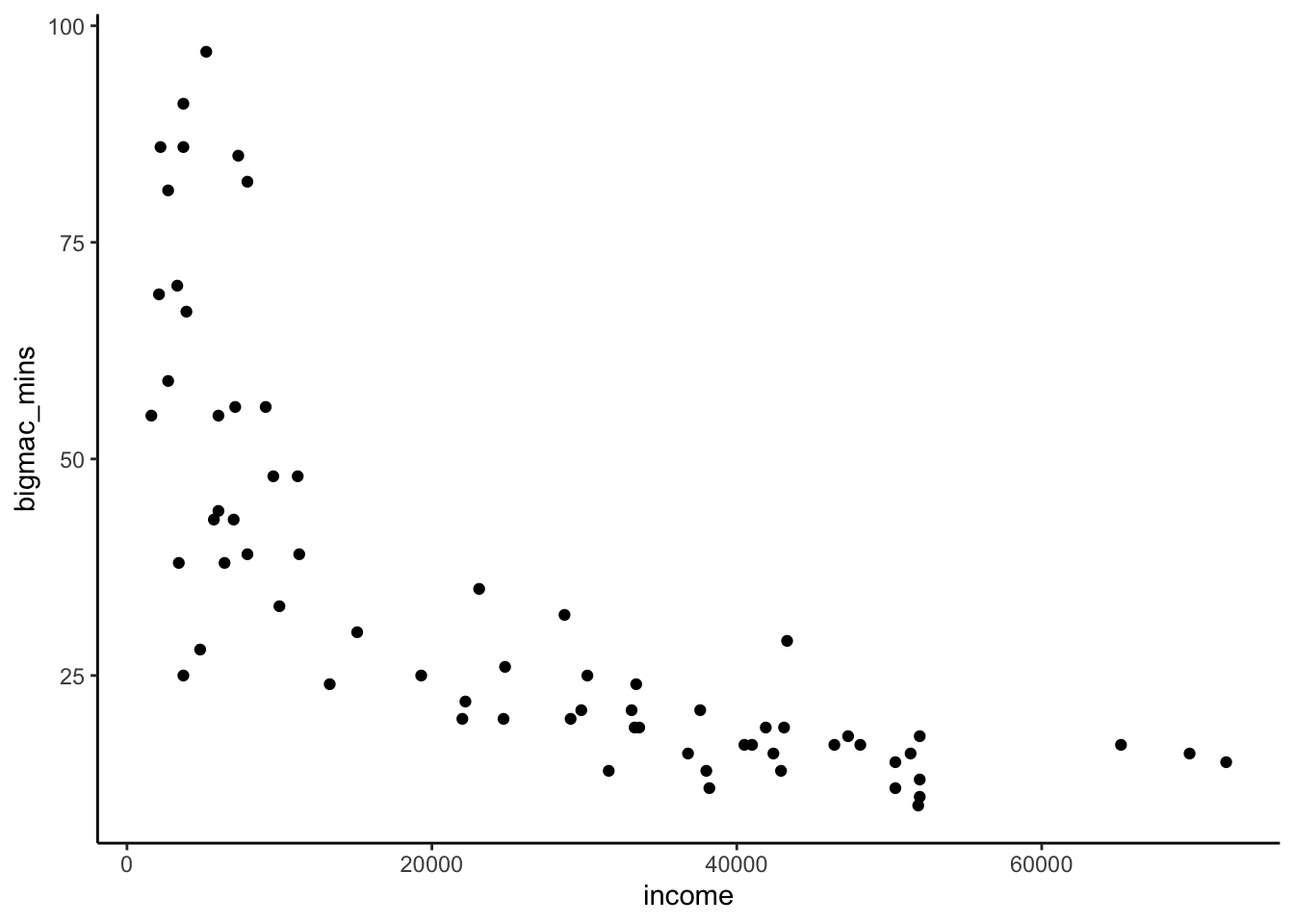
# bigmac_mins vs log_income
bigmac %>%
ggplot(aes(y = bigmac_mins, x = log_income)) +
geom_point()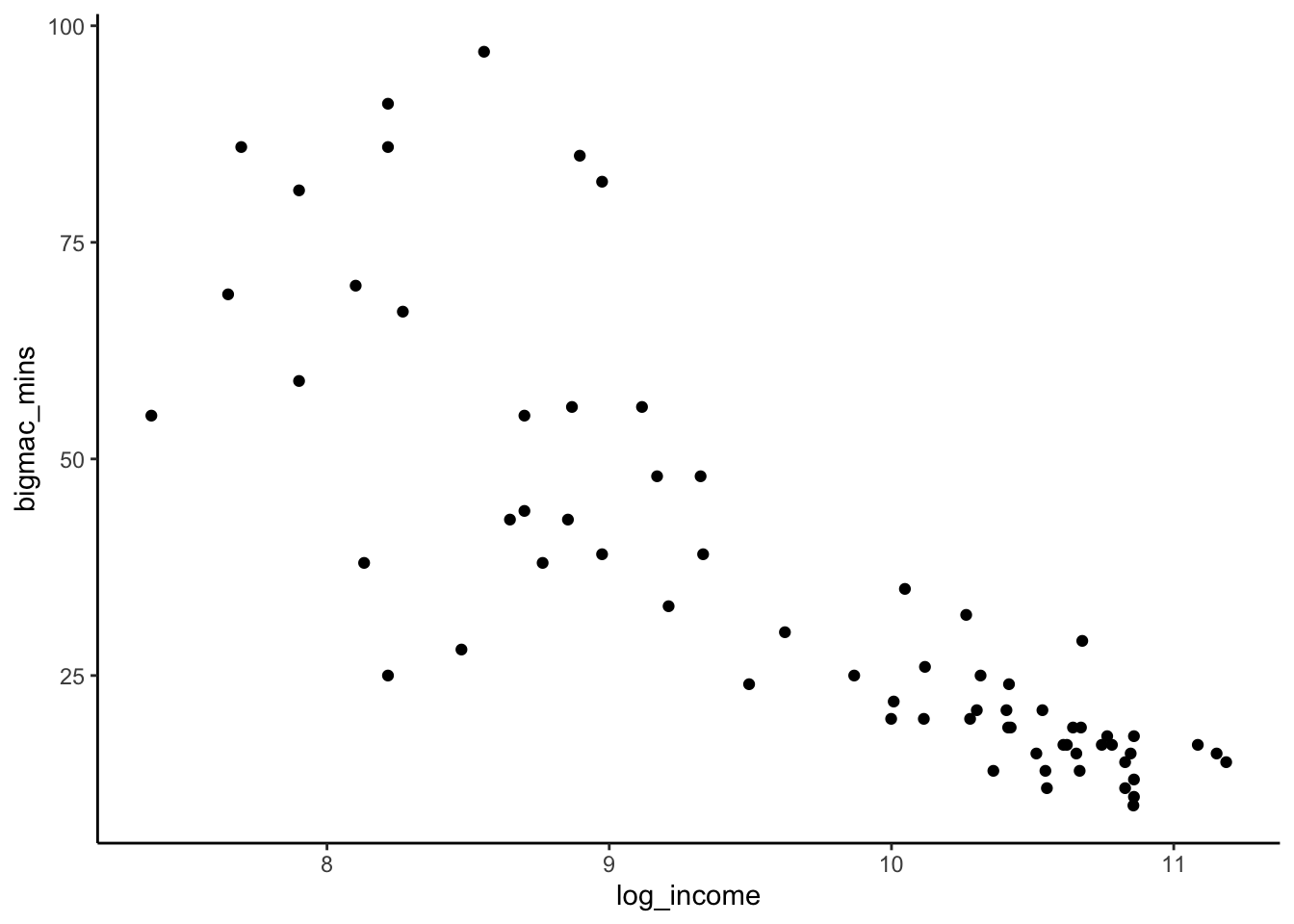
# log_bigmac vs log_income
bigmac %>%
ggplot(aes(y = log_bigmac, x = log_income)) +
geom_point()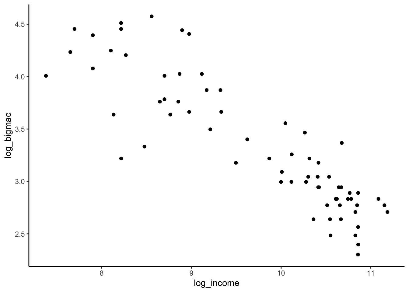
# log_bigmac vs log_income
# BUT with axis labels on the scale of the original units (not logged units)
# Note that we use the original variables, then log them in the last 2 lines!
bigmac %>%
ggplot(aes(y = bigmac_mins, x = income)) +
geom_point() +
scale_x_continuous(trans = "log") +
scale_y_continuous(trans = "log")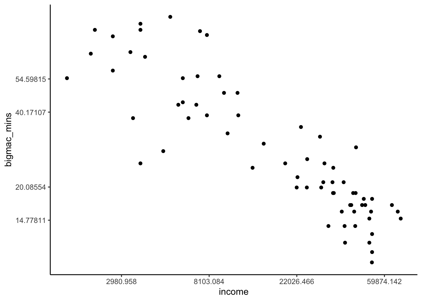
FOLLOW-UP
E[log(Big Mac time) | log(income)] = \beta_0 + \beta_1 log(income)
E[log(Big Mac time) | log(income)] = \beta_0 + \beta_1 log(income). This model is less wrong, but at the expense of interpretability.
Exercise 3: Transformations impact the meaning of our coefficients
Solution
bigmac %>%
ggplot(aes(y = bigmac_mins, x = log_income)) +
geom_point() +
geom_smooth(method = "lm", se = FALSE)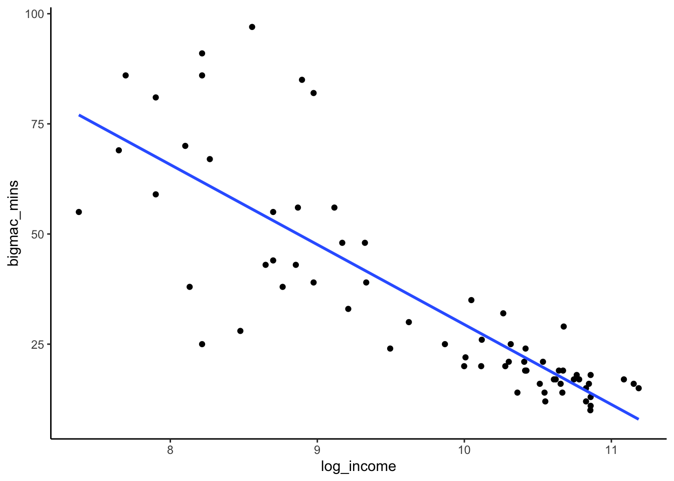
log_model <- lm(bigmac_mins ~ log_income, data = bigmac)
summary(log_model)
Call:
lm(formula = bigmac_mins ~ log_income, data = bigmac)
Residuals:
Min 1Q Median 3Q Max
-36.817 -6.951 -1.241 6.032 41.357
Coefficients:
Estimate Std. Error t value Pr(>|t|)
(Intercept) 210.875 14.687 14.36 <2e-16 ***
log_income -18.142 1.502 -12.08 <2e-16 ***
---
Signif. codes: 0 '***' 0.001 '**' 0.01 '*' 0.05 '.' 0.1 ' ' 1
Residual standard error: 13.21 on 66 degrees of freedom
(2 observations deleted due to missingness)
Multiple R-squared: 0.6886, Adjusted R-squared: 0.6838
F-statistic: 145.9 on 1 and 66 DF, p-value: < 2.2e-16210.875: expected number of minutes it takes to earn 1 Big Mac in cities with an average income of 1 dollar (X = 1 when log(X) = 0))
log(1.1)*(-18.142) = -1.73: for every 10% increase in income, the expected time it takes to earn 1 Big Mac to decrease by 1.73 minutes.
log(1.1)*(-18.142)WHY? Suppose we have two salaries: Salary1 and Salary2. If Salary2 is 10% higher than Salary1, then Salary2/Salary1 = 1.1. It is a property of logarithms that log(Salary2/Salary1) = log(Salary2) - log(Salary1). In this case log(Salary2/Salary1) = log(Salary2) - log(Salary1) = log(1.1) = 0.09531018. So a 10% increase in salary is a 0.09 unit increase in the log scale. Thus, while a 1 unit increase in log salary is associated with an average decrease of 18 Big Mac minutes, a 0.0953 unit increase in log salary (which corresponds to a 10% multiplicative increase), is associated with a 1.7 minute decrease in Big Mac minutes:
# Multiplicative difference of 1.1, or 10% between salaries gives us the
log(1.1) * -18.142[1] -1.729117
Exercise 4 (OPTIONAL): logging Y
Solution
bigmac %>%
ggplot(aes(y = log_bigmac, x = income)) +
geom_point() +
geom_smooth(method = "lm", se = FALSE)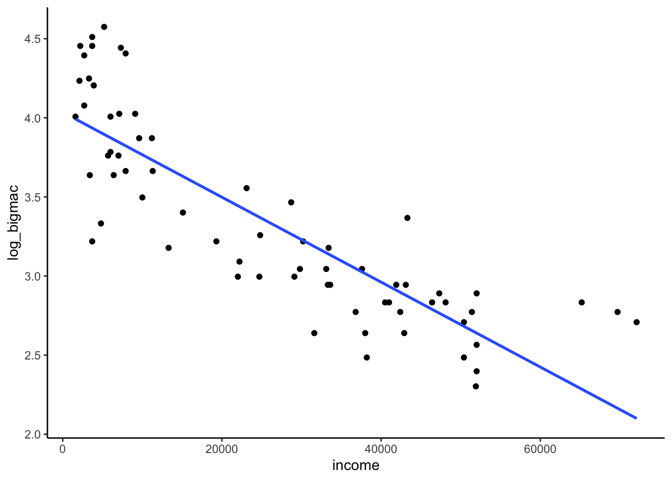
new_bigmac_model <- lm(log_bigmac ~ income, bigmac)
summary(new_bigmac_model)
Call:
lm(formula = log_bigmac ~ income, data = bigmac)
Residuals:
Min 1Q Median 3Q Max
-0.71669 -0.23163 -0.03674 0.18606 0.67940
Coefficients:
Estimate Std. Error t value Pr(>|t|)
(Intercept) 4.035e+00 6.703e-02 60.19 <2e-16 ***
income -2.684e-05 2.072e-06 -12.96 <2e-16 ***
---
Signif. codes: 0 '***' 0.001 '**' 0.01 '*' 0.05 '.' 0.1 ' ' 1
Residual standard error: 0.3326 on 66 degrees of freedom
(2 observations deleted due to missingness)
Multiple R-squared: 0.7178, Adjusted R-squared: 0.7135
F-statistic: 167.9 on 1 and 66 DF, p-value: < 2.2e-16exp(4.035)[1] 56.54292exp(-0.00002684)[1] 0.9999732E[log_bigmac | income] = 4.035 - 0.00002684 income
- Intercept: For cities with an average income of 0 (which doesn’t exist)…
- the average logged Big Mac earning time is 4.035 minutes; equivalently,
- the geometric average Big Mac earning time is 56.5 minutes (e^4.035 = 56.5).
- Slope: When average income increases by 1 dollar…
- the average logged Big Mac earning time drops by 0.00002684 minute; equivalently,
- the geometric average Big Mac earning time multiples by a factor of 0.9999732 (e^{-0.00002684} = 0.9999732), i.e. it’s 99.99732% as high
Exercise 5 (OPTIONAL): Proving the impacts of logs
Solution
Check out the resource!
Exercise 6: Transformations can help make our model easier to interpret
# Import data & check it out
peaks <- read_csv("https://mac-stat.github.io/data/high_peaks.csv")
head(peaks)# A tibble: 6 × 7
peak elevation difficulty ascent length time rating
<chr> <dbl> <dbl> <dbl> <dbl> <dbl> <chr>
1 Mt. Marcy 5344 5 3166 14.8 10 moderate
2 Algonquin Peak 5114 5 2936 9.6 9 moderate
3 Mt. Haystack 4960 7 3570 17.8 12 difficult
4 Mt. Skylight 4926 7 4265 17.9 15 difficult
5 Whiteface Mtn. 4867 4 2535 10.4 8.5 easy
6 Dix Mtn. 4857 5 2800 13.2 10 moderate Part a
Solution
# Define length_km
peaks <- peaks %>%
mutate(length_km = 1.60934 * length)
# Check it out
peaks %>%
select(time, length, length_km) %>%
head()# A tibble: 6 × 3
time length length_km
<dbl> <dbl> <dbl>
1 10 14.8 23.8
2 9 9.6 15.4
3 12 17.8 28.6
4 15 17.9 28.8
5 8.5 10.4 16.7
6 10 13.2 21.2Part b
Solution
# hiking time vs length in miles
peaks %>%
ggplot(aes(y = time, x = length)) +
geom_point() +
geom_smooth(method = "lm", se = FALSE)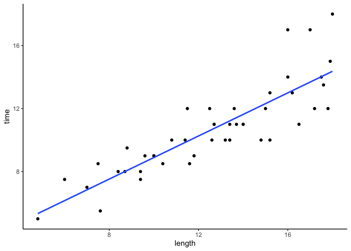
# hiking time vs length in km
peaks %>%
  ggplot(aes(y = time, x = length_km)) +
  geom_point() +
  geom_smooth(method = "lm", se = FALSE)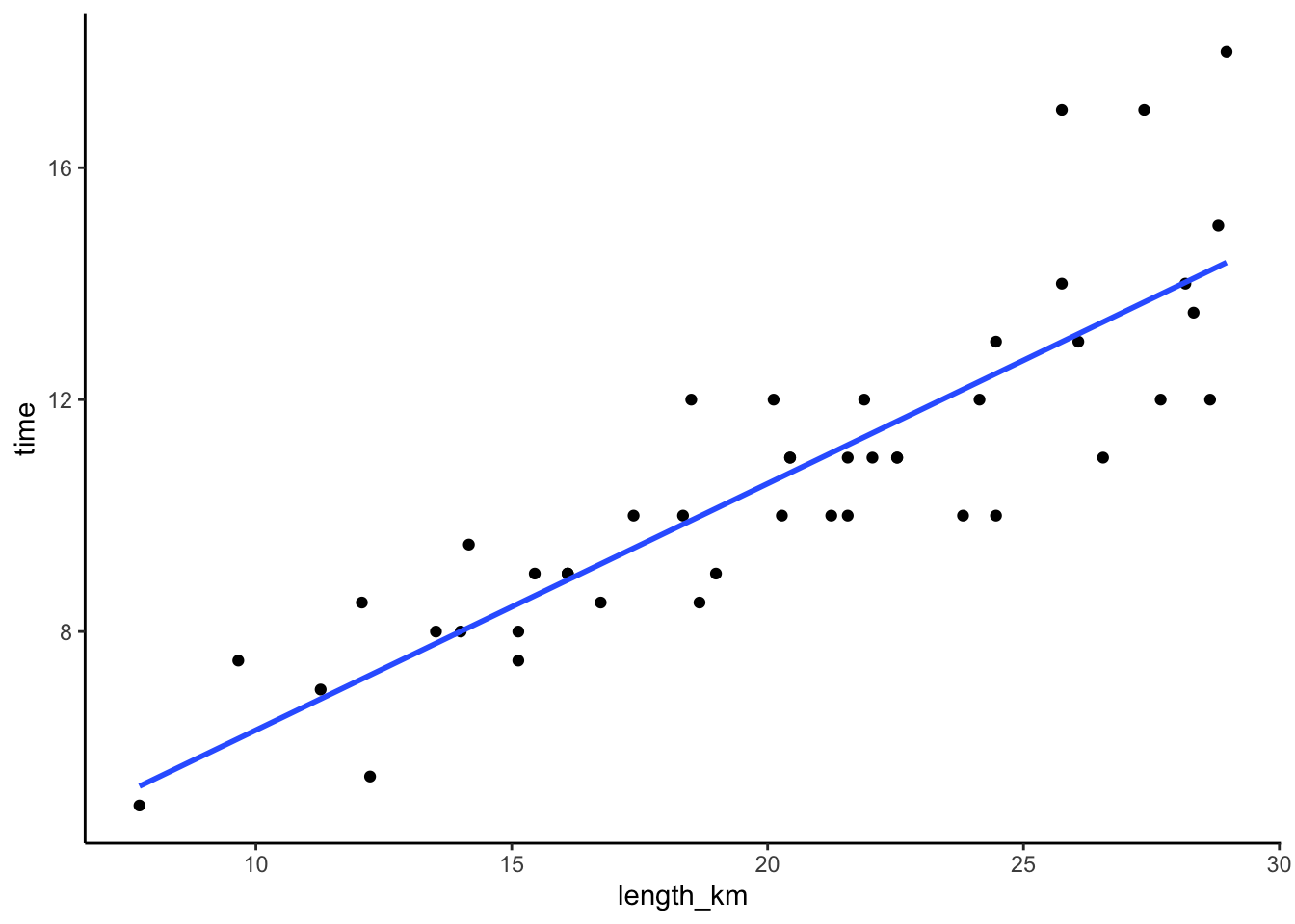
# both plots on the same axes
# Don't worry about the code!!
peaks %>%
  select(time, length, length_km) %>%
  pivot_longer(cols = -time, names_to = "Predictor", values_to = "length") %>%
  ggplot(aes(y = time, x = length)) +
  geom_point() +
  geom_smooth(method = "lm", se = FALSE, fullrange = TRUE) +
  facet_wrap(~ Predictor) +
  lims(y = c(0, 20), x = c(0, 30))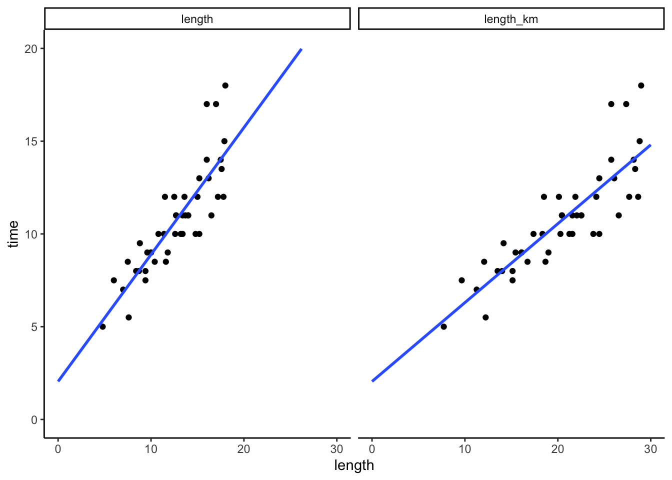
FOLLOW-UP:
- Same intercepts, different slopes.
- The quality of these models is the same! They’d have the same R-squared, make the same predictions, etc.
Exercise 7: Digging into scale transformations
peaks_model_1 <- lm(time ~ length, data = peaks)
summary(peaks_model_1)
Call:
lm(formula = time ~ length, data = peaks)
Residuals:
Min 1Q Median 3Q Max
-2.4491 -0.6687 -0.0122 0.5590 4.0034
Coefficients:
Estimate Std. Error t value Pr(>|t|)
(Intercept) 2.04817 0.80371 2.548 0.0144 *
length 0.68427 0.06162 11.105 2.39e-14 ***
---
Signif. codes: 0 '***' 0.001 '**' 0.01 '*' 0.05 '.' 0.1 ' ' 1
Residual standard error: 1.449 on 44 degrees of freedom
Multiple R-squared: 0.737, Adjusted R-squared: 0.7311
F-statistic: 123.3 on 1 and 44 DF, p-value: 2.39e-14Part a
Solution
- E[time | length] = 2.04817 + 0.68427 length
- E[time | length_km] = 2.04817 + 0.4251867 length_km
Why?
- The intercept represents the average hiking time when
length_kmis 0, hence whenlengthis 0. Thus the intercept is the same as in the original model, from which we know that the average hiking time whenlengthis 0 is 2.04817 hours. - The slope in this model represents the average change in hiking time for each 1-km increase in
length_km, which is the same as a (1/1.60934)-unit change inlength(since 1 km = (1/1.60934) miles). Based on this, the slope should be 0.68427*(1 / 1.60934) = 0.4251867.
Part b
Solution
# Fit a model of time vs length_km
peaks_model_2 <- lm(time ~ length_km, data = peaks)

# Display the model summary
summary(peaks_model_2)
Call:
lm(formula = time ~ length_km, data = peaks)
Residuals:
Min 1Q Median 3Q Max
-2.4491 -0.6687 -0.0122 0.5590 4.0034
Coefficients:
Estimate Std. Error t value Pr(>|t|)
(Intercept) 2.04817 0.80371 2.548 0.0144 *
length_km 0.42519 0.03829 11.105 2.39e-14 ***
---
Signif. codes: 0 '***' 0.001 '**' 0.01 '*' 0.05 '.' 0.1 ' ' 1
Residual standard error: 1.449 on 44 degrees of freedom
Multiple R-squared: 0.737, Adjusted R-squared: 0.7311
F-statistic: 123.3 on 1 and 44 DF, p-value: 2.39e-14Part c
Solution
# Don't worry about the code!!
peaks %>%
select(time, length, length_km) %>%
pivot_longer(cols = -time, names_to = "Predictor", values_to = "length") %>%
ggplot(aes(y = time, x = length)) +
geom_point() +
geom_smooth(method = "lm", se = FALSE, fullrange = TRUE) +
facet_wrap(~ Predictor) +
lims(y = c(0, 20), x = c(0, 30))
# Predicting price with the peaks_model_1
2.04817 + 0.68427*10[1] 8.89087# Predicting price with the peaks_model_2
2.04817 + 0.42519*(10*1.60934)[1] 8.890923Part d
Solution
- The intercept is the same. bX = 0 when X = 0.
- The slope changes to \beta_1 / b since a 1-unit increase in bX is equivalent to a (1/b)-unit increase in X.
E[Y | bX] = \beta_0 + (\beta_1/b) (bX)
Exercise 8: Location transformations (Part 1)
Part a
Solution
# Import data
homes <- read_csv("https://mac-stat.github.io/data/homes.csv")
head(homes)# A tibble: 6 × 16
Price Lot.Size Waterfront Age Land.Value New.Construct Central.Air
<dbl> <dbl> <dbl> <dbl> <dbl> <dbl> <dbl>
1 132500 0.09 0 42 50000 0 0
2 181115 0.92 0 0 22300 0 0
3 109000 0.19 0 133 7300 0 0
4 155000 0.41 0 13 18700 0 0
5 86060 0.11 0 0 15000 1 1
6 120000 0.68 0 31 14000 0 0
# ℹ 9 more variables: Fuel.Type <dbl>, Heat.Type <dbl>, Sewer.Type <dbl>,
# Living.Area <dbl>, Pct.College <dbl>, Bedrooms <dbl>, Fireplaces <dbl>,
# Bathrooms <dbl>, Rooms <dbl>homes %>%
ggplot(aes(y = Price, x = Living.Area)) +
geom_point() +
geom_smooth(method = "lm", se = FALSE)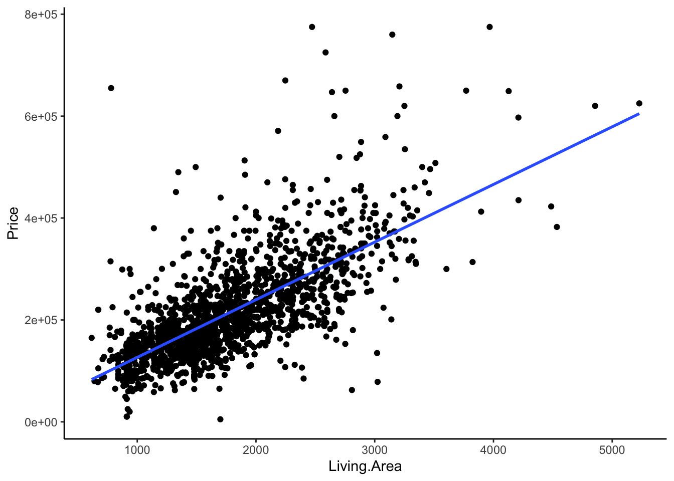
# Fit the model
home_mod <- lm(Price ~ Living.Area, data = homes)
# Display model summary output
summary(home_mod)
Call:
lm(formula = Price ~ Living.Area, data = homes)
Residuals:
Min 1Q Median 3Q Max
-277022 -39371 -7726 28350 553325
Coefficients:
Estimate Std. Error t value Pr(>|t|)
(Intercept) 13439.394 4992.353 2.692 0.00717 **
Living.Area 113.123 2.682 42.173 < 2e-16 ***
---
Signif. codes: 0 '***' 0.001 '**' 0.01 '*' 0.05 '.' 0.1 ' ' 1
Residual standard error: 69100 on 1726 degrees of freedom
Multiple R-squared: 0.5075, Adjusted R-squared: 0.5072
F-statistic: 1779 on 1 and 1726 DF, p-value: < 2.2e-16Part b
Solution
A 0 square foot home doesn’t exist!
Part c
Solution
homes %>%
summarize(min(Living.Area))# A tibble: 1 × 1
`min(Living.Area)`
<dbl>
1 616# Define Living.Area.Shifted
homes <- homes %>%
mutate(Living.Area.Shifted = Living.Area - 600)
# Check it out
homes %>%
select(Price, Living.Area, Living.Area.Shifted) %>%
head()# A tibble: 6 × 3
Price Living.Area Living.Area.Shifted
<dbl> <dbl> <dbl>
1 132500 906 306
2 181115 1953 1353
3 109000 1944 1344
4 155000 1944 1344
5 86060 840 240
6 120000 1152 552
Exercise 9: Location transformations (Part 2)
Part a
Solution
- E[Price | Living.Area] = 13439.394 + 113.123 Living.Area
- E[Price | Living.Area.Shifted] = 81312.89 + 113.123 Living.Area.Shifted
Why?
- The intercept represents the average house price when
Living.Area.Shiftedis 0, i.e.Living.Areais 600 square feet. From the originalhome_mod, we can calculate the expected price for 600 square foot homes: 13439.394 + (113.123*600) = 81312.89. - The slope in this model represents the average price change for each unit change in
Living.Area.Shifted(which is the same as a unit change inLiving.Area). Based on this, the slope should be the same as inhome_mod($113.12 per square foot).
Part b
Solution
Our intuition was correct, within rounding.
# Fit a model of Price vs. Living.Area.Shifted
# Save this as home_mod_2
home_mod_2 <- lm(Price ~ Living.Area.Shifted, data = homes)

# Display the model summary
summary(home_mod_2)
Call:
lm(formula = Price ~ Living.Area.Shifted, data = homes)
Residuals:
Min 1Q Median 3Q Max
-277022 -39371 -7726 28350 553325
Coefficients:
Estimate Std. Error t value Pr(>|t|)
(Intercept) 81312.919 3515.879 23.13 <2e-16 ***
Living.Area.Shifted 113.123 2.682 42.17 <2e-16 ***
---
Signif. codes: 0 '***' 0.001 '**' 0.01 '*' 0.05 '.' 0.1 ' ' 1
Residual standard error: 69100 on 1726 degrees of freedom
Multiple R-squared: 0.5075, Adjusted R-squared: 0.5072
F-statistic: 1779 on 1 and 1726 DF, p-value: < 2.2e-16Part c
Solution
# Predicting price with the home_mod
13439.394 + 113.123*1000[1] 126562.4# Predicting price with the home_mod_2
81312.919 + 113.123*(1000 - 600)[1] 126562.1Part d: CHALLENGE
Solution
- The slope is the same (increasing X - a by 1 unit is the same as increasing X by 1 unit).
- The intercept shifts, the new intercept being \beta_0 + a \beta_1 (i.e. the expected Y when X - a is 0, hence X = a).
E[Y | X - a] = [\beta_0 + a \beta_1] + \beta_1 (X - a)
Exercise 10: Univariate review
Solution
# What were the bigmac_mins in New York in 2006?
# Show just these 2 variables.
bigmac %>%
filter(city == "New York") %>%
select(city, bigmac_mins)# A tibble: 1 × 2
city bigmac_mins
<chr> <dbl>
1 New York 13# Show data on the city that had the smallest bigmac_mins in 2006
bigmac %>%
filter(bigmac_mins == min(bigmac_mins))# A tibble: 1 × 6
city bigmac_mins income bigmac_hrs log_income log_bigmac
<chr> <dbl> <dbl> <dbl> <dbl> <dbl>
1 Tokyo 10 51900 0.167 10.9 2.30# Construct and discuss a visualization of bigmac_mins
# Choose a visualization that helps you answer the below question:
# In roughly how many cities were did it take between 50 and 75 minutes to afford a Big Mac?
bigmac %>%
ggplot(aes(x = bigmac_mins)) +
geom_histogram()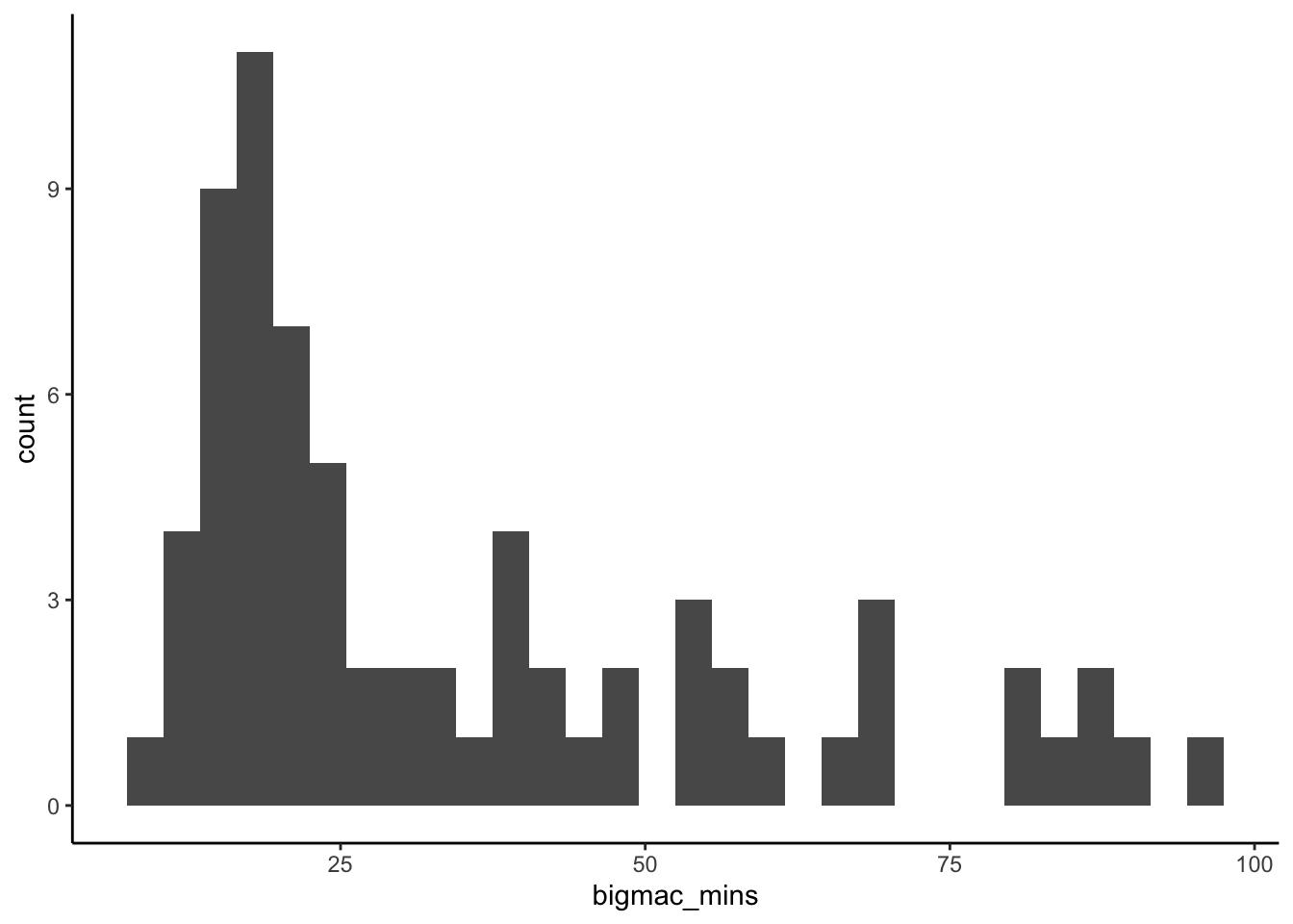
The minutes it took to afford a Big Mac was right skewed. Whereas many cities had Big Mac times under 25 minutes, it varied greatly from city to city, ranging from ~10 to ~100 minutes.
# Calculate the typical bigmac_mins across all cities in 2006
# (What's an appropriate measure here?)
# Median is appropriate given the right skew
bigmac %>%
summarize(median(bigmac_mins))# A tibble: 1 × 1
`median(bigmac_mins)`
<dbl>
1 25
Exercise 11: Modeling review
Solution
# Fit the model
bigmac_model_1 <- lm(bigmac_mins ~ income, data = bigmac)

# Get a model summary table
summary(bigmac_model_1)
Call:
lm(formula = bigmac_mins ~ income, data = bigmac)

Residuals:
    Min      1Q  Median      3Q     Max
-29.649  -9.556  -1.784   4.512  43.715

Coefficients:
              Estimate Std. Error t value Pr(>|t|)
(Intercept)  5.801e+01  3.104e+00   18.69  < 2e-16 ***
income      -9.092e-04  9.591e-05   -9.48 6.16e-14 ***
---
Signif. codes:  0 '***' 0.001 '**' 0.01 '*' 0.05 '.' 0.1 ' ' 1

Residual standard error: 15.4 on 66 degrees of freedom
  (2 observations deleted due to missingness)
Multiple R-squared:  0.5766,    Adjusted R-squared:  0.5701
F-statistic: 89.86 on 1 and 66 DF,  p-value: 6.164e-14
E[bigmac_min | income] = 58.01 - 0.00090923 income
For every 1-dollar increase in average teacher income, the expected time to afford a Big Mac decreases by 0.00090923 minutes. Or for every 1000-dollar increase in average teacher income, the expected time to afford a Big Mac decreases by nearly 1 minute (0.00090923*1000 = 0.90923).
# c
58.01 - 0.00090923*4800
[1] 53.6457# d
28 - (58.01 - 0.00090923*4800)[1] -25.6457
Exercise 12: Model evaluation review
Solution
1. Is it wrong? Yes. The residual plot suggests that the model violates the assumptions of linearity (there’s a curved pattern in the point cloud) and equal variance (the variability in the point cloud increases as the fitted values increase).
# Residual plot
bigmac_model_1 %>%
  ggplot(aes(y = .resid, x = .fitted)) +
  geom_point() +
  geom_hline(yintercept = 0)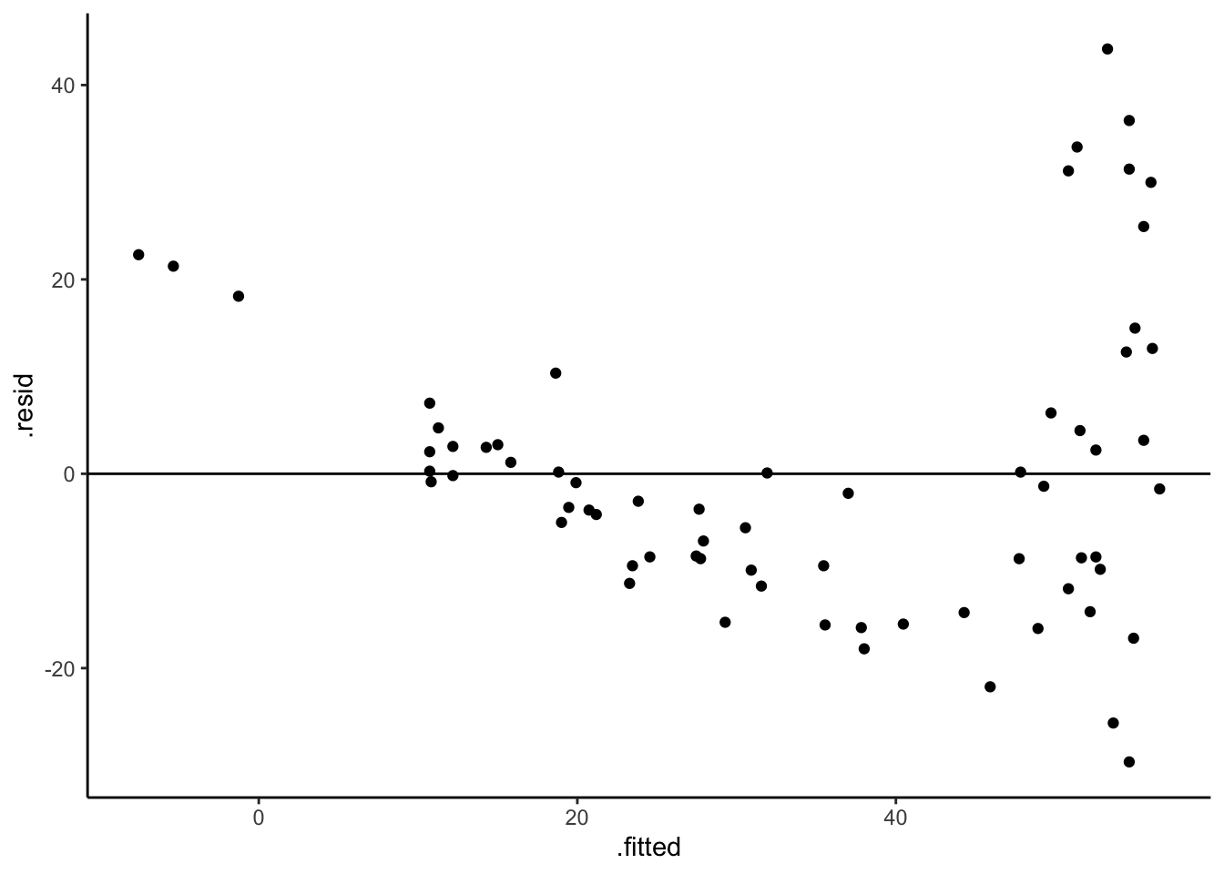
2. Is it strong? Moderately. R-squared = 0.5766. That is, the linear model explains roughly 58% of the variability in Big Mac earning times from city to city.
3. Is it fair? The model does worse (the residuals tend to be bigger) for cities with lower teaching incomes (hence higher predicted Big Mac times), thus does not capture reality in those cities.