# Load packages and import data
library(tidyverse)
data(diamonds)

# A little bit of data wrangling code - let's not focus on this for now
diamonds <- diamonds %>%
    mutate(
        cut = factor(cut, ordered = FALSE),
        color = factor(color, ordered = FALSE),
        clarity = factor(clarity, ordered = FALSE)
)7 Simple linear regression: categorical predictor
Settling In
- Sit where you’d like
- Introduce yourself
- Share your names, pronouns, major / minor.
- Check in about studying for Quiz 1. What are you finding helpful?
- Help each other get ready to take notes!
- Open your notebook. Take notes.
- We’ll do a brief recap; this is an opportunity to clarify basic concepts and answer questions that you had from the videos.
- Open the online manual to the “Course Schedule” and click on today’s activity. That brings you here!
- Download “07-cat-predictor.qmd” and open it in RStudio. Read the “Organizing your files” directions at the top of the file!!
- Open your notebook. Take notes.
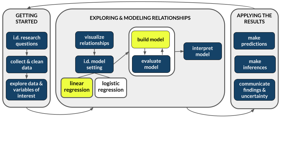
Recap
ImportantStatistical superpowers
Thus far we’ve used simple linear regression models to explore the relationship of a quantitative response variable Y with a quantitative predictor X:
E[Y | X] = \beta_0 + \beta_1 X
But we might also have access to categorical variables X which might be related to Y.
No problem! Simple linear regression models are flexible – X can be either quantitative or categorical.
We are going to take the idea of “linear model” BEYOND “a straight line”.
NoteLearning goals
By the end of this lesson, you should be able to:
- Write a model formula for a simple linear regression model with a categorical predictor using indicator variables
- Interpret the coefficients in a simple linear regression model with a categorical predictor
NoteAdditional resources
Required:
- Videos:
- Reading: Section 3.9 in the STAT 155 Notes only up through section 3.9.1 Indicator Variables
Categorical Predictor
In order to incorporate a categorical variable as a predictor X in a linear model, we convert the categorical variable into quantitative variables (using indicator variables).
Indicator Variable
For a category B, the indicator variable for it is:
CatB = \begin{cases} 1\quad \text{if the category is }B\\ 0\quad \text{if the category is not }B\end{cases}
Note: if there are K levels or categories of a categorical variable, we only need K-1 indicator variables to include in a linear model.
- The category that does not have an indicator variable in the model is called the reference level.
- Sometimes, these are referred to as “dummy variables” (in Economics).
Linear Model
For a simple linear model with a categorical predictor with 2 levels (A, B), the model is:
E[Y|CatB] = \beta_0 + \beta_1CatB
Interpretations
- \beta_0: E[Y | CatB = 0], average or expected value of Y for category A (the reference level)
- \beta_1: E[Y | CatB = 1] - E[Y | CatB = 0], difference in the average or expected value of Y comparing category B to category A (the reference level)
More Complex Linear Model
For a linear model with a categorical predictor with 3 levels (A, B,C), the model is:
E[Y|CatB,CatC] = \beta_0 + \beta_1CatB+ \beta_2CatC
Interpretations
- \beta_0: E[Y | CatB = 0, CatC = 0], average or expected value of Y for category A (the reference level)
- \beta_1: E[Y | CatB = 1, CatC = 0] - E[Y | CatB = 0, CatC = 0], difference in the average or expected value of Y comparing category B to category A (the reference level)
- \beta_2: E[Y | CatB = 0, CatC = 1] - E[Y | CatB = 0, CatC = 0], difference in the average or expected value of Y comparing category C to category A (the reference level)
Note: This is generalized to categorical predictors with 3+ levels. You include indicator variables for all but 1 level, the reference level.
NoteOrganize your files
This qmd file is where you’ll type notes, code, etc. Directions:
- Save this file in the
inclass_activitiessub-folder of thestat155folder you created before today’s class. Use a file name related to the activity number and/or today’s date (eg: “activity_7” or “7_categorical_predictors”).
Warm-up
Context: Today we’ll explore data on thousands of diamonds to understand how physical characteristics relate to price.
We’ll focus on 3 variables:
price= price in US dollarscut= quality of the diamond cut or shape (Fair,Good,Very Good,Premium,Ideal)color= diamond color, fromD(best) toJ(worst)
Research question:
How can we predict or explain the variability in price from diamond to diamond using diamond cut or color?
What’s new?
In this research question, our outcome / response variable (price) is still quantitative but our potential predictors (cut, color) are categorical! We’re in luck – simple linear regression is a powerful tool that can be used no matter whether a predictor is quantitative or categorical.
Example 1: Get to know the data
Write R code to answer the following:
# What do the first few rows of the data look like?
# What does a case represent?
# How many cases and variables do we have?# Construct and interpret 2 visualizations of priceInterpretation:
# Calculate the central tendency and spread in price# Tabulate the number of diamonds of each cut# Construct and interpret a visualization of the cut variableInterpretation:
Example 2: Price vs cut (bad viz)
Let’s now explore how diamond price might be explained by cut. We’ll start by visualizing this relationship. Use the results below to explain why a scatterplot is not an effective visualization and a line is not an effective summary of the relationship in this example (or for exploring a quantitative Y variable vs categorical X predictor in general).
NOTE: R gives error messages for bad code, but not bad ideas!!
# Try a scatterplot
diamonds %>%
  ggplot(aes(y = price, x = cut)) +
  geom_point() +
  geom_smooth(method = "lm", se = FALSE)
Example 3: Price vs cut (good viz)
Side-by-side density plots provide a better picture of the relationship between price and cut.
# Check out a density plot of price alone
diamonds %>%
  ggplot(aes(x = price)) +
  geom_density()
# Modify that code to separate the density plot by cut,
# using different line colors to distinguish between different cuts:
diamonds %>%
ggplot(aes(x = price)) +
geom_density()# Modify the code again: use different *fills* to distinguish cuts
diamonds %>%
ggplot(aes(x = price)) +
geom_density()# Modify this code to create side-by-side *boxplots* of price by cut
diamonds %>%
ggplot(aes(y = price)) +
geom_boxplot()# Modify this code to create separate *histograms*:
diamonds %>%
ggplot(aes(x = price)) +
geom_histogram(color = "white") +
facet_wrap(~ ___)FOLLOW-UPS
- Describe the relationship of
pricewithcut. Do you notice anything unexpected? What do you think might be happening here? - What do you think was the least effective plot?
NoteNext up: modeling!
We can use linear regression to model the relationship of a quantitative response variable Y with a categorical predictor variable X! This is a relief because predictors are often categorical. Examples:
- Model time to campus (Y) by mode of transportation (X) – walk, bike, bus, etc.
- Model film revenue (Y) by genre (X) – rom com, sci-fi, etc.
- Model wages (Y) by job industry (X) – agriculture, construction, etc.
- Model some health outcome (Y) by treatment – A or B.
Though the linear regression model formula is not represented by a line, it still has a familiar form:
E[Y | X] = \beta_0 + \beta_1 (something related to X)
Exercises
Exercise 1: Numerical summaries by category
In exploring the relationship of price with cut, we’ve explored some visual summaries. Let’s follow these up with some numerical summaries.
- To warm up, first calculate the mean
priceacross all diamonds.
diamonds %>%
___(mean(___))- To summarize the trends we observed in the grouped plots above, we can calculate the mean
pricefor each type ofcut. This requires the inclusion of thegroup_by()function:
# Group the diamonds data by cut
# Show just the first 6 rows
# Notice that nothing obviously changes, just how the data are structured in the background
diamonds %>%
    group_by(cut) %>%
    head()
# So we *almost always* follow up `group_by()` with `summarize()`
# For example: calculate the mean price by cut
diamonds %>%
group_by(cut) %>%
___(mean(___))- Examine the group mean measurements, and make sure that you can match these numbers up with what you see in the plots.
Exercise 2: Indicator variables
- Based on the results above, we learn that, on average, diamonds with a “Fair” cut tend to cost more than higher-quality cuts. Let’s construct a new variable named
cutFair, using on the following criteria:
cutFair= 1 if the diamond is of Fair cutcutFair= 0 otherwise (any other value of cut (Good, Very Good, Premium, Ideal))
The ifelse function allows to create a new variable from an existing one, based on whether or not the values in that variable meet a certain “condition” (remember, you can always look up function documentation in R by typing ?ifelse in the Console, and hitting enter!).
Fill in the following code to create cutFair. The condition was given to you already. Try to use this to complete the code.
# In the first blank, put what value cutFair should have if the condition is "met", or TRUE
# In the second blank, put what value cutFair should have if the condition is "not met", or FALSE
diamonds <- diamonds %>%
  mutate(cutFair = ifelse(cut == "Fair", ___, ___))
Variables like cutFair that are coded as 0/1 to numerically indicate if a categorical variable is at a particular state are known as an indicator variable. You will sometimes see these referred to as a “binary variable” or “dichotomous variable”; you may also encounter the term “dummy variable” in older statistical literature.
- Now, let’s calculate the group means based on the new
cutFairindicator variable. Examine the group means and store them in your brain for later:
diamonds %>%
    group_by(cutFair) %>%
summarize(mean(price))- Calculate the difference between the mean price for fair and not fair diamonds (mean for fair - mean for not fair). Check out the actual number and keep this in your brain!
Exercise 3: Modeling trend using a categorical predictor with exactly 2 categories
Next, let’s model the trend in the relationship between the cutFair and price variables using a simple linear regression model:
# Construct the model
diamond_mod0 <- lm(price ~ cutFair, data = diamonds)

# Summarize the model
coef(summary(diamond_mod0))
Compare these results to the output of the previous exercise. What do you notice? How do you interpret the intercept and cutFair coefficient terms from this model?
Exercise 4: Modeling trend using a categorical predictor with >2 categories
Using a single binary predictor like the cutFair indicator variable is useful when there are two clearly delineated categories. However, the cut variable actually contains 5 categories! Because we’ve collapsed all non-Fair classifications into a single category (i.e. cutFair = 0), the model above can’t tell us anything about the difference in expected price between, say, Premium and Ideal cuts. The good news is that it is straightforward to model categorical predictors with >2 categories. We can do this by using the cut variable as our predictor:
# Construct the model
diamond_mod <- lm(price ~ cut, data = diamonds)

# Summarize the model
coef(summary(diamond_mod))- Even though we specified a single predictor variable in the model, we get 4 coefficient estimates–why do you think this is the case?
NOTE: We observe 4 indicator variables (for Good, Very Good, Premium, and Ideal), but we do not see cutFair in the model output. This is because Fair is the reference level of the cut variable (it’s first alphabetically). You’ll learn below that it is, indeed, still in the model. You’ll also learn why the term “reference level” makes sense!
- After examining the summary table output from the code chunk above, complete the model formula:
E[price | cut] = ___ +/- ___ cutGood +/- ___ cutVery Good +/- ___ cutPremium +/- ___ cutIdeal
Exercise 5: Making sense of the model
Recall our model: E[price | cut] = 4358.7578 - 429.8933 cutGood - 376.9979 cutVery Good + 225.4999 cutPremium - 901.2158 cutIdeal
- Use the model formula to calculate the expected/typical price for diamonds of Good cut. HINT: Plug in 0s and 1s!!
4358.7578 - 429.8933*___ - 376.9979*___ + 225.4999*___ - 901.2158*___- Similarly, calculate the expected/typical price for diamonds of Fair cut.
4358.7578 - 429.8933*___ - 376.9979*___ + 225.4999*___ - 901.2158*___- Check your work with the
predict()function:
predict(diamond_mod, newdata = data.frame(cut = "Good"))
predict(diamond_mod, newdata = data.frame(cut = "Fair"))
predict(diamond_mod, newdata = data.frame(cut = c("Good", "Fair")))- Re-examine these 2 calculations. Where have you observed these numbers before?!
Exercise 6: Interpreting coefficients
Recall that our model formula is not a formula for a line. Thus we can’t interpret the coefficients as “slopes” as we have before. Taking this into account and reflecting upon your calculations above…
Interpret the intercept coefficient (
4358.7578) in terms of the data context. Make sure to use non-causal language, include units, and talk about averages rather than individual cases.Interpret the
cutGoodandcutVery Goodcoefficients (-429.8933and-376.9979) in terms of the data context. Hint: where did you use these value in the prediction calculations above?
Exercise 7: Modeling choices (CHALLENGE)
Why do we fit this model in this way (using 4 indicator variables cutGood, cutVery Good, cutPremium, cutIdeal)? Instead, suppose that we created a single variable cutCat that gave each category a numerical value: 0 for Fair, 1 for Good, 2 for Very Good, 3 for Premium, and 4 for Ideal.
How would this change things? What are the pros and cons of each approach?
Reflection
Through the exercises above, you learned how to build and interpret models that incorporate a categorical predictor variable. For the benefit of your future self, summarize how one can interpret the coefficients for a categorical predictor.
Extra Practice
Exercise 8: The least squares criterion
The coefficient estimates diamond_mod were selected in the same way as when our predictor is quantitative: by minimizing the sum of the squared residuals. Use this model to calculate the residual for the first diamond in the dataset:
# Observed data on the first diamond
diamonds %>%
  select(price, cut) %>%
  head(1)
Exercise 9: Diamond color
Consider modeling price by color.
- Before creating a visualization that shows the relationship between price and color, write down what you expect the plot to look like. Then construct and interpret an appropriate plot.
- Compute the average price for each color.
- Fit an appropriate linear model with
lm()and display a short summary of the model. - Write out the model formula from the above summary.
- Which color is the reference level? How can you tell from the model summary?
- Interpret the intercept and two other coefficients from the model in terms of the data context.
Exercise 10: Diamond clarity
Repeat the steps from the previous exercise for the clarity variable.
Exercise 11: Evaluating model strength
Let’s study some penguin data!
data(penguins)
penguins <- penguins %>%
  filter(!is.na(sex), !is.na(species))
We’ll focus on 3 variables with the goal of predicting flipper_len:
flipper_len= the length of the penguin’s flippers (arms) in mmspecies= Adelie, Chinstrap, or Gentoosex= female, male
And build 2 models of flipper_len:
# Model of flipper_len by sex
flipper_model_1 <- lm(flipper_len ~ sex, data = penguins)
flipper_model_2 <- lm(flipper_len ~ species, data = penguins)
Just as with models that use quantitative predictors, it’s important to evaluate our (eventual) models of flipper_len by species and sex: are they correct? strong? fair?
Let’s start with strength. How strong are these models? What’s the best predictor? Let’s explore.
- Based on the boxplots below, what is the stronger predictor of
flipper_len:sexorspecies?
penguins %>%
  ggplot(aes(y = flipper_len, x = sex)) +
  geom_boxplot()
penguins %>%
ggplot(aes(y = flipper_len, x = species)) +
geom_boxplot()- We used 2 approaches to measuring the strength of the simple linear regression models in previous activities: correlation and R-squared. Unfortunately, we get errors when we try to calculate the correlation between
flipper_lenandsex, and betweenflipper_lenandspecies. Why?
penguins %>%
summarize(cor(sex, flipper_len))
penguins %>%
summarize(cor(species, flipper_len))- Luckily, R-squared works no matter whether a predictor is quantitative or categorical! Interpret and compare the R-squared values for our separate models of
flipper_lenbysexandspecies. Which is the stronger predictor? Does this match your answer in part a?
# Model of flipper_len by sex
summary(flipper_model_1)
# Model of flipper_len by species
summary(flipper_model_2)Exercise 12: Evaluating model correctness
Let’s just focus on the stronger of our 2 models, that of flipper_len by species (flipper_model_2), and ask: is it correct (not wrong)? Recall that when our predictor was quantitative, residual plots provided some insight. Check out the residual plots below. They look a little goofy! Explain the goofiness (what’s happening here) and describe what you learn about the model’s “correctness”. Is the model “correct”?
# Residual plot
flipper_model_2 %>%
ggplot(aes(x = .fitted, y = .resid)) +
geom_point() +
geom_hline(yintercept = 0)# Residual plot using boxes!
flipper_model_2 %>%
ggplot(aes(x = .fitted, y = .resid, group = .fitted)) +
geom_boxplot() +
geom_hline(yintercept = 0)Exercise 13: Really understand how the coefficients work
Next, consider the model of flipper_len by island. The average flipper_len of penguins on each island is calculated below:
penguins %>%
group_by(island) %>%
summarize(mean(flipper_len))- Using just the above averages and your understanding of categorical predictors, fill in the model coefficients and indicator variables below. Do NOT use
lm()yet!!!
E[flipper_len | island] = ___ +/- ___ island??? +/- ___ island???
- Check your work to Part a.
flipper_model_3 <- lm(flipper_len ~ island, penguins)
summary(flipper_model_3)
Wrap Up
- Today
- PS 2. Due tonight!
- Next Monday (2/16)
- Quiz 1! Start studying, if you haven’t already.
Solutions
Warm Up
Example 1: Get to know the data
Solution
# What do the first few rows of the data look like?
# What does a case represent? A case represents a single diamond.
head(diamonds)# A tibble: 6 × 10
carat cut color clarity depth table price x y z
<dbl> <ord> <ord> <ord> <dbl> <dbl> <int> <dbl> <dbl> <dbl>
1 0.23 Ideal E SI2 61.5 55 326 3.95 3.98 2.43
2 0.21 Premium E SI1 59.8 61 326 3.89 3.84 2.31
3 0.23 Good E VS1 56.9 65 327 4.05 4.07 2.31
4 0.29 Premium I VS2 62.4 58 334 4.2 4.23 2.63
5 0.31 Good J SI2 63.3 58 335 4.34 4.35 2.75
6 0.24 Very Good J VVS2 62.8 57 336 3.94 3.96 2.48# How many cases and variables do we have?
dim(diamonds)[1] 53940 10# Construct and interpret 2 visualizations of price
ggplot(diamonds, aes(x = price)) +
geom_histogram()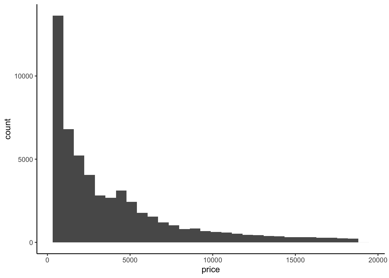
ggplot(diamonds, aes(y = price)) +
geom_boxplot()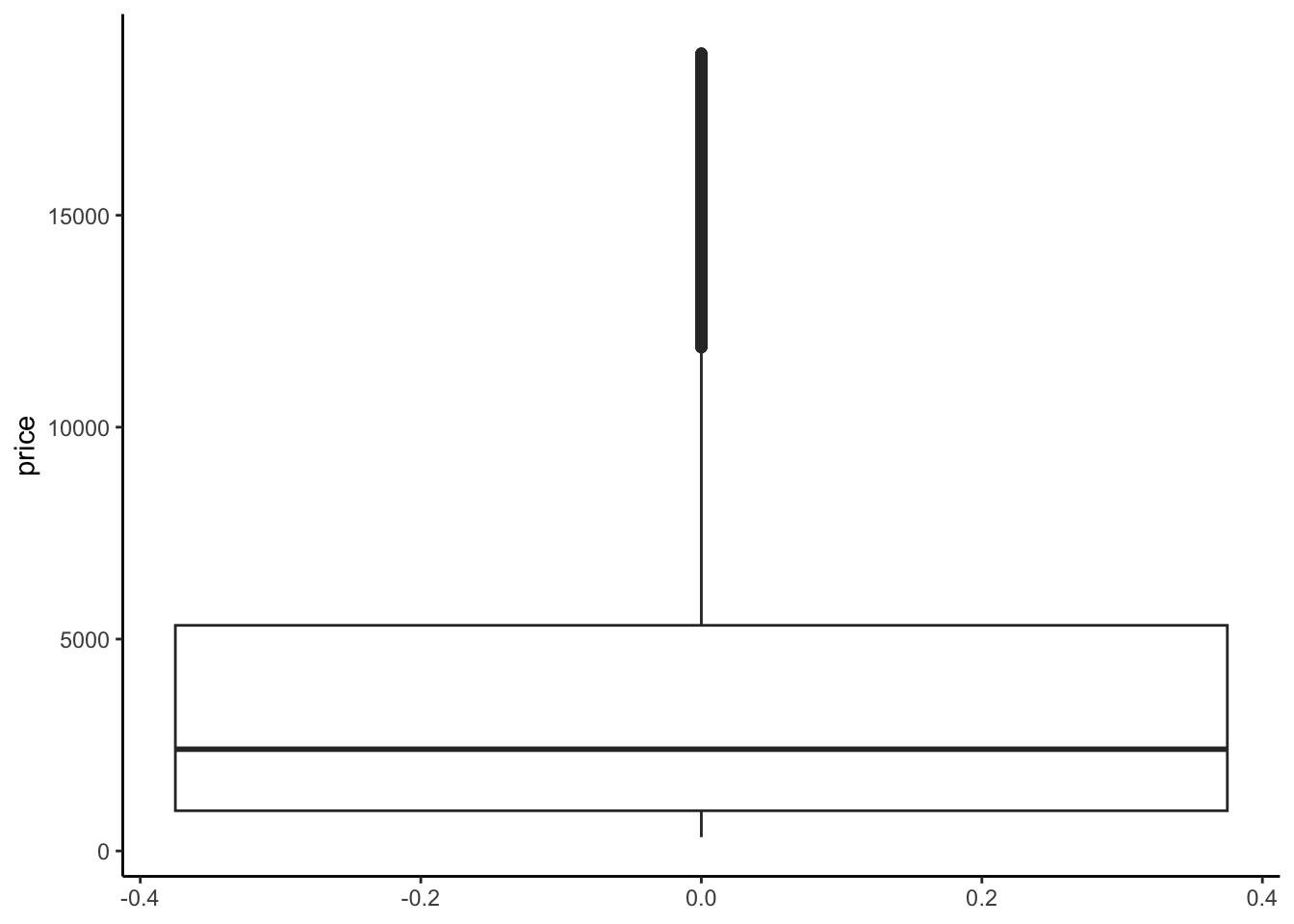
Interpretation: The distribution of price is right skewed with considerable high outliers. The right skew is evidenced by the mean price ($3932) being much higher than the median price ($2401).
# Calculate the central tendency and spread in price
diamonds %>%
summarize(mean(price), median(price), sd(price))# A tibble: 1 × 3
`mean(price)` `median(price)` `sd(price)`
<dbl> <dbl> <dbl>
1 3933. 2401 3989.# Tabulate the number of diamonds of each cut
diamonds %>%
count(cut)# A tibble: 5 × 2
cut n
<ord> <int>
1 Fair 1610
2 Good 4906
3 Very Good 12082
4 Premium 13791
5 Ideal 21551# Construct and interpret a visualization of the cut variable
ggplot(diamonds, aes(x = cut)) +
geom_bar()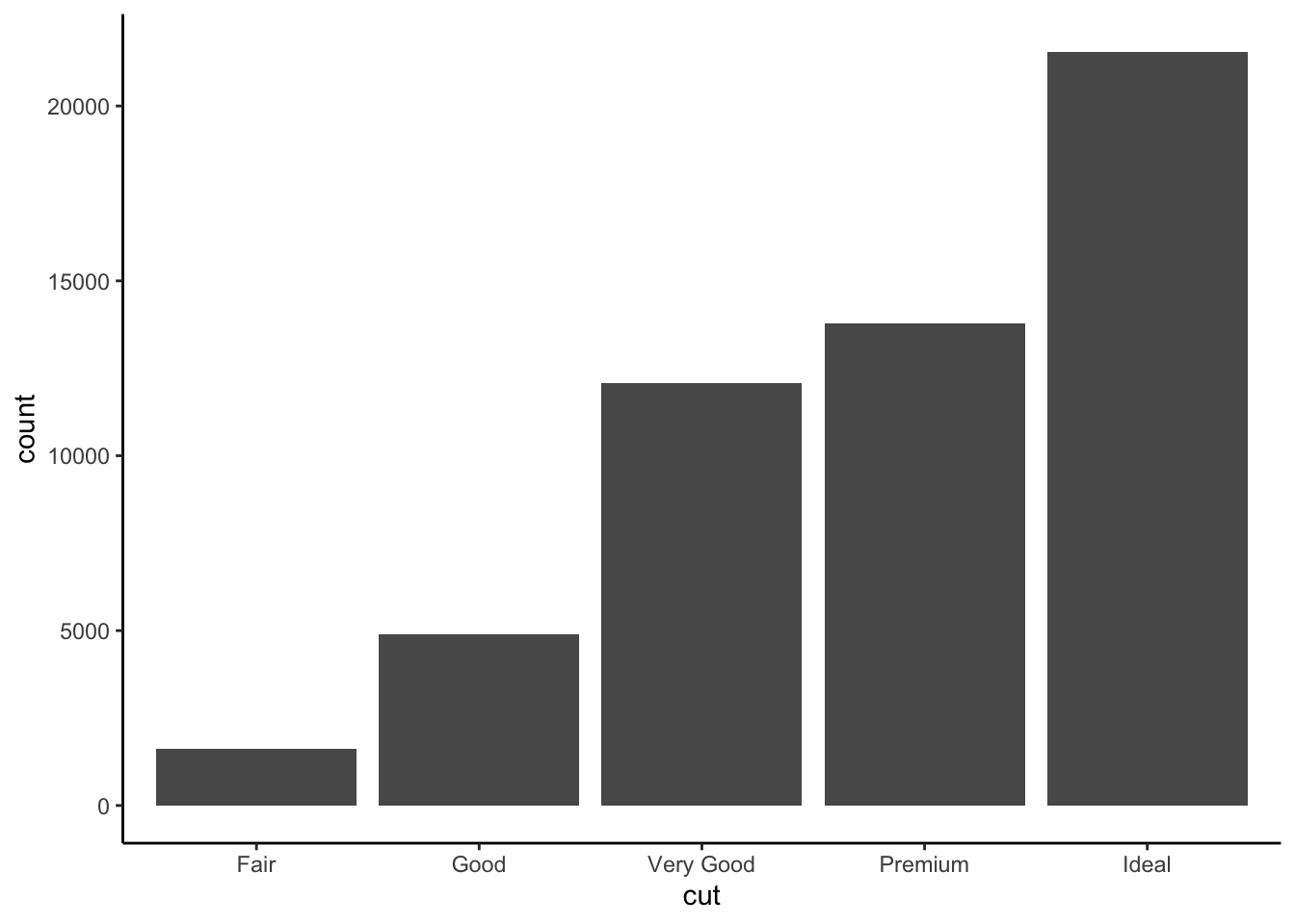
Interpretation: Most diamonds in this data are of Good cut or better. Ideal cut diamonds are the most common with each succesive grade being the next most common.
Example 2: Price vs cut (bad viz)
Solution
We just don’t see anything clearly on a scatterplot. With the small number of unique values of the predictor variable, all of the points are bunched up on each other.
# Try a scatterplot
ggplot(diamonds, aes(y = price, x = cut)) +
geom_point()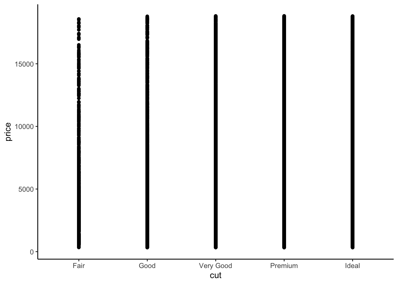
Example 3: Price vs cut (good viz)
Solution
# Check out a density plot of price alone
diamonds %>%
ggplot(aes(x = price)) +
geom_density()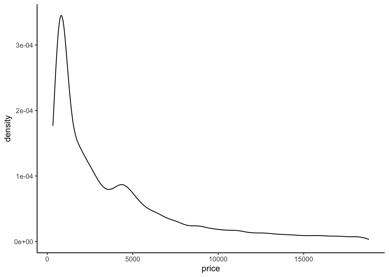
# Modify that code to separate the density plot by cut,
# using different line colors to distinguish between different cuts:
diamonds %>%
ggplot(aes(x = price, color = cut)) +
geom_density()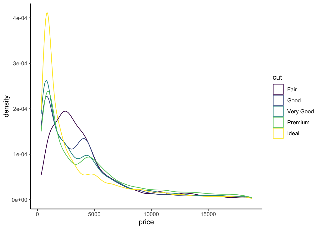
# Modify the code again: use different *fills* to distinguish cuts
diamonds %>%
ggplot(aes(x = price, fill = cut)) +
geom_density(alpha = 0.5)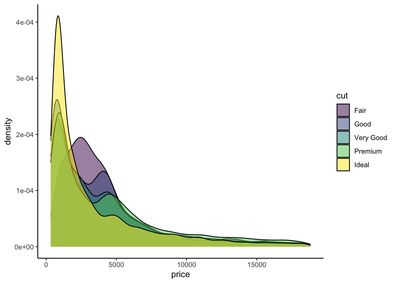
# Modify this code to create side-by-side *boxplots* of price by cut
diamonds %>%
ggplot(aes(y = price, x = cut)) +
geom_boxplot()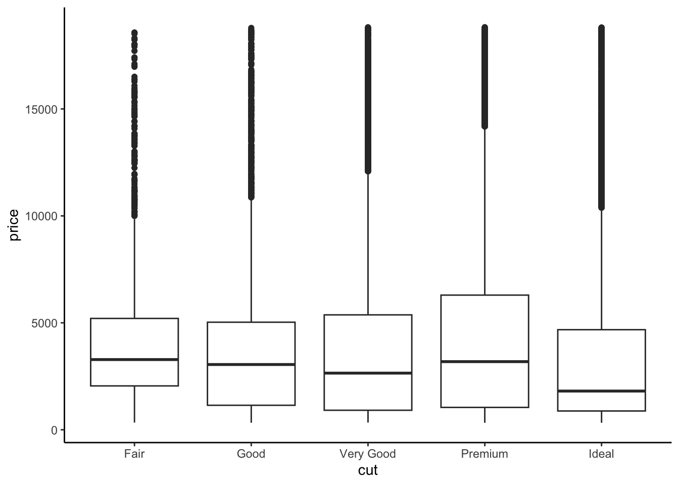
# Modify this code to create separate *histograms*:
diamonds %>%
ggplot(aes(x = price)) +
geom_histogram(color = "white") +
facet_wrap(~ cut)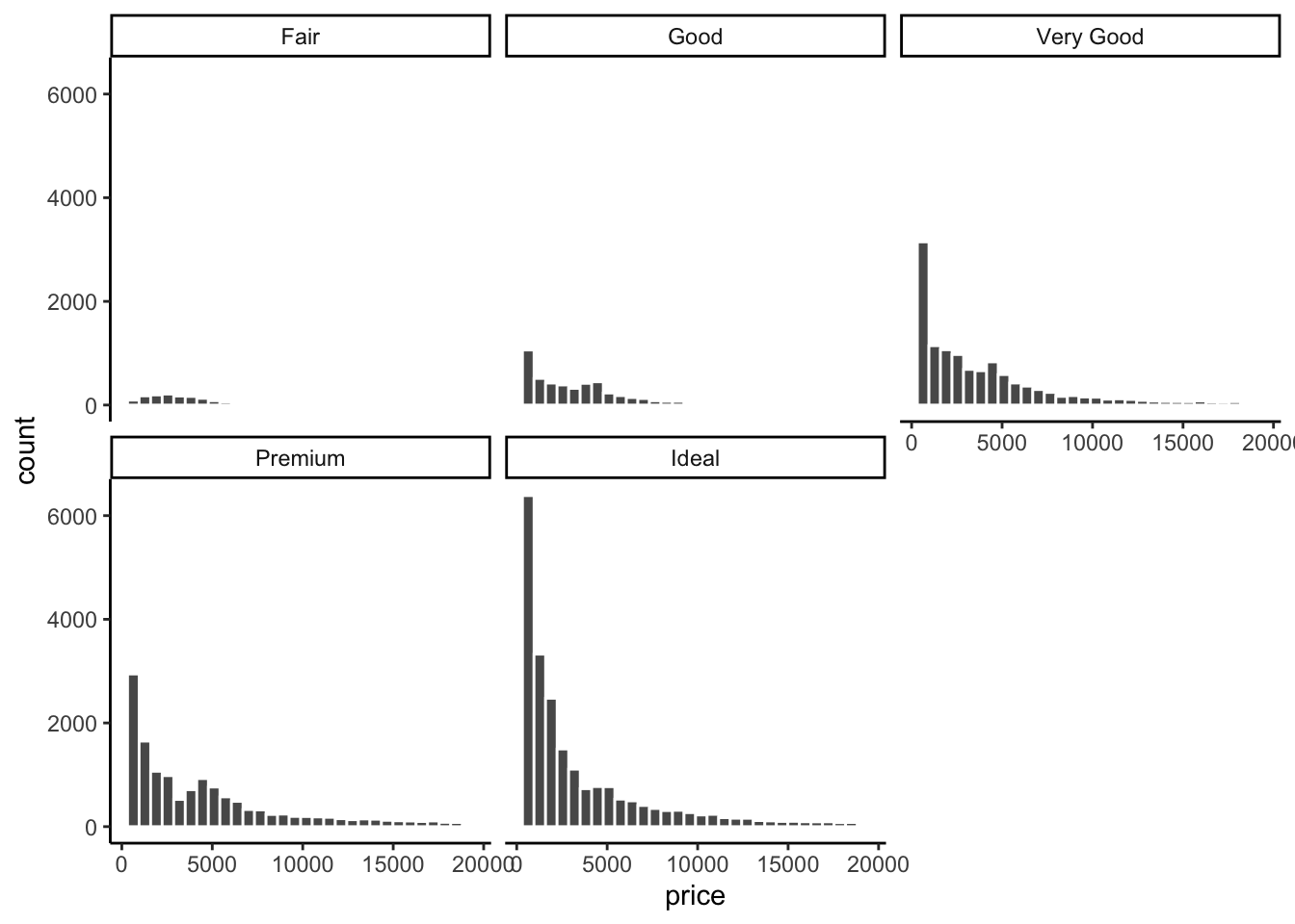
The relationship between price and cut seems to be opposite what we would expect. The diamonds with the best cut (Ideal) have the lowest average price, and the ones with the worst cut (Fair) are woth the most. Maybe something else is different between the diamonds with the best and worst cuts…size maybe?
The histograms are tough to compare.
Exercises
Exercise 1: Numerical summaries by category
Solution
Let’s follow up our plots with some numerical summaries.
- Mean
priceacross all diamonds:
diamonds %>%
summarize(mean(price))# A tibble: 1 × 1
`mean(price)`
<dbl>
1 3933.- Mean
pricefor each type ofcut:
diamonds %>%
group_by(cut) %>%
summarize(mean(price))# A tibble: 5 × 2
cut `mean(price)`
<ord> <dbl>
1 Fair 4359.
2 Good 3929.
3 Very Good 3982.
4 Premium 4584.
5 Ideal 3458.- Group means should reflect what you see in the plots (easiest to see in the boxplots)
Exercise 2: Indicator variables
Solution
- Create our new
cutFairvariable:
diamonds <- diamonds %>%
mutate(cutFair = ifelse(cut == "Fair", 1, 0))- Calculate the group means based on this new variable
diamonds %>%
group_by(cutFair) %>%
summarize(mean(price))# A tibble: 2 × 2
cutFair `mean(price)`
<dbl> <dbl>
1 0 3920.
2 1 4359.- Calculate the difference between the mean price for fair and not fair diamonds (mean for fair - mean for not fair). Check out the actual number and keep this in your brain!
4358.758 - 3919.695[1] 439.063Exercise 3: Modeling trend using a categorical predictor with exactly 2 categories
Solution
# Construct the model
diamond_mod0 <- lm(price ~ cutFair, data = diamonds)
# Summarize the model
coef(summary(diamond_mod0)) Estimate Std. Error t value Pr(>|t|)
(Intercept) 3919.6946 17.4367 224.795616 0.000000e+00
cutFair 439.0632 100.9269 4.350309 1.361951e-05The intercept is the expected value (mean) of the price for all diamonds with a cut quality that isn’t Fair (Good, Very Good, Premium, or Ideal, i.e. when
cutFair= 0)–the same as we saw in exercise 3e.When we add the intercept and coefficient for
cutFair, we get3919.69 + 439.06 = 4358.75–this is the mean price for all diamonds with a Fair cut quality that we saw in exercise 3e! Therefore, the coefficient ofcutFair(439.06) is interpreted as the difference between the mean value of diamonds with a Fair cut quality and the mean value of diamonds with a higher cut quality.
Exercise 4: Modeling trend using a categorical predictor with >2 categories
Solution
# Construct the model
diamond_mod <- lm(price ~ cut, data = diamonds)
# Summarize the model
coef(summary(diamond_mod)) Estimate Std. Error t value Pr(>|t|)
(Intercept) 4062.2364 25.40119 159.923098 0.000000e+00
cut.L -362.7254 68.04001 -5.331060 9.803272e-08
cut.Q -225.5798 60.64902 -3.719431 1.998742e-04
cut.C -699.4965 52.77862 -13.253406 4.981260e-40
cut^4 -280.3564 42.55674 -6.587826 4.504051e-11We observe 4 coefficient estimates because each category is being assigned to a separate indicator variable–
cutGood= 1 whencut == "Good"and 0 otherwise,cutVery Good= 1 when `cut == “Very Good” and 0 otherwise, and so on.E[price | cut] = 4358.7578 - 429.8933 cutGood - 376.9979 cutVery Good + 225.4999 cutPremium - 901.2158 cutIdeal
Exercise 5: Making sense of the model
Solution
- Expected/typical price for diamonds of Good cut:
E[price | cut] = 4358.7578 - 429.8933 * 1 - 376.9979 * 0 + 225.4999 * 0 - 901.2158 * 0 = 4358.7578 - 429.8933 = $3928.865
predict(diamond_mod, newdata = data.frame(cut = "Good")) 1
3928.864 - Expected/typical price for diamonds of Fair cut:
E[price | cut] = 4358.7578 - 429.8933 * 0 - 376.9979 * 0 + 225.4999 * 0 - 901.2158 * 0 = $4358.7578
predict(diamond_mod, newdata = data.frame(cut = "Fair")) 1
4358.758 predict(diamond_mod, newdata = data.frame(cut = "Good")) 1
3928.864 predict(diamond_mod, newdata = data.frame(cut = "Fair")) 1
4358.758 predict(diamond_mod, newdata = data.frame(cut = c("Good", "Fair"))) 1 2
3928.864 4358.758 - These come from our group mean calculations in Exercise 3b! The predicted value for diamonds of Fair cut is also the same as what we obtained using the SLR model in exercise 4 with only a single
cutFairindicator variable.
Exercise 6: Interpreting coefficients
Solution
Recall that our model formula is not a formula for a line. Thus we can’t interpret the coefficients as “slopes” as we have before. Taking this into account and reflecting upon your calculations above…
The average price of a Fair cut diamonds is $4358.7578.
- Interpretation of
cutGoodcoefficient: On average, Good cut diamonds are worth $429.89 less than Fair cut diamonds. - Interpretation of
cutVery Goodcoefficient: On average, Very Good cut diamonds are worth $377.00 less than Fair cut diamonds.
- Interpretation of
Exercise 7: Modeling choices (CHALLENGE)
Solution
Why do we fit this model in this way (using 4 indicator variables cutGood, cutVery Good, cutPremium, cutIdeal)? Instead, suppose that we created a single variable cutCat that gave each category a numerical value: 0 for Fair, 1 for Good, 2 for Very Good, 3 for Premium, and 4 for Ideal.
- If we used 0-4 instead of creating indicator variables, we would be constraining the change from 0 to 1, from 1 to 2, etc. to always be of the same magnitude. That is, a 1 unit change in the cut variable would always have the same change in price in our model.
- Using separate indicator variables allows the difference between subsequent categories to be different, which allows our model to be a bit more nuanced. It is possible to take nuance too far though. For example, in our previous investigations of bikeshare data, we modeled ridership versus temperature. We treated temperature as a quantitative predictor. Imagine if we had created an indicator variable for each unique temperature in the data—that would be so many variables! Having so many variables creates a very complex model which can be hard to make sense of. (These ideas are addressed further in STAT 253: Statistical Machine Learning!)
Exercise 8: The least squares criterion
Solution
# Observed price = 326
diamonds %>%
select(price, cut) %>%
head(1)# A tibble: 1 × 2
price cut
<int> <ord>
1 326 Ideal# Predicted price = 3457.542
predict(diamond_mod, newdata = data.frame(cut = "Ideal")) 1
3457.542 # Residual
326 - 3457.542[1] -3131.542Exercise 9: Diamond color
Solution
Consider modeling price by color.
- The best color diamonds are J, and worst are D. We would expect D diamonds to have the lowest price and increase steadily as we get to J. This is in fact what we see in the boxplots.
ggplot(diamonds, aes(x = color, y = price)) +
geom_boxplot()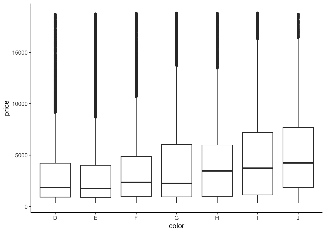
diamonds %>%
group_by(color) %>%
summarize(mean(price))# A tibble: 7 × 2
color `mean(price)`
<ord> <dbl>
1 D 3170.
2 E 3077.
3 F 3725.
4 G 3999.
5 H 4487.
6 I 5092.
7 J 5324.- We fit a linear model and obtain the model formula: E[price | color] = 3169.95 - 93.20 colorE + 554.93 colorF + 829.18 colorG + 1316.72 colorH + 1921.92 colorI + 2153.86 colorJ
diamond_mod2 <- lm(price ~ color, data = diamonds)
coef(summary(diamond_mod2)) Estimate Std. Error t value Pr(>|t|)
(Intercept) 4124.72726 18.63913 221.2939947 0.000000e+00
color.L 2126.73419 57.02422 37.2952761 1.337640e-300
color.Q 200.50417 54.25749 3.6954191 2.197414e-04
color.C -254.35557 51.08475 -4.9790903 6.408052e-07
color^4 40.87891 46.91865 0.8712721 3.836095e-01
color^5 -228.87914 44.35697 -5.1599368 2.479063e-07
color^6 87.92301 40.21604 2.1862672 2.880034e-02- Color D is the reference level because we don’t see its indicator variable in the model output.
- Interpretation of the intercept: Diamonds with D color cost $3169.95 on average.
- Interpretation of the
colorEcoefficient: Diamonds with E color cost $93.20 less than D color diamonds on average. - Interpretation of the
colorFcoefficient: Diamonds with F color cost $554.93 more than D color diamonds on average.
Exercise 10: Diamond clarity
Solution
We see the unexpected result that diamonds of better clarity (VS1 and higher) have lower average prices. In fact the best clarity diamonds (VVS1 and IF) have the lowest average prices. What might be going on? What if the most clear diamonds were also quite small…
ggplot(diamonds, aes(x = clarity, y = price)) +
geom_boxplot()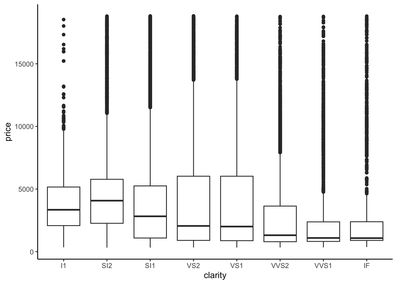
diamonds %>%
group_by(clarity) %>%
summarize(mean(price))# A tibble: 8 × 2
clarity `mean(price)`
<ord> <dbl>
1 I1 3924.
2 SI2 5063.
3 SI1 3996.
4 VS2 3925.
5 VS1 3839.
6 VVS2 3284.
7 VVS1 2523.
8 IF 2865.diamond_mod3 <- lm(price ~ clarity, data = diamonds)
coef(summary(diamond_mod3)) Estimate Std. Error t value Pr(>|t|)
(Intercept) 3677.41676 25.88161 142.086092 0.000000e+00
clarity.L -1723.35264 98.72036 -17.456913 4.696367e-68
clarity.Q -428.36467 96.70081 -4.429794 9.450847e-06
clarity.C 647.87442 83.30820 7.776838 7.567234e-15
clarity^4 -123.13052 66.72533 -1.845334 6.499443e-02
clarity^5 804.80570 54.62487 14.733320 4.907171e-49
clarity^6 -273.65013 47.67881 -5.739449 9.549240e-09
clarity^7 81.18721 42.01910 1.932150 5.334619e-02Exercise 11: Evaluating model strength
flipper_model_1 <- lm(flipper_len ~ sex, data = penguins)
flipper_model_2 <- lm(flipper_len ~ species, data = penguins)Part a
Solution
species appears to be the stronger predictor - the flipper_len values are more distinct between species (there’s less overlap in the boxes)
data(penguins)
penguins <- penguins %>%
filter(!is.na(sex), !is.na(species))
penguins %>%
ggplot(aes(y = flipper_len, x = sex)) +
geom_boxplot()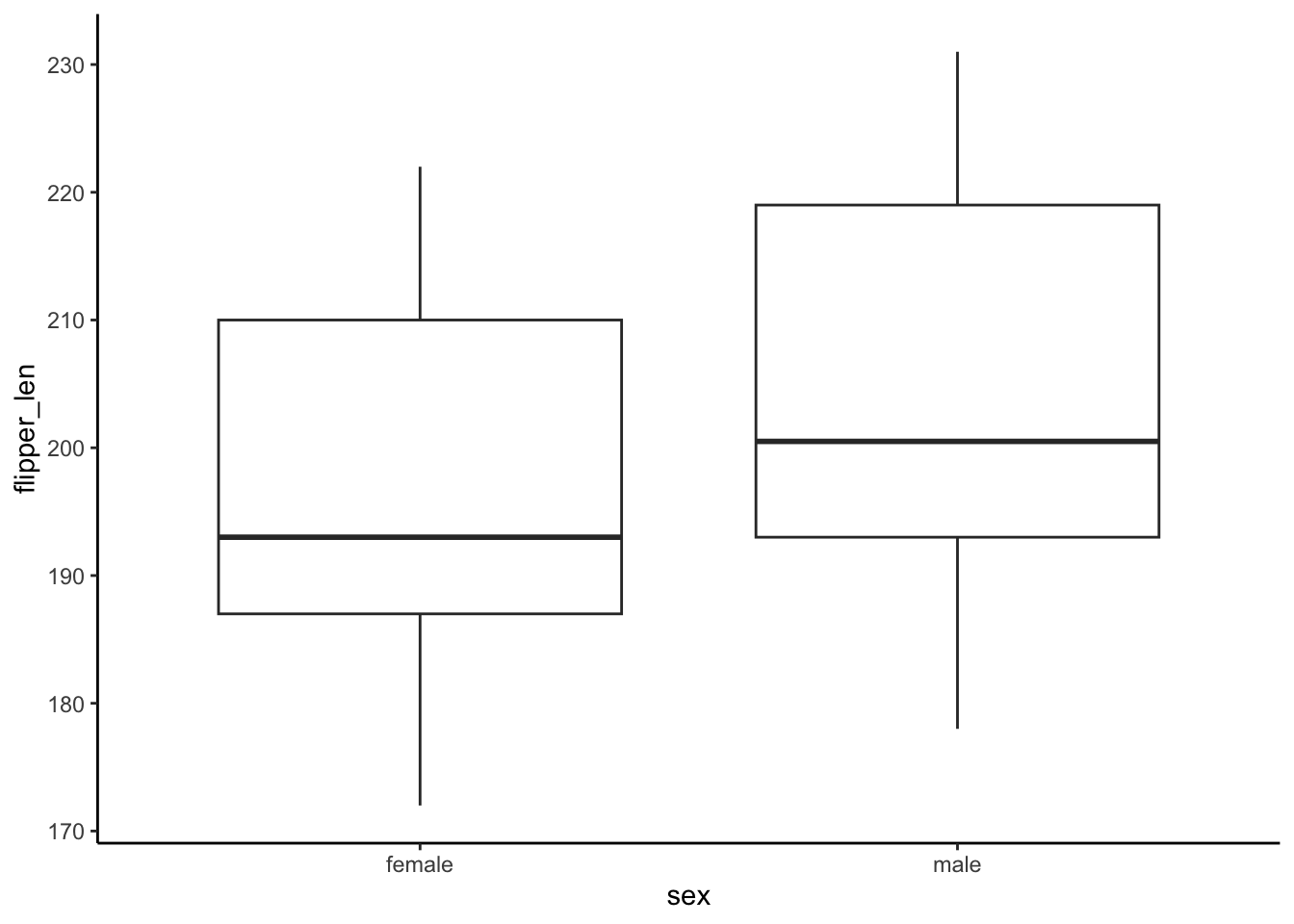
penguins %>%
  ggplot(aes(y = flipper_len, x = species)) +
  geom_boxplot()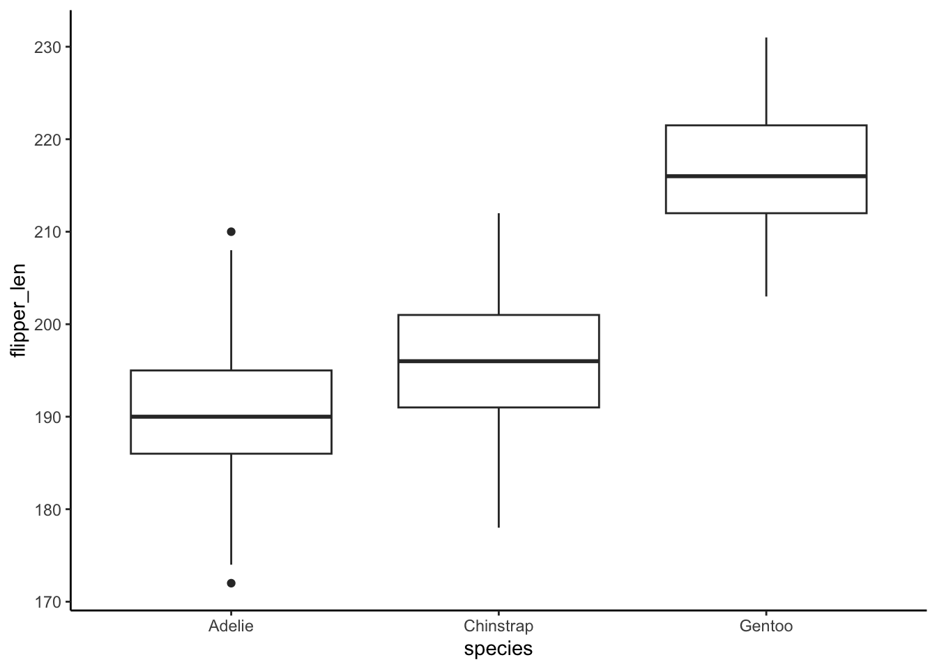
Part b
Solution
Correlation only works when both variables in the pair are quantitative, but sex and species are categorical.
Part c
Solution
Using sex: R-squared = 0.06511
Using species: R-squared = 0.7782. Thus species is the stronger predictor of flipper_len. It explains roughly 78% of the variability in flipper length from penguin to penguin.
summary(flipper_model_1)
Call:
lm(formula = flipper_len ~ sex, data = penguins)
Residuals:
Min 1Q Median 3Q Max
-26.506 -10.364 -4.364 12.636 26.494
Coefficients:
Estimate Std. Error t value Pr(>|t|)
(Intercept) 197.364 1.057 186.792 < 2e-16 ***
sexmale 7.142 1.488 4.801 2.39e-06 ***
---
Signif. codes: 0 '***' 0.001 '**' 0.01 '*' 0.05 '.' 0.1 ' ' 1
Residual standard error: 13.57 on 331 degrees of freedom
(11 observations deleted due to missingness)
Multiple R-squared: 0.06511, Adjusted R-squared: 0.06229
F-statistic: 23.05 on 1 and 331 DF, p-value: 2.391e-06summary(flipper_model_2)
Call:
lm(formula = flipper_len ~ species, data = penguins)
Residuals:
Min 1Q Median 3Q Max
-17.9536 -4.8235 0.0464 4.8130 20.0464
Coefficients:
Estimate Std. Error t value Pr(>|t|)
(Intercept) 189.9536 0.5405 351.454 < 2e-16 ***
speciesChinstrap 5.8699 0.9699 6.052 3.79e-09 ***
speciesGentoo 27.2333 0.8067 33.760 < 2e-16 ***
---
Signif. codes: 0 '***' 0.001 '**' 0.01 '*' 0.05 '.' 0.1 ' ' 1
Residual standard error: 6.642 on 339 degrees of freedom
(2 observations deleted due to missingness)
Multiple R-squared: 0.7782, Adjusted R-squared: 0.7769
F-statistic: 594.8 on 2 and 339 DF, p-value: < 2.2e-16Exercise 12: Evaluating model correctness
Solution
Since there are only 3 different species, there are only 3 possible predictions of flipper_len in this model (one per species). Thus each of the 3 groups on the x-axis corresponds to a species. Within each species, the observed flipper_len deviates from the species-based prediction, thus so too do the residuals. That’s why the points in each group have different y coordinates.
Overall, our model doesn’t seem too wrong! No matter the x value (species!), the residuals are normally balanced above and below 0 with roughly equal variance in each species.
# Residual plot
flipper_model_2 %>%
  ggplot(aes(x = .fitted, y = .resid)) +
  geom_point() +
  geom_hline(yintercept = 0)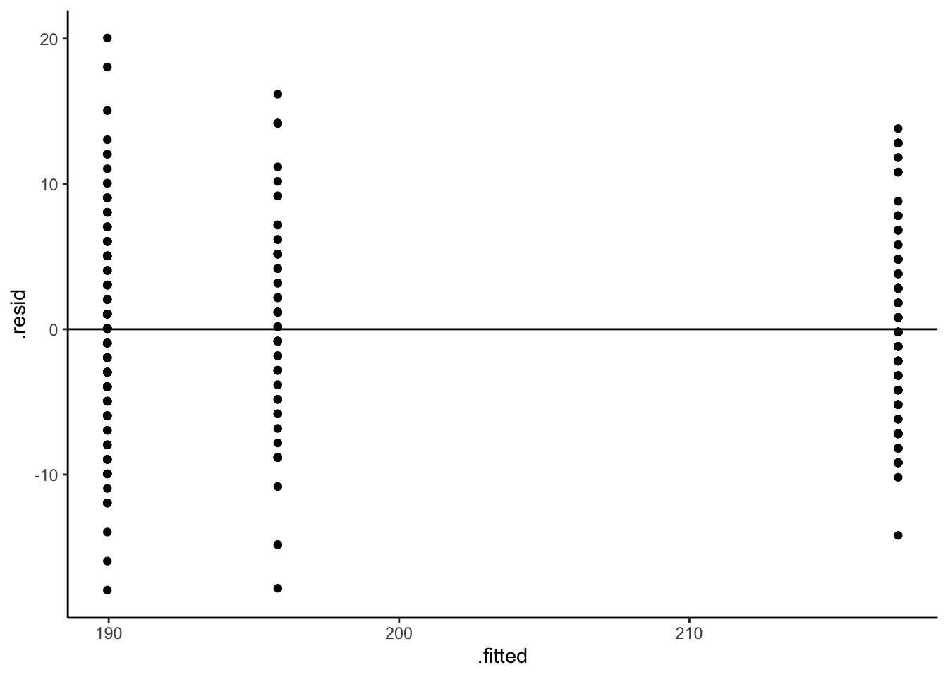
# Residual plot using boxes!
flipper_model_2 %>%
  ggplot(aes(x = .fitted, y = .resid, group = .fitted)) +
  geom_boxplot() +
  geom_hline(yintercept = 0)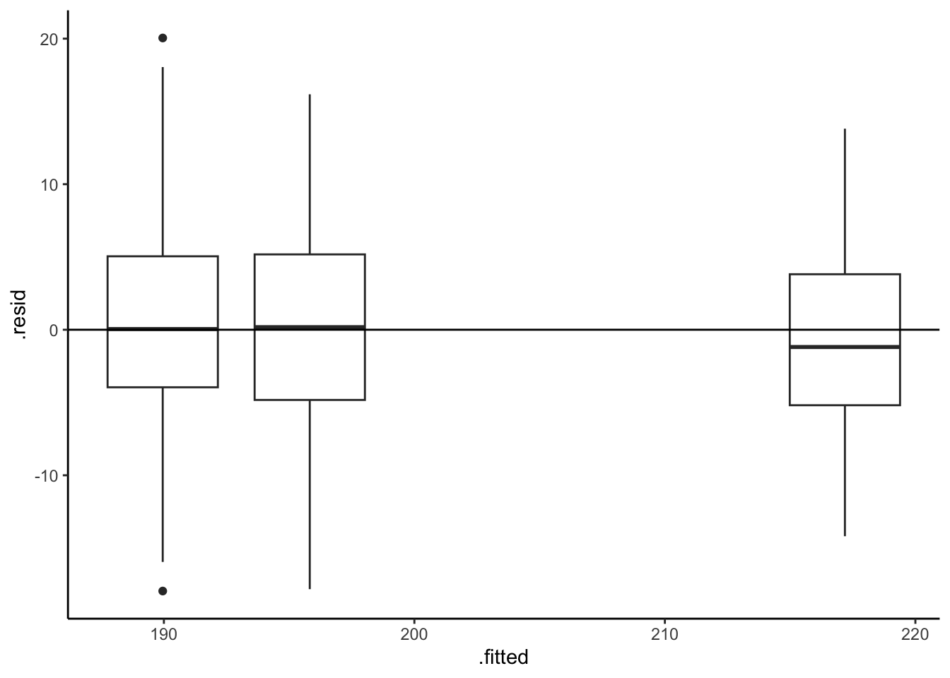
Exercise 13: Really understand how the coefficients work
Solution
penguins %>%
  group_by(island) %>%
summarize(mean(flipper_len))# A tibble: 3 × 2
island `mean(flipper_len)`
<fct> <dbl>
1 Biscoe 210.
2 Dream 193.
3 Torgersen 192.- E[
flipper_len|island] = 209.56 - 16.37 islandDream - 18.03 islandTorgersen
Why?
- The island terms are
islandDreamandislandTorgersensince Biscoe is the reference. - The intercept is the average flipper length for the reference, Biscoe.
- The
islandDreamcoefficient reflects the fact that the average flipper length on Dream is 16.37mm lower than that on Biscoe (193.1870 - 209.5583) - The
islandTorgersencoefficient reflects the fact that the average flipper length on Dream is 18.03mm lower than that on Biscoe (191.5319 - 209.5583)
flipper_model_3 <- lm(flipper_len ~ island, penguins)
summary(flipper_model_3)
Call:
lm(formula = flipper_len ~ island, data = penguins)

Residuals:
    Min      1Q  Median      3Q     Max
-37.558  -5.532   1.468   7.442  21.442

Coefficients:
                Estimate Std. Error t value Pr(>|t|)
(Intercept)      209.558      0.879 238.410   <2e-16 ***
islandDream      -16.371      1.340 -12.214   <2e-16 ***
islandTorgersen  -18.026      1.858  -9.702   <2e-16 ***
---
Signif. codes:  0 '***' 0.001 '**' 0.01 '*' 0.05 '.' 0.1 ' ' 1

Residual standard error: 11.22 on 330 degrees of freedom
Multiple R-squared:  0.3628,    Adjusted R-squared:  0.3589
F-statistic: 93.94 on 2 and 330 DF,  p-value: < 2.2e-16