12 Multiple linear regression: interaction terms practice
Settling In
- Sit where you’d like
- Introduce yourself
- Check in with each other.
- Help each other get ready to take notes!
- Open your notebook.
- Open the online manual to the “Course Schedule” and click on today’s activity. That brings you here!
- Download “12-mlr-interaction.qmd” and open it in RStudio. Read the “Organizing your files” directions at the top of the file!!
- Open your notebook.
Recap
NoteLearning goals
By the end of this lesson, you should be able to:
- Visualize interactions between categorical and quantitative predictors using scatterplots and side-by-side or boxplots
- Critically think through whether an interaction term makes sense, or should be included in a multiple linear regression model
- Write a model formula for a multiple linear regression model with an interaction term between two quantitative predictors, two categorical predictors, or one quantitative and one categorical predictor
- Interpret the intercept and slope coefficients in a multiple linear regression model with an interaction term
NoteAdditional resources
Model Building using Causal Diagram
Once you have a causal diagram with Y and a predictor of interest X_1, we’ll identify variables as one of the following based on the diagram structure.
We’ve covered Confounders and Effect Modifiers.
Confounder Variable
A variable X_2 is a confounder if it is…
- causally associated with outcome Y
- (causally) associated with predictor of interest X_1
In other words, X_2 would be a common cause of Y and X_1.
The X_2 “confounds” or confuses the relationship of X_1 and Y.
Solution: Include confounders in our model.
Precision Variable
A variable X_2 is a precision variable if it is…
- causally associated with outcome Y
- not associated with predictor of interest X_1
Solution: Don’t have to include in model, but a good idea to include in model.
Effect Modifier
A variable X_2 is an effect modifier if it …
- effects the relationship between X_1 and Y
Mediator
A variable X_2 is a mediator if it …
- causally associated with outcome Y
- caused by predictor of interest X_1
Collider
A variable X_2 is a collider if it …
- caused by outcome Y
- caused by predictor of interest X_1
Interaction Terms
To account for effect modifiers, we need interaction terms.
Interaction terms: X_1 * X_2, product of two variables
We can motivate interaction terms by writing down a MLR,
E[Y|X_1, X_2] = \beta_0 + \beta_1 X_1 + b X_2 and assume that X_1 modifies the “effect” of X_2, thus the slope coefficient depends on X_1,
b = \beta_2 + \beta_3X_1
We can plug that back in to our model statement and see that we get a product, X_1*X_2,
E[Y|X_1, X_2] = \beta_0 + \beta_1 X_1 + (\beta_2 + \beta_3X_1) X_2 = \beta_0 + \beta_1 X_1 + \beta_2 X_2 + \beta_3X_1* X_2
NoteOrganize your files
This qmd file is where you’ll type notes, code, etc. Directions:
- Save this file in the
inclass_activitiessub-folder of thestat155folder you created before today’s class. Use a file name related to the activity number and/or today’s date (eg: “activity 12” or “12 interactions”).
Warm-up
Example 1: Identify the confounder / effect modifier
It’s our job to identify important confounders and effect modifiers. Context is important!
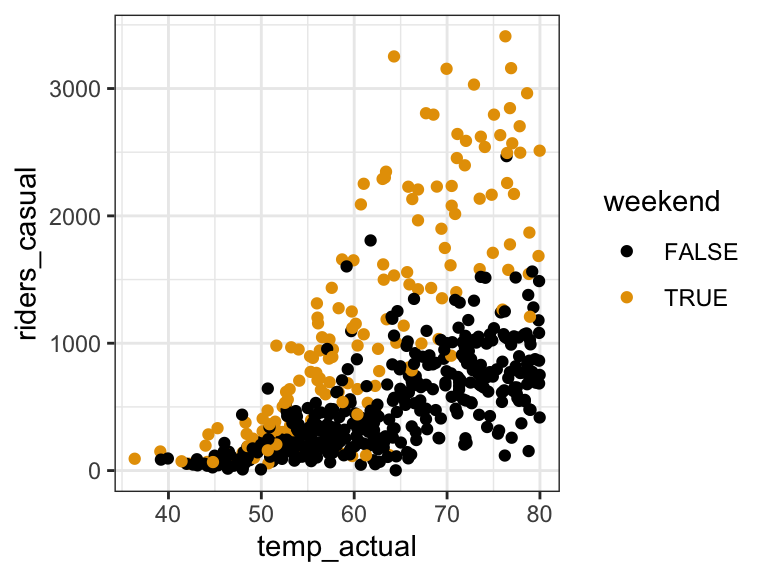
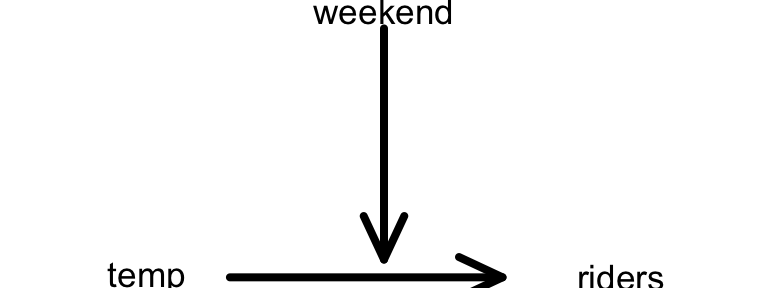
- Your friend wants to explore the relationship of bikeshare ridership among casual riders with temperature.
- Is weekend status a potential confounder or effect modifier in this relationship?
- Represent your ideas using a causal diagram. Draw it in your notebook.
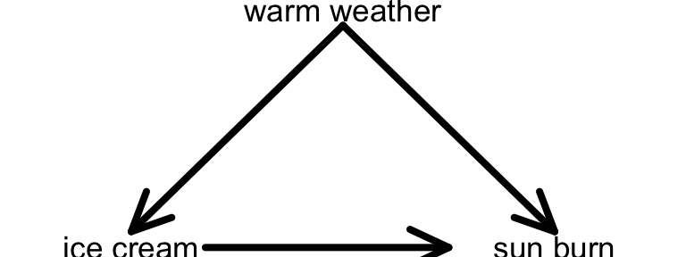
- Another friend claims that ice cream causes sun burns, noting that sun burn rates increase as ice cream sales increase. They are mistaken!
- What important variable did they not consider in their analysis?
- Is this a potential confounder or effect modifier?
- Represent your ideas using a causal diagram. Draw it in your notebook.
Example 2: Interaction or no interaction?
In addition to context, we can use plots to help identify potential interactions among our predictors, i.e. potential effect modifiers.
- In predicting penguin bill length, is there a “notable” interaction between bill depth and sex? Provide evidence and explain your answer in context.
data(penguins)
penguins %>%
  na.omit() %>%
  ggplot(aes(y = bill_len, x = bill_dep, color = sex)) +
  geom_smooth(method = "lm", se = FALSE)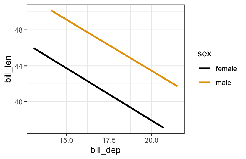
- In predicting wages, is there a “notable” interaction between education and job industry? Provide evidence and explain what your answer means in context.
read_csv("https://mac-stat.github.io/data/cps_2018.csv") %>%
  filter(industry %in% c("ag", "construction", "service")) %>%
  ggplot(aes(y = wage, x = education, color = industry)) +
  geom_smooth(method = "lm", se = FALSE)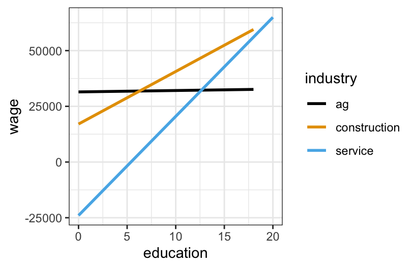
- In predicting bikeshare ridership, is there a “notable” interaction between weekend and user status (whether a user is a casual or registered rider)? Provide evidence and explain what your answer means in context.
# Don't worry about this wrangling code!
new_bikes <- bikes %>%
  select(riders_casual, riders_registered, weekend, temp_actual) %>%
  pivot_longer(cols = riders_casual:riders_registered,
               names_to = "user", names_prefix = "riders_",
               values_to = "rides") %>%
  mutate(weekend = factor(weekend))

new_bikes %>%
  ggplot(aes(y = rides, x = user, fill = weekend)) +
  geom_boxplot(alpha = .4)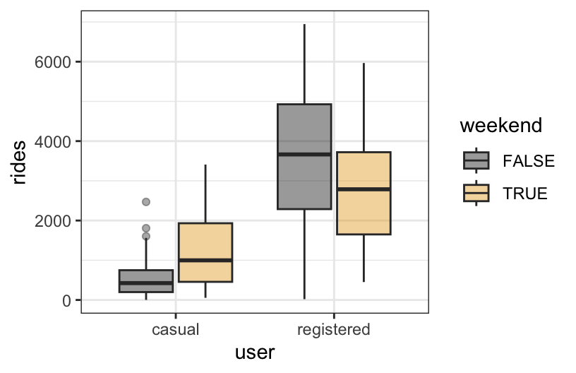
- In predicting bikeshare ridership among registered riders, is there a “notable” interaction between weekend status and season? Provide evidence and explain your answer in context.
bikes %>%
  ggplot(aes(y = riders_registered, x = season, fill = weekend)) +
  geom_boxplot(alpha = .4)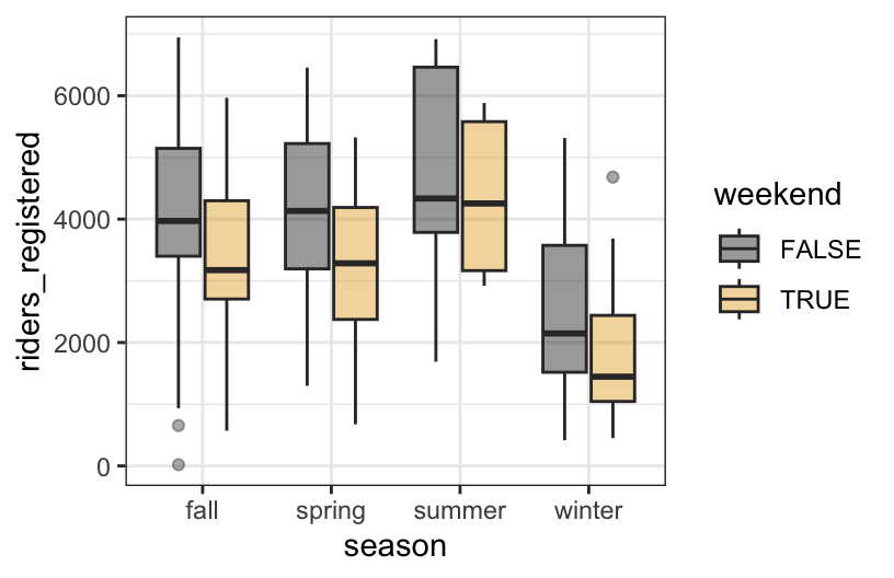
Example 3: Model formulas
For the toy example below:
- write out a model formula using \beta notation
- write out sub-model formulas for groups A and B
- sketch / note where each \beta coefficient is represented on the plot
- and indicate whether each \beta coefficient is negative, 0, or positive
# Ignore this code!
read_csv("https://mac-stat.github.io/data/cps_2018.csv") %>%
  filter(industry %in% c("construction", "service")) %>%
  rename(y = wage, x = education, z = industry) %>%
  mutate(z = ifelse(z == "construction", "B", "A")) %>%
  ggplot(aes(y = y, x = x, color = z)) +
  geom_smooth(method = "lm", se = FALSE)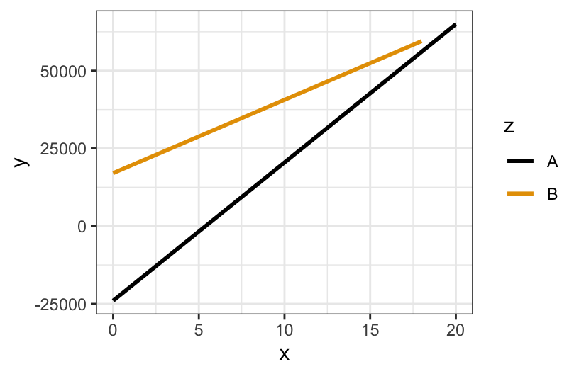
Exercises
Benoit and Marsh (2008) explore the 2002 Irish Dail elections, Ireland’s version of the U.S. House of Representatives.
Specifically, they explore how the number of votes a candidate received is associated with their campaign spending (in 1,000s of Euros) and their incumbent status: Yes = candidate is an incumbent (they are running for RE-election), or No.
Import their data:
campaigns <- read_csv("https://mac-stat.github.io/data/campaign_spending.csv") %>%
  select(wholename, district, votes, incumbent, spending) %>%
  mutate(spending = spending / 1000) %>%
  filter(!is.na(spending))
For the first several exercises, we’ll consider the following research questions:
What role does campaign spending play in elections?
.
- Do candidates that spend more money tend to get more votes?
- How might this depend upon whether a candidate is an incumbent (they are running for RE-election) or a challenger (they are challenging the incumbent)?
Exercise 1: Translating scientific questions into statistical questions
- Check out the variables we have access to in the
campaignsdata, and consider our research Question 1. How might we translate this question into a statistical one? That is, how might we answer using the data we have available? What might you compare?
There is no one right answer to this! Brainstorm with your group.
head(campaigns)- Question 2a is a bit more specific than Question 1. Translate this question into a statistical one. Specifically, write out the population model statement in E[Y | X] = ... notation that would answer this question, and note which regression coefficient you would interpret to provide you with an answer.
E[___ | ___] = ...
- Question 2b is also specific, and builds on Question 2a. Translate this question into a statistical one. Specifically, write out the population model statement for a multiple linear regression model in E[Y | X] = ... notation that would answer this question, and note which regression coefficient you would interpret to provide you with an answer.
E[___ | ___] = ...
Exercise 2: Visualizing Interaction
- Visualize the relationship between campaign spending and number of votes a candidate received. Include an aesthetic to distinguish this relationship between incumbents and challengers. Do not yet include lines of best fit from any statistical model!
# VisualizationBased on this visualization, what are your answers to research questions 2a and 2b? Write your answer in 2-3 sentences, describing general trends you notice, suitable for a general audience.
Add lines of best fit from a statistical model that includes an interaction term between incumbent status and spending to your plot from part (a), using
geom_smooth. Based on your updated plot, do you think including an interaction between incumbent status and spending in a multiple linear regression model would be meaningful in this context? Why or why not?
# Visualization with lines of best fitExercise 3: Fitting and interpreting models with interaction terms
- Fit the regression model you wrote out in Exercise 1 (c). Report the regression coefficients below and note what each physically represents in your plot of the model lines above.
# Model with interaction term
(Intercept):
incumbentYes:
spending:
incumbentYes:spending:
- Using the coefficient estimates from part (a), write out two separate model statements, one for incumbents and one for challengers. Combine terms (using algebra) when you can! Hint: remember the indicator variables video!
- For incumbents:
E[votes | spending] =
- For challengers:
E[votes | spending] =
Interpret the
incumbentcoefficient, in context. Make sure to use non-causal language, include units, and talk about averages rather than individual cases. Is this coefficient scientifically meaningful?Interpret the
spendingand interaction coefficients in your model, in context. Make sure to use non-causal language, include units, and talk about averages rather than individual cases. PRO TIP: When at least one of the variables interacting is quantitative, it’s often convenient to interpret the interaction coefficient alongside the quantitative variable’s coefficient. The former modifies the latter.Based on your interpretation in part (d), and the visualization you made including lines of best fit, do you think that including an interaction term for incumbent status and spending is meaningful, when predicting number of votes? Explain why or why not.
Exercise 4: Interactions between two categorical variables
Let’s return to our data on bike ridership. Suppose we are interested in the relationship between daily ridership (our response variable) and whether a user is a casual or registered rider and whether the day falls on a weekend. First, we need to create a binary variable indicating whether a user is a casual or registered rider.
# Creating user variable, don't worry about syntax!
new_bikes <- bikes %>%
  dplyr::select(riders_casual, riders_registered, weekend, temp_actual) %>%
  pivot_longer(cols = riders_casual:riders_registered, names_to = "user",
               names_prefix = "riders_", values_to = "rides") %>%
mutate(weekend = factor(weekend))- For each of our three relevant variables,
weekend,user, andrides, classify them as quantitative or categorical.
weekend:
user:
rides:
- Make an appropriate visualization to explore the relationship between these three variables.
# VisualizationIs the relationship between ridership and weekend status the same for both registered and casual users? Explain why or why not, referencing the visualization you made in part (b).
To reflect what you observed in your visualization, fit a multiple linear regression model with an interaction term between
weekendanduserin our model of ridership.
# Multiple linear regression model- Use your model to make 2 predictions:
Predict casual ridership on a weekday =
Predict registered ridership on a weekend =
- Use the appropriate coefficient estimate(s) to answer the following. (This is not easy! Your plot can help you assess whether your answers make sense!)
On weekdays, how many more registered vs casual riders would we expect?
Among casual riders, how many more riders would we expect on a weekend vs weekday?
Among registered riders, how many fewer riders would we expect on a weekend vs weekday? NOTE: The answer is NOT 1714.
Among casual riders, what’s the expected ridership on a weekday?
- Interpret the interaction term from your model, in context. Make sure to use non-causal language, include units, and talk about averages rather than individual cases. Just as in Exercise 3, you may find it useful to first write out multiple model statements for different categories defined by one of your categorical variables, and proceed from there!
Exercise 5: Interactions between two quantitative variables
# A little bit of data wrangling code - let's not focus on this for now
cars <- read_csv("https://mac-stat.github.io/data/used_cars.csv") %>%
  mutate(milage = milage %>% str_replace_all(",","") %>% str_replace(" mi.","") %>% as.numeric(),
         price = price %>% str_replace_all(",","") %>% str_replace("\\$","") %>% as.numeric(),
         age = 2026 - model_year) # 2026 so that yr. 2024 cars are one year old
Here we’ll explore the relationship between price, milage, and age of a used car. Below is a scatterplot of mileage vs. price, colored by age:
cars %>%
  ggplot(aes(x = milage, y = price, col = age)) +
  geom_point(alpha = 0.5) + # make the points less opaque
  scale_color_viridis_c(option = "H") + # a fun, colorblind-friendly palette!
  theme_classic() # removes the gray background and grid
It’s a little difficult to tell what exactly is going on here. In particular, does the relationship between mileage and price vary with age of a used car? Let’s try adding some fitted lines for cars of different ages.
# Ignore where the numbers in geom_abline() came from for now... we'll get there
cars %>%
  ggplot(aes(x = milage, y = price, col = age)) +
  geom_point(alpha = 0.5) +
  scale_color_viridis_c(option = "H") +
  theme_classic() +
  geom_abline(slope = -6.627e-01 + 1.775e-02, intercept = 8.628e+04 -1.395e+03, col = "black") +
  geom_abline(slope = -6.627e-01 + 10 * 1.775e-02, intercept = 8.628e+04 - 10 * 1.395e+03, col = "blue") +
  geom_abline(slope = -6.627e-01 + 30 * 1.775e-02, intercept = 8.628e+04 - 30 * 1.395e+03, col = "green") +
ggtitle("Black: Age = 1yr, Blue: Age = 10yr, Green: Age = 30yr")- Challenge question: Based on the fitted lines in the plot above, anticipate what the signs (positive or negative) of the coefficients in the following interaction model will be:
E[price | age, milage] = \beta_0 + \beta_1 milage + \beta_2 age + \beta_3 milage:age * \beta_0: Put your response here…
\beta_1: Put your response here…
\beta_2: Put your response here…
\beta_3: Put your response here…
- Fit a multiple linear regression model with an interaction term between
milageandagein our model of used carprice.
# Multiple linear regression model


# ... now do you see where the numbers in geom_abline() came from?
As before, we could choose distinct ages, and interpret the relationship between mileage and price for each of those groups separately. However, since age is quantitative and not categorical, this doesn’t quite give us the whole picture. Instead, we want to know how the relationship between mileage and price changes for each additional year old a car is. This is what the interaction coefficient estimates, when the interaction term is between two quantitative variables!
- Interpret the interaction term, in context. Make sure to use non-causal language, include units, and talk about averages rather than individual cases.
Reflection
Through the exercises above, you practiced visualizing, fitting, and interpreting multiple linear regression models with interaction terms between combinations of categorical and quantitative variables. Think about how the fitted lines looked in situations where you think there was a meaningful interaction taking place. How do you think the fitted lines would look if there was no meaningful interaction present? Explain your reasoning.
Extra practice
The homes data includes 2006 data on homes in Saratoga County, New York:
# Import data
homes <- read_csv("https://mac-stat.github.io/data/homes.csv") %>%
  mutate(price = Price, size = Lot.Size, new = (New.Construct == 1)) %>%
  select(price, size, new)
head(homes)
Let’s explore the relationship of home price ($) with lot size (acres) and whether or not it’s new construction (TRUE/FALSE):
homes %>%
  ggplot(aes(y = price, x = size, color = new)) +
  geom_smooth(method = "lm", se = FALSE)
Exercise 6: Concepts
Do any 2 of these 3 variables (price, size, new) interact? If so:
- Which 2 variables interact?
- What’s your evidence?
- What does this interaction mean in context?
Exercise 7: More concepts
Consider the interaction model below:
E[price | size, new] = \beta_0 + \beta_1 size + \beta_2 newTRUE + \beta_3 size*newTRUE
Answer the following questions using the plot alone – don’t yet build any models. Based on our sample data…
Is \beta_0 negative (< 0), 0, or positive (> 0)? Provide evidence from the plot and explain what this means in context.
Is \beta_1 negative (< 0), 0, or positive (> 0)? Provide evidence from the plot and explain what this means in context.
Is \beta_2 negative (< 0), 0, or positive (> 0)? Provide evidence from the plot and explain what this means in context.
Is \beta_3 negative (< 0), 0, or positive (> 0)? Provide evidence from the plot and explain what this means in context.
Exercise 8: Use the model
Build the sample model:
home_model <- lm(price ~ size * new, data = homes)
coef(summary(home_model))
Were your answers to the previous exercise correct?!
Provide 2 separate sub-model formulas for new and not new construction.
Interpret the
sizeandsize:newTRUEcoefficients.
Wrap Up
Next Monday:
- CP 9
Next Friday:
- No Class
- Complete project group preference form (link on Moodle)
- Attend 2 MSCS Capstone Talks
- See MSCS Capstone Schedule in Moodle & on Slack!
- Complete Reflections about talks in Capstone Reflection Moodle assignment
Monday, 3/9:
- CP 10, PS 4 Due
Solutions
Warm Up
Example 1: Identify the confounder / effect modifier
Solution
- Weekend status is an effect modifier: the relationship of ridership with temperature varies by weekend / weekday:
- Warm weather is a potential confounder. The warmer the weather, the more the ice cream sales and the more incidences of sun burn.
Example 2: Interaction or no interaction?
Solution
No. The lines are parallel – the decrease of bill length with bill depth is similar for the different species.
Yes. The lines are not parallel – the increase of wages with education differs by industry.
Yes. The relationship between rides and weekend status varies by user status – ridership tends to be higher on weekends for casual riders, but lower on weekends for registered riders.
No. The relationship between rides and weekend status is similar in each season – ridership tends to be lower on weekends (and the diff in ridership on weekends vs weekdays is similar in each season).
Example 3: Model formulas
Solution
read_csv("https://mac-stat.github.io/data/cps_2018.csv") %>%
  filter(industry %in% c("construction", "service")) %>%
  rename(y = wage, x1 = education, x2 = industry) %>%
  mutate(x2 = ifelse(x2 == "construction", "B", "A")) %>%
  ggplot(aes(y = y, x = x1, color = x2)) +
  geom_smooth(method = "lm", se = FALSE)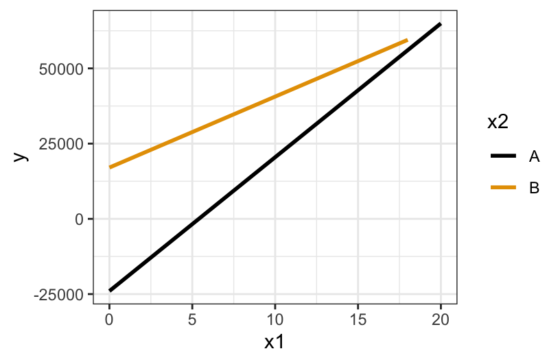
model formula
E[y | x, z] = \beta_0 + \beta_1 x + \beta_2 zA + \beta_3x*zAsub-model formulas
- group A: E[y | x] = \beta_0 + \beta_1 x + \beta_2(0) + \beta_3(
x*0) = \beta_0 + \beta_1 x - group B: E[y | x] = \beta_0 + \beta_1 x + \beta_2(1) + \beta_3(
x*1) = (\beta_0 + \beta_2) + (\beta_1 + \beta_3) x
- group A: E[y | x] = \beta_0 + \beta_1 x + \beta_2(0) + \beta_3(
coefficients
- \beta_0 = intercept of A line, hence negative
- \beta_1 = slope of A line, hence positive
- \beta_2 = difference in intercept of B vs A line, hence positive
- \beta_3 = difference in slope of B vs A line, hence negative
Exercises
Exercise 1: Translating scientific questions into statistical questions
Solution
From this question, the only clear variable that should be involved in our analysis/exploration is spending. We could first begin by providing numerical and visual summaries of campaign spending. We could also look at whether spending varies by district, number of votes, or incumbency status. This would give us a broad idea of how campaign spending may vary across the variables we access to in our data.
We can estimate the average associated increase in number of votes per additional 1,000 Euros spent, via a simple linear regression model. The model statement that allows us to answer this question is given by
E[votes | spending] = \beta_0 + \beta_1 spending
The regression coefficient we would interpret to answer this question is the coefficient fpr spending, which in this case is \beta_1.
- We are interested in the how the association between average number of votes and campaign spending varies by incumbency status. The model statement that allows us to answer this question is given by
E[votes | spending, incumbent] = \beta_0 + \beta_1 spending + \beta_2 incumbent + \beta_3 spending:incumbent
(note that the order in which you put spending and incumbent status does not matter!)
The regression coefficient we would interpret to answer this question is the interaction coefficient, which in this case is \beta_3.
Exercise 2: Visualizing Interaction
Solution
# Visualization
campaigns %>%
  ggplot(aes(spending, votes, color = incumbent)) +
  geom_point()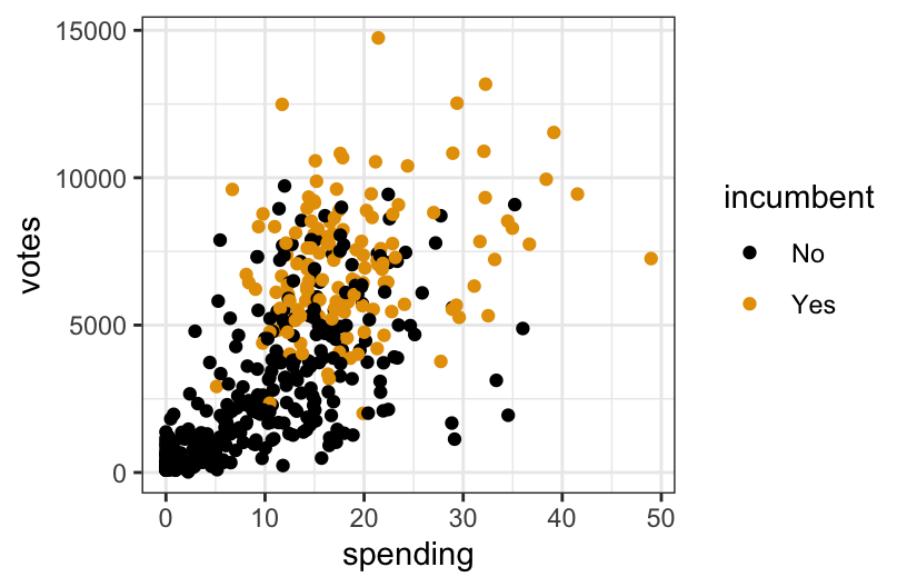
In general, the more a candidate spends on their campaign, the more votes they receive. Incumbents appear to spend more than challengers on their campaigns, typically. The impact of spending on votes appears to be greater for challengers than for incumbents, in that more spending may lead to even more votes for challengers, than it would for incumbents.
I think including an interaction term between incumbent status and spending would be meaningful, since the relationship between spending and votes does seem to vary by incumbent status. In particular, note that the lines on the visualization are not parallel. Parallel lines imply that there is no interaction present, so the further the lines are from parallel, the more intense (in some sense) the interaction term.
# Visualization with lines of best fit
campaigns %>%
  ggplot(aes(spending, votes, color = incumbent)) +
  geom_point() +
  geom_smooth(method = "lm", se = FALSE)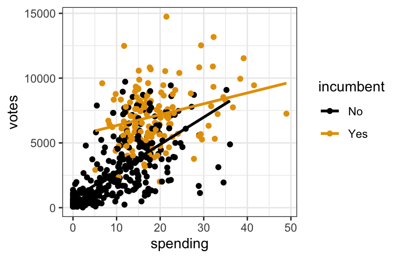
Exercise 3: Fitting and interpreting models with interaction terms
Solution
# Model with interaction term
lm(data = campaigns, votes ~ spending*incumbent)
##
## Call:
## lm(formula = votes ~ spending * incumbent, data = campaigns)
##
## Coefficients:
##           (Intercept)               spending           incumbentYes
##                 690.5                  209.7                 4813.9
## spending:incumbentYes
##                -125.9
(Intercept): 690.5 (intercept of challengers line)
incumbentYes: 4813.9 (difference in intercept, incumbent vs challengers lines)
spending: 209.7 (slope of challengers line)
incumbentYes:spending: -125.9 (difference in slope, incumbent vs challengers lines)
- For incumbents:
E[votes | spending] = 690 + 4813.9 + 209.7 * spending - 125.9 * spending = 5503.9 + 83.8 * spending
- For challengers:
E[votes | spending] = 690.5 + 209.7 * spending
On average, we expect the difference in number of votes between incumbents and challengers to be 4813.9, for campaigns where no money is spent. This is likely not a scientifically meaningful estimate since there are very few campaigns where no money is spent. However, such campaigns do exist, so I would say this one could be meaningful in certain contexts, if not broadly!
On average, we expect an increase in spending by 1,000 euros to be associated with an increase in number of votes by 210, for challengers. For incumbents, the increase in the expected number of votes per additional 1,000 euros is 126 less than that for challengers (thus a total increase of 84).
I think the interaction term is meaningful when predicting number of votes, since 84 and 210 are relatively different numbers! The interaction term gives us the additional information that spending has less of an effect on number of votes for incumbents than it does for challengers, which is particularly meaningful if you are a campaign manager!
Exercise 4: Interactions between two categorical variables
Solution
# Creating user variable, don't worry about syntax!
new_bikes <- bikes %>%
  dplyr::select(riders_casual, riders_registered, weekend, temp_actual) %>%
  pivot_longer(cols = riders_casual:riders_registered, names_to = "user",
               names_prefix = "riders_", values_to = "rides") %>%
  mutate(weekend = factor(weekend))
weekend: categorical (binary)
user: categorical (binary)
rides: quantitative
# Visualization
new_bikes %>%
  ggplot(aes(y = rides, user, fill = weekend)) +
  geom_boxplot()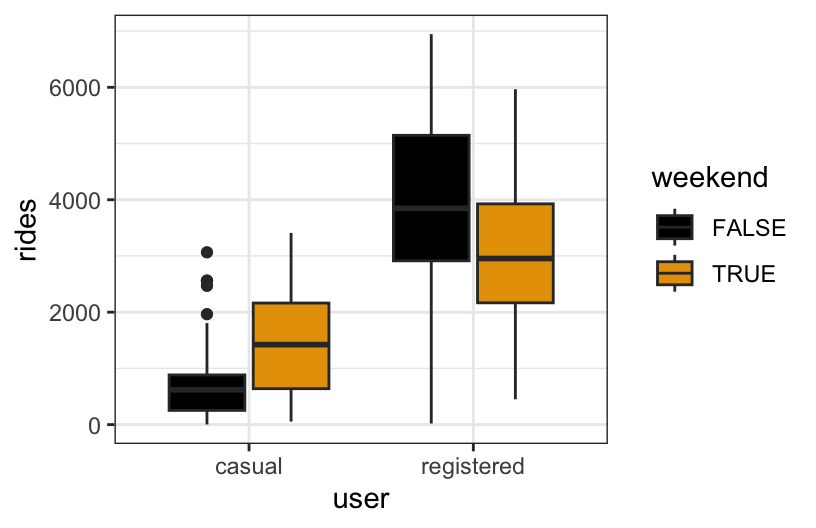
The relationship between ridership and weekend status does not appear to be the same for registered and casual users. Specifically, casual users have higher median riders on weekends, whereas the opposite is true for registered users.
# Multiple linear regression model
lm(data = new_bikes, rides ~ user * weekend)
##
## Call:
## lm(formula = rides ~ user * weekend, data = new_bikes)
##
## Coefficients:
##                (Intercept)              userregistered
##                      625.0                      3300.5
##                weekendTRUE  userregistered:weekendTRUE
##                      776.7                     -1714.4
# Predict casual ridership on a weekday
625 + 777*0 + 3300*0 - 1714*0*0
# Predict registered ridership on a weekend
625 + 777*1 + 3300*1 - 1714*1*1- 3300
- 777
- 937 (= 777-1714)
- 625
- On average, we expect there to be 777 more rides on weekends compared to non-weekends, for casual riders. On average, we expect there to be 938 (776.7 - 1714.4, rounded) less rides on weekends compared to non-weekends, for registered riders.
Note: There are lots of ways you could correctly interpret the interaction term here! You could do it one sentence, you could do it in four (one for each unique group defined by the two categorical variables), or you could compare users and registered riders for weekends, and then separately for non-weekends! All are valid options.
Exercise 5: Interactions between two quantitative variables
Solution
Here we’ll explore the relationship between price, milage, and age of a used car. Below is a scatterplot of mileage vs. price, colored by age:
cars %>%
  ggplot(aes(x = milage, y = price, col = age)) +
  geom_point(alpha = 0.5) + # make the points less opaque
  scale_color_viridis_c(option = "H") + # a fun, colorblind-friendly palette!
  theme_classic() # removes the gray background and grid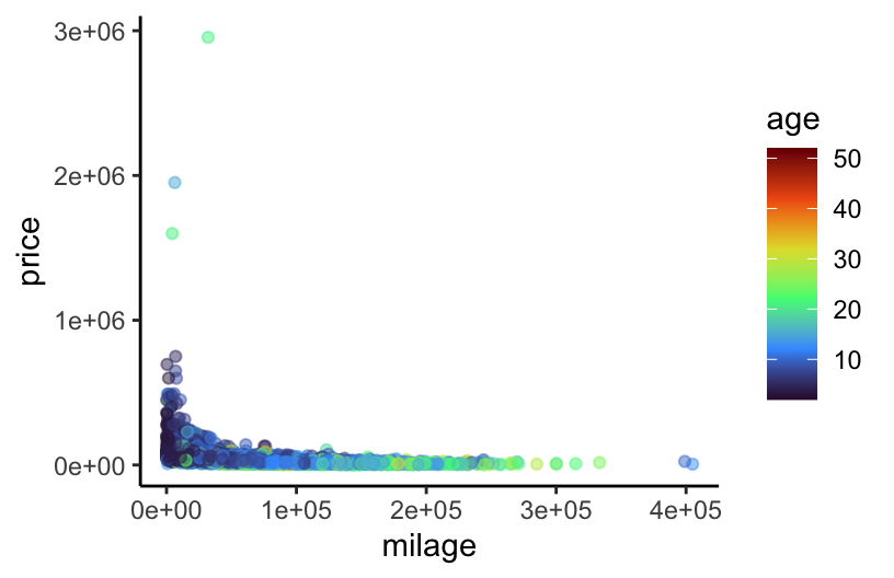
It’s a little difficult to tell what exactly is going on here. In particular, does the relationship between mileage and price vary with age of a used car? Let’s try adding some fitted lines for cars of different ages.
# Ignore where the numbers in geom_abline() came from for now... we'll get there
cars %>%
  ggplot(aes(x = milage, y = price, col = age)) +
  geom_point(alpha = 0.5) +
  scale_color_viridis_c(option = "H") +
  theme_classic() +
  geom_abline(slope = -6.627e-01 + 1.775e-02, intercept = 8.628e+04 -1.395e+03, col = "black") +
  geom_abline(slope = -6.627e-01 + 10 * 1.775e-02, intercept = 8.628e+04 - 10 * 1.395e+03, col = "blue") +
  geom_abline(slope = -6.627e-01 + 30 * 1.775e-02, intercept = 8.628e+04 - 30 * 1.395e+03, col = "green") +
  ggtitle("Black: Age = 1yr, Blue: Age = 10yr, Green: Age = 30yr")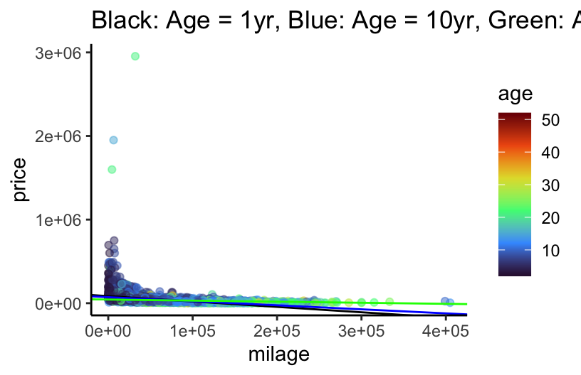
E[price | age, milage] = \beta_0 + \beta_1 milage + \beta_2 age + \beta_3 milage:age * \beta_0: positive, since the intercept is the average price for a car with zero miles that is brand new.
\beta_1: negative, since the more miles a new car has, the cheaper it should be
\beta_2: negative, since the intercept of the lines seems to decrease with age (black -> blue -> green)
\beta_3: positive, since the slope of the lines seems to increase with age (black -> blue -> green)
# Multiple linear regression model

lm(data = cars, price ~ milage * age)
##
## Call:
## lm(formula = price ~ milage * age, data = cars)
##
## Coefficients:
## (Intercept)       milage          age   milage:age
##   8.767e+04   -6.805e-01   -1.395e+03    1.775e-02

# ... now do you see where the numbers in geom_abline() came from?
As before, we could choose distinct ages, and interpret the relationship between mileage and price for each of those groups separately. However, since age is quantitative and not categorical, this doesn’t quite give us the whole picture. Instead, we want to know how the relationship between mileage and price changes for each additional year old a car is. This is what the interaction coefficient estimates, when the interaction term is between two quantitative variables!
- The overall decrease in the expected price per mile is $0.02 less for each additional year old the car is. (That is, the slope of price vs mileage is still negative, but less negative as age increases.)
Exercise 6: Concepts
Solution
# Import data
homes <- read_csv("https://mac-stat.github.io/data/homes.csv") %>%
  mutate(price = Price, size = Lot.Size, new = (New.Construct == 1)) %>%
  select(price, size, new)
head(homes)
## # A tibble: 6 × 3
##    price  size new
##    <dbl> <dbl> <lgl>
## 1 132500  0.09 FALSE
## 2 181115  0.92 FALSE
## 3 109000  0.19 FALSE
## 4 155000  0.41 FALSE
## 5  86060  0.11 TRUE
## 6 120000  0.68 FALSE

homes %>%
  ggplot(aes(y = price, x = size, color = new)) +
  geom_smooth(method = "lm", se = FALSE)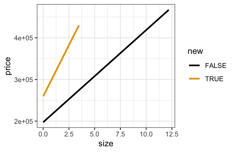
YES!
- size and new, the 2 predictors, interact
- the model lines are notably non-parallel
- the increase in price with lot size is steeper for new construction than for old construction
Exercise 7: More concepts
Solution
- \beta_0 > 0
- This is the intercept of old homes (black line).
- The average price of old homes with 0 acre (or very small) lots is positive. Makes sense lol :)
- \beta_1 > 0
- This is the slope for old homes (black line).
- Thus the average price of old homes increases with lot size.
- \beta_2 > 0
- This is the difference in intercepts for new vs old construction.
- For homes with 0 acre (or very small) lots, the expected price is higher for new vs old construction.
- \beta_3 > 0
- This is the difference in slopes for new vs old construction.
- The increase in the average price with lot size is steeper for new vs old construction.
Exercise 8: Use the model
Solution
home_model <- lm(price ~ size * new, data = homes)
coef(summary(home_model))
##               Estimate Std. Error   t value     Pr(>|t|)
## (Intercept)  197405.15   2896.369 68.156068 0.000000e+00
## size          22119.54   3332.334  6.637852 4.250745e-11
## newTRUE       61995.59  16391.809  3.782108 1.608113e-04
## size:newTRUE  27082.06  26220.696  1.032850 3.018188e-01
Yes!
New construction:
E[price | size, new]
= 197405.15 + 22119.54 size + 61995.59
*1+ 27082.06*size*1= (197405.15 + 61995.59) + (22119.54 + 27082.06)size
= 259400.7 + 49201.6 size
Old construction:
E[price | size, new]
= 197405.15 + 22119.54 size + 61995.59
*0+ 27082.06*size*0= 197405.15 + 22119.54 size
For every additional 1 acre in size, the expected price for old construction increases by $22119.54. This increase is 27082.06 dollars per acre higher for new construction.