# Load packages and data
library(tidyverse)
fake_news <- read_csv("https://ajohns24.github.io/data/fake_news.csv") %>%
  mutate(title_has_excl = title_excl > 0,
         is_fake = (type == "fake")) %>%
select(is_fake, title_has_excl, negative)18 Logistic wrap-up + Project time
Settling In
- Sit with your project group
- Finalize the data you are going to work with
- Project Milestone 1 is due April 6th
- Help each other get ready to take notes!
- Open your notebook.
- Open the online manual to the “Course Schedule” and click on today’s activity. That brings you here!
- Download “18-logistic-wrap.qmd” and open it in RStudio. Read the “Organizing your files” directions at the top of the file!!
- Open your notebook.
Recap
NoteLearning goals
By the end of this lesson, you should be able to:
- Use multiple logistic regression models to make predictions
- Evaluate the quality of logistic regression models by using predicted probability boxplots and by computing and interpreting accuracy, sensitivity, specificity, false positive rate, and false negative rate
NoteAdditional resources
Required:
- Interpreting logistic regression coefficients
- Evaluating logistic regression models
- Required: Part 1: Concepts (script)
- Optional: Part 2: R Code (script)
Additional material:
- Reading: Section 4.4 in the STAT 155 Notes
Logistic Regression
Model
Let Y be a binary categorical response variable:
Y = \begin{cases} 1 & \; \text{ if event happens} \\ 0 & \; \text{ if event doesn't happen} \\ \end{cases}
A logistic regression model of Y by X_1 and X_2 is
\log(\text{Odds}[Y = 1 | X_1,X_2]) = \beta_0 + \beta_1 X_1 + \beta_2X_2
We can transform this to get (curved) models of odds and probability:
\begin{split} \text{Odds}[Y = 1 | X_1,X_2] & = e^{\beta_0 + \beta_1 X_1 + \beta_2X_2} \\ P[Y = 1 | X_1,X_2] & = \frac{\text{Odds}[Y = 1 | X_1,X_2]}{\text{Odds}[Y = 1 | X_1,X_2]+1} = \frac{e^{\beta_0 + \beta_1 X_1 + \beta_2X_2}}{e^{\beta_0 + \beta_1 X_1 + \beta_2X_2}+1} \\ \end{split}
Prediction
To use the fit model for prediction, we can plug in values for X_1 and X_2 and get the predicted probabilities,
\hat{P}(Y=1 | X_1, X_2) = \frac{e^{\hat{\beta}_0 + \hat{\beta}_1 X_1 + \hat{\beta}_2X_2}}{e^{\hat{\beta}_0 + \hat{\beta}_1 X_1 + \hat{\beta}_2X_2}+1}
Model Evaluation
To evaluate how well the model does in modeling/predicting the outcome, we first get the the predicted probabilities (fitted values) for each row/case.
\hat{P}(Y=1 | X_1, X_2) = \frac{e^{\hat{\beta}_0 + \hat{\beta}_1 X_1 + \hat{\beta}_2X_2}}{e^{\hat{\beta}_0 + \hat{\beta}_1 X_1 + \hat{\beta}_2X_2}+1} Probabilities to Hard Classification
We must choose a threshold (e.g. cut-off), \tau, to determine how to translate a predicted probability, \hat{P}(Y=1 | X_1, X_2), to a predicted category.
If
- \hat{P}(Y=1 | X_1, X_2) \geq \tau, we predict Y = 1
- \hat{P}(Y=1 | X_1, X_2) < \tau, we predict Y = 0
Note: This is often chosen in practice to balance the human consequences of the two types of errors (false positives - predicted Y = 1 when True Y = 0; false negatives - predicted Y = 0 when True Y = 1).
Accuracy
Once we have a threshold, we can find a confusion matrix of the counts for true Y and predicted Y,
| Predicted Y = 1 | Predicted Y = 0 | Total | |
|---|---|---|---|
| True Y = 1 | n_1 | n_2 | n_1 + n_2 |
| True Y = 0 | n_3 | n_4 | n_3 + n_4 |
| Total | n_1 + n_3 | n_2 + n_4 | n_1 + n_2 + n_3 + n_4 |
The overall accuracy is the (number of correctly predicted) / total = (n_1 + n_4)/(n_1 + n_2 + n_3 + n_4).
The sensitivity (true positive rate) is the accuracy among True Y=1, (number of correctly predicted True Y = 1) / (total of True Y = 1) = n_1 /(n_1 + n_2)
The specificity (true negative rate) is the accuracy among True Y=0, (number of correctly predicted True Y = 0) / (total of True Y = 0) = n_4 /(n_3 + n_4)
Warm-up
Fake news is a problem. Using data obtained from https://www.kaggle.com/mdepak/fakenewsnet, and cleaned using code provided at https://www.kaggle.com/kumudchauhan/fake-news-analysis-and-classification, we’ll try to predict if an article is fake news based on various features. NOTE: These data are from real articles posted online.
Example 1: Intuition
We’ll explore the relationship of whether or not an article is_fake (TRUE or FALSE) with title_has_excl (whether the title has an exclamation point) and negative (the percent of words that have negative sentiment):
head(fake_news)# A tibble: 6 × 3
is_fake title_has_excl negative
<lgl> <lgl> <dbl>
1 TRUE FALSE 8.47
2 FALSE FALSE 4.74
3 TRUE TRUE 3.33
4 FALSE FALSE 6.09
5 TRUE FALSE 2.66
6 FALSE FALSE 3.02The model formula for this relationship is:
log(odds the article is fake) = \beta_0 + \beta_1 negative + \beta_2 title_has_exclTRUE
Intuitively:
Will \beta_1 be positive or negative?
Will \beta_2 be positive or negative?
Example 2: Visualize the relationships of interest
Part a
Briefly summarize what you observe.
Part b
IMPORTANT: Why is the above plot of fake_news vs negative sentiment so much better than those below? (Why are the plots below wrong?)
Example 3: Build & interpret the logistic regression model
The estimated model is
log(odds the article is fake | title_has_exclTRUE, negative) = -1.8791 + 2.5265 title_has_exclTRUE + 0.3829 negative
# Original coefficients
coef(news_model)
(Intercept) title_has_exclTRUE negative
-1.8791361 2.5264918 0.3828887 # Exponentiated coefficients
exp(coef(news_model)) (Intercept) title_has_exclTRUE negative
0.152722 12.509544 1.466515 Interpret the coefficients:
title_has_exclTRUE coefficient:
negative coefficient:
Example 4: How good is the model at distinguishing between real and fake news?
We can use our model to calculate the probability that an article is fake based on its negative sentiment score and whether or not its title includes an exclamation mark. Below are the probability calculations for the articles in our sample, split up by those that were & weren’t actually fake.
Discuss thresholds that could be used to predict a fake new article.

Exercises
In these exercises you’ll practice some more logistic regression concepts and review interaction terms.
Exercise 1: Evaluating the model
Let’s explore using a probability threshold of 0.5 to make a binary prediction of an article’s status:
- If the article’s probability of being fake is greater than or equal to 50%, we’ll predict that it’s fake.
- Otherwise, we’ll predict that it’s real.
We can visualize this threshold on our predicted probability boxplots:
fake_news %>%
  mutate(.fitted = predict(news_model, newdata = ., type = "response")) %>%
  ggplot(aes(x = is_fake, y = .fitted)) +
  geom_boxplot() +
  geom_hline(yintercept = 0.5, color = "red")
Part a
Using the boxplots alone…
- approximately, in what range is the sensitivity (true positive rate): 0-25%, 25-50%, 50-75%, or 75-100%
- approximately, in what range is the specificity (true negative rate): 0-25%, 25-50%, 50-75%, or 75-100%
Part b
The corresponding confusion matrix is below:
# Rows = actual / observed to be fake (FALSE or TRUE)
# Columns = predicted to be fake (FALSE or TRUE)
library(janitor)
threshold <- 0.5
fake_news %>%
  mutate(.fitted = predict(news_model, newdata = ., type = "response")) %>%
  mutate(predictFake = .fitted >= threshold) %>%
  tabyl(is_fake, predictFake) %>%
  adorn_totals(c("row", "col"))
# Calculate the overall accuracy# Calculate the sensitivity (true positive rate)
# Was your answer in Part a correct?# Calculate the specificity (true negative rate)
# Was your answer in Part b correct?Part c
In general, sensitivity & specificity are inversely related – increasing one leads to a decrease in the other. In this context, would you rather have high sensitivity or high specificity? Why?
Exercise 2: Calculations
Suppose you come across a news article that has an exclamation point in the title, and 4% of its words have a negative sentiment. Calculate the probability that this article is fake. You should make this calculation by hand, but can check it using predict():
# Calculate the prediction by hand# Check your work
predict(news_model, newdata = data.frame(title_has_excl = TRUE, negative = 4), type = "response")
Choose your own adventure:
- Finish PS 5 (due tomorrow)
- If you already finished PS 5, start the project milestone 1.
- Come back to the extra practice to review Interaction terms
Extra practice
Exercise 3: Interaction
Let’s revisit the Adelie and Gentoo penguins as well as the concept of interaction:
data(penguins)
penguins_sub <- penguins %>%
  filter(species %in% c("Adelie", "Gentoo"))

penguins_sub %>%
  ggplot(aes(y = body_mass, x = flipper_len, color = species)) +
  geom_smooth(method = "lm", se = FALSE)
Part a
In their relationship with body_mass, flipper_len and species interact. What does that mean?
Part b
The model formula can be expressed as:
E[body_mass | flipper_len, species] = \beta_0 + \beta_1 flipper_len + \beta_2 speciesGentoo + \beta_3 flipper_len * speciesGentoo
Indicate whether the coefficients below are positive or negative and what your reasoning is:
\beta_1
\beta_2
\beta_3
Exercise 4: More interaction
summary(lm(body_mass ~ flipper_len*species, penguins_sub))Part a
Write out separate sub-model formulas of body_mass vs flipper_len for Adelies and Gentoos.
Part b
Interpret the flipper_len and flipper_len:speciesGentoo coefficients.
Part c
Predict the body mass of a Gentoo penguin with 220mm long flippers.
Wrap-up
- Finish and study the activity!
- PS 5 is due Tuesday night
- Quiz 2 is coming up next Monday, 3/30 (1 week from today)
- Definitely start studying today if you haven’t already. Slowly studying instead of cramming before the quiz will give you more time to absorb and deeply learn the material, and will be less stressful.
- Structure: Same as Quiz 1.
- Content: Will focus on the Multiple Linear Regression and Logistic Regression units, but is naturally cumulative.
- Review session: Sunday at 2:30pm in OLRI 250
Solutions
Warm Up
# Load packages and data
library(tidyverse)
fake_news <- read_csv("https://ajohns24.github.io/data/fake_news.csv") %>%
  mutate(title_has_excl = title_excl > 0,
         is_fake = (type == "fake")) %>%
  select(is_fake, title_has_excl, negative)
Example 1: Intuition
Solution
Answers will vary!Example 2: Visualize the relationships of interest
Solution
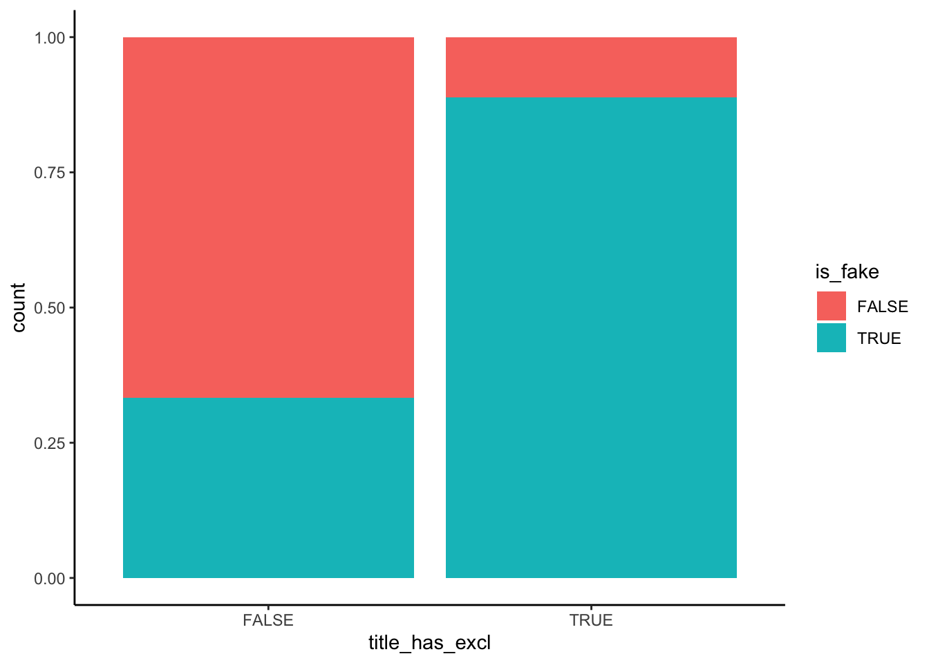
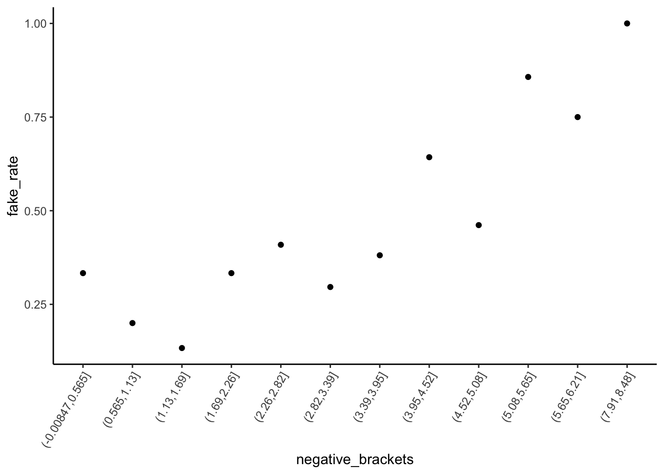
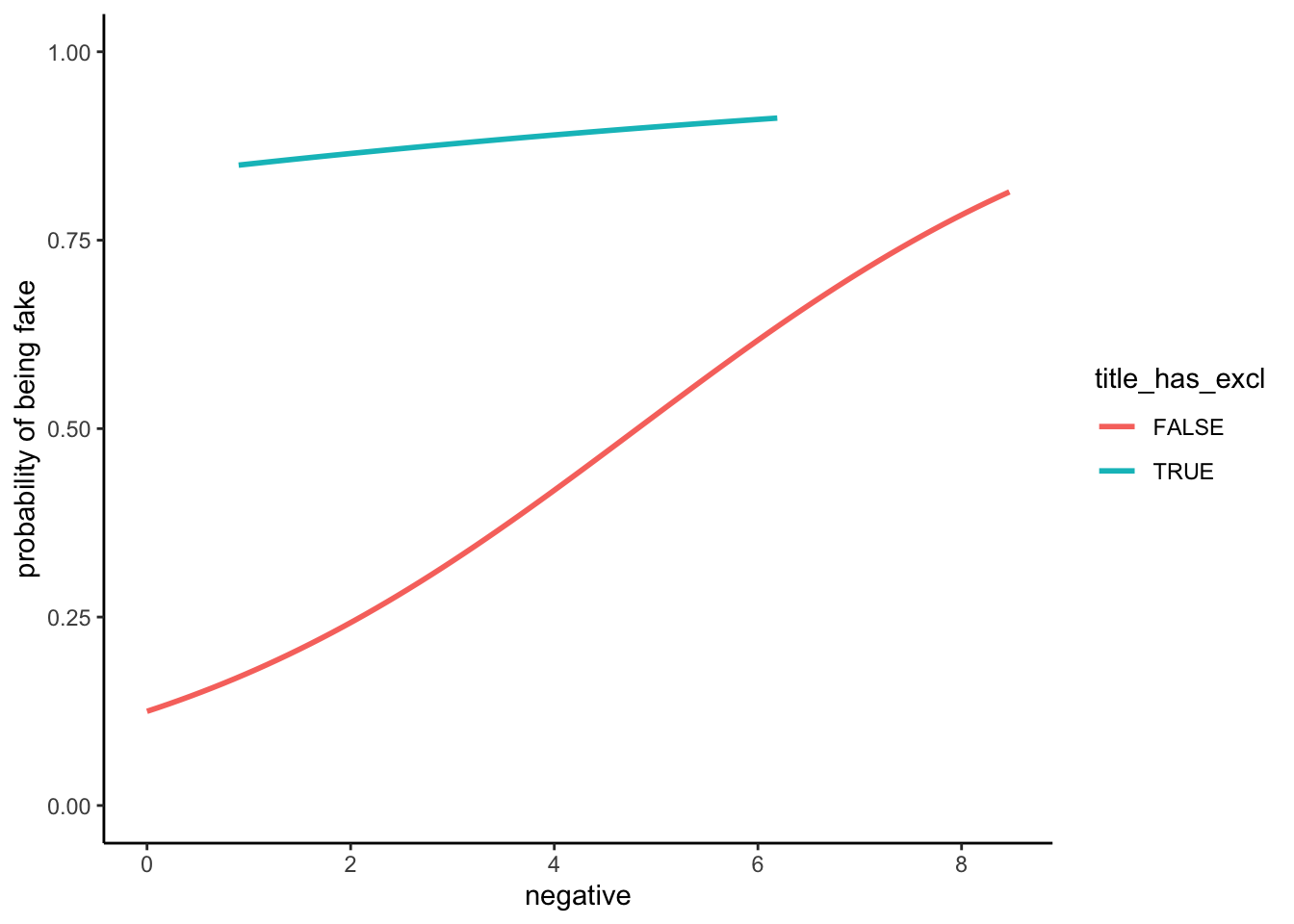
An article with “!” in the title is very likely to be fake – a ~90% chance relative to a ~35% chance for articles without “!”. Further, the chance of being fake increases with negative sentiment, starting at a ~25% chance of being fake for articles with very few negative words and ending at a near 100% chance of being fake for articles in which ~8% of words are negative.
head(fake_news)# A tibble: 6 × 3
is_fake title_has_excl negative
<lgl> <lgl> <dbl>
1 TRUE FALSE 8.47
2 FALSE FALSE 4.74
3 TRUE TRUE 3.33
4 FALSE FALSE 6.09
5 TRUE FALSE 2.66
6 FALSE FALSE 3.02# Plot relationship of is_fake with title_has_excl
fake_news %>%
ggplot(aes(x = title_has_excl, fill = is_fake)) +
geom_bar(position = "fill")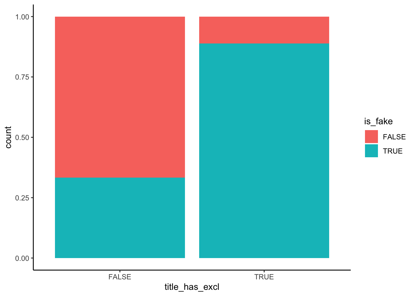
# Plot relationship of is_fake with negative sentiment
fake_news %>%
  mutate(negative_brackets = cut(negative, 15)) %>%
  group_by(negative_brackets) %>%
  summarize(fake_rate = mean(is_fake)) %>%
  ggplot(aes(x = negative_brackets, y = fake_rate)) +
  geom_point() +
  theme(axis.text.x = element_text(angle = 60, vjust = 1, hjust=1))
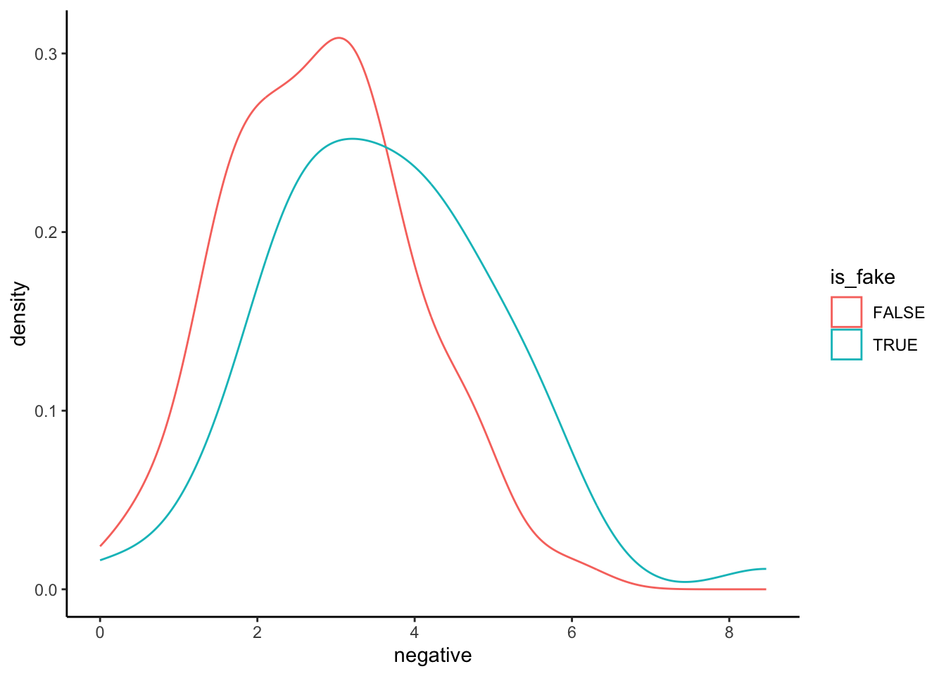
This plot exhibits how negativity scores depend upon fake/real status, not how fake/real status depends upon negativity scores. That is, it treat negative as Y and is_fake as X, but we’re interested in the reverse.
# BAD plot of is_fake vs negative sentiment
fake_news %>%
  ggplot(aes(x = negative, color = is_fake)) +
  geom_density()
Example 3: Build & interpret the logistic regression model
Solution
# Model the relationship of is_fake with negative sentiment & title_has_excl
news_model <- glm(is_fake ~ title_has_excl + negative, fake_news, family = "binomial")
coef(summary(news_model))
Estimate Std. Error z value Pr(>|z|)
(Intercept) -1.8791361 0.5017141 -3.745432 0.0001800836
title_has_exclTRUE 2.5264918 0.7858810 3.214853 0.0013051133
negative 0.3828887 0.1464251 2.614912 0.0089250487# Original coefficients
coef(news_model) (Intercept) title_has_exclTRUE negative
-1.8791361 2.5264918 0.3828887 # Exponentiated coefficients
exp(coef(news_model)) (Intercept) title_has_exclTRUE negative
0.152722 12.509544 1.466515 Intercept: If an article does not have a “!” in the title and 0% of its words are negative, the odds that it’s fake are only 0.15. (The probability it’s fake is only 15% as high as the probability it’s real.)
title_has_exclTRUE coefficient: When controlling for an article’s negative sentiment (i.e. among articles that have the same negativity level), the odds of being fake are 12.5 times higher for articles that have an “!” in the title than for articles that don’t.
negative coefficient: When controlling for “!” use in the title (i.e. among both articles that do and don’t have an “!”), for every 1 percentage point increase in negative words, the odds of being fake increase by 47% (multiply by 1.47) on average.
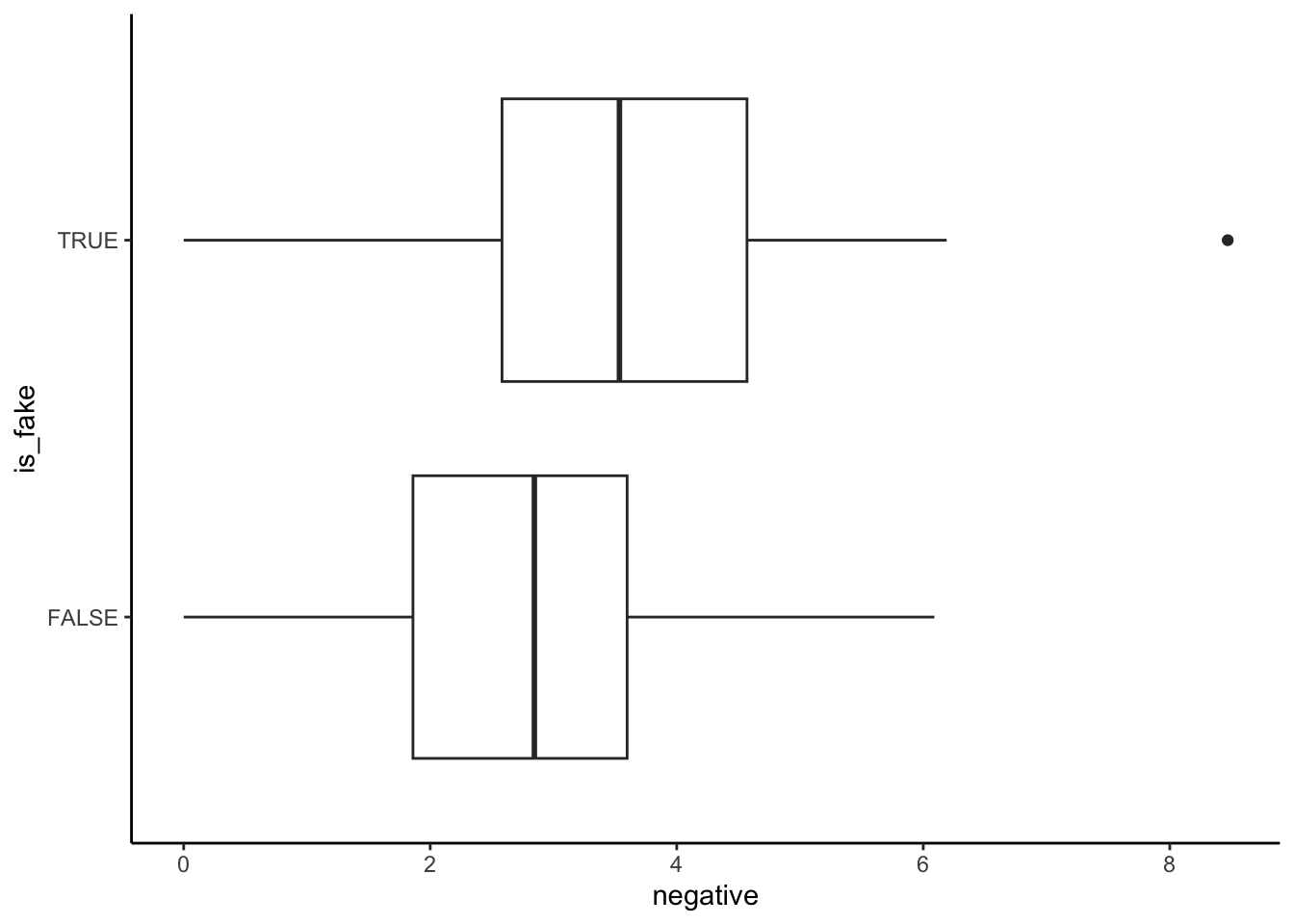
Example 4: How good is the model at distinguishing between real and fake news?
Solution
- The model seems to distinguish pretty well between real and fake news (there’s not a ton of overlap in the boxes).
- The model assigns higher probabilities of being fake to articles that actually are fake than to articles that aren’t.
fake_news %>%
  mutate(.fitted = predict(news_model, newdata = ., type = "response")) %>%
  ggplot(aes(x = is_fake, y = .fitted)) +
  geom_boxplot()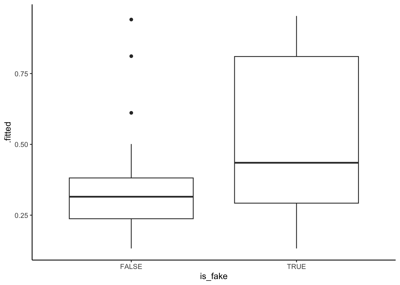
Exercises
`
Exercise 1: Evaluating the model
Solution
fake_news %>%
  mutate(.fitted = predict(news_model, newdata = ., type = "response")) %>%
  ggplot(aes(x = is_fake, y = .fitted)) +
  geom_boxplot() +
  geom_hline(yintercept = 0.5, color = "red")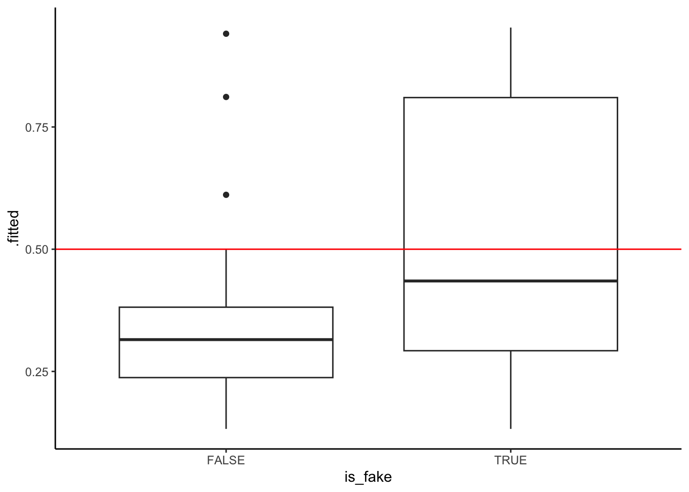
- sensitivity is between 25% and 50%. True positive cases are those in the “TRUE” boxplot that fall above the 0.5 probability threshold.
- specificity is between 75% and 100%. True negative cases are those in the “FALSE” boxplot that fall below the 0.5 probability threshold.
# Rows = actual / observed to be fake (FALSE or TRUE)
# Columns = predicted to be fake (FALSE or TRUE)
library(janitor)
threshold <- 0.5
fake_news %>%
  mutate(.fitted = predict(news_model, newdata = ., type = "response")) %>%
  mutate(predictFake = .fitted >= threshold) %>%
  tabyl(is_fake, predictFake) %>%
  adorn_totals(c("row", "col"))
is_fake FALSE TRUE Total
FALSE 86 4 90
TRUE 39 21 60
Total 125 25 150# Calculate the overall accuracy
(86 + 21) / 150[1] 0.7133333# Calculate the sensitivity (true positive rate)
21 / 60[1] 0.35# Calculate the specificity (true negative rate)
86 / 90[1] 0.9555556Whether sensitivity or specificity is better is somewhat subjective:
higher sensitivity: our model would be better at detecting when an article is fake, but at the cost of us mistaking real news for fake news.
higher specificity: our model would be better at detecting when an article is real, but at the cost of us more often mistaking fake news for real news.
Exercise 2: Calculations
Solution
# by hand
log_odds <- -1.8791 + 0.3829*4 + 2.5265*1
odds <- exp(log_odds)
prob <- odds / (odds + 1)
prob
[1] 0.8983478# Check
predict(news_model, newdata = data.frame(title_has_excl = TRUE, negative = 4), type = "response") 1
0.8983396 Exercise 3: Interaction
Solution
data(penguins)
penguins_sub <- penguins %>%
  filter(species %in% c("Adelie", "Gentoo"))

penguins_sub %>%
  ggplot(aes(y = body_mass, x = flipper_len, color = species)) +
  geom_smooth(method = "lm", se = FALSE)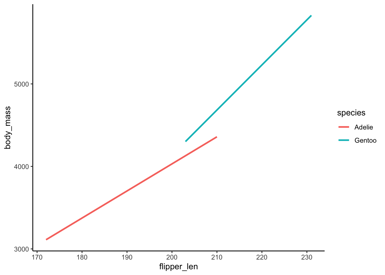
- The relationship between
body_massandflipper_lenvaries by / is different for the 2species. - .
\beta_1 > 0: This is the slope of the Adelie line. Among Adelies, the relationship between body mass and flipper length is positive.
\beta_2 < 0: This is the difference in the intercept of the Gentoo line relative to the Adelie line. The “baseline” body mass at a flipper length of 0 is lower among Gentoo than Adelie.
\beta_3 > 0: This is the difference in the slope of the Gentoo line relative to the Adelie line. The increase in body mass with flipper length is higher among Gentoo than Adelie.
Exercise 4: More interaction
Solution
summary(lm(body_mass ~ flipper_len*species, penguins_sub))
Call:
lm(formula = body_mass ~ flipper_len * species, data = penguins_sub)

Residuals:
    Min      1Q  Median      3Q     Max
-911.18 -265.28  -32.61  218.22 1144.81

Coefficients:
                           Estimate Std. Error t value Pr(>|t|)
(Intercept)               -2535.837    917.099  -2.765  0.00608 **
flipper_len                  32.832      4.825   6.804 6.54e-11 ***
speciesGentoo             -4251.444   1488.407  -2.856  0.00462 **
flipper_len:speciesGentoo    21.791      7.238   3.011  0.00285 **
---
Signif. codes:  0 '***' 0.001 '**' 0.01 '*' 0.05 '.' 0.1 ' ' 1

Residual standard error: 386.5 on 270 degrees of freedom
  (2 observations deleted due to missingness)
Multiple R-squared:  0.7886,    Adjusted R-squared:  0.7863
F-statistic: 335.8 on 3 and 270 DF,  p-value: < 2.2e-16
.
- Adelie: E[body_mass
|flipper_len] =-2535.837 + 32.832 flipper_lenProof: E[body_mass|flipper_len] =-2535.837 + 32.832 flipper_len - 4251.444*0 + 21.791*flipper_len*0 - Gentoo: E[body_mass
|flipper_len] =-6787.281 + 54.623 flipper_lenProof: E[body_mass|flipper_len] =-2535.837 + 32.832 flipper_len - 4251.444*1 + 21.791*flipper_len*1 = (-2535.837 - 4251.444) + (32.832 + 21.791) flipper_len
- Adelie: E[body_mass
For every 1cm increase in flipper length, the expected body mass increases by 32.8g for Adelies and by 21.8g more than that for Gentoos.
.
    # Using the original model
    -2535.837 + 32.832*220 - 4251.444*1 + 21.791*220*1
[1] 5229.779 # Using the Gentoo sub-model
-6787.281 + 54.623*220[1] 5229.779