# Load packages
library(tidyverse)
data(penguins)
penguins <- penguins %>%
  filter(species != "Adelie", bill_len < 57)

# Check it out
head(penguins)8 Introduction to multiple regression
Settling In
- Grab a Card and Sit at that table
- Introduce yourself
- Share your names, pronouns, major / minor.
- Check in about how finishing PS2 went. What resources did you find helpful?
- Help each other get ready to take notes!
- Open your notebook.
- Open the online manual to the “Course Schedule” and click on today’s activity. That brings you here!
- Download “08-mlr-intro.qmd” and open it in RStudio. Read the “Organizing your files” directions at the top of the file!!
Recap
NoteLearning goals
By the end of this lesson, you should be familiar with:
- some limitations of simple linear regression
- the general goals behind multiple linear regression
- strategies for visualizing and interpreting multiple linear regression models of Y vs 2 predictors, 1 quantitative and 1 categorical
NoteAdditional resources
Today is a day to discover ideas, so no readings or videos to go through before class.
Bivariate Relationships
Quantitative Y, Categorical X
- Side-by-Side boxplots (
y =Y,x =categorical var) - Density plots (
colored orfilled by categorical var) - Side-by-Side histogram (
faceted by categorical var)
Linear Models with Categorical X
- Convert X to indicator variables (1/0 values) for each categorical level
- Incorporate indicator variables for all but 1 level
- Reference level: the level without an indicator variable in the model
Interpretations
- Intercept: Average Y for reference level
- Coefficients: Difference in Average Y between level and reference level
Multiple linear regression model
In general, a multiple linear regression model of Y with multiple predictors (X_1, X_2, ..., X_p) is represented by the following formula:
E[Y \mid X_1, X_2, ..., X_p] = \beta_0 + \beta_1 X_1 + \beta_2 X_2 + ... + \beta_p X_p
NoteOrganize your files
This qmd file is where you’ll type notes, code, etc. Directions:
- Save this file in the
inclass_activitiessub-folder of thestat155folder you created before today’s class. Use a file name related to the activity number and/or today’s date (eg: “activity 8” or “8 multiple linear regression”).
Warm-up
Example 1
Let’s explore some data on penguins. You can find a codebook for these data by typing ?penguins in your console (not qmd).
Our goal is to build a model that we can use to get good predictions of penguins’ flipper (“arm”) lengths. Consider 2 simple linear regression models of flipper_len by penguin bill_len and species:
# Model 1: R-squared = 0.0288
summary(lm(flipper_len ~ bill_len, penguins))

# Model 2: R-squared = 0.7014
summary(lm(flipper_len ~ species, penguins))
How might we improve our predictions of flipper_len using only these 2 predictors? If we improve the predictions, what do you think is a reasonable range of possible values for the new R-squared?
Example 2
Consider a simple linear regression model of flipper_len by bill_len:
penguins %>%
  ggplot(aes(y = flipper_len, x = bill_len)) +
  geom_point() +
  geom_smooth(method = "lm", se = FALSE)
Thoughts? What’s going on here? How does this highlight the limitations of a simple linear regression model?
Example 3
The cps dataset contains employment information collected by the U.S. Current Population Survey (CPS) in 2018. We can use these data to explore wages among 18-34 year olds. The original codebook is here.
# Import data
cps <- read_csv("https://mac-stat.github.io/data/cps_2018.csv") %>%
  select(-education, -hours) %>%
  filter(age >= 18, age <= 34) %>%
  filter(wage < 250000)
# Check it out
head(cps)We can use a simple linear regression model to summarize the relationship of wage with marital status:
# Build the model
wage_mod <- lm(wage ~ marital, data = cps)
# Summarize the model
coef(summary(wage_mod))What do you / don’t you conclude from this model? How does it highlight the limitations of a simple linear regression model?
Reflection: Why are multiple regression models so useful?
We can put more than 1 predictor into a regression model! Adding predictors to models…
- Predictive viewpoint: Helps us better predict the response
- Descriptive viewpoint: Helps us better understand the isolated (causal) effect of a variable by holding constant confounders, other variables that may distort the relationship of interest…
Exercises
In the coming weeks, we’ll explore how to visualize, interpret, build, and evaluate multiple linear regression models. First, we’ll explore some foundations using a model of penguin flipper_len by just 2 predictors: bill_len (quantitative) and species (categorical).
Exercise 1: Visualizing the relationship
We’ve learned how to visualize the relationship of flipper_len by bill_len alone:
penguins %>%
ggplot(aes(y = flipper_len, x = bill_len)) +
geom_point()THINK: How might we change the scatterplot points to also indicate information about penguin
species? (There’s more than 1 approach!)Try out your idea by modifying the code below. If you get stuck, talk with the tables around you!
penguins %>%
ggplot(aes(y = flipper_len, x = bill_len, ___ = ___)) +
geom_point()Exercise 2: Visualizing the model
We’ve also learned that a simple linear regression model of flipper_len by bill_len alone can be represented by a line:
penguins %>%
ggplot(aes(y = flipper_len, x = bill_len)) +
geom_point() +
geom_smooth(method = "lm", se = FALSE)THINK: Reflecting on your plot of
flipper_lenbybill_lenandspeciesin Exercise 1, how do you think a multiple regression model offlipper_lenusing both of these predictors would be represented?Check your intuition below by modifying the code below to include
speciesin this plot, as you did in Exercise 1.
penguins %>%
ggplot(aes(y = flipper_len, x = bill_len, ___ = ___)) +
geom_point() +
geom_smooth(method = "lm", se = FALSE)Exercise 3: Intuition
Your plot in Exercise 2 demonstrated that the multiple linear regression model of flipper_len by bill_len and species is represented by 2 lines. Let’s interpret the punchlines!
For each question, provide an answer along with evidence from the model lines that supports your answer.
What’s the relationship between
flipper_lenandbill_len, no matter a penguin’sspecies? What’s your evidence?Does the rate of increase in
flipper_lenwithbill_lenappear to differ between the twospecies? What’s your evidence?What’s the relationship between
flipper_lenandspecies, no matter a penguin’sbill_len? What’s your evidence?The formula for this linear regression model is represented by the below formula:
E[flipper_len | species, bill_len] = \beta_0 + \beta_1 bill_len + \beta_2 speciesGentoo
Based on parts a-c:
Will \beta_1 be positive or negative? Why?
Will \beta_2 be positive or negative? Why?
Exercise 4: Model formula
Of course, there’s a formula behind the multiple regression model. We can obtain this using the usual lm() function.
# Build the model
penguin_mod <- lm(flipper_len ~ bill_len + species, data = penguins)
# Summarize the model
coef(summary(penguin_mod))In the
lm()function, how did we communicate that we wanted to modelflipper_lenby bothbill_lenandspecies?Complete the following model formula. (Was your answer in Exercise 3 part d correct?!)
E[flipper_len | bill_len, speciesGentoo] = ___ + ___ * bill_len + ___ * speciesGentoo
Exercise 5: Sub-model formulas
Ok. We now have a single formula for the model.
And we observed earlier that this formula is represented by two lines: one describing the relationship between flipper_len and bill_len for Chinstrap penguins and the other for Gentoo penguins.
Let’s bring these ideas together.
Utilize the model formula to obtain the equations of these two lines, i.e. to obtain the sub-model formulas for the 2 species. Hint: Plug speciesGentoo = 0 and speciesGentoo = 1.
Chinstrap: E[flipper_len | bill_len] = ___ + ___ bill_len
Gentoo: E[flipper_len | bill_len] = ___ + ___ bill_len
Exercise 6: coefficients – physical interpretation
Reflecting on Exercise 5, let’s interpret what the model coefficients tell us about the physical properties of the two 2 sub-model lines. Choose the correct option given in parentheses:
The intercept coefficient, 127.75, is the intercept of the line for (Chinstrap / Gentoo) penguins.
The
bill_lencoefficient, 1.40, is the (intercept / slope) of both lines.The
speciesGentoocoefficient, 22.85, indicates that the (intercept / slope) of the line for Gentoo is 22.85mm higher than the (intercept / slope) of the line for Chinstrap. Similarly, since the lines are parallel, the line for Gentoo is 22.85mm higher than the line for Chinstrap at anybill_len.
Exercise 7: coefficients – contextual interpretation
Next, interpret each coefficient in a contextually meaningful way. What do they tell us about penguin flipper lengths?!
Interpret 127.75 (intercept of the Chinstrap line).
Interpret 1.40 (slope of both lines). For both Chinstrap and Gentoo penguins, the expected flipper length…
Interpret 22.85. At any
bill_len, the expected flipper length…
Exercise 8: Prediction
Now that we better understand the model, let’s use it to predict flipper lengths! Recall the model and visualization:
E[flipper_len | bill_len, speciesGentoo] = 127.75 + 1.40 * bill_len + 22.85 * speciesGentoo
penguins %>%
ggplot(aes(y = flipper_len, x = bill_len, color = species)) +
geom_point() +
geom_smooth(method = "lm", se = FALSE)- Predict the flipper length of a Chinstrap penguin with a 50mm long bill. Make sure your calculation is consistent with the plot.
127.75 + 1.40*___ + 22.85*___To check your work, mark your prediction on the plot using a red dot: Make sure it’s where it should be!
penguins %>%
ggplot(aes(y = flipper_len, x = bill_len, color = species)) +
geom_point() +
geom_smooth(method = "lm", se = FALSE) +
geom_point(aes(x = 50, y = ____), color = "red", size = 4)- Predict the flipper length of a Gentoo penguin with a 50mm long bill. Make sure your calculation is consistent with the plot.
127.75 + 1.40*___ + 22.85*___penguins %>%
ggplot(aes(y = flipper_len, x = bill_len, color = species)) +
geom_point() +
geom_smooth(method = "lm", se = FALSE) +
geom_point(aes(x = 50, y = ____), color = "red", size = 4)- Use the
predict()function to confirm your predictions in parts a and b.
# Confirm the calculation in part a
predict(penguin_mod,
newdata = data.frame(bill_len = ___, species = "___"))
# Confirm the calculation in part b
predict(penguin_mod,
newdata = data.frame(bill_len = ___, species = "___"))Exercise 9: R-squared
Finally, recall that improving our predictions was one motivation for multiple linear regression (using 2 predictors instead of 1). To this end, consider the R-squared values of the simple linear regression models that use just one predictor at a time:
mod_bill <- lm(flipper_len ~ bill_len, data = penguins)
summary(mod_bill)
mod_species <- lm(flipper_len ~ species, data = penguins)
summary(mod_species)If you had to use only 1 of our 2 predictors, which would give the better predictions of
flipper_len?What do you guess is the R-squared of our multiple regression model that uses both of these predictors? Why?
Check your intuition. How does the R-squared of our multiple regression model compare to that of the 2 separate simple linear regression models?
summary(penguin_mod)Reflection
You’ve now explored your first multiple regression model! Thus you likely have a lot of questions about what’s to come. What are they?
Extra exercises
Exercise 10: Challenge Part 1
In this activity, we explored the model of flipper_len by a quantitative predictor (bill_len) and a categorical predictor (species). Challenge yourself to anticipate what visualizations / models might be like with 2 quantitative predictors: bill_len and bill_dep.
Part a
First, let’s visualize the relationship of flipper_len with bill_len and bill_dep. To do so, start with the scatterplot of flipper_len and bill_len, and modify it. THINK: How might you change the points to reflect their corresponding bill_dep?
# Do NOT include a geom_smooth (which wouldn't make sense here)
penguins %>%
ggplot(aes(y = flipper_len, x = bill_len)) +
geom_point()Part b
In Part a, you represented a 3D point cloud in 2D. BONUS (just for fun & for better understanding that this is a 3D relationship): Visualize this same data in something more like 3D:
# Don't worry about this code!
# It's specialized to this exercise and we'll rarely use it
library(plotly)
penguins %>%
plot_ly(x = ~bill_len, y = ~bill_dep, z = ~flipper_len,
type = "scatter3d")Part c
We can think of your plot above as a 3D point cloud. And the estimated formula for the linear regression model is
E[flipper_len | bill_len, bill_dep] = 179.2 + 2.38 bill_len - 5.15 bill_dep
quant_model <- lm(flipper_len ~ bill_len + bill_dep, penguins)
coef(summary(quant_model))QUESTION:
The model of flipper_len by bill_len and species is represented by 2 parallel lines. How would you draw / represent the model here?!
Part d
Challenge: Interpret the (Intercept) and bill_len coefficients. What physical meaning do they have, i.e. where do they come into the “drawing” of the model? What contextual meaning do they have?
Exercise 11: Challenge Part 2
Next, challenge yourself to anticipate what visualizations / models might be like with 2 categorical predictors: species and sex.
Part a
First, let’s visualize the relationship of flipper_len with species and sex. To do so, start with the side-by-side boxplots of flipper_len by species, and modify them.
penguins %>%
ggplot(aes(y = flipper_len, x = species)) +
geom_boxplot()Part b
The estimated formula for the linear regression model is
E[flipper_len | species, sex] = 191.8 + 21.07 speciesGentoo + 8.39 sexmale
cat_model <- lm(flipper_len ~ species + sex, penguins)
summary(cat_model)QUESTION:
The model of flipper_len by species alone would only produce 2 possible predictions, one for Chinstraps and one for Gentoos. What about the model here?! How many possible predictions would it make? HINT: Checking out the plot again might help.
Part c
Challenge: Interpret the (Intercept) and speciesGentoo coefficients. What physical meaning do they have, i.e. where do they come into the “drawing” of the model? What contextual meaning do they have?
Wrap Up
- Next Monday (2/16)
- Quiz 1! Start studying, if you haven’t already.
- Next Wednesday
- CP 6 (10 minutes before class)
Solutions
Warm up
Example 1
Solution
answers will vary! in general, we’d expect R-squared to be higher than in either of these models, thus higher than 0.7014.
# Model 1: R-squared = 0.02881
summary(lm(flipper_len ~ bill_len, penguins))
Call:
lm(formula = flipper_len ~ bill_len, data = penguins)
Residuals:
Min 1Q Median 3Q Max
-30.441 -10.998 3.015 8.942 19.881
Coefficients:
Estimate Std. Error t value Pr(>|t|)
(Intercept) 177.4971 13.6676 12.987 <2e-16 ***
bill_len 0.6712 0.2850 2.355 0.0195 *
---
Signif. codes: 0 '***' 0.001 '**' 0.01 '*' 0.05 '.' 0.1 ' ' 1
Residual standard error: 11.91 on 187 degrees of freedom
Multiple R-squared: 0.02881, Adjusted R-squared: 0.02362
F-statistic: 5.548 on 1 and 187 DF, p-value: 0.01954# Model 2: R-squared = 0.7014
summary(lm(flipper_len ~ species, penguins))
Call:
lm(formula = flipper_len ~ species, data = penguins)
Residuals:
Min 1Q Median 3Q Max
-18.045 -5.045 -1.045 3.955 15.955
Coefficients:
Estimate Std. Error t value Pr(>|t|)
(Intercept) 196.0448 0.8065 243.07 <2e-16 ***
speciesGentoo 21.0372 1.0039 20.96 <2e-16 ***
---
Signif. codes: 0 '***' 0.001 '**' 0.01 '*' 0.05 '.' 0.1 ' ' 1
Residual standard error: 6.602 on 187 degrees of freedom
Multiple R-squared: 0.7014, Adjusted R-squared: 0.6998
F-statistic: 439.2 on 1 and 187 DF, p-value: < 2.2e-16Example 2
Solution
There appear to be 2 groups of points, likely the 2 different species (gentoo and chinstrap). Neither of these groups is well represented by this simple model.
penguins %>%
ggplot(aes(y = flipper_len, x = bill_len)) +
geom_point() +
geom_smooth(method = "lm", se = FALSE)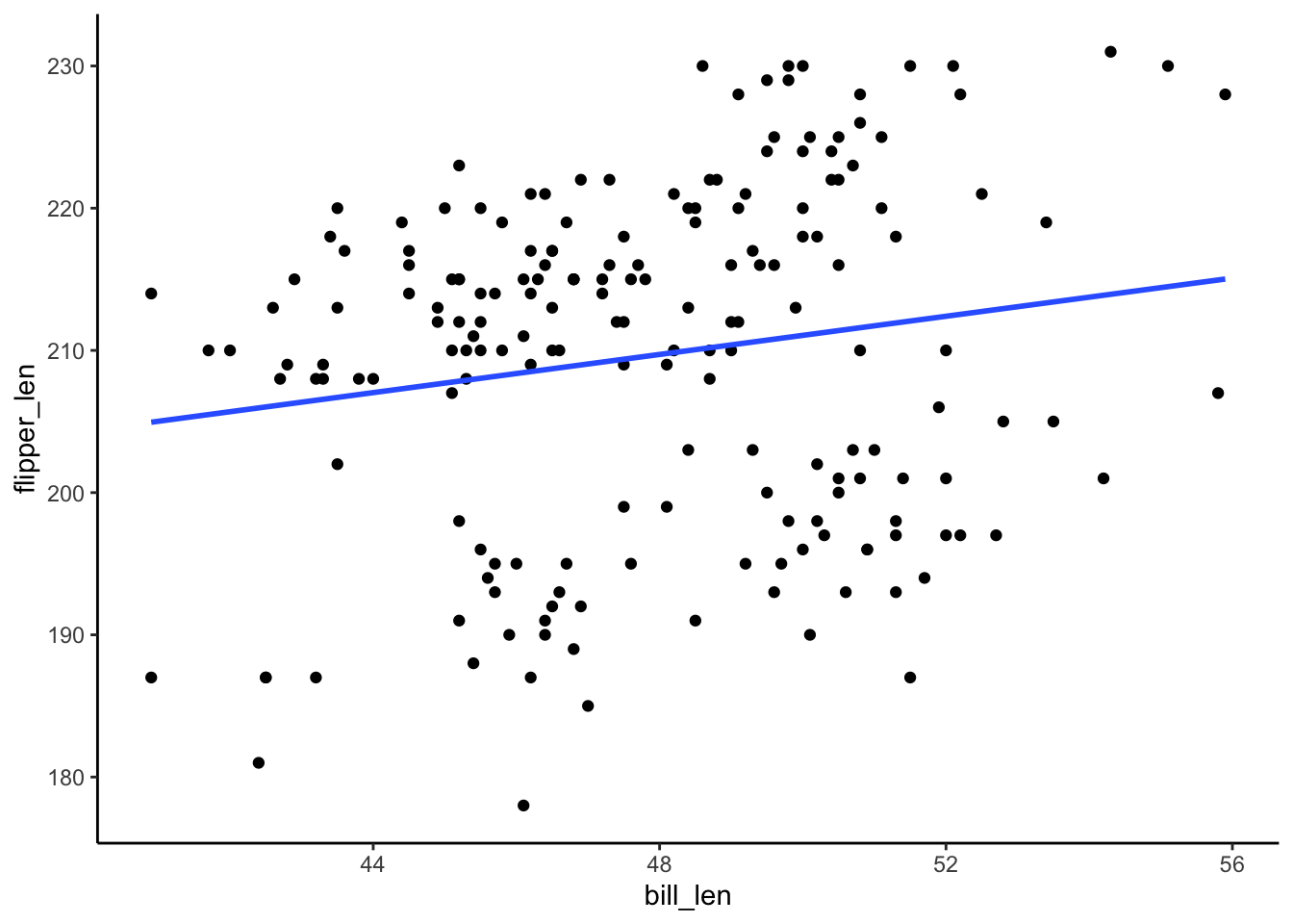
Thoughts? What’s going on here? How does this highlight the limitations of a simple linear regression model?
Example 3
Solution
# Import data
cps <- read_csv("https://mac-stat.github.io/data/cps_2018.csv") %>%
select(-education, -hours) %>%
filter(age >= 18, age <= 34) %>%
filter(wage < 250000)
# Check it out
head(cps)# A tibble: 6 × 6
wage age marital industry health education_level
<dbl> <dbl> <chr> <chr> <chr> <chr>
1 75000 33 single management fair bachelors
2 33000 19 single management very_good bachelors
3 43000 33 married management good bachelors
4 50000 32 single management excellent HS
5 14400 28 single service excellent HS
6 33000 31 married management very_good bachelors # Build the model
wage_mod <- lm(wage ~ marital, data = cps)
# Summarize the model
coef(summary(wage_mod)) Estimate Std. Error t value Pr(>|t|)
(Intercept) 46145.23 921.062 50.10002 0.000000e+00
maritalsingle -17052.37 1127.177 -15.12839 5.636068e-50It appears that single people make far less, on average. This is likely explained by other factors such as age and experience, which are ignored by this model. (For example, single people tend to be younger and younger people tend to have less experience thus lower wages.)
Exercises
Exercise 1: Visualizing the relationship
Solution
no wrong answer
There are multiple options!
penguins %>%
ggplot(aes(y = flipper_len, x = bill_len, color = species)) +
geom_point()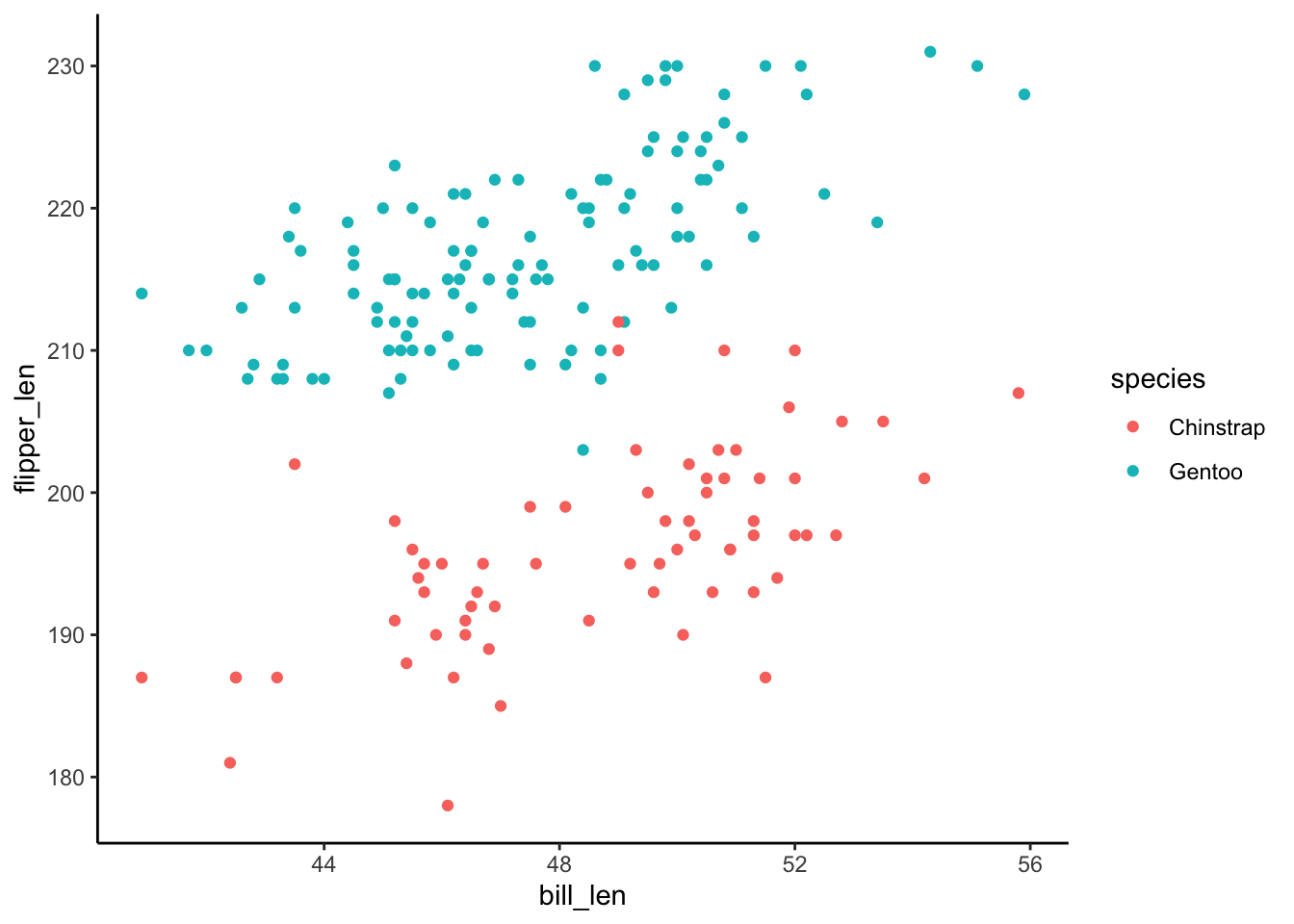
penguins %>%
ggplot(aes(y = flipper_len, x = bill_len, shape = species)) +
geom_point()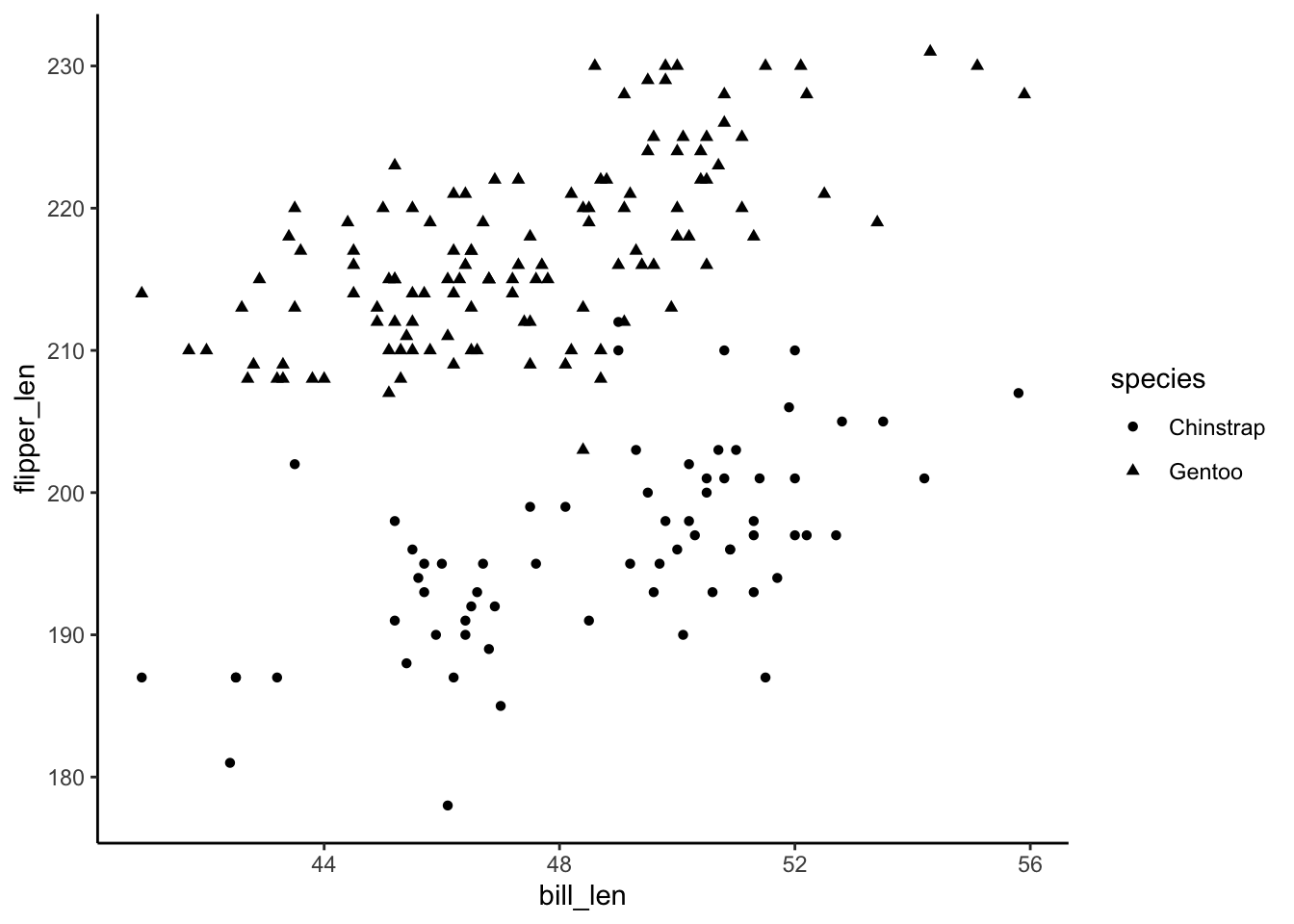
Exercise 2: Visualizing the model
Solution
no wrong answer
penguins %>%
  ggplot(aes(y = flipper_len, x = bill_len, color = species)) +
  geom_point() +
  geom_smooth(method = "lm", se = FALSE)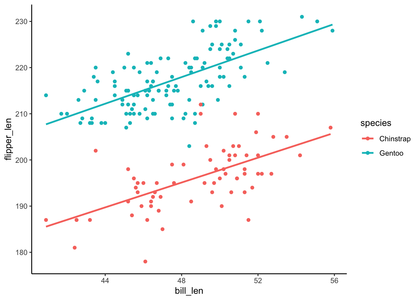
Exercise 3: Intuition
Solution
- Flipper length is positively associated with bill length. Both lines have positive slopes.
- No. The lines are parallel / have the same slopes.
- Gentoo tend to have longer flippers. The Gentoo line is above the Chinstrap line.
- Intuition.
Exercise 4: Model formula
Solution
penguin_mod <- lm(flipper_len ~ bill_len + species, data = penguins)
summary(penguin_mod)
Call:
lm(formula = flipper_len ~ bill_len + species, data = penguins)

Residuals:
     Min       1Q   Median       3Q      Max
-15.4763  -3.2260  -0.1525   3.1581  15.5303

Coefficients:
              Estimate Std. Error t value Pr(>|t|)
(Intercept)   127.7537     6.1175   20.88   <2e-16 ***
bill_len        1.4024     0.1250   11.22   <2e-16 ***
speciesGentoo  22.8480     0.7938   28.78   <2e-16 ***
---
Signif. codes:  0 '***' 0.001 '**' 0.01 '*' 0.05 '.' 0.1 ' ' 1

Residual standard error: 5.112 on 186 degrees of freedom
Multiple R-squared:  0.8219,    Adjusted R-squared:   0.82
F-statistic: 429.3 on 2 and 186 DF,  p-value: < 2.2e-16
bill_len + species- E[flipper_len | bill_len, speciesGentoo] = 127.75 + 1.40 * bill_len + 22.85 * speciesGentoo
Exercise 5: Sub-model formulas
Solution
Chinstrap: E[flipper_len | bill_len] = 127.75 + 1.40 bill_len
Gentoo: E[flipper_len | bill_len] = (127.75 + 22.85) + 1.40 bill_len = 150.6 + 1.40 bill_len
Exercise 6: coefficients – physical interpretation
Solution
The intercept coefficient, 127.75, is the intercept of the line for Chinstrap penguins.
The
bill_lencoefficient, 1.40, is the slope of both lines.The
speciesGentoocoefficient, 22.85, indicates that the intercept of the line for Gentoo is 22.85mm higher than the intercept of the line for Chinstrap. Similarly, since the lines are parallel, the line for Gentoo is 22.85mm higher than the line for Chinstrap at anybill_len.
Exercise 7: coefficients – contextual interpretation
Solution
For Chinstrap penguins with 0mm bills (silly), the expected flipper length is 127.75mm.
For both Chinstrap and Gentoo penguins, the expected flipper length increases by 1.40mm for every additional mm in bill length.
At any
bill_len, the expected flipper length for Gentoo penguins is 22.85mm longer than that for Chinstrap penguins.
Exercise 8: Prediction
Solution
# a
127.75 + 1.40*50 + 22.85*0
[1] 197.75penguins %>%
ggplot(aes(y = flipper_len, x = bill_len, color = species)) +
geom_point() +
geom_smooth(method = "lm", se = FALSE) +
geom_point(aes(x = 50, y = 197.75), color = "red", size = 4)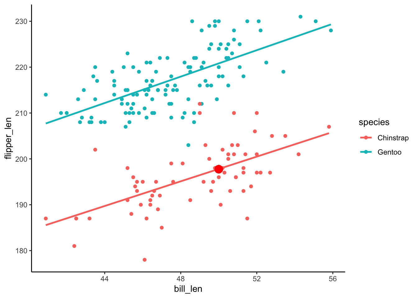
# b
127.75 + 1.40*50 + 22.85*1
[1] 220.6penguins %>%
ggplot(aes(y = flipper_len, x = bill_len, color = species)) +
geom_point() +
geom_smooth(method = "lm", se = FALSE) +
geom_point(aes(x = 50, y = 220.6), color = "red", size = 4)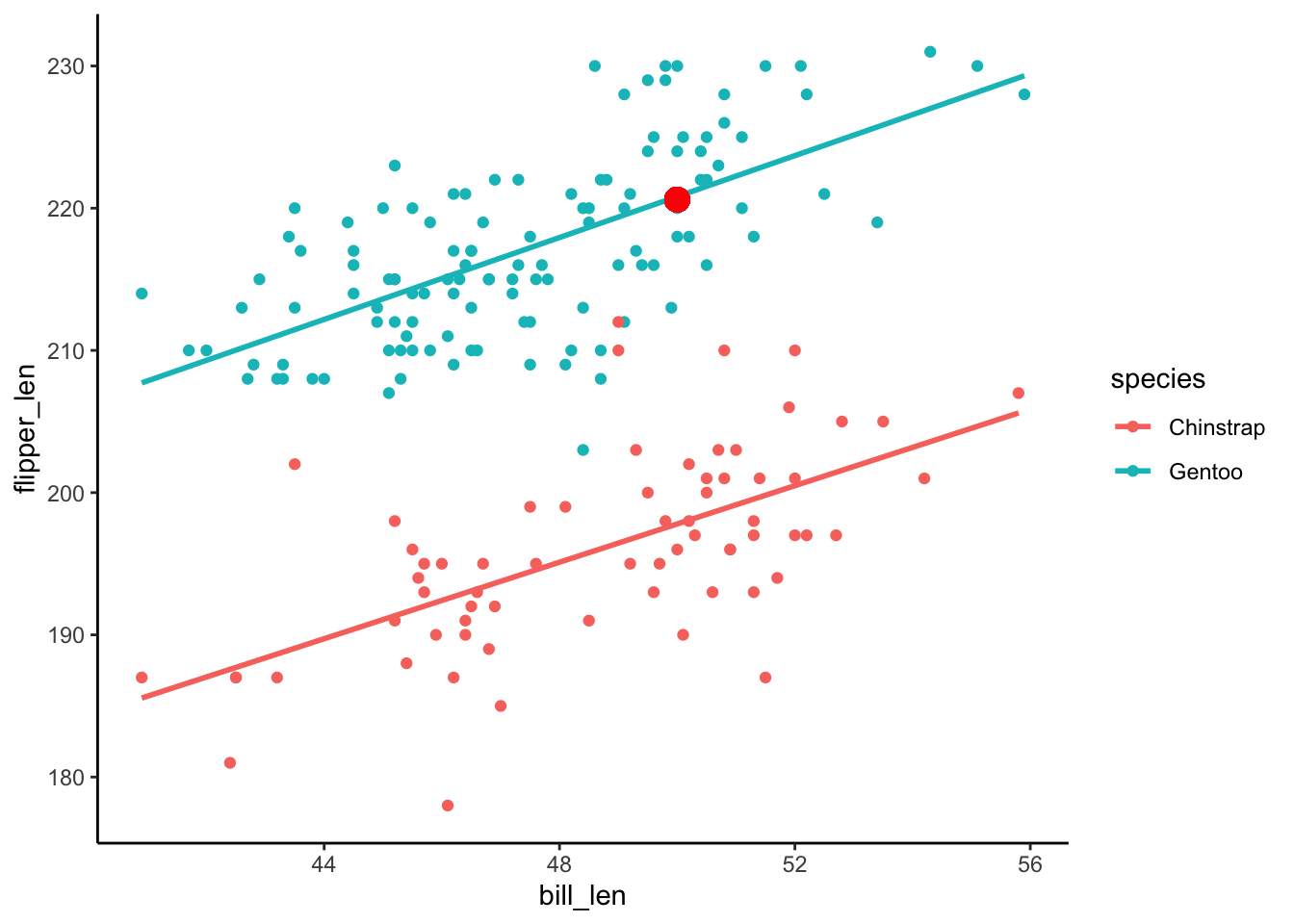
# c
predict(penguin_mod,
        newdata = data.frame(bill_len = 50,
                             species = "Chinstrap"))
1
197.872 predict(penguin_mod,
newdata = data.frame(bill_len = 50,
species = "Gentoo")) 1
220.7201 Exercise 9: R-squared
Solution
- species
- no wrong answer
- It’s higher than the R-squared when we use either predictor alone!
Exercises 10 & 11
Solution
No solutions! We’ll get into this topic in our next activity :)